Student Posts

Team member:  Ye Liu only

Source: http://www.willisms.com/archives/2005/03/the_american_em.html

Source: http://graphics.cs.wisc.edu/Courses/Visualization10/archives/661-assignment-4a-critique-by-ye-liu

Analysis:

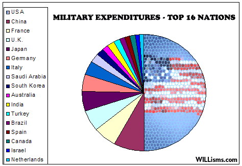
Problem definition: Show the audience the military expenditures of the 16 nations who have the highest military cost. Especially, pointing out America has the largest military expenditure, whose absolute value is almost the total summary of the other 15 top nations.

Data:

A: The names of the 16 nations who have the highest military expenditures.

B: The military expenditure amount s for each of the nations.

Abstraction:

Show comparison of the military expenditures of the 16 nations. Emphasize America as it has the highest largest military expenditure.

Mapping and encoding:

  1. Using a pie diagram to compare the military expenditures for different nations.
  2. Using different colors to mark for different countries, using different sizes (or central angles) of the pie partitions to show the amount of the expenditures.
  3. Drawing a meshed national flag in the U.S. partition to emphasize it.

Drawbacks:

  1. Mapping colors to 16 countries are challenging audiences’ perception limits. It’s very hard to distinguish every color and map them to different countries.
  2. Much of the information is omitted, including the absolute value of the expenditures and the percentage.
  3. The “emphasizing” on the U.S.A. are not successful as the meshed national flag is hard to recognize, and causing a lot of misunderstanding, because it’s blurred.
  4. The edges of the pie partitions are not refined, and the figure seems very coarse.

New design:

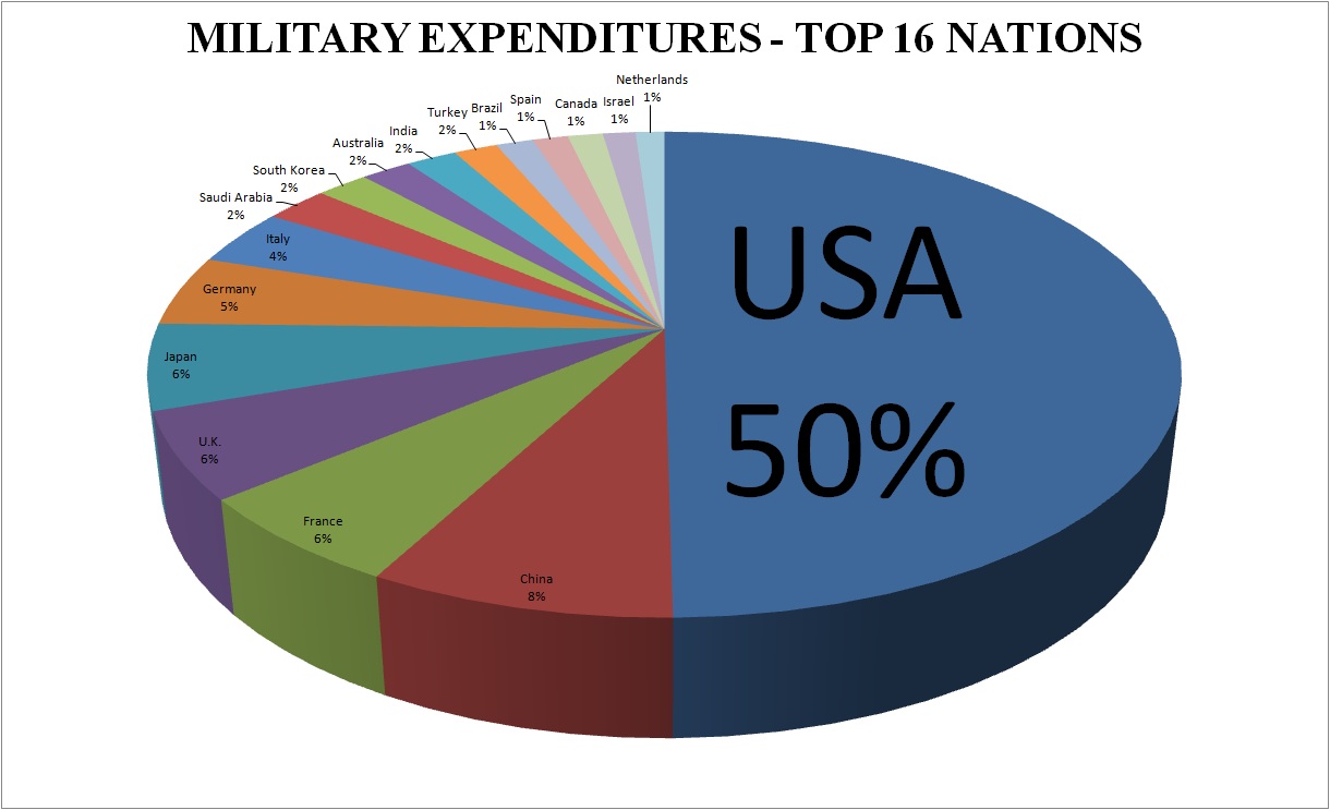
Using a 3-D pie diagram with fine edges and every nation directly annotated on the pie partitions would be a way for improvement. It does not need the audiences to map colors to countries, as it using both color and position to map the data and reduce cluttering. It can also provide data such as the percentage or the absolute value of the expenditures. It uses a larger font along with the percentage to emphasize the overwhelming expenditure for the U.S.A. It looks much smooth too, which would be more attractive and pleasant for audiences to view.

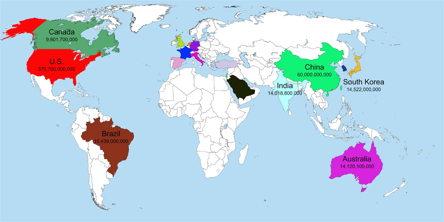
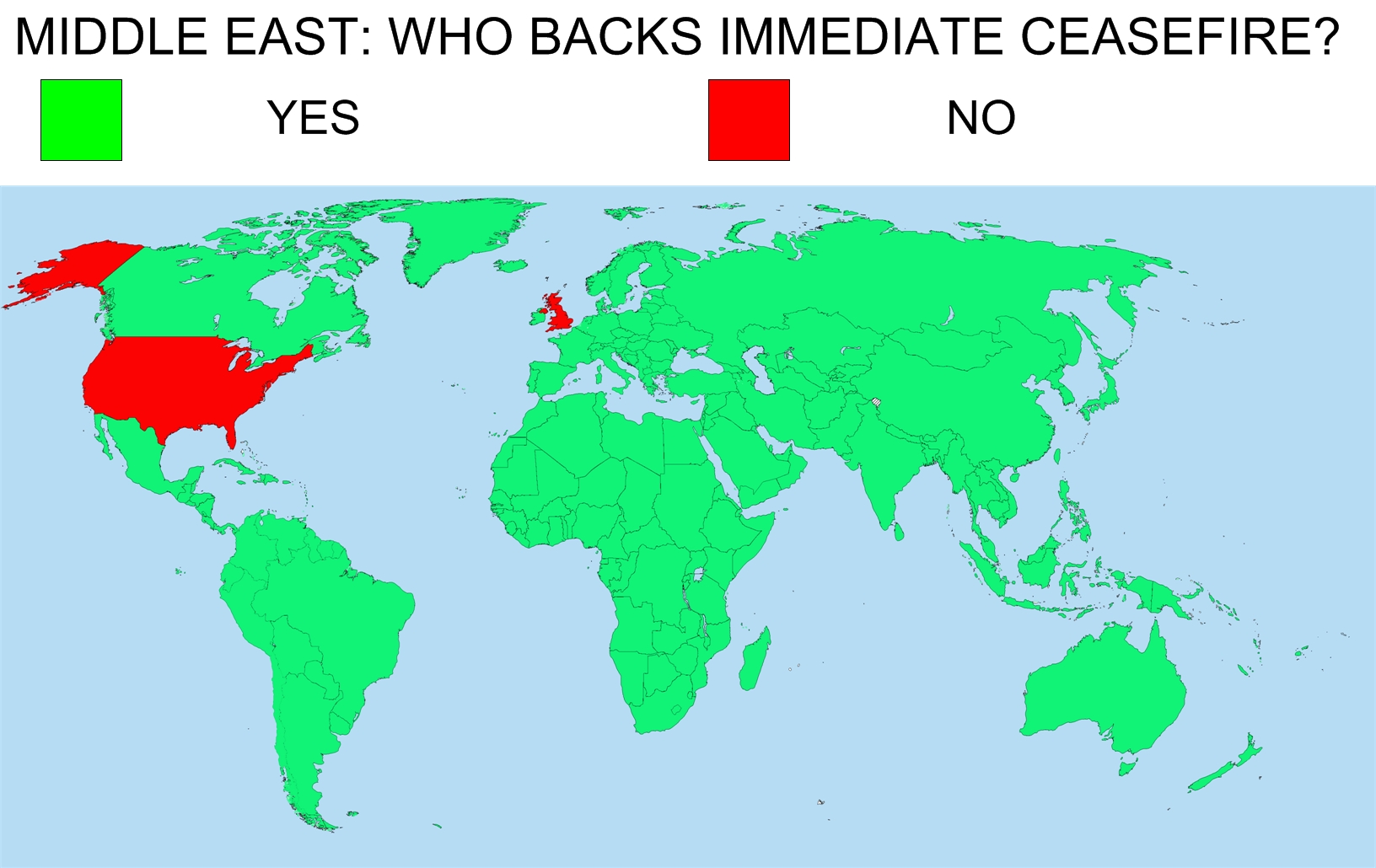
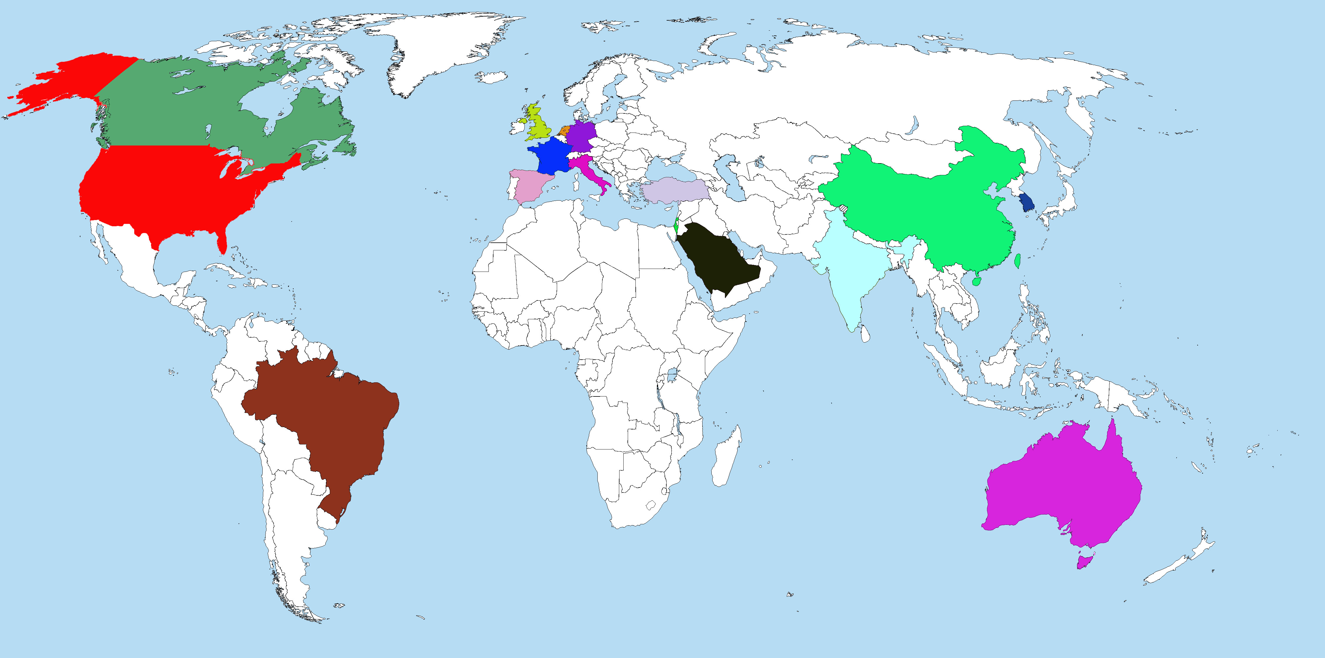
Another method would be using a world map again. The figure underneath shows an incomplete work but can already prove my point. Mapping countries to their own positions on the map with colors would be an efficient way for audiences with a little geography, not to mention we have much place to annotate the name of the nations and list their expenditures. Relatively loose data arrangement would reduce the cluttering problem and make the map fancier to view.

Analysis II: Bank Graph

February 16, 2010

in Student Posts

Market Cap of Banks:

The original graph was this:

The data for this visualization are 15 banks, and their market value at two distinct points of time.

It encodes bank to position, market value to size, and time to color and one might argue position.

Market Value: Diameter of a circle
Bank: Each bank has a separate position on the visualization
Time: As time is binary in this case, time is blue for one date, green for the other, the green circle for a specific bank is also within that banks blue circle, sharing the same bottom.

The first mapping simply fixes the problem of diameter being misleading to comparing circle sizes. Instead, the market value is mapped to area. In this example, there is a mockup involving seven of the banks where the only difference from the original is the sizes of the circles, reflecting this difference.

The second visualization creates a bar graph with the following encodings:

Market Value: Height of the colored portions of the bar
Bank: Each bank has a separate position on the bar graph
Time: Time is still binary, so color is still used, in this case blue and grey

The bars are also positioned from least previous initial market value to greatest from left to right.

The first altered visualization isn’t much of an improvement from the original. While it gives a better first glance look at the difference between market values at the different time within an individual bank, it still is not easy to compare between banks and the size of circles still isn’t the best way to display quantified data.

The bar graph is much better than either visualization. It’s easy to compare market values within one bank and between banks. The banks are also ordered in some fashion, whereas in the original visualization, there did not seem to be any reason for the order chosen. We’ve also chosen to emphasize new market value, as we believe it was the more important of the two data sets.

Crayon Chart:

Problem: Show the additions and changes to the manufactured crayon colors over the last 107 years
Abstraction: Color and time
Encoding: Color is mapped to both color and position, and time is mapped to position.
Implementation: Vector (likely) based static image

The original graph uses color to represent the actual color of the crayons. This literal use of variables is similar to mapping position to spatial data, where the required level of interpretation by the reader is reduced through the lack of non-intuitive associations. Improvements were made by including additional data on the top of the graph denoting the number of total colors, along with the number of colors added and subtracted, for each time stamp. The additions increase the visual noise, but allows the reader to extract data easily.

We redesigned this graphic from National Geographic on the costs and benefits of healthcare:

The Cost of Care

The data consists of a series of points, (one corresponding to each country surveyed.) Each point has 3 values associated with it: $ amount spent per capita (quantitative), expected life span (quantitative),average  number of doctor visits per year (ordered – the original graphic condensed this number into 4 bins,) and whether or not the country has a public health insurance system (categorical – all countries have a public health insurance system except for the US and Mexico).

The visual encoding used in the original graphic was:

–       Cost of healthcare per person- y position

–       Average life expectancy- y position

–       Average number of doctor’s visits per person- line thickness

–       Type of coverage (universal or otherwise)- hue

Good points with this design are that vertical position was used to encode the 2 most important variables, cost per capita and expected life-span. As an added bonus, the (scaled) difference between these 2 quantities falls out as the slope of the line representing each country. The average number of doctor visits per capita per year is encoded as the thickness of the line. Thickness is not listed in Munzner’s table of visual channels, (p. 683) though it can be interpreted as a kind of length. The author’s intent was to de-emphasize the number of visits, which may be why it was binned, and not given a more prominent channel.


Redesign 1:

For the first redesign, we decided that it might be an improvement to remove all of the line crossings, as it may reduce the visual clutter. Thus, we made each line vertical, so that now its top y-coordinate encodes cost, and its bottom (negative) coordinate encodes expected life-span. We left doctor visits out, as there was no simple way to encode this as line thickness in Matlab (that we have found). Color (hue) was used to show the final variable, existence of a national health care system. Ideally, the countries should be labeled, and if it were feasible to do so, we would have. A remaining issue is how to populate the new free variable, the x-coordinate of each line. In order to better highlight the underlying trend from the original graphic, used the (scaled) difference between cost and lifespan as the x-coordinate, which is a stronger channel than slope, as in the original graphic. An advantage is that it can be seen that of all the countries listed, Mexico actually has the lowest difference, which was not easy to detect from the original graphic.


Redesign 2:

For the second redesign of this graphic, we chose to encode average cost as the vertical position of each line, and expected lifespan as length. The idea here it test whether anything is lost by using a slightly weaker channel for one of the main variables, and also to see if there is a discernible pattern in the ratio between cost and lifespan, encoded as the slope between the tips of each line and the origin. This time, we encoded number of doctor visits as the radius of a circle centered at the middle of each line, with the color of the circle representing the categorical variable, existence of a national health plan.

One drawback to this approach was that the circles tended to overlap a bit, making it difficult to connect each line with its corresponding circle. Also, the ratio of cost per expected year of lifetime does not pop out quite as well as expected. An advantage is that the 2 variables are not fused into a single line, and are easier to read separately. Also, the outliers are still apparent in this view.


As a final comparison, the author himself considered a scatter plot as an alternative, but rejected this in favor of the original plot above:

http://blogs.ngm.com/blog_central/2010/01/the-other-health-care-debate-lines-vs-scatterplot.html

-Leslie Watkins & Chris Hinrichs

Visualization Assignment 4-b

By Shuang Huang & Faisal Khan

This posting is about the re-design of the Time magazine visualization here (http://www.time.com/time/2007/america_numbers/commuting.html).  This was about showing average commute time across major U.S. cities.

Original encodings

Here are the encodings used in the original map:

-Cities

Position on 3D US map

-Average Commute time:

length:  Different size bars proportion to the length of the commute time were erected at the geographical location of different major cities.

Color: They used color saturation to also encode the same information. Each bar was colored using the saturation value proportions to the average commute time.

New encodings

A simple solution is to use a 2D map instead of original 3D map for representing geographical position of each city. We can use the original color saturation values to color a rectangular region around the location of a city thus showing the average commute values. Apparently there doesn’t seem to be lot of deviation in the commute times across our chosen set of cities. Thus, it might be more useful to use discrete colors to use in which range commute value for a particular city falls in. Below is a rough representation of this new design.

We did come up with another design in which we made an attempt to show the relationship between cities, the ones having similar commute values. We thought this might be useful especially if the commute (or some similar quantity) vary significantly in their values. In this new design we used a 3D map to encode cities position as usual. A color bar representing range of values is placed on the top of this map.

To show the correspondence between these values and cities we can use connections. To reduce the clutter an interactive plot can be made that highlights connections based on the selection in the color bar region.

Team member:  Ye Liu only

Original Design:
Cover of Independent, U.K., Jul 21, 2006

Source: http://graphics.cs.wisc.edu/Courses/Visualization10/archives/661-assignment-4a-critique-by-ye-liu

Analysis:

Problem definition: The authors would like to pass to their audience the information as following:

  1. The U.N. has made a call for an immediate ceasefire;
  2. There are 3 country, including U.S.A. and U.K. who do not back up this call;
  3. Most important, there are only 3 country, including U.S.A. and U.K. who do not back up this call;
  4. Implication the authors don’t back up their governments behavior.

Data:

A: attitude towards the U.N. ceasefire call, a Bool type categorical variable, only has “yes” or “no” values.

B: nations. In this case, we only consider one properties: their attitude towards the UN ceasefire call.

Abstraction:

Compare the nations who back up the UN call, and those who don’t.  The fact that U.K. and the U.S. is the absolute majority can state anything itself. The implication can be made that U.K. and the U.S. is against peace, so they are against the world.

Mapping and encoding:

  1. To emphasize the equality of all nations in the world, all other properties expect for the name and symbol of the nations are abandoned from the illustration.
  2. Using national flags of the same sizes as the symbol for the nations to further emphasize the equality.
  3. Put the nations with the answer “yes“ and those with the answer “no” side by side to compare.
  4. Split the two categories from a standard list of national flags, which has more implications that the entire world is composed by the nations with different opinions.

Drawbacks:

No known drawbacks with in this specific case. Someone might argue that it uses a big illustration to state for a simply fact, and omits a lot of the details of the nations. It might be hard to count for those nations who back up the U.N. call. But the authors use the illustration to create more emotional attractions, and to emphasize the abnormal behaviors of U.K. and the U.S.

New design:

I’m using different colors for positions and areas of different nations in the world map to compare their attitude. The good point is that it still shows an obvious comparison and still indicates that U.K. and the U.S.A are the majority. However, the drawbacks are:

  1. Too complicated. Coloring different areas in the world map is not an easy job.
  2. The contrast and the visual shock are reduced as U.K. and the U.S.A. occupies a large territory, which seemingly enhanced their power to say “NO”.

By Faisal Khan and Shuang Huang

Source:

http://graphics.cs.wisc.edu/Courses/Visualization10/archives/471-bank-graph

This design is believed to be a bad one, since it gives the audience the information that JP Morgan performs better than all the competitors. The comparison is a bit misleading by using the size of circles.

Problem definition:

The graph is to show the shrinkage of banks from 2007 to 2009.

Data:

1.    Time: Two time points, Q2 2007 and 01/20/2009.

2.    Bank: A categorical variable.

3.    Market value: The market value of each bank at each time point, and unit is billion dollars.

Abstraction:

Compare the difference of performance among banks. Especially, show JP Morgan’s good performance.

Mapping and Encoding:

  1. Each bank’s market values are shown in two circles, old one surrounding current value.
  2. Green represents current market value and blue means old one.
  3. The value is proportional to circle size. So the size of the circle represents the market value.
  4. The banks are ordered arbitrarily.
  5. Citibank, which does not perform well, is placed in the center of the graph.

Drawbacks:

  1. The graph tends to show JP Morgan performs best. Actually, it is not the best neither in current market value, nor percentage of shrinkage.
  2. The order of placing the banks is arbitrary.
  3. There are no specific criteria to compare the performance.

New graph:

  1. It orders the bank based on the current market values.
  2. It shows the percentage of shrinkage clearly by listing the exact number.
  3. It uses more common technique and is easy to understand.
  4. It does not highlight any bank, and makes the comparison fair.

Group members: Nate Vack and Adrian Mayorga

For the bad dataset we chose the eye data visualization that Nate posted about. The mappings are as follows:

Data:

  • List locations with associated times
  • Areas of interest
  • The image itself

Mapping:

  • Locations and times are aggregated into “fixations”
    • (x,y) position, time, duration
  • Areas of interest map to shapes
  • Image maps to itself

Visual Encoding:

  • Fixations are encoded by red circles.
    • center of circle is x,y position
    • size of circle is duration
    • sequential fixations are joined by a yellow line
  • Areas of interest are indicated by green shapes( ellipses , rectangles)

There are a few obvious flaws for these mapping and encodings. For one, mapping duration to size of circle is very misleading, it implies that when the fixation is longer, the area looked at is bigger. Additionally, it is not obvious that aggregating and thresholding the raw data into fixations is the  correct thing to do in all cases. The thinness and color of the lines also causes them to sometimes blend into the background image, making it hard for the investigator to see what’s going on.

We have come up with alternative encodings that we feel address these problems.

The first is to just draw the raw data as a continuous line over the image.

lines

This is essentially the same mapping, but skipping the aggregation step. Since each point now represents and equal amount of time, representing duration directly is not needed. Implicitly, the time spent in a region will be represented by having a higher density of lines.

The second is to “fog up” the entire image. Then “clear” the areas where the subject looked.

mask

This will make the areas where there was the most activity the clearest. However, the areas there there was little activity will suffer from a loss of detail.

The last is to instead of aggregating position and time into “fixations”, we can collapse this into a binary category of whether or not the subject was looking inside the region of interest. Using the other axis as time produces a line graph that clearly shows when the subject was looking inside the area of interest. However, all context of where exactly the subject was looking will be lost. This encoding would be more useful if the image had more than one area of interest.

bar

Group members: Nate Vack and Adrian Mayorga

For the good redesign we chose the Depth-Dependent Halos that I posted.

The mappings are:

Data

  • A set of 3 dimensional poly-lines

Mapping

  • Poly-lines are bundled together
  • A camera view is chosen and a 2-d projection is performed. Depth information is also calculated

Encoding

  • The bundles are drawn directly from the projection
  • Discontinuities in depth are encoded by white lines (halos) that surround the  bundles. Larger discontinuities yield larger halos.

Besides the halos, all of their mappings are pretty much the obvious ones, just a simple 3d to 2d projection. The halos intuitively encode differences in depth, almost in a sense hacking the perceptual system to convey 3d structure in a 2d image. Also, because they do not perform needless abstraction of the data, the context of the lines is not lost.

We have come up with the following alternates:

If annotations that label particular regions of the data are available, we could represent the connectivity explicitly with a node graph. Alternatively, if annotations are not available, more aggressive bundling can be performed.

graph

The same data can also be shown in a symmetric matrix

mat

The bundles can also be drawn as ribbons or arrows. While this removes the visual context, connectivity is more explicitly conveyed

ribbons

We can also change the way that depth is being encoded. If we instead use intensity, then closer areas would appear brighter, while the far away things would fade into the dark background, or vice-versa. With this mapping we lose the sharp delineation between relative depth discontinuities but it gives more information about absolute depths.

gray

Critique-II: Good One

February 15, 2010

in Student Posts

Group Members:

Jee Young Moon and Chaman Singh Verma

Source : 2nd Visualization: Big Bang

http://graphics.cs.wisc.edu/Courses/Visualization10/archives/602-assignment-iv-visualization-critique

( Acknowledgment) Images are taken from Google site.

**********************************************************************

Introduction:

We like this visualization because its contents carry  lots of information in space efficient manner.  With an effective integration of colors, words, and geometry make this visualization to describe a story around it and it supports Tufte’s argument that visualization must augment rational thinking.

1. Problem Definition:

In cosmology, there are many great experimental and theoretical results to substantiate the facts that Universe is expanding with the Big Bang. The problem is to show pictorially the entire knowledge to explain this natural phenomenon.

Source of this Visualization:

**************************

Scientific American Magazine ( Issue # is not known, circa 2004)

Targeted Audience :

*******************

General public who is interested in science but with probably less formal education the field of  cosmology.

2. Abstraction

  1. Time:    Universe is continuously expanding with time.
  2. Location:    Galaxies are running away from each other in higher dimension but for human understanding we can assume it to be in three dimensions.
  3. Geometrical  Shape :    Assuming the universe is expanding as balloon shape with time.
  4. Empty Space:      Dark energy is pervading in the universe,

3. Mapping and Encoding:

  1. Time is shown in the Z-Axis in increasing order.
  2. At any given instance of time, XY plane show the locations of  galaxies and starts.
  3. Dark energy is shown with the black color and different galaxies are  shown with different colors depending on their age.
  4. Expansion is shown in the shape of a balloon by bounding curves.
  5. Ever expanding nature is shown by the arrows in the picture.
  6. Text as additional information. It also shows composition of the universe in a separate pie chart and experimental measurements to support universe expansion.
  7. Translucent color in balloon shape is used to show the past universe.  An vivid 5 billion ago universe in the visualization exemplify this effectively.

4.  Other choices:

  1. This visualization doesn’t show or reveal the information that galaxies are running away from each other or stars are born and die. There is no mapping  between the two instances of galaxies positions.
  2. Instead of showing expansion of universe as in the open-ended cone shaped balloon, this visualization were more effective if we had chosen closed shaped balloon or sphere.

5. Comparison with our mapping


We believe that mapping a 3-dimensional phenomenon into 2-dimensional paper/screen is difficult, therefore the present visualization is probably better than ours. Since they dissect it by time, they effectively show 3-dimension.