By Faisal Khan and Shuang Huang
Source:
http://graphics.cs.wisc.edu/Courses/Visualization10/archives/471-bank-graph
This design is believed to be a bad one, since it gives the audience the information that JP Morgan performs better than all the competitors. The comparison is a bit misleading by using the size of circles.
Problem definition:
The graph is to show the shrinkage of banks from 2007 to 2009.
Data:
1. Time: Two time points, Q2 2007 and 01/20/2009.
2. Bank: A categorical variable.
3. Market value: The market value of each bank at each time point, and unit is billion dollars.
Abstraction:
Compare the difference of performance among banks. Especially, show JP Morgan’s good performance.
Mapping and Encoding:
- Each bank’s market values are shown in two circles, old one surrounding current value.
- Green represents current market value and blue means old one.
- The value is proportional to circle size. So the size of the circle represents the market value.
- The banks are ordered arbitrarily.
- Citibank, which does not perform well, is placed in the center of the graph.
Drawbacks:
- The graph tends to show JP Morgan performs best. Actually, it is not the best neither in current market value, nor percentage of shrinkage.
- The order of placing the banks is arbitrary.
- There are no specific criteria to compare the performance.
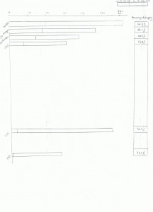
New graph:
- It orders the bank based on the current market values.
- It shows the percentage of shrinkage clearly by listing the exact number.
- It uses more common technique and is easy to understand.
- It does not highlight any bank, and makes the comparison fair.
