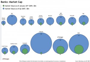
This is a graph that compares the market values of various banks at two different times. Once in 2007, the other after the crash to show value in early January, 2009.
This graph is very misleading, shape is probably not the best method to display the data, especially when there are only two pieces of data that are being compared within one bank. If the plan is to also compare between different banks, then there should be a better ordering, possibly by original market value (represented by the blue circles) or changed market value (represented by the green circles), depending on what you wish to show or compare.
One major problem with this image is that I quantify and compare areas much more readily than I do diameter, which is how the circle sizes are determined. Especially as there is no actual diameter lines written in to compare the two. For example, Goldman Sachs, which has dropped from 100 to 35, does not immediately appear to be worth about a third of it’s original value. Looking at the graph, my first impressions is that it’s worth a much smaller fraction of the value. This is a very misleading image.

{ 1 comment }
This visualization is a disaster. As Emma pointed out, using area in this manner to represent the change in market value is very misleading. A bar chart would show the correct areal proportions while allowing horizontal grid lines to show the relationship between the different corporations.
JP Morgan appears to be doing better, relatively speaking, than any of their competitors even though other banks may have sustained lower losses or their market shares remains higher. It is very telling that there is a JP Morgan logo in the lower left corner, although no disclaimer can justify representing the data in this manner.