 Team member: Ye Liu only
Original Design:
Cover of Independent, U.K., Jul 21, 2006
Source: http://graphics.cs.wisc.edu/Courses/Visualization10/archives/661-assignment-4a-critique-by-ye-liu
Analysis:
Problem definition: The authors would like to pass to their audience the information as following:
- The U.N. has made a call for an immediate ceasefire;
- There are 3 country, including U.S.A. and U.K. who do not back up this call;
- Most important, there are only 3 country, including U.S.A. and U.K. who do not back up this call;
- Implication the authors don’t back up their governments behavior.
Data:
A: attitude towards the U.N. ceasefire call, a Bool type categorical variable, only has “yes” or “no” values.
B: nations. In this case, we only consider one properties: their attitude towards the UN ceasefire call.
Abstraction:
Compare the nations who back up the UN call, and those who don’t. The fact that U.K. and the U.S. is the absolute majority can state anything itself. The implication can be made that U.K. and the U.S. is against peace, so they are against the world.
Mapping and encoding:
- To emphasize the equality of all nations in the world, all other properties expect for the name and symbol of the nations are abandoned from the illustration.
- Using national flags of the same sizes as the symbol for the nations to further emphasize the equality.
- Put the nations with the answer “yes“ and those with the answer “no” side by side to compare.
- Split the two categories from a standard list of national flags, which has more implications that the entire world is composed by the nations with different opinions.
Drawbacks:
No known drawbacks with in this specific case. Someone might argue that it uses a big illustration to state for a simply fact, and omits a lot of the details of the nations. It might be hard to count for those nations who back up the U.N. call. But the authors use the illustration to create more emotional attractions, and to emphasize the abnormal behaviors of U.K. and the U.S.
New design:
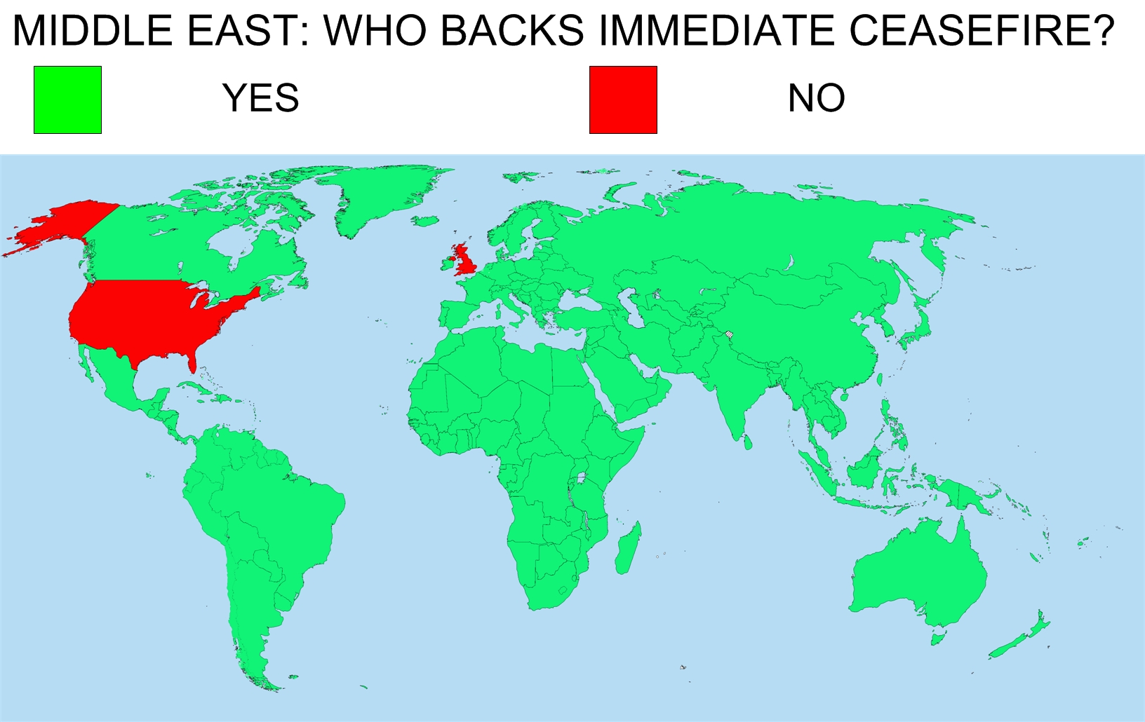
I’m using different colors for positions and areas of different nations in the world map to compare their attitude. The good point is that it still shows an obvious comparison and still indicates that U.K. and the U.S.A are the majority. However, the drawbacks are:
- Too complicated. Coloring different areas in the world map is not an easy job.
- The contrast and the visual shock are reduced as U.K. and the U.S.A. occupies a large territory, which seemingly enhanced their power to say “NO”.