Visualization Assignment 4-b
By Shuang Huang & Faisal Khan
This posting is about the re-design of the Time magazine visualization here (http://www.time.com/time/2007/america_numbers/commuting.html). This was about showing average commute time across major U.S. cities.
Original encodings
Here are the encodings used in the original map:
-Cities
Position on 3D US map
-Average Commute time:
length: Different size bars proportion to the length of the commute time were erected at the geographical location of different major cities.
Color: They used color saturation to also encode the same information. Each bar was colored using the saturation value proportions to the average commute time.
New encodings
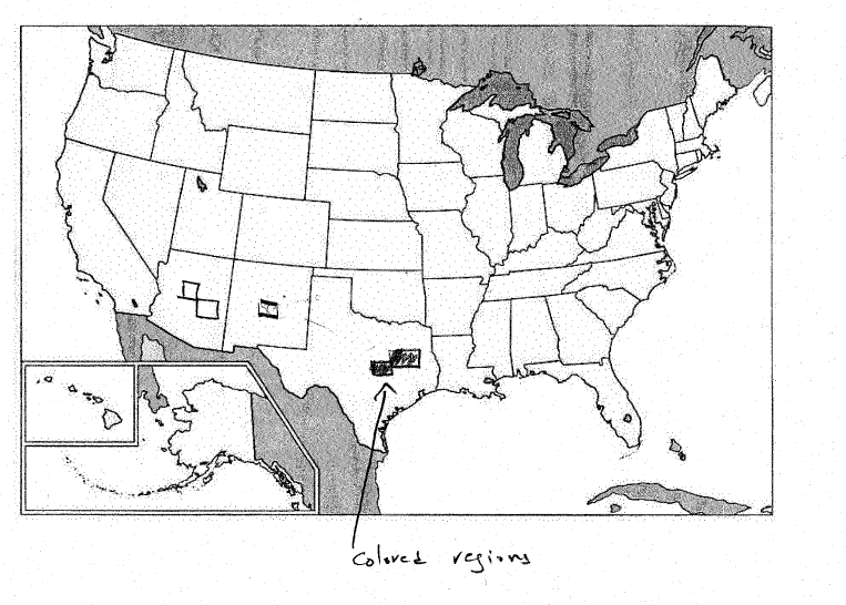
A simple solution is to use a 2D map instead of original 3D map for representing geographical position of each city. We can use the original color saturation values to color a rectangular region around the location of a city thus showing the average commute values. Apparently there doesn’t seem to be lot of deviation in the commute times across our chosen set of cities. Thus, it might be more useful to use discrete colors to use in which range commute value for a particular city falls in. Below is a rough representation of this new design.
We did come up with another design in which we made an attempt to show the relationship between cities, the ones having similar commute values. We thought this might be useful especially if the commute (or some similar quantity) vary significantly in their values. In this new design we used a 3D map to encode cities position as usual. A color bar representing range of values is placed on the top of this map.
![]()
To show the correspondence between these values and cities we can use connections. To reduce the clutter an interactive plot can be made that highlights connections based on the selection in the color bar region.