We redesigned this graphic from National Geographic on the costs and benefits of healthcare:
The data consists of a series of points, (one corresponding to each country surveyed.) Each point has 3 values associated with it: $ amount spent per capita (quantitative), expected life span (quantitative),average number of doctor visits per year (ordered – the original graphic condensed this number into 4 bins,) and whether or not the country has a public health insurance system (categorical – all countries have a public health insurance system except for the US and Mexico).
The visual encoding used in the original graphic was:
– Cost of healthcare per person- y position
– Average life expectancy- y position
– Average number of doctor’s visits per person- line thickness
– Type of coverage (universal or otherwise)- hue
Good points with this design are that vertical position was used to encode the 2 most important variables, cost per capita and expected life-span. As an added bonus, the (scaled) difference between these 2 quantities falls out as the slope of the line representing each country. The average number of doctor visits per capita per year is encoded as the thickness of the line. Thickness is not listed in Munzner’s table of visual channels, (p. 683) though it can be interpreted as a kind of length. The author’s intent was to de-emphasize the number of visits, which may be why it was binned, and not given a more prominent channel.
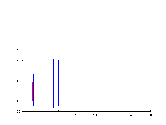
Redesign 1:
For the first redesign, we decided that it might be an improvement to remove all of the line crossings, as it may reduce the visual clutter. Thus, we made each line vertical, so that now its top y-coordinate encodes cost, and its bottom (negative) coordinate encodes expected life-span. We left doctor visits out, as there was no simple way to encode this as line thickness in Matlab (that we have found). Color (hue) was used to show the final variable, existence of a national health care system. Ideally, the countries should be labeled, and if it were feasible to do so, we would have. A remaining issue is how to populate the new free variable, the x-coordinate of each line. In order to better highlight the underlying trend from the original graphic, used the (scaled) difference between cost and lifespan as the x-coordinate, which is a stronger channel than slope, as in the original graphic. An advantage is that it can be seen that of all the countries listed, Mexico actually has the lowest difference, which was not easy to detect from the original graphic.
Redesign 2:
For the second redesign of this graphic, we chose to encode average cost as the vertical position of each line, and expected lifespan as length. The idea here it test whether anything is lost by using a slightly weaker channel for one of the main variables, and also to see if there is a discernible pattern in the ratio between cost and lifespan, encoded as the slope between the tips of each line and the origin. This time, we encoded number of doctor visits as the radius of a circle centered at the middle of each line, with the color of the circle representing the categorical variable, existence of a national health plan.
One drawback to this approach was that the circles tended to overlap a bit, making it difficult to connect each line with its corresponding circle. Also, the ratio of cost per expected year of lifetime does not pop out quite as well as expected. An advantage is that the 2 variables are not fused into a single line, and are easier to read separately. Also, the outliers are still apparent in this view.

As a final comparison, the author himself considered a scatter plot as an alternative, but rejected this in favor of the original plot above:
http://blogs.ngm.com/blog_central/2010/01/the-other-health-care-debate-lines-vs-scatterplot.html
-Leslie Watkins & Chris Hinrichs