Team member: Ye Liu only
Source: http://www.willisms.com/archives/2005/03/the_american_em.html
Source: http://graphics.cs.wisc.edu/Courses/Visualization10/archives/661-assignment-4a-critique-by-ye-liu
Analysis:
Problem definition: Show the audience the military expenditures of the 16 nations who have the highest military cost. Especially, pointing out America has the largest military expenditure, whose absolute value is almost the total summary of the other 15 top nations.
Data:
A: The names of the 16 nations who have the highest military expenditures.
B: The military expenditure amount s for each of the nations.
Abstraction:
Show comparison of the military expenditures of the 16 nations. Emphasize America as it has the highest largest military expenditure.
Mapping and encoding:
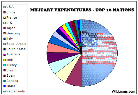
- Using a pie diagram to compare the military expenditures for different nations.
- Using different colors to mark for different countries, using different sizes (or central angles) of the pie partitions to show the amount of the expenditures.
- Drawing a meshed national flag in the U.S. partition to emphasize it.
Drawbacks:
- Mapping colors to 16 countries are challenging audiences’ perception limits. It’s very hard to distinguish every color and map them to different countries.
- Much of the information is omitted, including the absolute value of the expenditures and the percentage.
- The “emphasizing” on the U.S.A. are not successful as the meshed national flag is hard to recognize, and causing a lot of misunderstanding, because it’s blurred.
- The edges of the pie partitions are not refined, and the figure seems very coarse.
New design:
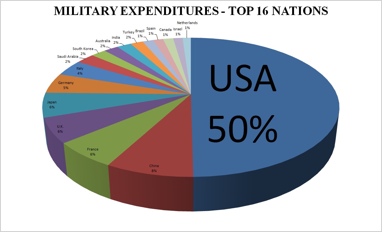
Using a 3-D pie diagram with fine edges and every nation directly annotated on the pie partitions would be a way for improvement. It does not need the audiences to map colors to countries, as it using both color and position to map the data and reduce cluttering. It can also provide data such as the percentage or the absolute value of the expenditures. It uses a larger font along with the percentage to emphasize the overwhelming expenditure for the U.S.A. It looks much smooth too, which would be more attractive and pleasant for audiences to view.
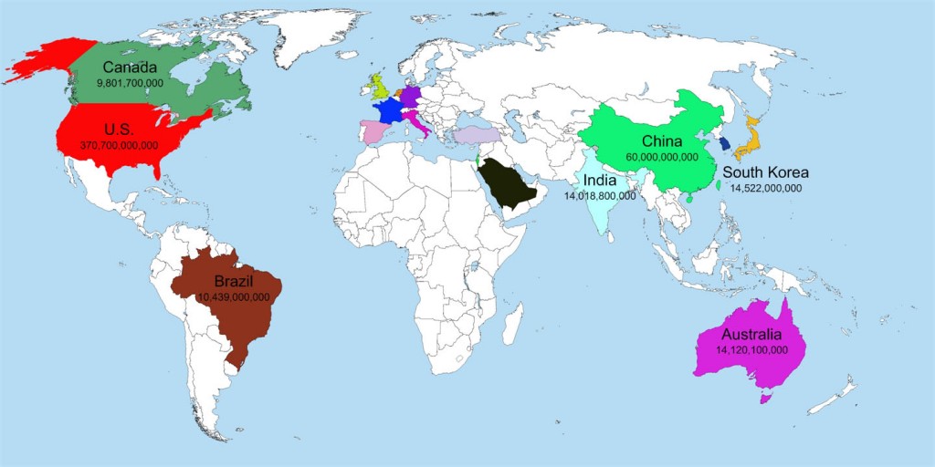
Another method would be using a world map again. The figure underneath shows an incomplete work but can already prove my point. Mapping countries to their own positions on the map with colors would be an efficient way for audiences with a little geography, not to mention we have much place to annotate the name of the nations and list their expenditures. Relatively loose data arrangement would reduce the cluttering problem and make the map fancier to view.


