Market Cap of Banks:
The original graph was this: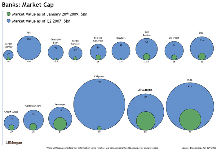
The data for this visualization are 15 banks, and their market value at two distinct points of time.
It encodes bank to position, market value to size, and time to color and one might argue position.
Market Value: Diameter of a circle
Bank: Each bank has a separate position on the visualization
Time: As time is binary in this case, time is blue for one date, green for the other, the green circle for a specific bank is also within that banks blue circle, sharing the same bottom.
The first mapping simply fixes the problem of diameter being misleading to comparing circle sizes. Instead, the market value is mapped to area. In this example, there is a mockup involving seven of the banks where the only difference from the original is the sizes of the circles, reflecting this difference.
The second visualization creates a bar graph with the following encodings:
Market Value: Height of the colored portions of the bar
Bank: Each bank has a separate position on the bar graph
Time: Time is still binary, so color is still used, in this case blue and grey
The bars are also positioned from least previous initial market value to greatest from left to right.
The first altered visualization isn’t much of an improvement from the original. While it gives a better first glance look at the difference between market values at the different time within an individual bank, it still is not easy to compare between banks and the size of circles still isn’t the best way to display quantified data.
The bar graph is much better than either visualization. It’s easy to compare market values within one bank and between banks. The banks are also ordered in some fashion, whereas in the original visualization, there did not seem to be any reason for the order chosen. We’ve also chosen to emphasize new market value, as we believe it was the more important of the two data sets.