We chose to redesign a “future trend map”:
http://nowandnext.com/PDF/trends_and_technology_timeline_2010.pdf
This visualization encodes five dimensions of data in the following ways:
– “time zones”– radial distance from the center of the map, hue
– phenomena – text labels, position on category lines, connection?
– category of phenomena – hue
– type of phenomena – shape, glyphs
– global risks – bulleted list, containment?
The biggest problems we had with this visualization were:
– There is no easy way to find things – the subway lines weave and snake all over the place;
– The color encoding uses too many hues;
– There is no clear rule about how to interpret spatial locality, in terms of whether nearby trends relate to each other.
How we address these things:
– We straightened out the lines so that you can follow each trend more linearly.
– W grouped some of the trends into larger trends (which don’t really seem to be all that distinct from each other anyway) so that there are fewer divisions in the data.
– The implicit groupings based on spatial locality should not be preserved if they are not explicitly linked.
Our redesign is shown here. Not all of the trends (i.e., subway stations) are shown here because there were too many – but you can imagine what it would look like if they were all there. Major intersections of groupings of trends (subway lines) are shown on the left as connecting lines. The 7 aggregated trends are shown by color at the left, and the various “time zones” are shown at the bottom. The intent here is to make the future look a lot more boring — and predictable.
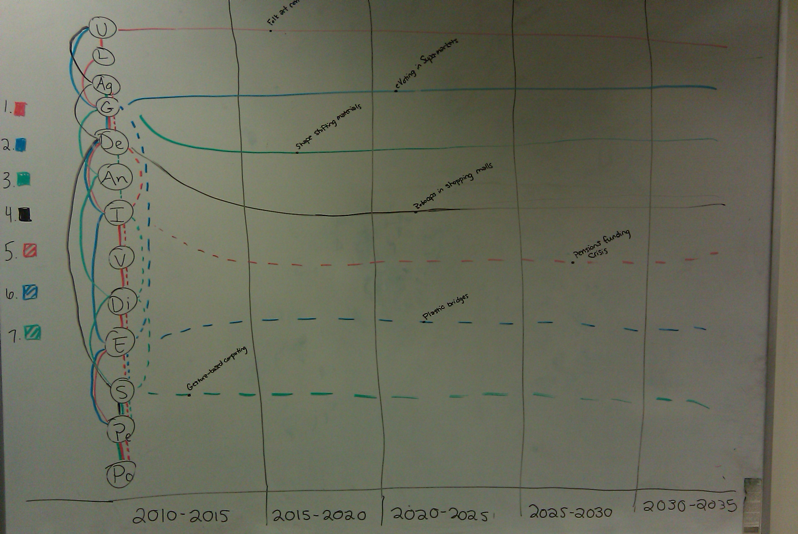
first redesign
Second redesign
For the second redesign, we wanted to compare the effect of grouping the trend-lines by leaving each one as a separate row (i.e., this time we didn’t group them). We reduced clutter by removing the connecting lines to show “megatrends” and replaced those with entries in dedicated columns. Time was assigned to color to emphasize the qualitative difference in predictions that were further out. Again, the effect is for minimalism and ease of use, rather than impressing the viewer with how messy and complicated the future is
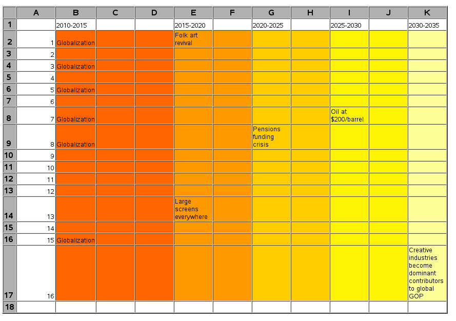
second redesign
One possible drawback is that the original graphic supports a more un-ordered, wandering traversal, following from one trend to another – however, the readers of this graph can let their eyes wander across it as well. The only difference is that we have not preserved the intersections of the trend-lines, because they were not explicitly said to be meaningful.
Leslie Watkins & Chris Hinrichs