Student Posts

Closed radial pattern with the same orientation applied to all samples.

Team of Jeremy, Adrian and Leslie

This demo is online, and can be viewed here.

The concept places all study samples on the same eight spokes and allows the user to select the study and variable by clicking the ‘wedges’  near the center.  Navigational highlights include:

1. Variables for each study are shown when the pointer is over each wedge and lines are then drawn upon mouse-down.

2. If a new variable is selected, which is different than the previously selected variable, the orientation is adjusted so that the current variable is on top.

3. The user can select all four studies by clicking the letters surrounding the spokes.

4. Values can be seen by placing the pointer over and individual dot (data point) and a circle is drawn to show the relative position of other points along other spokes.

5. The play button (which is currently not functional) will be used to animate between different time points in the longitudinal studies.

We are submitting the following visualizations:
– A heat map created in R: Association strength is encoded by lightness of color. Each column corresponds to a pair. In other words, we transformed the upper triangle of the matrix into a vector. Each row corresponds to a participant in each venue. Here we presented all the participants’ vector because in this way we see the contrast among groups with possible noise/variance.
– A visualization made up of cascading triangles showing the comparison between each “story” in each of the venues: In the parallel axis, nodes are placed. For a fixed node A, the pairs are presented by linking the left and right parallel axis with the width proportional to the association strength.   The same information in other network is presented in the same way linked to the next parallel axis.
A node-circle visualization created in Processing: Each circle is a node and each sub-region in a circle represent a network. The coloring of these regions corresponds to normalized relative centrality values. The bars shows the connection strength of a node with all other nodes in corresponding network. The thickness of each bar shows the relative strength of the connection.

The same plot but using the length of the bar as encoding for node link strength.

– An animated, horizontal stacked chart created in a spreadsheet software and Quicktime: Each scene is a “venue” showing each of the stories plotted against rest of the stories.
We created a visualization which uses human completion mechanisms instead of grouping mechanisms to show dense subsets of a matrix/graph.

Team members: Jim Hill, Ye Liu, Shuang Huang

Overview

Our goal is to develop a tool that will answer these two questions.

  1. Given a set of frame’s, what is the general distribution of the frames.
  2. Given two or more frames, how do they each compare.

To solve the first question we first decided that there must be a way to calculate the distance between two frames.  The method of calculation is not important, how it is visualized is.  We decide to pick a frame as a reference, which frame does not matter.  We then encode the distance of each frame from the reference as the distance of a green circle from the reference frame (red circle) located at the center of the screen.  Frames are spaced evely around the reference frame.  No information is encoded in the frame ordering.  The main window looks like this:

Main Window

This is an interactive visualization.  Hovering over any of the frames will display it’s name, clicking a frame will select it and double clicking will cause that frame to be used as the reference frame.

After selecting reference frames, clicking the compare button will bring up a compare window in which the frames are directly compared.  We have currently implemented two methods for comparing frames.

Encoding Differences using Lightness

We first find the difference matrix by subtracting one frames elements from the others.  This will result in a set of positive and negative numbers.  To visualize these differences, the size values are encoded using lightness of the color green for positive values and red for negative values.  A very light color represents a very small difference.  A solid green or solid red represents a very large difference.  The following is an image from the comparison:

Lightness Diff

This method of comparison can only compare two frames.

Encoding Differences using Bars

Our second method of encoding the difference between charts was to create a bar chart for each frame element to be compared.  The visualization still consists of a matrix of boxes, but each box contains a bar chart that shows the relative sizes of each element of each frame.  This allows for more than one frame to be visualized at one time.

Bar Diff

Source Code:

Currently this has only been tested on Linux.  It requires linking with the Qt libraries.  The source code can be found at:

http://www.cs.wisc.edu/~jshill4/cs838/DesignChal1/Project

Design Prototype

March 3, 2010

in Student Posts

Team: Emma Turetsky, Nakho Kim, Chaman Singh Verma

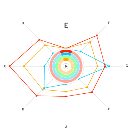
We felt this assignment contained two different problems. One was to get an overall picture or idea of the whole dataset, this would be a general view diagram, the other was to see how one skill or node relates to all the other nodes in the dataset and compare that between two datasets, this would be an egocentric diagram. It is very hard to do both together as it can easily clutter the visualization, making it harder to see the data and make it difficult for patterns to emerge, an example of this is the “spoke graph” the prof. Gleicher’s. So instead, we chose to focus on these problems seperately, rather than trying to do both at one time.

The egocentric approach, which is the one we ultimately chose, is the optimal way for showing individual node connections between one node and the others, but it is hard to show more than one degree of connectedness, making it hard to see the network overall as a whole, even if all the diagrams for the nodes are presented.

One of the major difficulties we saw with this approach was that there was too much clutter, especially around points with low correlation, so we decided to come up with a visualization which reduces the clutter without getting rid of the data completely. We chose a visualization of the second type, one which focuses on how the data relates to one data set, but can be easily compared between datasets.

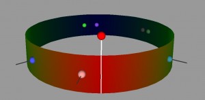
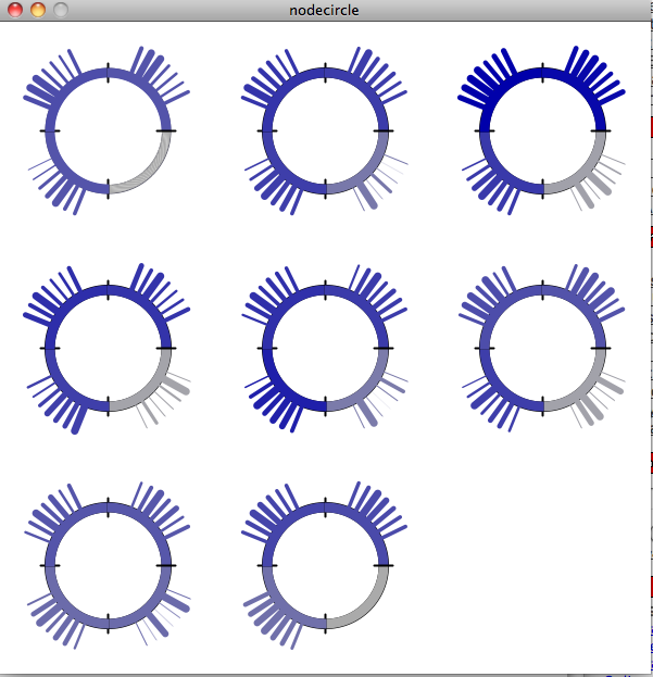
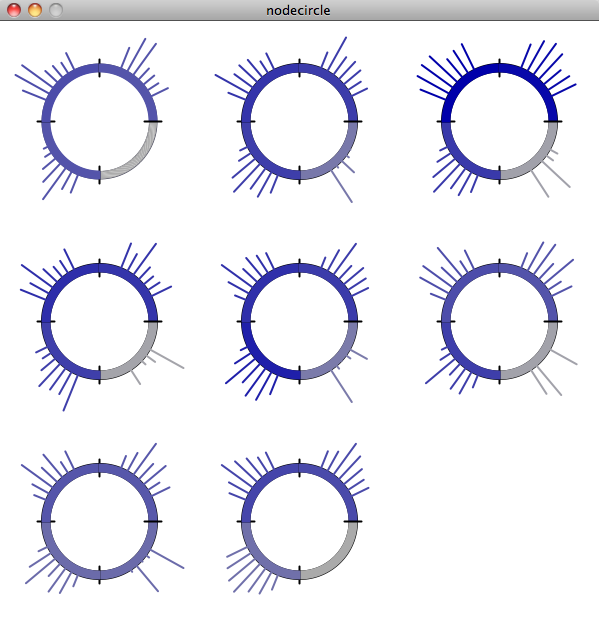
Our visualization is made up of a cylinder. There is a node sticking up vertically from the cylinder, this is the skill/point we are focusing on at the moment. When that point is in the center, you can see one half of the cylinder, the horizontal distance from the main point of the other points on the cylinder represent the correlation. So in this view, the edges of the cylinder are the .5 mark and the point opposite the focused node is 0. Note that this means that distance can be either to the right or the left of the focused point, but direction doesn’t matter. Where a point is vertically on the cylinder also does not matter, but can be used to show multiple points with the same of similar distance without having them overlap. If two points are the same horizontally but different vertically, they still have the same value.

The view can also be rotated so that if you wish to, you can see the points with lesser correlation on the other side of the column. What is nice about this view is that we can display multiple datasets on one column, as long as the focus point is the same. We have also show multiple focus points by stacking the columns on top of each other. While the prototype is not completely finished, we have a program which gives the general idea of what we are trying to achieve.

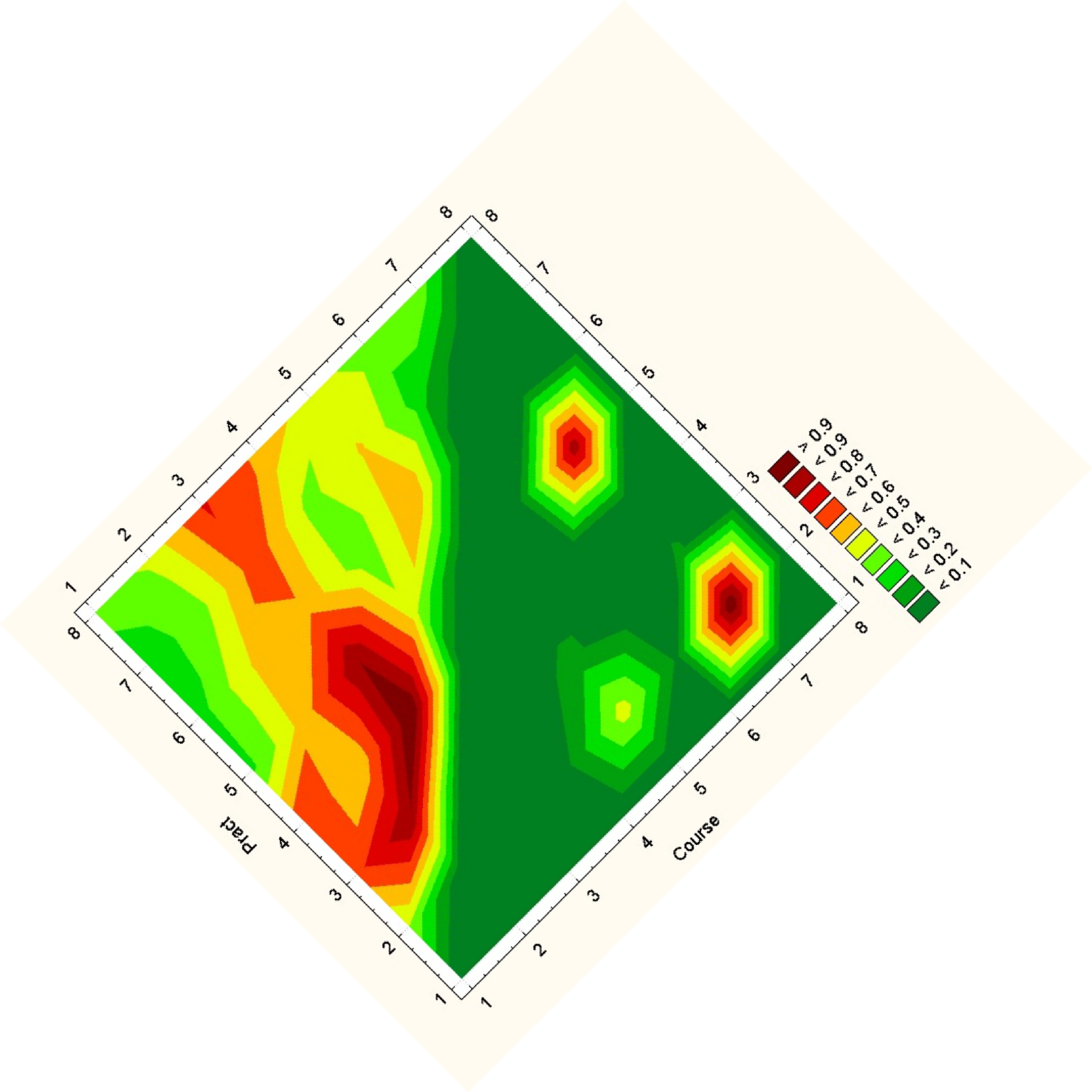
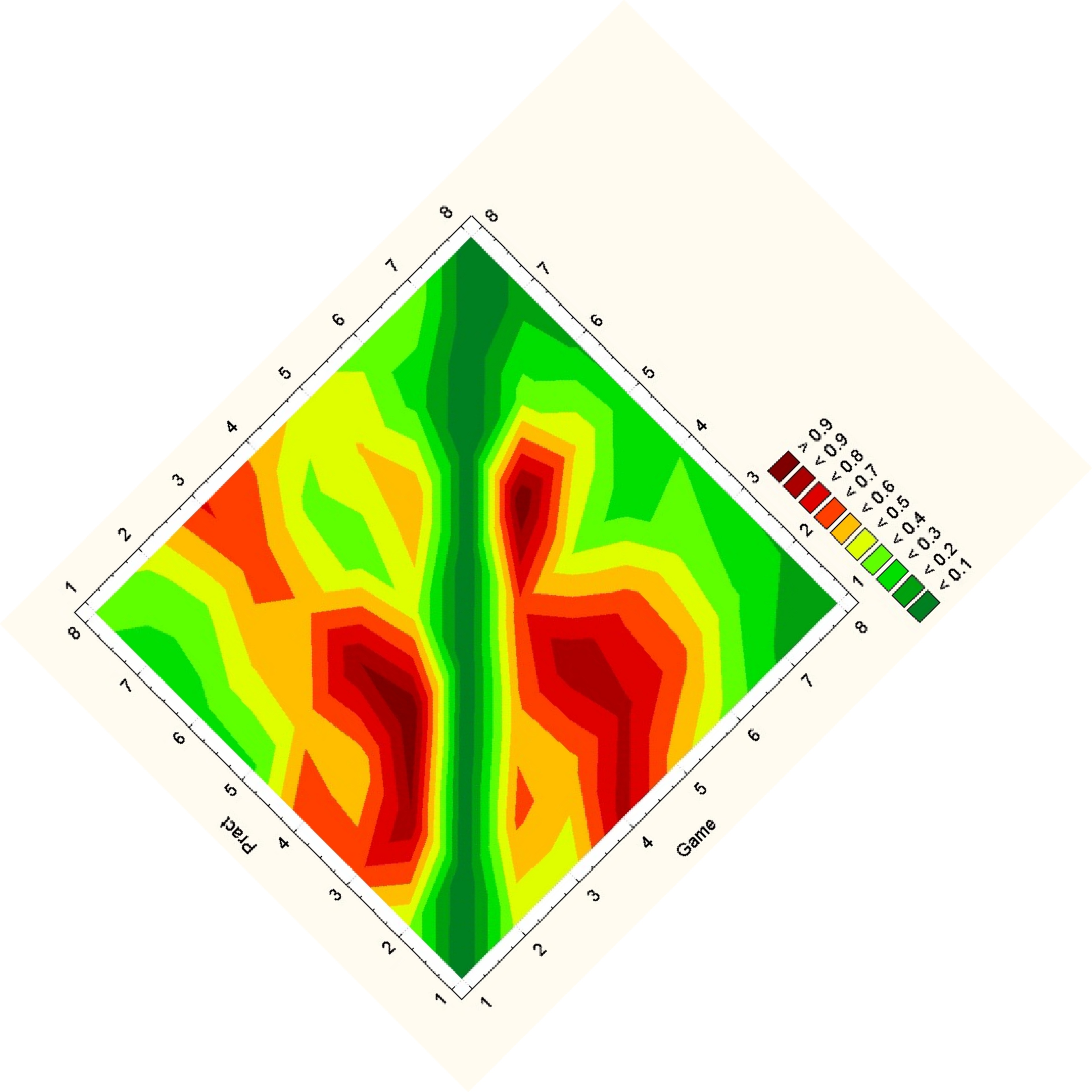
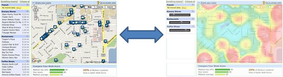
For a general view diagram, the idea is to show the network as a whole. The problem with this is that it gets easily cluttered and makes it hard to read individual connections. In a general view diagram, if the data points hold fixed positions, it’s easy to compare to or more networks, but hard to make a comparison. One example of this is the “golfball” view shown in class. If, in a network diagram, node positions are reordered depending on the dataset, it’s easy to see patterns within one dataset, but extremely difficult to compare between datasets.

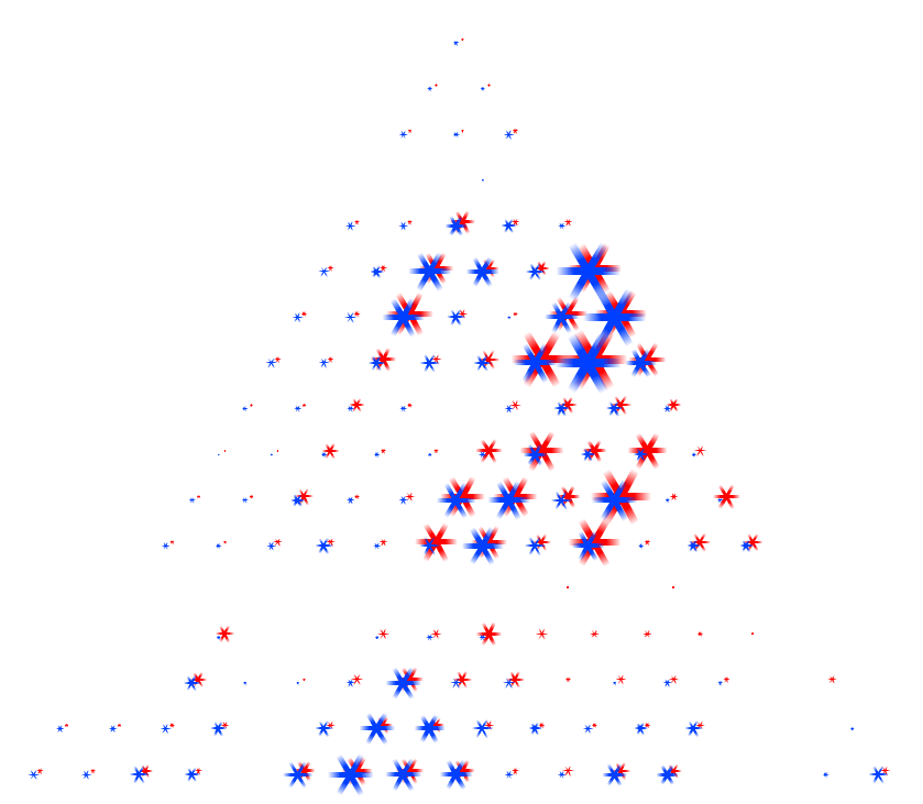
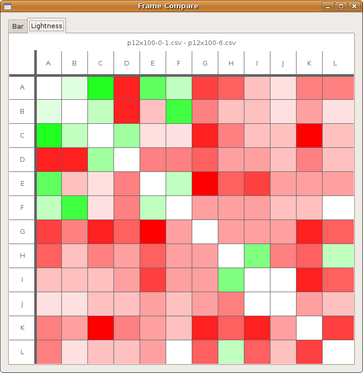
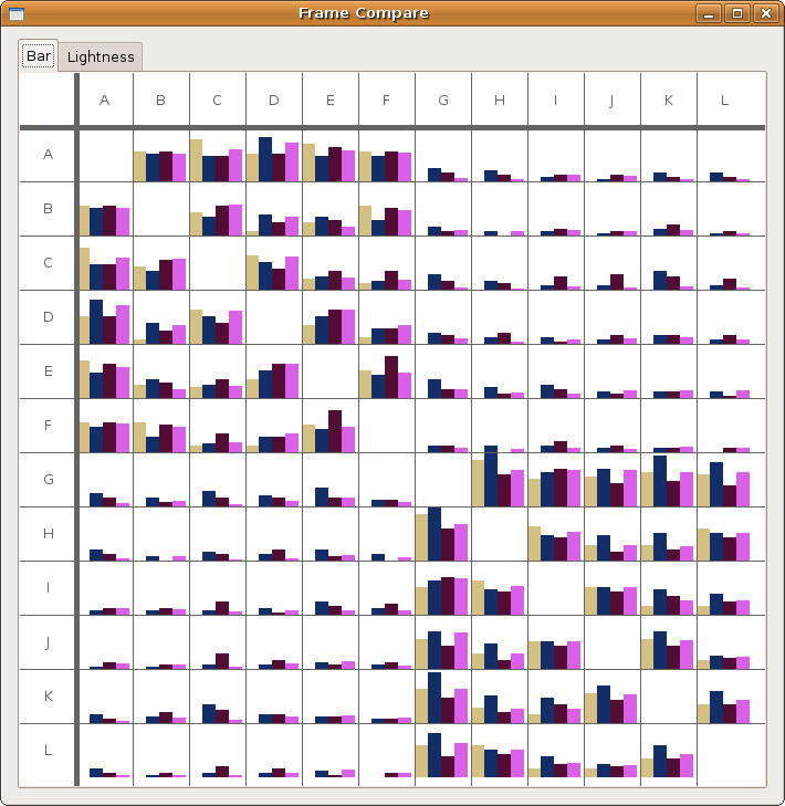
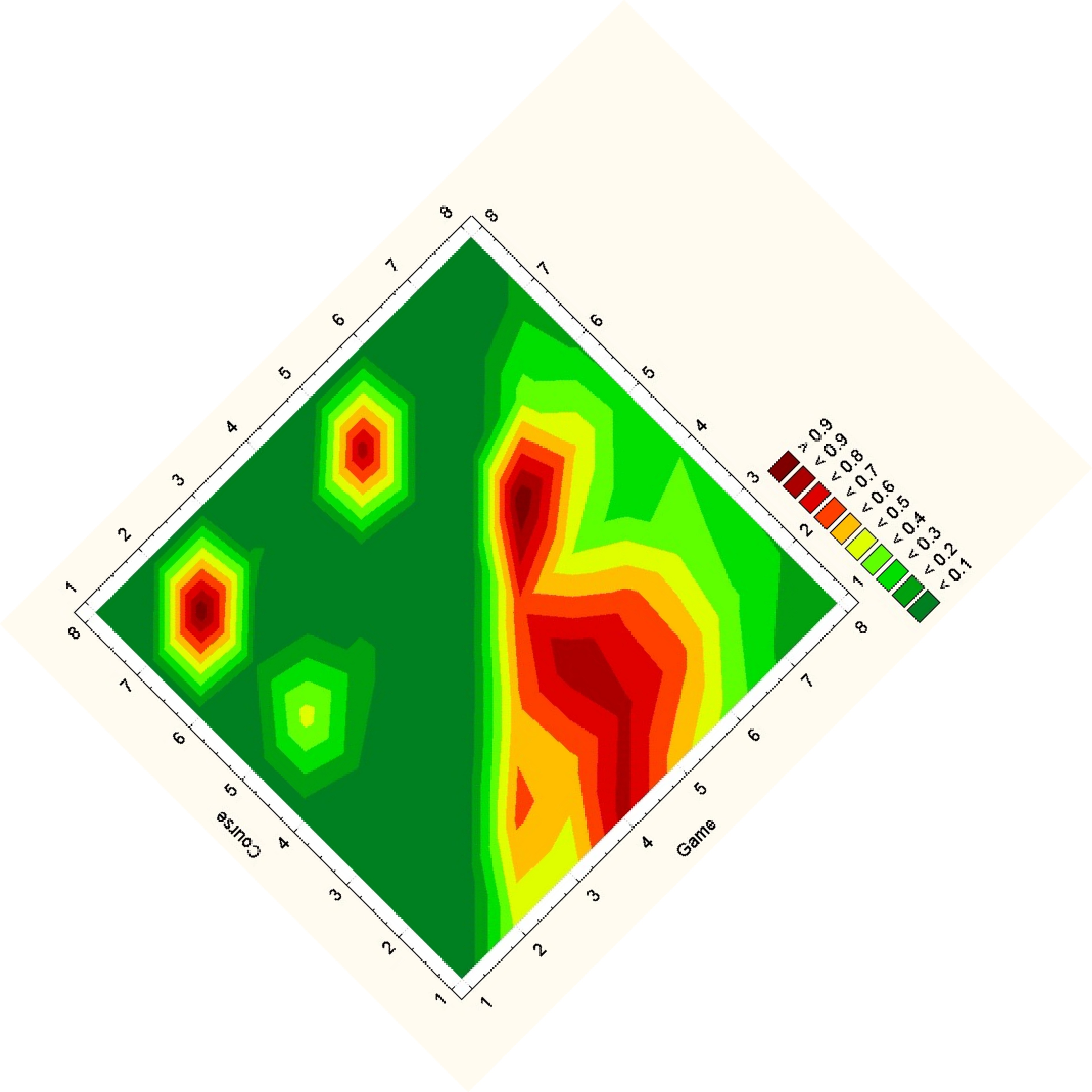
For an overall view, we decoded to use a fixed comparison of data matrices. We did this by essentially using the given matrix as the x and y coordinates in a plot and the correlation as some other value, in this case color. Then we noticed that since the matrices are identical, we could replace one triangle of a matrix with the other to get one graph where the coordinates on one side are symmetric with the coordinates on the other side. Doing this for a wafer plot gives us the following three plots.

Note that while you can clearly tell that the datasets have some differences, it is really hard to see what exactly those differences are. Due to the statistical software used, a gradient is formed, so though the original data on the vertices are distinct points, these plots imply and idea of connection and intermediate points between the data.

In light of Mike G’s talk on Tue at the Physics dept., the following article from NYT today is very relevant.

http://pogue.blogs.nytimes.com/2010/02/25/photoshop-and-photography-when-is-it-real/?ref=technology

http://www.i-am-bored.com/bored_link.cfm?link_id=47264

This is a really simple, but a simply amazing visualization. Proof that one doesn’t need moving parts, fireworks and sound-effects to make a wonderful visualization that conveys the subject matter effectively.

Movie Narrative Charts (by Randall Munroe)
http://xkcd.com/657/

This infographic shows the interaction between various characters in movies. Though mainly intended for geek humor, some valuable insights can be drawn from such approaches nonetheless. It is effective at visualizing which events involve more complex interaction between key characters, while at the same time making it possible to see the narrative trail each character followed before that (surprisingly, the visual encoding is also perceptually clear enough). This approach could prove valuable in studying historical material with focus on interaction between key figures.

Redesign of WalkScore

February 16, 2010

in Student Posts

Puneet & Danielle

Problem -> abstraction -> encoding -> implementation

Munzner describes the above process as ‘domain problem characterization, data/operation abstraction design, encoding/interaction technique design, algorithm design’

Deconstructing Walkscore
————————
Problem: Assess livability of a neighborhood by how far one has to walk for different services. The idea is that places you would usually walk to — parks, neighborhood grocery stores, restaurants and coffee shops — make up the social fabric of a neighborhood.

Abstraction: Livability is abstracted to availability of different services within walking distance.

Encoding: Map position to position, distance to color

Implementation: Show the results on a map.

Suggested improvement: Walkscore is a wonderful way to visualize and assess livability of a neighborhood. The improvements I can think of are: a heat map that creates a color gradient from green to red, where greener is closer and redder is farther from the origin. Ironically, Walkscore does implement a heat map, but only as a pre-created map for certain neighborhoods. As far as I can see, it does not have a facility for the users to create one for their own neighborhood.

An additional interface element to implement would be to weight the various walking destinations — for some, having a grocery store within walking distance may be more important, while for others, existence of neighborhood coffee shops or parks where neighbors gather may be more important. Being able to move sliders for various destination categories and watching the heat map change in real-time would be one one meaningful improvement that I can think of.

With this change, the user does not necessarily get a better or worse view of the information, but simply is presented with a different interpretation. If someone were looking to explore a particular area, the original encodings would be ideal to use. However, if someone was looking to make a decision about a location based on factors important to them, the heat map would provide a very straightforward basis for such a decision.

Puneet & Danielle

Deconstructing Multivariate Volumetric Vis
——————————————
Problem: Display the relationship between two different sets of multi-variate data in a single view.

Abstraction: The relationship between the two data sets is abstracted into a function of the predefined logical operators over the data set. The likely reasoning for this choice is to simplify the expression of the relationship of the data across a large number of variables. The exact values of the data are presented over a relative scale with respect to one another, again most likely in order to simplify visual representation. These abstractions are very logical decisions as far as simplifying the display and interpretation of a complicated body of data given that the purpose of this tool is more to demonstrate that such data can be shown, not necessarily in the most detail-oriented manner possible.

Encoding: The value of the variables is mapped to color. This is a fairly logical choice assuming an appropriate mapping of value to color. Additionally, the relationships of the variables between the data sets as expressed by the logical function are mapped to position. This decision appears to be motivated by the spatial nature logical expressions used to compare the data sets, implying a spatial relationship between data encoded in a spatial mapping.

Implementation: Generate a visual volume created by the above encodings in a digital format.

Suggested improvement:

While the visualizations generated by this system result in very aesthetically pleasing images, the outputs in their current state mean nothing. The encodings themselves have been abstracted to solely a relational level, but the nature of this relationship is left completely unspecified. One possible improvement for the representation is to map the values over an absolute and explicit color scale, with distinct visual intervals such that different data intervals are perceptually distinct from one another.

Additionally, the positional encoding of the data is completely uninterpretable at present. Essentially, the points mapped to the volume are mapped without regard for the user as there is no way to abstract any significant detail about the positional relationships from the visualization. One possible choice to improve the positional encoding of the data within each data set would be to give an explicit dimensionality to the different variables encoded in position in order to complement the spatial relationships encoded in the defining relational function.

These changes would likely detract from the aesthetics of the original image. However, they would make the visualization interpretable. By adding more explicit data to clarify the encodings, the visualizations become more about the information than art. Ideally, unlike the included redesign, transparency in the colors would be retained in order to maintain the volumetric aspect of the visualizations. However, by integrating more information about the encodings into the actual visual space, the reader can better understand what information is being presented. This new, more informative encoding could also then be implemented over an interactive platform to allow the user to navigate through the visualized data set. This sort of experimentation, however, was not done for this assignment.

HW4b Redesign the Bad

February 16, 2010

in Student Posts

We chose to redesign a “future trend map”:
http://nowandnext.com/PDF/trends_and_technology_timeline_2010.pdf

This visualization encodes five dimensions of data in the following ways:

– “time zones”– radial distance from the center of the map, hue
– phenomena – text labels, position on category lines, connection?
– category of phenomena – hue
– type of phenomena – shape, glyphs
– global risks – bulleted list, containment?

The biggest problems we had with this visualization were:
– There is no easy way to find things – the subway lines weave and snake all over the place;
– The color encoding uses too many hues;

– There is no clear rule about how to interpret spatial locality, in terms of whether nearby trends relate to each other.

How we address these things:
– We straightened out the lines so that you can follow each trend more linearly.

– W grouped some of the trends into larger trends (which don’t really seem to be all that distinct from each other anyway) so that there are fewer divisions in the data.

– The implicit groupings based on spatial locality should not be preserved if they are not explicitly linked.

Our redesign is shown here. Not all of the trends (i.e., subway stations) are shown here because there were too many – but you can imagine what it would look like if they were all there. Major intersections of groupings of trends (subway lines) are shown on the left as connecting lines. The 7 aggregated trends are shown by color at the left, and the various “time zones” are shown at the bottom. The intent here is to make the future look a lot more boring — and predictable.

first redesign

first redesign


Second redesign

For the second redesign, we wanted to compare the effect of grouping the trend-lines by leaving each one as a separate row (i.e., this time we didn’t group them). We reduced clutter by removing the connecting lines to show “megatrends” and replaced those with entries in dedicated columns. Time was assigned to color to emphasize the qualitative difference in predictions that were further out. Again, the effect is for minimalism and ease of use, rather than impressing the viewer with how messy and complicated the future is

Second redesign

second redesign

One possible drawback is that the original graphic supports a more un-ordered, wandering traversal, following from one trend to another – however, the readers of this graph can let their eyes wander across it as well. The only difference is that we have not preserved the intersections of the trend-lines, because they were not explicitly said to be meaningful.

Leslie Watkins & Chris Hinrichs