The final report for our project can be found here:
http://pages.cs.wisc.edu/~jshill4/projects/cs838EpVis/cs838-dc1-report.pdf
The complete source code can be found here:
http://pages.cs.wisc.edu/~jshill4/projects/cs838EpVis/cs838-dc1-src.zip
Instructions for compiling are included in the zip file.
A 32-bit Windows XP binary can be found here. A quick note, because everything is statically linked, you don’t need the Qt libraries installed to run the exe, but it’s a little large.
http://pages.cs.wisc.edu/~jshill4/projects/cs838EpVis/cs838-dc1-bin.zip
This is a collection of some nice tutorials on topics related to photography. Some of the concepts related to color in photographs are explained with visual illustration. These can be very helpful for understanding color for our purposes as well.
http://www.cambridgeincolour.com/tutorials.htm
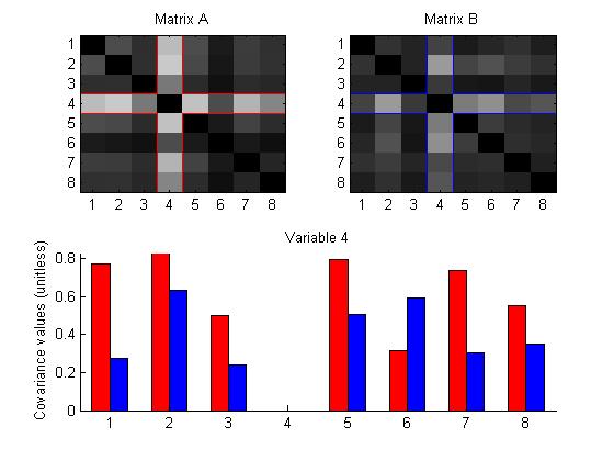
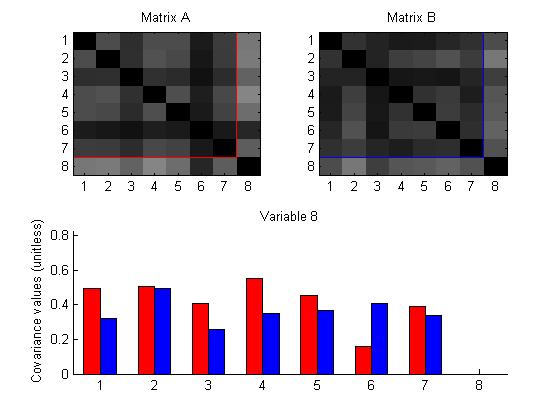
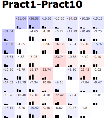
Comparing two matrices
Group: Leslie, Adrian, Jeremy
This design displays two matrices and offers a side-by-side comparison, mapping the value of the entries to color intensity.
Furthermore, choosing a diagonal entry will highlight the row and column containing that entry in each matrix, and display a bar graph comparing the values of the entries.


Group: Nate, Chris, Danielle
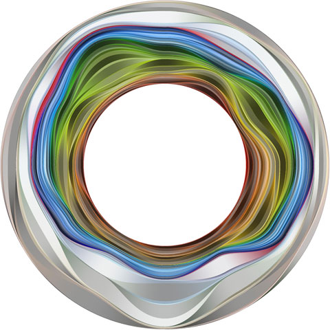
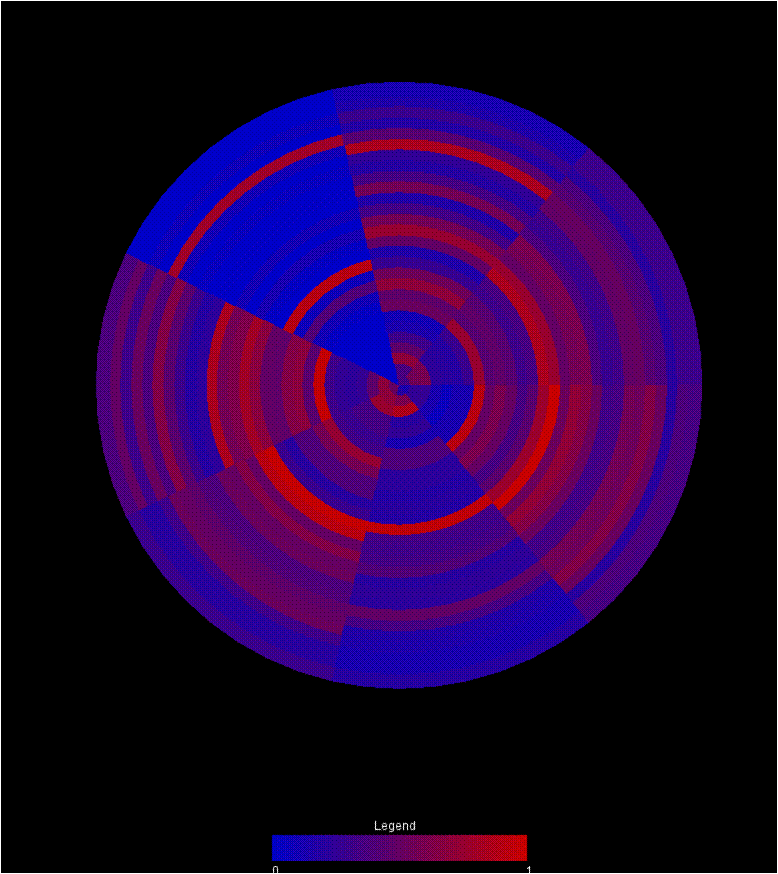
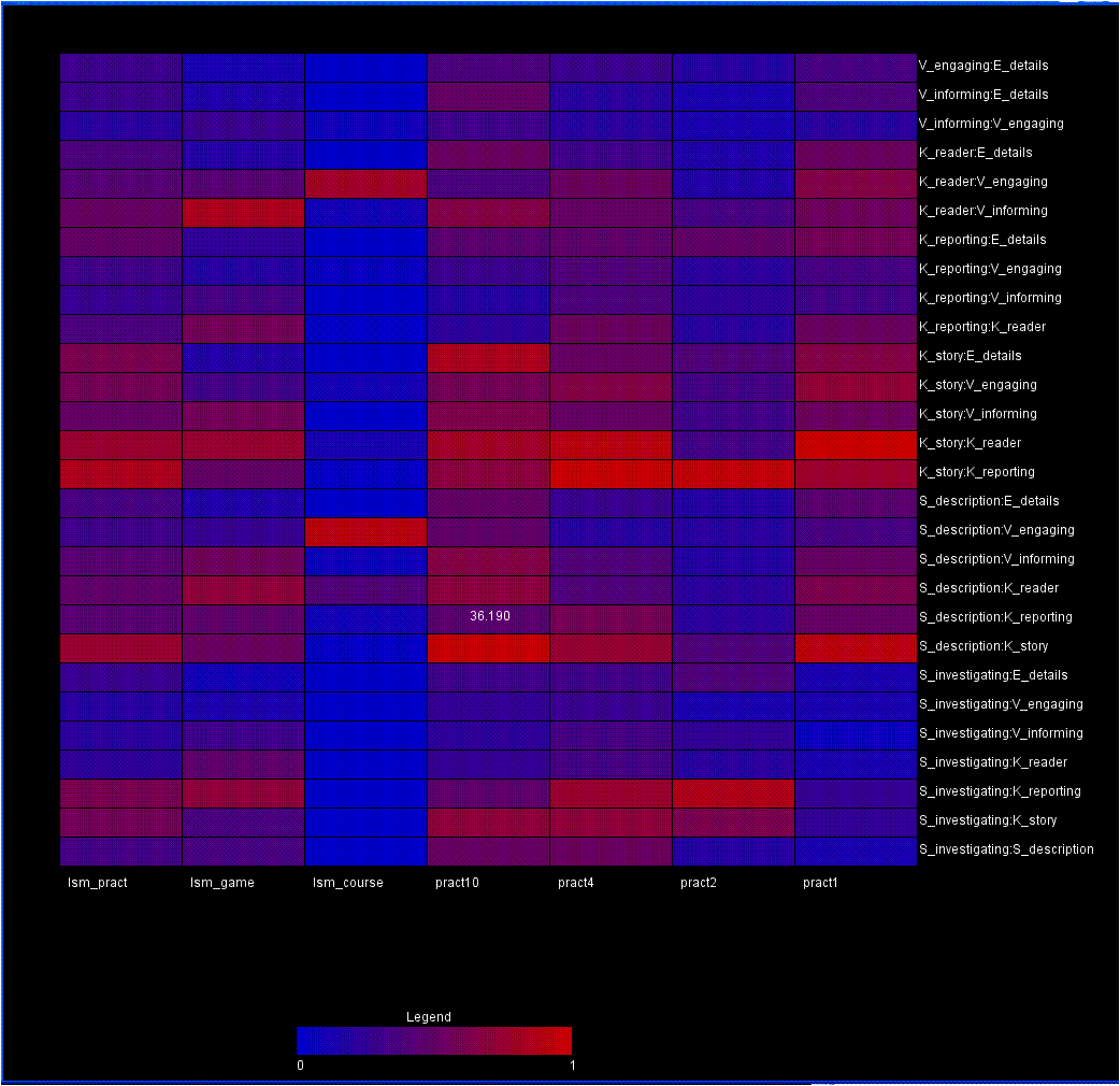
Two other visualizations that we’ve composed to address this problem use a color encoding to demonstrate the changes in data across different frameworks. Both visualizations utilize a red-blue color ramp encoding the normalized value of the data point. All data elements are pulled from the upper triangle of the matrix, so no redundant information is encoded in the view.
The first is a wheel with each wedge representing an individual matrix in the graph. Each of the rings then represents a single category pairing in the matrix. As a result, comparing the colors around a ring reveals trends in that pairing between the matricies. Comparing colors between rings reveals the relationship between the variable sets. Finally, comparing wedges reveals the similarity between matricies. Eventually, mouse overs should be integrated to give more information about any particular circle segment.

A second visualization, drawing from heat map principles, maps each matrix to a position along the x-axis. A particular pairing is then mapped to the y-axis. Mouseing over a box reveals the raw value represented by that individual data point. In this view, skimming across a row reveals relationships between variables across the matricies. Comparing boxes in the columns demonstrates the patterns within a matrix. Comparing rows represents comparisons between variable pairings. Comparing columns allows the user to compare different matricies.
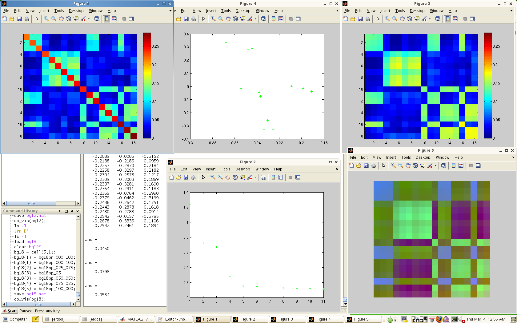
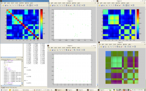
The third visualization is a kind of console for viewing the eigen-spectrum / PCA properties of the data. This console consists of 5 windows:
– The original data matrix
– The spectrum of eigenvalues
-The original matrix recomposed from the top 3 eigenvectors
-The PCA view of the matrix in 2D
-The first 3 eigenvectors mapped independently to the RGB channels.
A screen capture is shown below.
Team of Jeremy, Adrian and Leslie
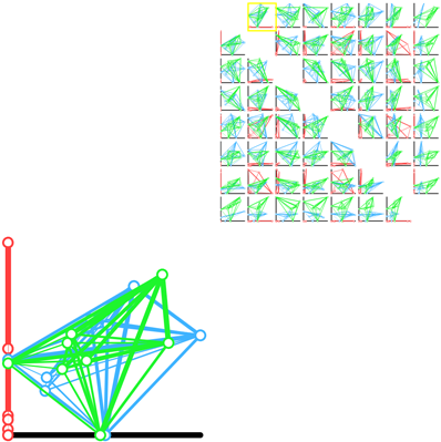
A scatter plot matrix of pairwise projections.
This demo is online, and can be viewed here.
This prototype explores the idea of showing every possible axis aligned 2D projection. The weight between the nodes indicates the strength of the paring. In a given scatter plot, the position of the nodes is calculated by using the current two axis as to perform a lower dimensional projection. This allows us to see a difference in shape between each of the frameworks from several different “meaningful” views.
The Group: Danielle, Chris, and Nate.
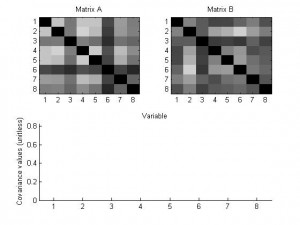
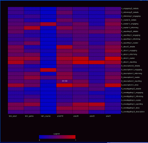
Here’s one of our sample designs — this shows a difference between two of the practicum datasets:
The pattern of this design is generally to show the data in a matrix layout. At the top of every cell, there’s the value of some comparison metric. At the bottom of the cell, the raw data (or something roughly equivalent) is shown — albeit in a low-res format. In this example, color redundantly encodes the main metric in a heatmap; with more complex comparison metrics, that need not be the case. Additionally, when the comparison metric has some sense of whether this comparison passed some statistical threshold, it can only color those cells that do.
Mouseover (or some other cell selection mechanism) can display additional information about the comparison in question — data values, diagnostic information on the residuals, and such.