Team of Jeremy, Adrian and Leslie
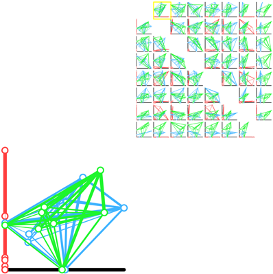
A scatter plot matrix of pairwise projections.
This demo is online, and can be viewed here.
This prototype explores the idea of showing every possible axis aligned 2D projection. The weight between the nodes indicates the strength of the paring. In a given scatter plot, the position of the nodes is calculated by using the current two axis as to perform a lower dimensional projection. This allows us to see a difference in shape between each of the frameworks from several different “meaningful” views.
{ 11 comments }
This design is although complex at first sight, could convey useful information, if a user know how to interpret the data. Also this design was looking elegant when it was displayed on the machine, but the static images are soup and I presume that as the dimensions grow, it will be very difficult to comprehend the pictures because of overlapping and cluttering. But overall, efforts were good.
I like the idea of trying to visualize the matrix as an object. I think that’s useful for comparing between matrices, but I see this and I have a very hard time taking in the information. I think it’s a bit too busy for a simple scan for information, but if you are doing an in depth exploration of the data, it could be useful.
It is a bit hard to draw the information at the first glance, but it is meaningful to use pattern or shape for comparison. Using the width of the line between nodes to represent the strength of pairing is a good idea. It would be better if we can view the information of nodes.
This example leaves a strong impression because of the level of engagement required by the user. Some small changes relating to the visual hierarchy might be helpful. For example, using a rougher estimate for the matrix thumbnails could reduce some of the clutter. Sparklines, a Tufte favorite, could be used instead, along with reducing the overall size of the thumbnails. Also, concise labeling will be key for informing the user how the data is shifting between frames.
The animated transitions in this visualization are great as far as perceiving the transitions between the different data dimensions. However, the way the visualization is set up leaves a lot of white space. While the spacing allows for the user to focus either on browsing graphs or examining a particular graph in detail, the separation is a little visually awkward.
I like the animate design. However, I’m a little bit confused by the red, green and blue frames. What do the three colors stand for? Plus, how is the polyhedrons generated? I mean, how to make sure that they are generated by the same comparable mechanism, so that their shape is comparable?
This is a good idea. My only issue is that the graphs are very cluttered. I’m not sure what the fix for this is other than possibly reducing the number of data points.
This is an interesting idea. One problem is that the lines tend to overlap each other, making it harder to see what’s underneath. Maybe if the connecting lines are drawn as arcs they would overlap less.
Also, maybe line thickness or color saturation could be used to represent some more information…
I liked the idea from a visualization point of view. The transition can be very helpful to see progression in this type of data. One idea for reducing clutter might be to use more saturated color for one network and let other have lighter color. This is kind of putting one frame (graph) in perspective than others. The focus among graphs can be change with a mouse click.
It is not sure how useful these projections are for visualizing epistemic frames given the noise in the data.
This visualization is able to show the entire data set (no aggregates) by partitioning the data set into chunks and displaying one chunk at a time using a scatter plot. I am impressed with how this partitioning is done:
– In each partition, the full capabilities of the scatter plot are used.
– When traversing the matrix of basis pairs, moving horizontally (vertically) only changes the x (y) coordinates of data points. This reduces disorientation.
– Because swapping one dimension keeps one coordinate fixed, the use of animation allows better comparison of projections. Without this constraint, animation can only be justified as eye candy.
Clever!
There’s one fundamental problem with this approach, however, and I don’t know how to solve it: that of multiple comparisons.
In this vis, you get to see lots and lots of shape representations of the data — and lots and lots of ways to support the narrative you’ve got in your head. And people are very good at finding visual patterns that support a narrative. The PCA stuff Chris did suggests that with the real datasets, there’s only one axis that predicts significantly more variance than the others — so here, you’re pretty much guaranteed to be looking at some amount of that axis and, essentially, noise. I’m subtly encouraged to see noise as pattern here, because I have lots of opportunities to do so.
So, the concept seems sound, but I think there needs to be some indication, with each view, of how much variance is left unexplained after these two axes are pulled out.