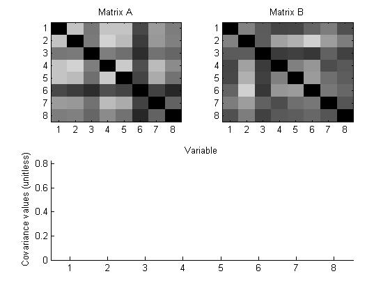
Comparing two matrices
Group: Leslie, Adrian, Jeremy
This design displays two matrices and offers a side-by-side comparison, mapping the value of the entries to color intensity.
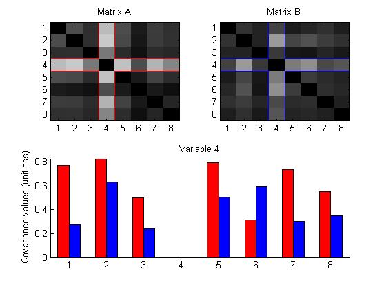
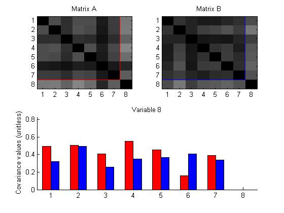
Furthermore, choosing a diagonal entry will highlight the row and column containing that entry in each matrix, and display a bar graph comparing the values of the entries.
{ 9 comments }
The multiple views is nice. I like the face that color on the matrix maps to color on the bar. The ability to interact and highlight an individual cell is important. The bar graph helps because it can be hard to make out difference within the grays, so it can use space as a comparison rather than color.
The general overview (grayscale) is good way to get an overall impression of the data for each frame element. Quite a few of the visualizations show a matrix to represent a matrix and I’m wondering if an alternate form of visualization would convey the same information without being so literal. Overall, I believe this visualization is easy to comprehend and navigate while allowing comparisons to be made.
The ability for comparing individuals is helpful in both highlighting the required comparison and locating the interesting ones. The color choice is easy to understand. Another advantage is that this visualization can be used for comparison among multiple matrices, instead just two.
The choice for the color might be a concern for that. I like the design that highlights the difference on each row, but just a thought, what if someone would like to compare different rows, such as row2 of the first matrix and row 3 of the second one? Is not proper to say that this kind of comparison is meaningless.
I really do like the manner in which the two visualizations are coordinated with the highlighting. Knowing what you’re looking at is a huge part of coordinating visualizations effectively as far as complementing visual memory. However, it may be helpful to migrate to a more uniform color scheme between the two visualizations. While grey-scale is effective at showing the information, color may help the clustering pop a little more.
I did something similar so I definitely approve of the approach. I think separating the matricies as you did may have been a good thing as it allows the viewer to see what’s going on in each frame and not just the difference between the two.
I also liked the idea of coordinated interaction between visualization. I think the symmetric part of matrix might be removed to improve the design. Due to lack of any clear pattern or cluster in underlying link strength matrix, I don’t think picking any other color scheme will improve clustering.
The interaction between the grayscale heat map and bar plot is great for exploring data and detail on demand.
Simple, rather elegant, and easy to see how this scales to several (many?) datasets. I like!
It’s be very nice, though, to see how this actually looks with three or more matrices…