Team: Emma Turetsky, Nakho Kim, Chaman Singh Verma
We felt this assignment contained two different problems. One was to get an overall picture or idea of the whole dataset, this would be a general view diagram, the other was to see how one skill or node relates to all the other nodes in the dataset and compare that between two datasets, this would be an egocentric diagram. It is very hard to do both together as it can easily clutter the visualization, making it harder to see the data and make it difficult for patterns to emerge, an example of this is the “spoke graph” the prof. Gleicher’s. So instead, we chose to focus on these problems seperately, rather than trying to do both at one time.
The egocentric approach, which is the one we ultimately chose, is the optimal way for showing individual node connections between one node and the others, but it is hard to show more than one degree of connectedness, making it hard to see the network overall as a whole, even if all the diagrams for the nodes are presented.
One of the major difficulties we saw with this approach was that there was too much clutter, especially around points with low correlation, so we decided to come up with a visualization which reduces the clutter without getting rid of the data completely. We chose a visualization of the second type, one which focuses on how the data relates to one data set, but can be easily compared between datasets.

Our visualization is made up of a cylinder. There is a node sticking up vertically from the cylinder, this is the skill/point we are focusing on at the moment. When that point is in the center, you can see one half of the cylinder, the horizontal distance from the main point of the other points on the cylinder represent the correlation. So in this view, the edges of the cylinder are the .5 mark and the point opposite the focused node is 0. Note that this means that distance can be either to the right or the left of the focused point, but direction doesn’t matter. Where a point is vertically on the cylinder also does not matter, but can be used to show multiple points with the same of similar distance without having them overlap. If two points are the same horizontally but different vertically, they still have the same value.
The view can also be rotated so that if you wish to, you can see the points with lesser correlation on the other side of the column. What is nice about this view is that we can display multiple datasets on one column, as long as the focus point is the same. We have also show multiple focus points by stacking the columns on top of each other. While the prototype is not completely finished, we have a program which gives the general idea of what we are trying to achieve.
For a general view diagram, the idea is to show the network as a whole. The problem with this is that it gets easily cluttered and makes it hard to read individual connections. In a general view diagram, if the data points hold fixed positions, it’s easy to compare to or more networks, but hard to make a comparison. One example of this is the “golfball” view shown in class. If, in a network diagram, node positions are reordered depending on the dataset, it’s easy to see patterns within one dataset, but extremely difficult to compare between datasets.
For an overall view, we decoded to use a fixed comparison of data matrices. We did this by essentially using the given matrix as the x and y coordinates in a plot and the correlation as some other value, in this case color. Then we noticed that since the matrices are identical, we could replace one triangle of a matrix with the other to get one graph where the coordinates on one side are symmetric with the coordinates on the other side. Doing this for a wafer plot gives us the following three plots.
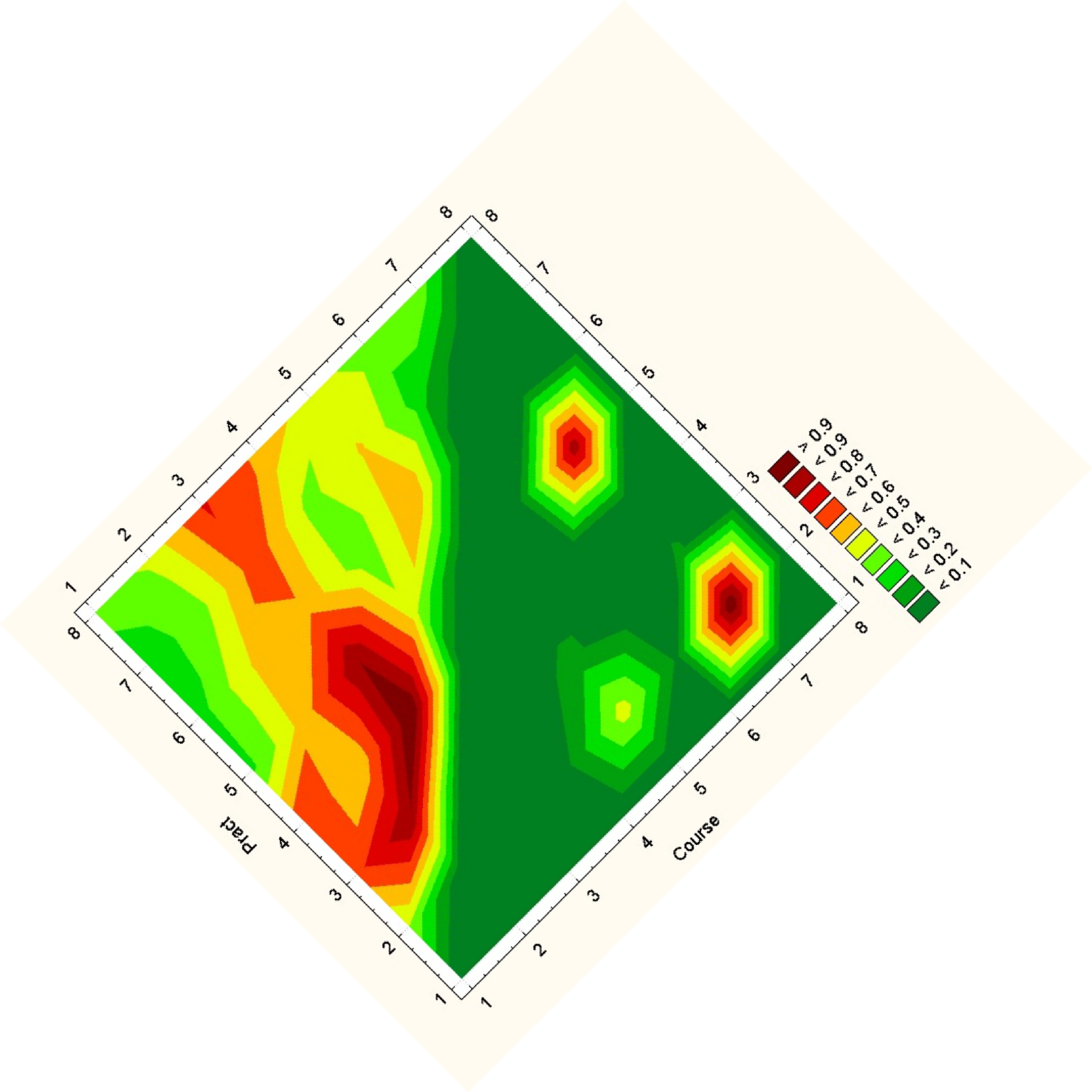
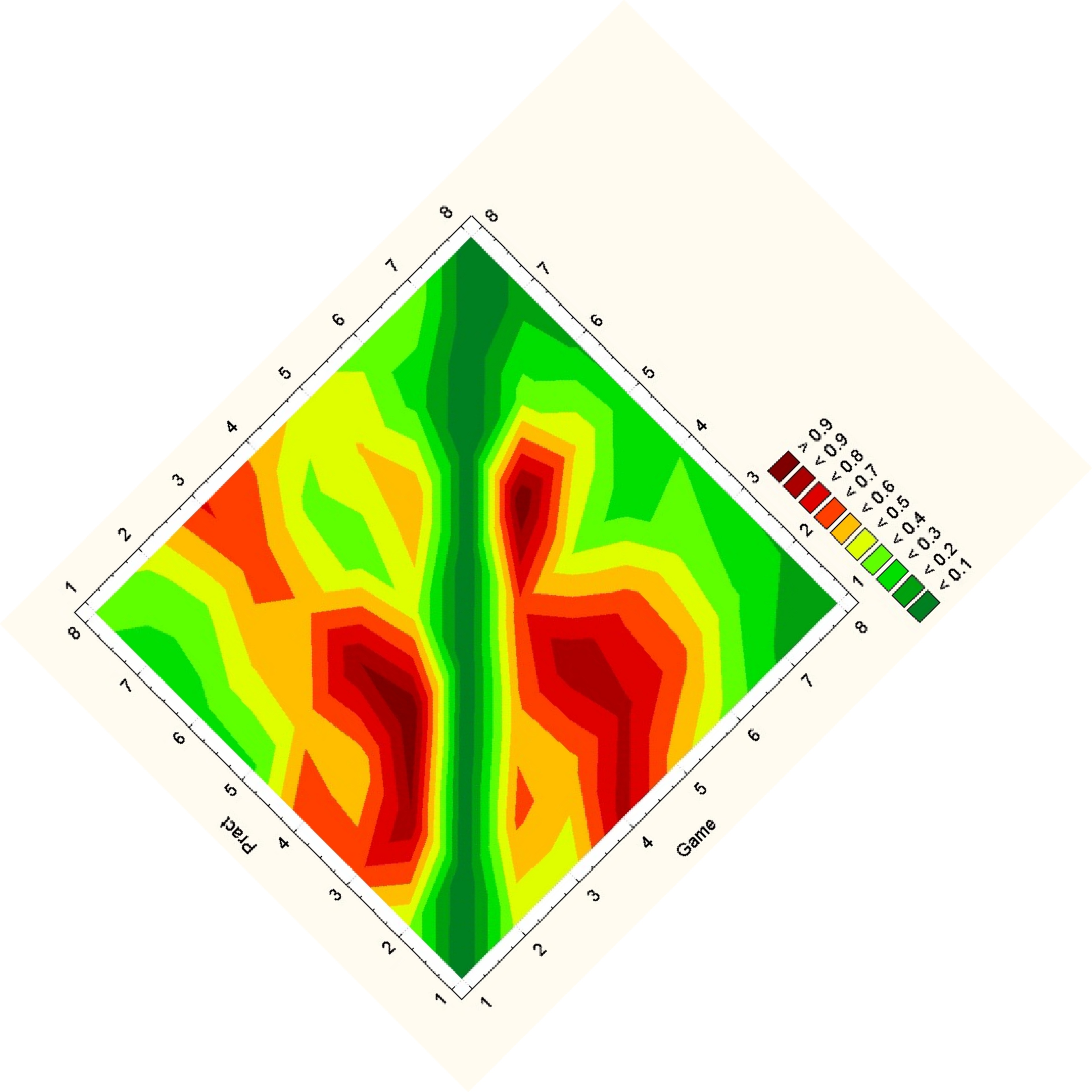
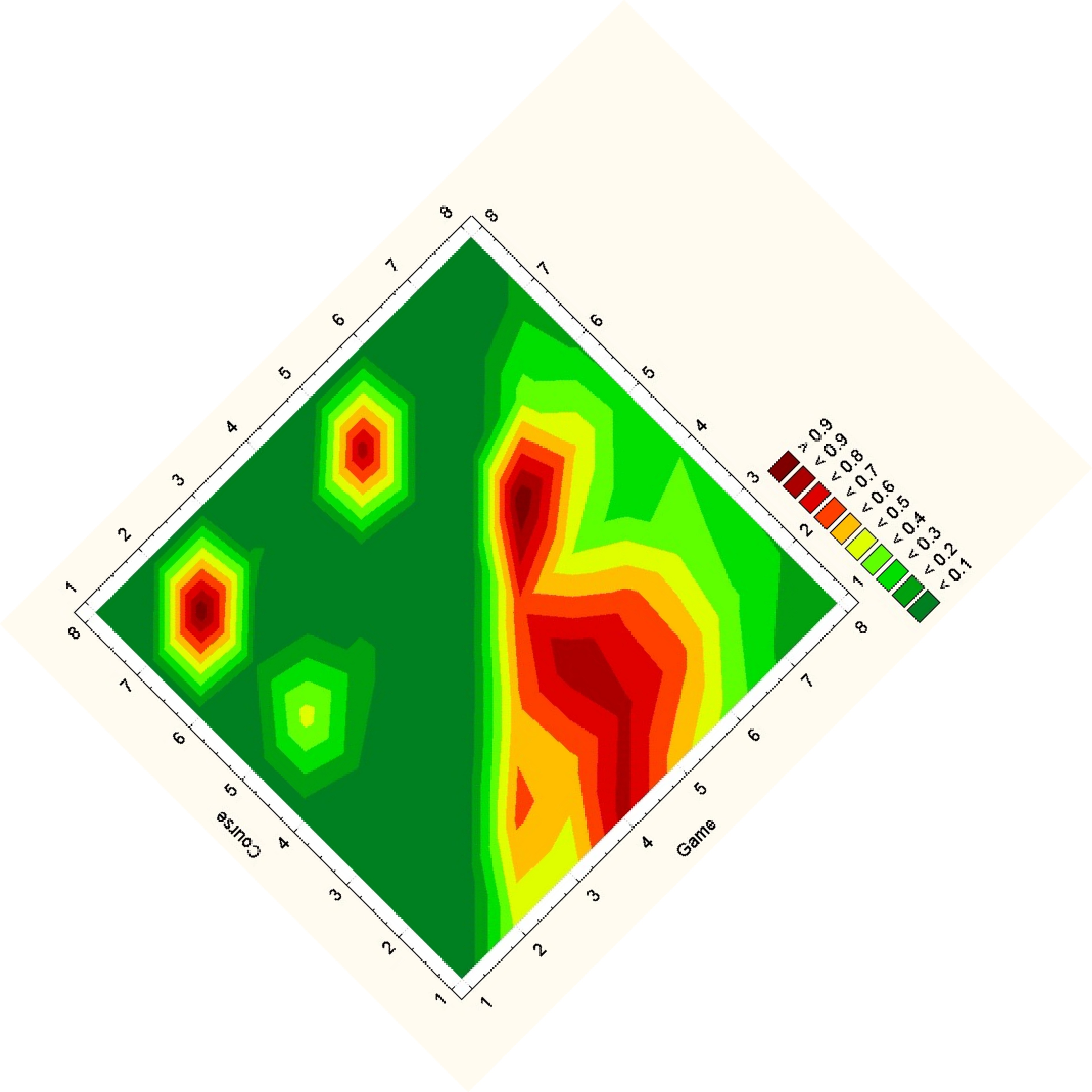
Note that while you can clearly tell that the datasets have some differences, it is really hard to see what exactly those differences are. Due to the statistical software used, a gradient is formed, so though the original data on the vertices are distinct points, these plots imply and idea of connection and intermediate points between the data.
{ 12 comments }
Furthermore, if we continue improving the symmetrical heatmap view, we could deal with data reorganizing as well (though I don’t think we’ll be able to build it that far in the prototype). There can be an interactive function allowing the user to rearrange the data by clicking and dragging specific data cells to build a cluster – for example, bringing all the high-relevancy skill relationships into one corner. The reordering could be done not only by manual dragging but also by clustering functions often used in network diagrams. As long as the ordering of data on the other side (the comparison dataset) adjusts automatically to the changes the user made on one side, comparing the two datasets symmetrically should still be okay.
The second plot easily conveys the overall links and can be compared to other group easily.
The first example, the rotating cylinder dingus, is a really different departure from the usual visualizations. It requires a bit of work still to make the overall interpretation more easy and obvious, but my kudos to the team for thinking outside the square.
The second example is also a very nice example of lateral thinking… throwing away a symmetrical triangle of data and replacing it with a triangle of data from a different dataset.
Very nice job overall.
i am really intrigued by the “symmetry seeking” design – i keep wanting to look at things side by side (rather than mirrored), but you would think that symmetry detection might be perceptually more significant.
I like the fact that you guys thought about the problem at different scales. However like you pointed out, even if you notice a slight difference in the higher symmetry comparison, its hard to tell exactly what it going on. Maybe if you linked the two visuals somehow, you could have a sort of hierarchical exploration system.
Also, how would the symetric based visualization scale when more than two frames need to be compared?
I’m a little bit confused by the cylinder design. For me, since each matrix has its own distance towards any other matrix, there might be specified cylinders for each one of them (if we define the distance of two matrix by some way, distance of matrix 3 and matrix 1, “D31” is not necessarily equal to “D32+D21”) thus, what’s the superity for the cylinder design?
For plot 2, the different between this method and some others is that this one actually put two matrice side by side to compare, while others are overlapping them.
The second plot is really nice as far as comparing two matricies side-by-side. Pushing two halves of the symmetric matricies together nicely exploits the nature of the data; although the false pattern matchings as pointed out in class certainly are a perceptual problem.
The first visualization looks really nice and is very different from the other proposed solutions. However, managing 3D visualizations is well documented as a visual problem. Between the 3D problems and the complexity of the visualization, it may be very difficult for the user to determine any significant trends in the data.
The first attempt was probably the most imaginative in the class. I would worry about the random positioning of each data point on either side of the zero point. It would also be nice to see this with more than one frame.
The second attempt really made the frame data pop out. I think there’s a lot of promise there.
Treating the ‘symmetric’ designs as two separate entities might be useful. A flipbook could be used to show the different matrices as overlays with the same orientation, instead of mirroring the graphics along the same axis. This would allow a direct comparison to be made without the need to mentally reorient the graphics.
Regarding the first visualization, I agree with Danielle– a 3D visualization might create some problems. It seems like the curve of the cylinder will affect people’s ability to accurately gauge distances between points, especially closer to the sides. However, I like the idea of being able to focus on either low-correlation or high-correlation data separately.
The second visualization is a really cool idea. I like that you used a dataset where it shows information well and one where it wasn’t as clear. That seems like a great way to help pinpoint specific problems, and help everyone improve their designs.
The cylinder vis is an interesting idea; however, it seems to be particularly tricky for me to judge either precise angles in 3D, or precise colors — so it’s hard to tell how close two lines are, especially when on opposite sides of the cylinder.
The more I think about the symmetry view, however, the more I like it. True, the exact details of the design will need to be chosen to to help weed out false symmetries (maybe an “overlay” view would highlight those?), but this is a neat idea that uses both our skill at detecting symmetries, and the fact that the data in these networks should be at least somewhat spatially correlated.
The use of symmetry for displaying correlation is interesting. Could this lead to comparison of multiple frames through the tiling of triangles? What would this look like in a kaleidoscope?