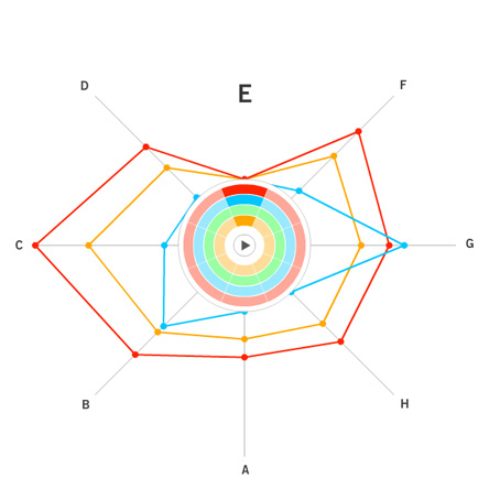
Closed radial pattern with the same orientation applied to all samples.
Team of Jeremy, Adrian and Leslie
This demo is online, and can be viewed here.
The concept places all study samples on the same eight spokes and allows the user to select the study and variable by clicking the ‘wedges’ near the center. Navigational highlights include:
1. Variables for each study are shown when the pointer is over each wedge and lines are then drawn upon mouse-down.
2. If a new variable is selected, which is different than the previously selected variable, the orientation is adjusted so that the current variable is on top.
3. The user can select all four studies by clicking the letters surrounding the spokes.
4. Values can be seen by placing the pointer over and individual dot (data point) and a circle is drawn to show the relative position of other points along other spokes.
5. The play button (which is currently not functional) will be used to animate between different time points in the longitudinal studies.
{ 10 comments }
Nicely implemented. The concentric circles might cover the radial patterns in some cases.
A great way to browse through radar maps of each variable. It would be great if users could open several windows with different vaiables and compare them at the same time.
In my view, this was the best representation of dataset. It has all the simplicity, and sparseness. I presume that this will scale quite nicely to reasonably large dimensions.
I really like this view. The implementation and the interaction is nice. There is little clutter and you can compare between data sets nicely. I would like to see it have an option of not reorienting when choosing a new variable. That way you can simply cycle through the variables and see how everything compares within one frame of reference.
This radar map is quite nice and I like the color selection. Also, it gives a way to view each variable one by one, which makes the plot neat. I guess the orientation can be changed according to certain setting, and the angel between variables can also be changed to represent their closeness.
I generally agree with everyone else on this. The visualization definitely has the “cool” factor in it’s presentation. However, because interaction is so heavily weighted, it would be nice to be able to anchor certain views in order to keep track of trends seen thus far and perhaps then build on the exploration given the marked setting of the view.
I think it’s a good design. The “transmitting ray” design give it space to extend for larger sample sets, and the coding translated comparison of data in a row into comparison of octagons. I think the only problem might be that it can not be used to tell the difference of 2 matrices in a macro view, and when the number of the rows grows, it can eventually have clutter problems.
I thought this was a great visualization. The best idea was the use of circles to show relative distances from the center. I should have thought of that for my solution. My only question is one of scalability. With 20 frames, the selection circle gets pretty big. This could be fixed by moving the circle off to the side.
The navigation of this visualization is impressive. In both the reference frame selection and reference concept selection, one can iterate forward, iterate backward, and arbitrarily select.
Super clever! Of the “let’s make the matrix into a shape” designs, I like this one quite a lot. The interaction seems a little fiddly — it’s easy to make things spin when you don’t mean to — but other than that, it’s a great way to visually represent the data.
One thing I do wonder: how easy would it be to indicate “classes” of data labels? Say, the “skill / knowledge / identity” concepts?