
Task Abstraction: A Crash Course
Task abstraction is how we discuss what the visualization is trying to help the viewer do. Typically, this is done by trying to organize the range of tasks into categories or a taxonomy.
Read more…Visualization Snacks is my attempt to provide Visualization Knowledge in small, easily accessible pieces.
Warning: This is a pre-release version of the site. I am just putting up the shell with a few postings for my class.
Many people want help with Visualization, but don’t have the opportunity to take a class, or do extensive reading, or search through the endless resources. Many of the resources out there only work in the context of a larger chunk.
What I’ve found is the pieces I’ve created for the class I teach (CS765 Course Web) are not necessarily appropriate for anything other than the students in the class. Visualization Snacks is an attempt to put that kind of content into a form that may be more usable to others.
What you’ll find (the sections of the site)…
Snacks - these are the core “lessons” written explicitly for this site. The idea is to have a form that allows for quick consumption. The goal is to provide the main idea quickly, but then provide the background afterwards. The why follows the what.
Tutorials - these are written “documents” that were originally created for my class, or that don’t have the stylized form of the Snacks. They tend to be longer.
Critiques - are examinations of specific visualizations. The idea of a critique is to examine something closely to learn from it (not just to criticize).
Papers - are my summaries/discussions of papers (or other documents). The idea is that I read them, so you don’t have to. In some cases, it’s an opportunity for me to give you the short, informal version of something else I’ve written.
Resources - descriptions of books and other things that might be helpful.
Task abstraction is how we discuss what the visualization is trying to help the viewer do. Typically, this is done by trying to organize the range of tasks into categories or a taxonomy.
Read more…The vocabulary for describing data abstractly defined concisely. These are the terms that come up most often in describing data for visualization.
Read more…The essay Design and Redesign by Viegas and Wattenberg is an important bridge between the design culture (of design and redesign) and data visualization. It has a great discussion of how designers use critique and redesign, and how this can be used (and abused) in visualization. At the time (2015) it was trying to bring design culture to visualization, and the importance of visualization to designers.
Read more…I really like the book Discussing Design. Here is an AI generated summary of what is in it. The authors give away the first chapter. This summary can help you decide if you want to read more than that.
Read more…The “Problem Space” paper describes a way to think about the problem a visualization is trying to solve, rather than the solution. It proposes six aspects to consider, named for the “5Ws and an H” from journalism: Who, What, Where, Why, When, and How.
Read more…This tutorial argues for thinking about visualizations in terms of a set of building blocks, rather than the conventional approach of chart types and rules.
Read more…This tutorial gives you a sense of my thoughts on Visualization. I define visualization broadly and use this definition to explore the basic concepts. By defining visualization in a clear and operational manner, we can better organize our thinking about what it means to do visualization well (which is our goal), how we should go about doing it, and what we need to learn to do it.
Read more…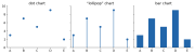
A chart type is a bundle of encoding choices that someone found useful enough to name. Decomposing charts into their encodings explains why “line vs. bar” questions have answers, and shows you design choices (like ordering) that the chart names hide.
Read more…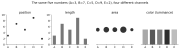
Visualizations are built by encoding data into visual properties: position, size, color, shape, and so on. Thinking in terms of these building blocks - rather than in terms of chart types - lets you decompose designs, compare choices, and invent new things. And one building block towers over the others: position. Spend it wisely.
Read more…We often think of interaction as a solution to visualization problems, as it has many upsides. However, there are costs to the user (beyond the obvious costs in terms of design, implementation and deployment). The paper “A Framework of Interaction Costs in Information Visualization” by Heidi Lam gives a nice way to think about these costs. It’s an adaptation of earlier work in HCI, but she shows how appropriate it is. She validates the framework by applying it in a broad survey of visualization papers.
Read more…Many (if not all) visualizations are about making comparisons in the data. I’ve spent a lot of effort to come up with ways of thinking about comparisons, or (if you prefer) to think about visualization in terms of comparison. These were summarized in a 2017 paper (it has a 2018 publication date) “Considerations for Visualizing Comparison”.
Read more…The paper An Algebraic Process for Visualization Design by Gordon Kindlmann and Carlos Scheidegger is something that influenced my thinking a lot. It is a great example of visualization formalism that has a big and practical payoff in how we think about visualizations. It came back to mind recently.
Read more…A quick walkthrough of showing how to get started with Tableau. The data set is one we will use in CS765 Fall 2025: Life expectancy data from around the world. I won’t get as far as making “good” visualizations - but it will give you some hints on how to get started with the data set, and with Tableau.
Read more…This is a tutorial on how to get started with Tableau. It is targeted at CS765 students (but should be OK for anyone). I am using the Census dataset I used in my 2024 Class. The tutorial will walk you through what I did to make a few initial pictures. This will show you some of the quirks of Tableau and the dataset.
Read more…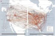
Let’s look at the “Airline Route Maps” (the ones that are in the back of an airline magazine) as a way to explore the importance of task and how understanding task and data can lead to novel designs. It will show us a different way to think about node link diagrams more generally.
Read more…