
Charts Are Just Encodings in Disguise
A chart type is a bundle of encoding choices that someone found useful enough to name. Decomposing charts into their encodings explains why “line vs. bar” questions have answers, and shows you design choices (like ordering) that the chart names hide.
Warning: Claude wrote this. Mike takes no credit. It came up with the idea and the catch phrase “Charts Are Just Encodings in Disguise”.
This snack works through the idea of decomposing charts into encodings, which I introduce in Encodings: Building Blocks for Visualizations.
Start with the most standard chart there is. A line chart is:
- something continuous → position on X
- something continuous → position on Y
A bar chart (or a dot chart) is:
- something discrete → position on X
- something continuous → position on Y (or height)
Written this way, “which chart do I use?” stops being a rule to memorize and becomes a question about the data: is the thing on the X axis continuous?
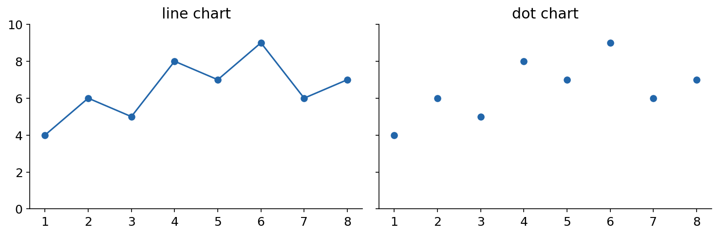
The same data as a line chart and a dot chart. (Fake data.) Figure by Mike’s robot assistant.
Connecting the dots isn’t free decoration: the line implies you could interpolate between points, and it makes slopes easy to see. Try it on the figure above with different meanings for the X axis. If X is day of the experiment, the line is helpful: between-day trends mean something. If X is student ID number, the line is nonsense: there is no “halfway between student 3 and student 4,” and the slopes you can’t help seeing are meaningless. (If X is position along a road… it depends what you’re measuring.) The chart names “line chart” and “dot chart” hide this reasoning; the encodings expose it. For a nice real-world example of when connecting discrete points is defensible, see Cairo Discrete Line.
Same Encoding, Different Names
Here’s the same discrete data three ways:
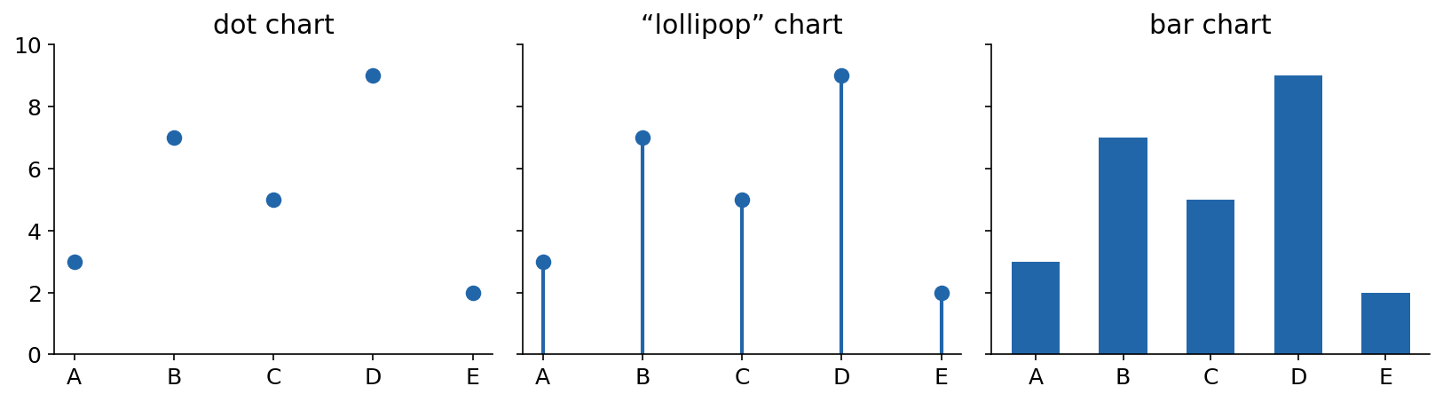
Dot, lollipop, bar: the same encoding wearing three outfits. (Fake data.) Figure by Mike (well, his robot assistant).
Is the middle one a “lollipop chart”? (I think that’s what it’s called - the names are not standardized, which is part of my point.) All three have the same fundamental encoding: discrete → X, value → vertical position. They differ in the mark and its redundancy - the bar and the lollipop stem redundantly encode the value as length, which anchors the value to zero and makes it harder to misread. Whether that redundancy helps or just adds ink depends on your task and your data (does zero matter?). But arguing about which chart type it is misses that these are minor variations on one design.
Ordering: The Choice the Chart Name Hides
When the X-axis is categorical, the categories have no inherent order - which means you get to choose one. That’s a real design decision, and the chart type doesn’t make it for you:
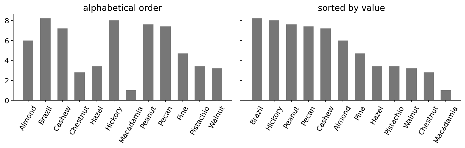
Same bars, two orderings. Which nut ranks fourth? Which chart answers that faster? (Fake data.) Figure by Mike (well, his robot assistant).
Alphabetical order is good for looking up a specific item. Sorting by value is good for almost everything else: it exposes the overall distribution, puts similar values next to each other for close comparison, and makes min/max/rank questions trivial. I call sorting by value a “Pareto mapping” (I’m not sure anyone else does): you’re redundantly using a dependent variable (the value) as an independent variable (the position).
Notice what happened: “bar chart” named none of this. The interesting choices - what gets position, whether marks redundantly encode with length, what imposes the order - live below the level of chart names.
The Takeaway
When you pick a chart type, you’re really picking a bundle of encodings. Decompose to the encodings and you can reason about the choices - including the ones (like ordering) that the chart type quietly leaves to you.