Visualization Snacks are brief bits of visualization knowledge in written form. The idea is to put things into a form where you can get the main message quickly, and then refer to the details if you want.
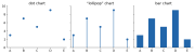
A chart type is a bundle of encoding choices that someone found useful enough to name. Decomposing charts into their encodings explains why “line vs. bar” questions have answers, and shows you design choices (like ordering) that the chart names hide.
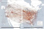
Let’s look at the “Airline Route Maps” (the ones that are in the back of an airline magazine) as a way to explore the importance of task and how understanding task and data can lead to novel designs. It will show us a different way to think about node link diagrams more generally.
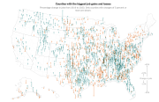
Core lesson: think about what a visualization makes easy to see. Different representations make some things easier, and harder. And be careful when dealing with geographic data in the US: populations and counties are spread unevenly.
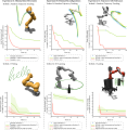
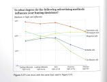
Don’t make the wrong thing easy to see. Here’s a real example from my own work where a seemingly innocent line graph was misleading and needed some serious redesign.
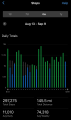
In this snack, we look at “value over time” graphs in two different iPhone apps. It’s a good opportunity to connect design and task with a comparative critique.