
Phone App Time Graphs
In this snack, we look at “value over time” graphs in two different iPhone apps. It’s a good opportunity to connect design and task with a comparative critique.
Lesson: Principle 1 - Task first: Tasks are important for design decisions. Maybe more important than data types.
Here is a graph from the app from my water heater (yes, water heaters have apps nowadays):
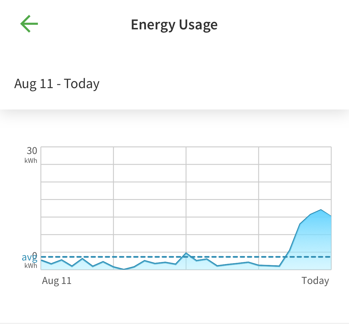
Energy usage from my water heater. Screenshot from the AOSmith app on my iPhone.
Hopefully, the message is obvious: after a month of not using much energy, it started using a crazy amount. Yes, something is broken (the plumber has already ordered a new one).
Of course, there’s a Vis lesson here…
My question (or task) is “when did the problem start?” This visualization is not very helpful. To use critique format… if the goal is to help the viewer localize events, having a clear labeling of the axis and easy connection to events would help the user identify the time of events and their specific times.
This graph is the standard choice: we have a measurement over time, so we pick a line graph. But not all apps make this same choice. Here is a graph from the activity monitor in the Garmin connect app (for my watch):
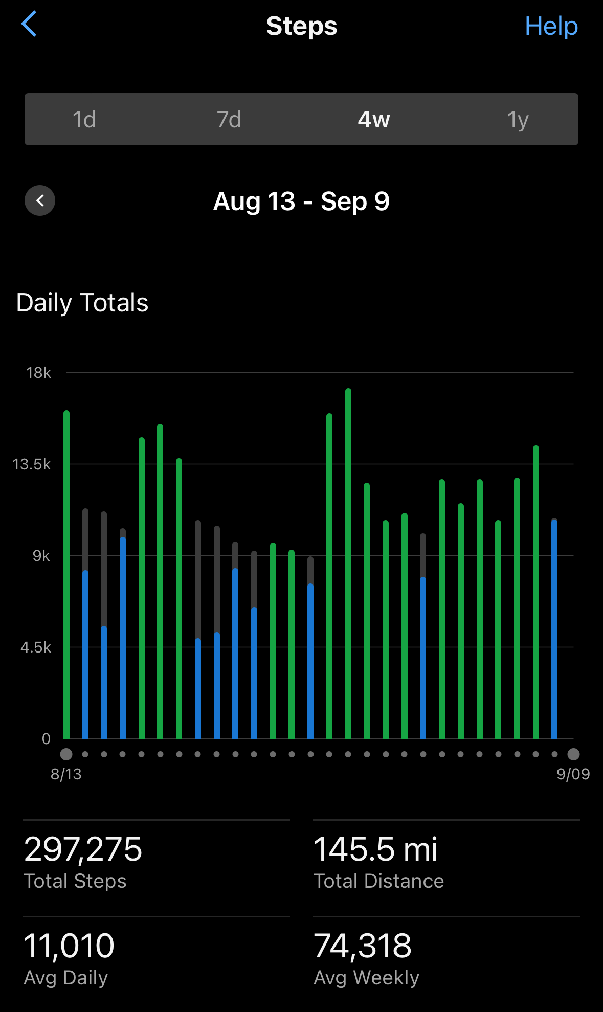
Steps per day from my Garmin watch. Screenshot from the Garmin Connect app on my iPhone.
Had the water heater folks chosen this design, it would have been much easier for me to see which day the problem started. There are many different choices in the apps - the Garmin app chose to discretize time, it chose a dark theme, and it chose to encode another variable in the color of the bars. The discretization makes it better suit my task.
Of course, the water heater folks may have had different tasks in mind.
This is a good opportunity for comparative visualization (comparing visualizations - as opposed to visualization of comparison). What tasks are each visualization good for? What are the different choices in each design, and how do they affect the effectiveness for different tasks?
Arguably, these are different data types: the step counts are discrete (so they need to be binned over periods of time), electric usage could be the rate (instantaneous usage) which is a continuous signal, and therefore the line graph is more appropriate. But the units on the graph are kilowatt hours (which are amounts, not rates) - it could be the per day usage.
There are pros and cons to both designs (binned vs. continuous). The decision should really consider task, not just data type.