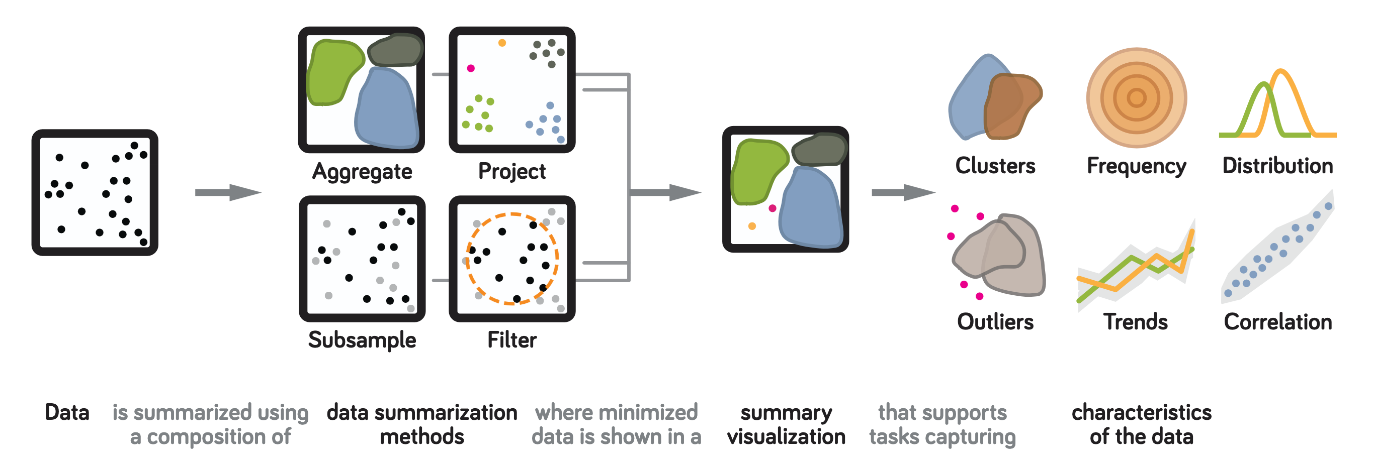
AI summary: The paper opens by defining summary visualizations as designs that reduce data via visual/statistical technique before showing it — a histogram binning raw values, a scatterplot’s points replaced by a KDE-derived density surface, a text corpus collapsed to topic clusters via LDA — and observes that while summarization choices strongly affect what analyses a system supports, there was (as of 2018) no systematic guidance for making those choices. Figure 1 gives the paper’s organizing schematic: data is reduced via a composition of data summarization methods, shown visually as a summary visualization, that supports tasks capturing characteristics of the data. The paper’s four “target design factors” are exactly the four boxes in that pipeline read a different way: the data summarization method used, the visualization’s purpose, the tasks it supports, and the data type it summarizes.
Section 2 (background) surveys prior taxonomies the authors drew on to build their own codebook. On summarization methods: Card & Mackinlay’s functions for processing data (filtering, sorting, multidimensional scaling, selection), Ellis & Dix’s three clutter-reduction techniques (sampling, filtering, clustering), and Elmqvist & Fekete’s survey of hierarchical aggregation — the current paper explicitly builds on and extends these into a broader four-category taxonomy (aggregation, subsampling, filtering, projection). On purpose: Bertin’s exploratory/presentation dichotomy, refined by Schulz et al. into three goals (exploratory/undirected search, confirmatory/directed search, presentation). On tasks: Andrienko & Andrienko and Shneiderman’s “Eyes Have It” as canonical task taxonomies, Zhou & Feiner’s high-level presentation-intent tasks, Rind et al.’s Task Cube, Brehmer & Munzner’s multi-level typology, and Schulz et al.’s “5 Ws and an H” characterization (why/how/what/when/who a task addresses) — the paper adopts Schulz et al.’s taxonomy as its task codebook because it’s the most comprehensive umbrella over the others. On data: Shneiderman’s data-type taxonomy, plus surveys of high-dimensional-data overview techniques (Kehrer & Hauser; Keim & Kriegel) that catalog summarization techniques for particular data types without connecting purpose/task/data-type systematically — which is exactly the gap this paper’s cross-cutting analysis targets.
Section 3 lays out the methodology. The authors state four research questions: Q1 does the proposed four-category summarization taxonomy (aggregation, subsampling, filtering, projection) sufficiently cover the methods designers actually use? Q2 how does a summary’s purpose affect its design? Q3 how does a summary’s design affect the tasks it supports? Q4 how does data type inform summarization design choices? They use quantitative content analysis (QCA, per Riffe et al. 1998) rather than grounded theory specifically because grounded theory would let concepts emerge from the sampled corpus itself, which the authors worried would bias results toward whichever papers happened to be sampled — QCA instead applies a codebook built before coding, assembled from the 15 existing typologies surveyed in Section 2, so the coding scheme isn’t just induced from the sample. Two visualization researchers served as coders. The corpus: 1,158 papers from EuroVis, InfoVis, SciVis/Vis, and VAST, 2009–2015, from which 180 were randomly sampled (48 EuroVis, 53 InfoVis, 48 SciVis, 31 VAST) — theory, survey, toolkit, and evaluation papers were excluded up front because they don’t propose a design with an explicit designer rationale to code. Two coders independently applied the codebook (Table 1: 22 attributes across four categories — Data Summarization, Purpose, Task, Data), after first iterating on a preliminary coding of 10 papers to resolve codebook ambiguities. 54 of the 180 papers (30%) were redundantly coded by both coders for validation, yielding Cohen’s κ = 0.71 (substantial agreement) and 86% raw agreement.
The codebook itself (Table 1): Data Summarization — four binary present/absent codes: Aggregation (combining multiple elements, e.g. hierarchical aggregation), Subsampling (stochastic subsetting, e.g. random sampling), Filtering (subsetting by a data property, e.g. selecting a representative set), Projection (mapping to reduced/derived dimensions, e.g. PCA). Purpose — three binary codes: Exploratory, Confirmatory, Presentation (per Bertin/Schulz et al.). Task — drawn from Schulz et al.’s means and characteristics: means of navigation (browsing, searching, elaborating, summarizing), means of relation (comparison — seeking similarities; variations — seeking dissimilarities; relation-seeking — seeking relations between individual objects; a fourth code, discrepancy/outlier-seeking at the individual-object level, was dropped for poor inter-coder agreement), and high-level characteristics — six codes the coders themselves defined through iteration since Schulz et al.’s taxonomy doesn’t specify them concretely: trends (estimate high-level change across a dependent dimension), outliers (items not matching the modal distribution), clusters (groups of similar items), frequency (how often items appear), distribution (extent/frequency of items), correlation (patterns between dimensions). Data — Shneiderman’s data-type taxonomy (with one-dimensional and temporal data collapsed into “sequence data”). The authors explicitly considered and rejected coding for absolute data size, reasoning that most systems don’t state bounds on the number of datapoints supported and tend to design for “more than one dataset,” so coding size would have required unreliable extrapolation — flagged as a limitation and a direction for future work, not an oversight.
Of the 180 sampled papers, 104 (58%) contained at least one summary visualization. Of those, 64 (36% of the original 180) were “fully-coded” — detailed enough in the paper’s own text to code purpose and task in addition to summarization method; the remaining 40 described systems that were largely about rendering/scientific visualization with too little discussion of intended analysis goals to code purpose or task, so those 40 were coded only for summarization method. The full analysis results (presumably including per-paper codes) are published online at graphics.cs.wisc.edu/Vis/vis_summaries/, referenced but not included in this PDF.
Section 4 presents results organized around the four research questions, synthesized into 16 named design themes (T1–T16, Table 2), each theme tagged with which factor or factor-combination it concerns (e.g., “Data Summarization,” “Purpose × Task”).
Q1 (data summarization methods): All 104 summaries used at least one of the four taxonomy categories, and none needed a method outside the four — validating that the taxonomy is sufficient to describe the corpus. Most summaries (63/104, 61%) combined more than one method (T1). Aggregation was used in 74% of summaries, 27% exclusively — the single most common method — and strongly supported characterizing the whole dataset (T3): of aggregation-using summaries, 78% supported distribution characterization and 80% supported cluster identification. Aggregation was common across every data type sampled (T4), suggesting it functions as a “default” summarization choice, trading interpretive specificity for broad applicability — summaries without aggregation instead emphasized individual-value judgments like spotting outliers (supported by 70% of non-aggregating visualizations). Filtering appeared in 44% of summaries, rarely alone (only 17% of filtering-using summaries used filtering exclusively) — it was frequently paired with aggregation specifically to reintroduce individual values an aggregation step had erased (e.g., recovering outliers in a KDE-aggregated scatterplot). Filtering supported identifying clusters (82%), characterizing distributions (79%), and evaluating correlation (61%), and — like aggregation — was usable across all data types (T5), though the authors note filtering gives analysts little visibility into how the filter itself might bias what’s shown. Projection appeared in 28% of summaries, again rarely alone (80% paired with aggregation or filtering), and was strongly biased toward high-dimensional data types: documents (23% of projection uses), 3D data (30%), and multidimensional data (33%) — foreshadowing the Q4 finding that data type shapes method choice. Projection-based summaries supported characteristics similar to filtering-based ones (T6): clusters (89%), distributions (84%), correlation (74%), outliers (79%). Projection was almost never used for presentation (only 2 of 20 presentation-purpose summaries, 10%) — the authors hypothesize this is because projection’s mathematical complexity makes it hard to build a clear presentation narrative around, though they flag that their corpus simply contained few presentation examples generally, so this is a hypothesis, not a settled finding. Subsampling was the rarest method (only 16/104, 15%), almost never used alone, and predominantly used for spatial visualization (T7: 65% of subsampling uses) — mainly to assist rendering by reducing visual noise rather than as a primary analytic move. Among the 5 fully-coded subsampling examples, subsampling correlated with tasks that are inherently statistically robust to random reduction — trend analysis (83%) and characterizing distributions (83%) — leading to T8: subsampling can support summarization specifically where the target tasks are statistically robust to random sampling, which the authors suggest makes it useful when the analyst doesn’t yet know a priori what properties matter.
Q2 (purpose): From the 64 fully-coded examples: 92% (59/64) supported exploration, 66% (42/64) confirmation, and 22% (14/64) presentation — these overlap rather than partition (Figure 5’s Venn diagram: 17 exploration-only, 3 confirmation-only, 2 presentation-only, 30 exploration+confirmation, 3 exploration+presentation, 0 confirmation+presentation-only, 9 all three). The dominance of exploration supports T9: summaries frequently serve as a starting point for detailed analysis rather than an end in themselves — 95% of exploratory summaries let analysts actively navigate the dataset further. Exploratory summaries also support a broader set of data-characterization tasks (T10): 70% support more than half the six coded characterization tasks, versus 43% for presentation summaries; 12% of exploratory examples supported all six. Confirmatory summaries, in turn, tend to also support exploration (T11): 61% of all 64 supported both exploration and confirmation simultaneously, and confirmatory designs likewise supported a broad task set (68% supported more than half the coded tasks) — closer to exploratory designs than to presentation designs. Presentation summaries, conversely, emphasize a small, specific set of characteristics (T12): 57% communicated three or fewer of the six characterization tasks, and only one example (Domino, a matrix-reordering system) communicated all six. All coded presentation examples used aggregation, with 50% using aggregation alone and 35% aggregation plus filtering — supporting T13: designs built to communicate specific, already-known information rely heavily on aggregation. The authors flag that their literature-derived corpus underrepresents presentation-oriented design (common in journalism and dashboards rather than research papers), so they anticipate the aggregation-reliance pattern would be even stronger in those outlets, consistent with Kosara’s presentation-oriented design guidelines. Only 5 coded summaries were designed exclusively for confirmation (not exploration or presentation); all 5 used aggregation and none used subsampling — feeding T14: subsampling methods favor exploratory use, plausibly because stochastic data reduction is a poor fit for the kind of precise, directed search confirmatory analysis needs.
Q3 (tasks): Under “means of navigation,” most summaries present a high-level overview first and let viewers drill down — 91% support browsing, 75% support both discovering unknown and confirming expected patterns — supporting T15: summaries act as roadmaps, guiding subsequent detailed exploration through interaction (the glyph-SPLOM example: a summary of clustering patterns across many SPLOMs used to pick which individual scatterplot to open and explore in detail). Drilling down takes three forms in the surveyed designs: changing granularity (“elaborating,” 55%), changing the visual representation/summarization method (44%), or adding supplemental information to the existing display. Under “means of relation,” most summaries support identifying similarities (comparison, 89%) and differences (variations, 88%) between groups of datapoints, but far fewer (45%) support relation-seeking between individual items — and most of those that do are network visualizations, where relationships between specific entities are the whole point. The authors found no notable correlation between relation-seeking support and purpose or summarization method, hypothesizing that relation-seeking methods generally target large collections where higher-level, aggregate relationships are what’s tractable, not individual-value relationships. Under “data characteristics,” summaries most commonly emphasize clusters (80%) and distributions (75%) — patterns describing the whole dataset — with trends (59%), outliers (59%), frequency (56%), and correlation (58%) roughly equally but less commonly supported; only 11% (7/64) supported all six. This bias toward clusters/distributions over individual values or specific relationships supports T16: summarization emphasizes descriptive, aggregate patterns across the whole dataset and all its dimensions, rather than patterns in individual values or between specific data points.
Q4 (data type): Data type systematically shapes summarization design. Nine of ten coded one-dimensional/sequence-data visualizations used aggregation and supported cluster-identification tasks. Two-dimensional data summaries frequently supported trend discovery (88%) and frequency judgments (75%). Three-dimensional data summaries instead emphasized characterizing distributions (71%) over trend or frequency (43% and 14% respectively). Neither multidimensional data (21% of examples) nor network data (0%) used subsampling frequently — the authors attribute this to a real risk specific to those data types: stochastically removing points from network data could destroy critical structures like hierarchy-defining relations between nodes, a risk that doesn’t apply the same way to simpler tabular data. Nearly all network-data summarization instead combined aggregation (collapsing groups of nodes/edges) with filtering (selecting the most meaningful or common connections) specifically to support relation-seeking — Networks of Names is the worked example, first aggregating all social-network relations across a large entity collection, then filtering to the relations that occur most often. The authors read these data-type-specific patterns as evidence that designers currently follow a fairly narrow set of “expected” summarization moves per data type, and hypothesize (without direct evidence beyond the survey itself) that their four-category framework could help transfer design elements across data types that haven’t conventionally been paired — e.g., the paper separately notes in the discussion that projection was commonly used for text (1D/sequence) and spatial (3D) data but never observed for other sequence data, despite the conceptual link that “text is itself a sequence of words.”
Section 5 (Discussion) restates the four questions’ answers as a synthesis rather than new content, then turns explicitly to open opportunities: exploratory designs supporting many tasks risk overwhelming a viewer who doesn’t know what questions to ask, suggesting a middle path of composing multiple summarization methods to focus exploration on a relevant subset without simply maximizing task coverage; the trade-off between task specificity (aggregation-heavy designs, which commit to emphasizing particular characteristics like clusters, per T13) and task flexibility (subsampling-heavy designs, which preserve more of the dataset’s global character, per T14) is framed as a design lever rather than a solved problem, citing Saraiya et al.’s observation that combining multiple values into one representation actively shapes how a viewer interprets the data — not a neutral act; and the authors flag that no surveyed design explicitly leverages ensemble coding (the perceptual ability to estimate summary statistics like mean or variance directly from a scatter of individual marks without any explicit aggregation encoding, per Szafir et al.) as an alternative to computing and encoding summary statistics outright — naming it as an unexploited opportunity for more “holistic” summary designs.
Section 5.1 (Limitations) is candid about scope: this is a descriptive survey of current practice, not a normative or generalizable claim — sampling from 1,158 papers down to 180 means results characterize the sample, not visualization practice as a whole. The analysis deliberately stays at the level of summarization method (aggregation/filtering/subsampling/projection) rather than specific visual encoding choices, because the authors argue encoding is a secondary decision downstream of the summarization method — meaning the paper cannot offer prescriptive encoding recommendations, only a scaffold for future work that would need to. And because the corpus is drawn entirely from the research literature, presentation-style summaries common in journalism and professional dashboards are underrepresented; the authors suggest expanding to practitioner-community examples and using stratified (rather than uniform random) sampling to better capture underrepresented design patterns as future work.