
Data Abstraction: A Cheat Sheet
The vocabulary for describing data abstractly defined concisely. These are the terms that come up most often in describing data for visualization.
Munzner’s chapter 2 makes the case for why you’d want to describe data abstractly. The short version is that the kinds of data are few and recurring, so what you learn about a kind carries to the next dataset that shares it. These are the terms I like to use—and some of the quirks in how I like to use them.
The terms at a glance
Organization - where the measurements live
| Term | In one line |
|---|---|
| Domain | Where you measure. Discrete or continuous. |
| Table | A discrete set of items, each with attributes. |
| Field | Measurements over a continuous domain. |
| Network | Items plus the links between them; a tree has no cycles. |
| Geometry | Items with explicit shape - Munzner’s fourth type. |
| Dimensionality | How many dimensions the domain has, not the value. |
| Scalar / vector / tensor | How much you record at each location. |
| Key / value | The attributes that index, vs. the ones measured. |
| Flat / multidimensional table | One key, vs. several keys jointly. |
| Rotation | Treating a different attribute as the key. |
| Sampling | Measuring at finitely many locations, not everywhere. |
| Reconstruction | Rebuilding a continuous signal from samples. |
| Inference | Reasoning about a population from a sample. |
Attributes - what the values are
| Term | In one line |
|---|---|
| Attribute | A measured property, described by its set of possible values. |
| Record / vector value | One attribute holding several numbers at once. |
| Rich type | A value that is a whole object: text, date, image, geometry. |
| Level of measurement | Which operations the values support. NOIR, below. |
| Nominal | Names, no order. = ≠ |
| Ordinal | Ordered, no arithmetic. < > |
| Interval | Differences mean something, zero is arbitrary. + − |
| Ratio | True zero, so ratios mean something. × ÷ |
| Quantitative | Interval and ratio, grouped together. |
| Categorical | Nominal and a closed, finite value set. |
| Cardinality | How many distinct values the set has. |
| Sequential / diverging | Runs one way, vs. has a meaningful middle. |
| Cyclic | The end wraps back around to the start. |
| Hierarchical | Values that aggregate: days into weeks into years. |
Joint properties - domain and range together
| Term | In one line |
|---|---|
| Interpolatable | Whether a value between two measurements means anything. |
| Part / whole | Values that only mean something against a total. |
| Partition | Parts that are disjoint and exhaustive. |
Conversions - moving between types
| Term | In one line |
|---|---|
| Discretization | Continuous → discrete, by thresholding or rounding. |
| Binning / aggregation | Bucket like values, then summarize each bucket. |
| Interpolation | Estimate the values between measurements. |
| Rank transformation | Keep the order, discard the intervals. |
| Normalization | Absolute values → shares. Loses magnitude. |
Where the data lives: dataset types
Any dataset needs two descriptions: how it is organized - where the measurements live - and what the values are. This section is about organization; Describing Attributes, below, is about values.
The domain is where you measure. The property that matters most about a domain is whether it is discrete (a countable set of objects) or continuous (you could have measured anywhere), and that split is what separates the first two types.
- Table - a discrete set of items (rows), each with measured attributes (columns). Because the domain is discrete, it can always be unrolled into 1D, though sometimes the set has a structure of its own - a grid, or more generally a lattice.
- Field - measurements over a continuous domain: temperature at every point in a room, brightness at every position on the screen. You measure “everywhere,” not at named objects.
- Network (graph) - two kinds of object: items, and the links between them. Either can carry attributes. A tree is the acyclic special case.
Munzner counts geometry as a fourth type - items with explicit shape, like a country outline or a streamline. Mostly it behaves like a table whose items carry a position, with the caveat that a shape is more than a position once the item is a polygon rather than a point.
The dimensionality of a field is its domain - where you measure - not what you measure there. A field can be 1D (a signal over time), 2D (an image), or 3D (a volume); at each location you might record one number (scalar), a direction and magnitude (vector), or more (tensor).
Keys and values
Some attributes index the data; others are measured.
| Indexes the data | Measured at each index | |
|---|---|---|
| Munzner | key | value |
| Statistics | independent variable | dependent variable |
| Math | domain | range |
| Tableau | dimension | measure |
- A flat table has at most one key. A multidimensional table needs several keys jointly.
- Not every column can be a key - it has to actually identify a row uniquely. (Munzner’s Table 2.1 makes this point with two people named Amy.)
- In a field, spatial position is the key, and it’s a quantitative one.
- Time-varying data has time as a key; if time is a value, it isn’t.
Rotation - which attribute you treat as the key is a choice, not a property of the data. “For each day, what was the temperature” can become “for each temperature, which days had it.” The unusual rotation is sometimes the good one.
Sampling
Sampling is measuring at a finite set of locations rather than everywhere. It is a statement about the domain, and it runs in both directions: on a continuous domain it makes the data discrete; on an already-discrete one it just makes the set smaller. Either way, sampling is summarization: it throws away information. We need to use some other process to estimate what was lost (or that we never had).
More detail: Sampling and Reconstruction
While sampling is ubiquitous, it needs to be understood: it always involves trying to represent something big and (potentially) complicated with a small, discrete set. Almost always, something is lost. Statistics and signal processing both study this carefully.
Sampling continuous fields is common: we almost always represent a continuous field as a sampled table. For example, brightness can be measured anywhere on the screen, but we store it as a grid of pixels. The reconstruction process rebuilds a continuous signal from the sample. The field of signal processing helps us understand this process.
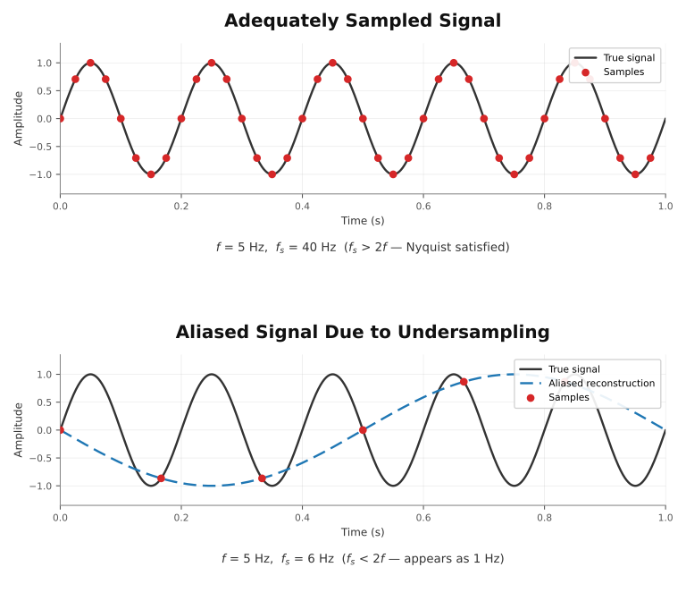
Continuous phenomena (like the sine wave) can be sampled at discrete times. Reconstruction re-creates a continuous signal from the samples. If the signal is sampled sufficiently, reconstruction can be faithful; otherwise, aliasing occurs. The field of Signal Processing has elegant theory that explains all this. Created by Claude from Gleicher’s old slide.
The second case—representing a large set by a smaller set—is common in statistics. For example, we cannot survey all people in the country or observe all species in the ocean; we can only see a subset (called a sample). Statistical inference allows us to try to understand the population from a sample.
Describing Attributes
An attribute is described by the set of possible values it might take. Levels of measurement classify those sets by the operations they support.
A value is not always a single number:
- Records (or vectors) - one attribute holding several numbers at once: an RGB color, a 3D velocity, a block of survey responses. In a field these are the scalar / vector / tensor distinction; in a table they are just a column holding a tuple.
- Rich types - values that are whole objects with their own structure: text, dates, images, geometry, URLs. These almost always get decomposed (a date into year, month, weekday) or reduced (text into a word count) before anything encodes them, and that decomposition is a design decision.
Levels of measurement (NOIR)
What you measure has a level of measurement. The four classic levels go by the acronym NOIR.
| Level | What it is | Operations | Examples |
|---|---|---|---|
| Nominal | Names. No order. | =, ≠, group |
ZIP codes, student IDs, movie genres |
| Ordinal | Ordered, but no arithmetic. | <, >, rank, median |
shirt sizes, Likert scales, letter grades |
| Interval | Differences are meaningful; zero is arbitrary. | +, −, mean |
temperature in °C/°F, calendar dates |
| Ratio | True zero, so ratios are meaningful. | ×, ÷ (“twice as much”) |
weight, distance, count, duration |
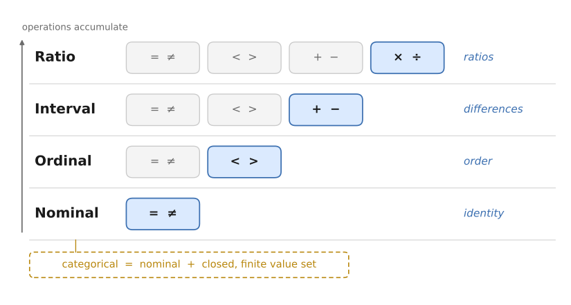
The four levels as a ladder: each rung supports every operation below it, plus one more. Categorical is a nominal attribute with the extra promise that its value set is closed and finite. Figure generated by Claude.
Some points:
- The levels are a ladder. Each rung supports every operation below it, plus one more.
- Numbers lie about their level. A student ID, a ZIP code, a jersey number, a department code - all stored as numbers, all nominal. “It’s a number” is not “it’s a ratio.”
- Interval and Ratio are sometimes grouped as Quantitative; Munzner ch. 2 does this. I keep them apart because the true zero is what licenses “twice as much,” proportions, and a bar that starts at zero - none of which mean anything for temperature in °C.
Categorical: nominal with a small closed set
I use categorical more narrowly than most people do. For me it’s a subset of nominal: a nominal attribute whose possible values form a closed, finite set.
- Nominal says only “these are names, with no order.” Names can be anything - free text, IDs, values nobody has seen yet.
- Categorical adds that the set of possibilities is fixed. You don’t have to be able to list them - I’d call the set of US counties categorical - but the set is closed, so a brand-new value is a surprise rather than a matter of course.
The distinction is worth a separate word because the small closed set is what makes a whole set of moves available. You can give every value its own hue or shape, build a legend that fits on the page, facet one panel per value, or put them all on an axis. None of that survives contact with a nominal attribute of ten thousand distinct values, even though the level is identical. Categorical implies set size; nominal doesn’t.
Other properties worth naming
Other properties of attributes (and the sets of values they may take).
- Sequential vs. diverging. A sequence runs one way (zero up to a max). Diverging data has a meaningful middle with distinct sides - elevation around sea level, profit around zero. The middle is a real property of the data.
- Cyclic. Hours, weekdays, months, compass bearings. The end connects back to the start.
- Cardinality. How many distinct values the set has. It matters at every level, not just for nominal - a quantitative attribute with six distinct values behaves nothing like one with six million.
- Continuous vs. discrete. Separate from the level of measurement, and from whether the domain is continuous.
- Hierarchical structure. Some attributes aggregate: days into weeks into years, cities into states.
Two cases carry enough extra baggage to be worth flagging:
- Time is nominally a 1D interval quantity, but it has cycles at several scales, irregular units, and a strong left-to-right convention. Rarely “just a number.”
- Geographic position is nominally 2D interval, but drags in projections, conventions, and every reader’s prior expectations about maps.
Conversions
Moving data between types is often the right design move, not a compromise.
- Down-conversions are easy. Discard the ordering (ordinal → nominal), or collapse a large set into a small one.
- Up-conversions are hard, because they mean imposing structure that wasn’t in the data - inventing an order for categories.
Here are a few key type conversion transformations:
| Conversion | What it does | The catch |
|---|---|---|
| Discretization | Continuous → discrete, by thresholding or rounding | Where you cut is a decision |
| Binning + aggregation | Group like values into buckets, then summarize each | Bin choice can quietly change the story |
| Interpolation | Invent values between measurements | Only if an in-between value is meaningful |
| Rank transformation | Keep the order, discard the intervals | Ratio/interval → ordinal is lossy |
Discrete, Continuous, Interpolatable (Interpolable)
The type of the domain and range work together. This turns out to be significant for visualization design.
An example is the property of being interpolatable (interpolable is a standard alternate term): does it make sense to talk about the value between two measurements? There could have been a measurement there - we don’t have it. We could estimate that value by interpolation (connecting the dots, although there are mathematically fancy ways to do this).
An example: time is continuous. But we often discretize it into units (hours, days, seasons). Depending on what we’re measuring, different operations make sense - and different visual forms imply that. If we are binning over the period, then time is discrete: it doesn’t make sense to talk about the count “in between days”. If we have a measurement on each day, then it does make sense to talk about “what the measurement would have been in between”. Note that this requires both the domain (time) and the value (binned vs. measured) to determine what makes sense.
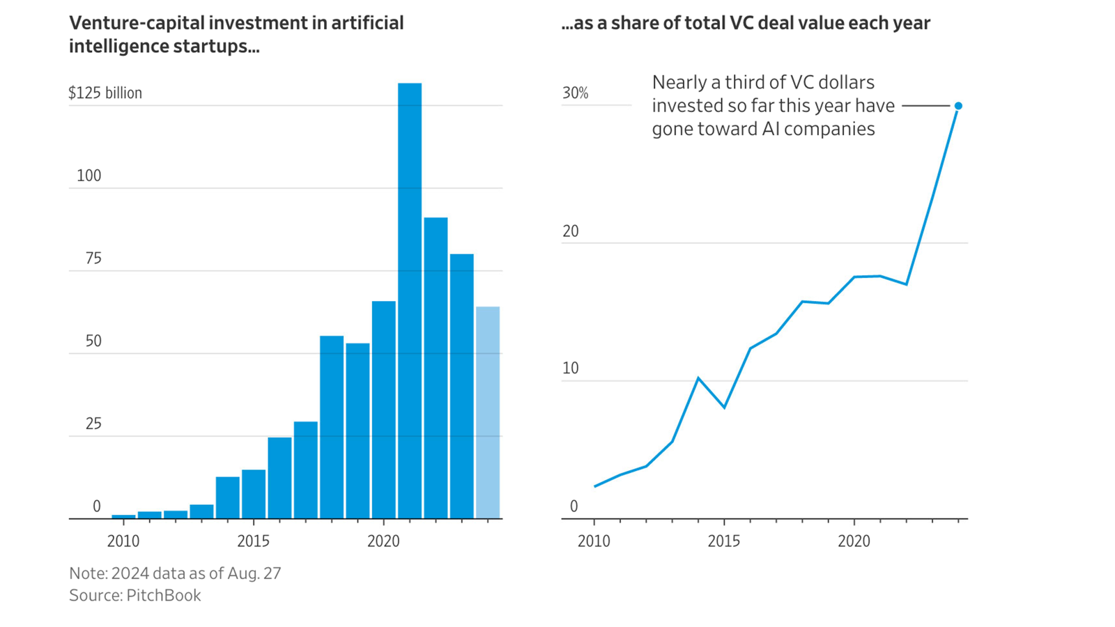
A figure that includes both discrete and continuous time over the same domain. On the left, the value is binned by year, so a bar chart is appropriate. On the right, it is a measurement at a given time, so it is interpolable and a line chart is appropriate. Wall St. Journal, 2024.
Two examples that consider this are Phone App Time Graphs and Cairo Discrete Line.
Warning: while data properties (such as interpolability) should influence visualization design, they shouldn’t be considered rules.
Part / Whole
Sometimes a value only means something against a total: market share, share of the vote, percent of the budget. The interesting quantity belongs to the group rather than to any single item—“23%” isn’t a fact about one company; it’s a fact about that company’s place among all of them.
This is another property that involves the domain and the range together, and both halves have to hold:
- The range has to add up. The values need to be a ratio quantity that is additive - counts, dollars, area, population. Averages, rates, and temperatures don’t sum, so there’s no whole for them to be part of.
- The domain has to be a partition - disjoint, so nothing is counted twice, and exhaustive, so nothing is left out. This is the half that usually breaks. If survey respondents could pick more than one answer, the shares overlap and won’t total. If the long tail got dropped and there’s no “other” bucket, the whole is missing a piece.
Part/whole often nests - counties inside states inside the country, subcategories inside categories - and then each level is its own partition. That nesting is what hierarchical part/whole forms are built on.
There is a whole family of designs for showing part/whole relationships, including pie charts, stacked bars, mosaic plots, and treemaps. These designs are often effective for showing part/whole relationships. However, they do not work for non-part/whole data; not only do they not make sense, but they also imply to the viewer that they should interpret the data as part/whole. Also, while these designs are often effective for part/whole tasks (e.g., determining what portion of the whole a part is), they are often less effective for other tasks (e.g., comparing parts).
Warning 1: Just because data has a part/whole form doesn’t mean that it should be displayed using a part/whole design. Part/Whole Designs are only appropriate if both the data and the task apply. See Tutorial 1: What Is Vis (Tasks as the Key) for an example.
Warning 2: Part/Whole designs (such as pie charts) are very effective when both the data and tasks suggest them. They get a bad reputation because they are often applied in the wrong situations.
Normalizing to shares is a conversion, and it costs something: proportions throw the magnitude away. Two pies with identical slices can come from wildly different totals, so a share is usually worth showing next to a size rather than instead of one.
What this buys you, and what it doesn’t
The levels tell you which operations are meaningful on the values. This can (should) influence the visual design - many of the worst problems come from data type / design mismatches. Task and semantics should also factor into design. Naive data type to chart recommendations are a starting point.
Claude’s summary: type constrains the space of honest designs without picking one out of it; what the viewer is trying to do usually does more of that work. (Munzner’s 2.6 makes a version of this point: type and semantics are crosscutting, and neither dictates the other.) Task abstraction is the other half of this vocabulary, and gets its own page.
Want more?
- Munzner, Visualization Analysis and Design, chapter 2 (“What: Data Abstraction”) - the required reading, and where the motivation this page skips lives. Read 2.1-2.5 carefully; 2.5, on attribute types, is the most important handful of pages in the book for this material. Interval and ratio come back merged. I describe the book at Munzner: Visualization Analysis and Design.