
Encodings: Building Blocks for Visualizations
Visualizations are built by encoding data into visual properties: position, size, color, shape, and so on. Thinking in terms of these building blocks - rather than in terms of chart types - lets you decompose designs, compare choices, and invent new things. And one building block towers over the others: position. Spend it wisely.
Warning: This was written by Claude, based on the slides from class and access to the readings. I intended to edit it, but didn’t have enough time. The content is fine - it just is Claude’s voice (trying to write like me).
Building Blocks, Not Chart Types
There are two ways to learn visualization. One is to learn a gallery of chart types: a catalog of charts, with rules for when each applies. Lots of books (and websites) work this way, and it can be useful. But it has problems. You have to remember all the names (and hope everyone agrees on what the names mean). It doesn’t help you compare options: why is a bar chart better than a pie chart here? And it can’t help you generate new designs - if your problem doesn’t fit something in the catalog, you’re stuck.
The alternative is to reason with building blocks. We can describe (almost) any visualization by how it assembles a few basic pieces:
- Encodings - how data values connect to visual properties
- Layouts - where things go (which, we’ll see, is really a kind of encoding)
- Transformations - changing the data so it fits a visualization
(Interaction is another building block - it gets its own discussion later.)
With building blocks, chart types stop being things to memorize and become things to understand: a chart type is just a bundle of encoding choices that someone found useful enough to name. That means we can take designs apart to see why they work (or don’t), compare alternatives choice-by-choice, and put the pieces together in new ways when the standard charts don’t fit. This idea of decomposing charts is useful enough that I’ve written more about it: see Charts Are Just Encodings in Disguise.
A caveat on terminology: I’ll use “encoding” loosely for the whole idea of mapping data to visual things. Munzner (and others) distinguish between encoding (data to visual properties) and layout/arrangement (where things go). Cartographers (usually) don’t need the distinction: in a map, position encodes position.
What Can We Encode With?
If we turn a “data item” into a “visual item” (a dot, a line, a blob - Munzner calls these marks), what properties can that visual item have? The properties are called visual channels (or visual variables - the field has never settled on one term).
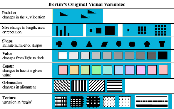
Bertin’s original visual variables. From the InfoVis Wiki
Here is a more modern accounting of the channels:
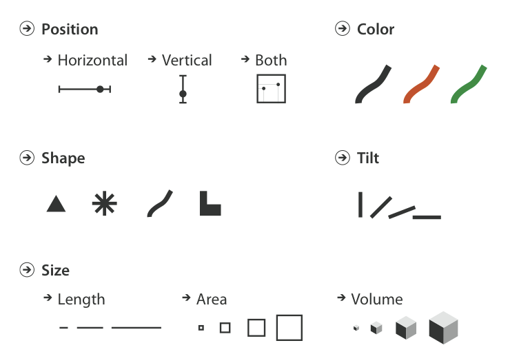
A few of the many visual channels. Figure 5.3 of Munzner, Visualization Analysis and Design.
The list isn’t fixed - people keep finding more (texture, motion, curvature, …). What matters more than the full list is that channels have properties, and the properties determine what a channel can do:
- Is it ordered? Size has a natural more-and-less. Shape doesn’t - nobody thinks a triangle is “more” than a circle.
- Is it continuous, or does it only support a few distinguishable values?
- Can values be matched at a distance (find all the red dots), or only compared side by side?
- Are values nameable? (“the red one” works; “the 37-degree tilted one” doesn’t)
These properties need to match the data (and task). An ordered channel imposes its order on whatever you encode: viewers can’t help reading dark-to-light as an amount. Use it for categories, and you’ve implied an order that doesn’t exist. Conversely, an unordered channel (like shape) can’t convey an amount - viewers would have to memorize which shape means “more.” Munzner calls this the expressiveness principle: show all of the information, and only the information.
One useful cut through the channel list (it’s Munzner’s): magnitude channels show how much (position, length, size, luminance), and identity channels show what or where (shape, hue, spatial region). Match magnitude channels to quantities, identity channels to categories.
And a warning about color, because everyone reaches for it first: color is not one channel. Luminance (light-to-dark), saturation (how colorful), and hue (which color) behave differently - two of them are ordered, one isn’t, and they interact with each other. Color is complicated enough to get its own module later.
Which Channel Is Best?
Here’s the same small dataset encoded four ways:
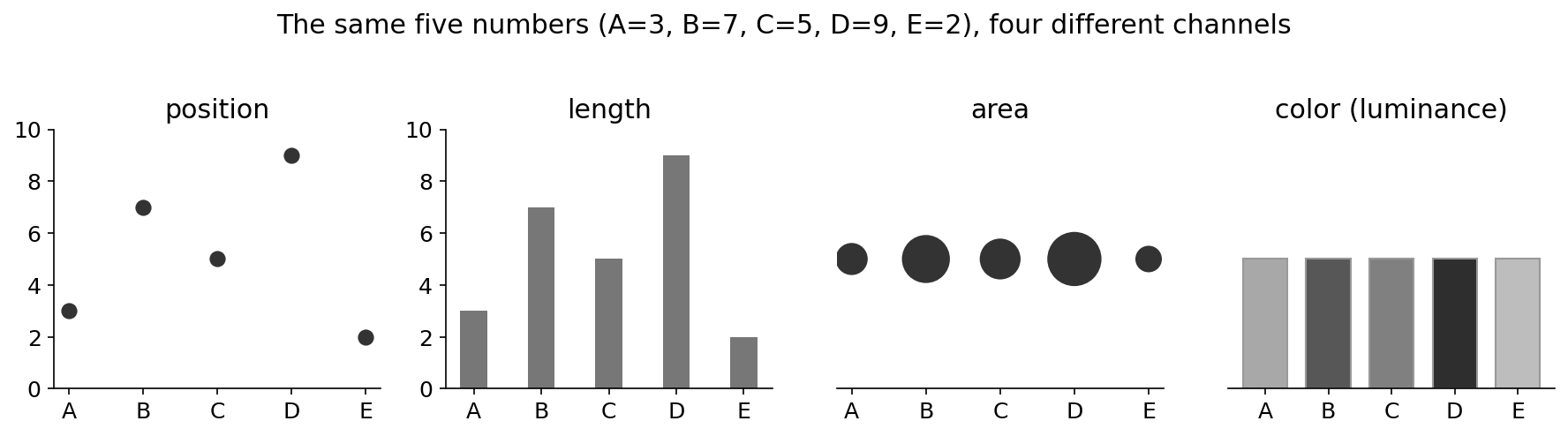
The same five numbers, encoded with four different channels. (Made with fake data.) Figure by Mike (well, his robot assistant).
I’ll bet you can rank these yourself: reading values (and seeing differences) is easy with position, decent with length, rough with area, and rougher with luminance. Your intuition here is backed by evidence - there is a whole research tradition of measuring how well people read different encodings, going back to Cleveland & McGill’s experiments in 1984.
The evidence (and a warning about experiments)
Cleveland & McGill asked people to make “elementary” judgments (like: what proportion is the smaller value of the larger?) using different encodings, and measured error. Their ranking - position, then length, then angle/slope, then area, then color - has held up remarkably well, including in a 2010 crowdsourced replication by Heer & Bostock.
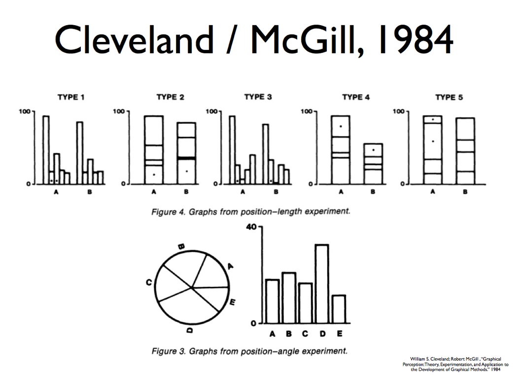
Stimuli from Cleveland & McGill’s position-length and position-angle experiments. Figures from Cleveland & McGill, 1984.
But be careful: experiments feel scientific and absolute. Ask what they measured (precise value reading), and whether that’s your task. A channel that loses at precise reading might win at something else - like being noticeable at a distance, or making patterns visible. We’ll come back to this when we discuss perception and evaluation.
- William S. Cleveland and Robert McGill. 1984. Graphical Perception: Theory, Experimentation, and Application to the Development of Graphical Methods. Journal of the American Statistical Association 79, 387, 531-554.
“Best” itself deserves suspicion. Better for what? More precision in reading? Easier to spot outliers? Easier to match at a distance? Combines well with other encodings? Stays out of the way when you want to ignore it? Different channels win at different things - which is why picking encodings means knowing your task, not just your data type.
So, the guidance for choosing an encoding: pick channels that match your data type (expressiveness), that are good for the low-level task, and that work well with the other channels you’re using. Where do the rankings come from - designer intuition, perceptual principles, or experiments? All three, and the latter two are coming attractions in later modules.
Position Is Special
The consistent headline from all that research: position is the best encoding channel. It’s ordered, precise, works for nearly every task - absolute judgments, relative judgments, finding things, grouping things, seeing patterns.
Which leads to my favorite piece of practical advice in this whole topic. For any design, ask two questions: What does position mean here? and Am I spending it on something important?
Position is also sneaky: it’s being used even when you don’t think you’re encoding anything. Layout is position encoding. Faceting (small multiples), overlays, even a table - the row and column positions of a table are encoding data. You don’t get to not use position; you only get to use it deliberately or accidentally.
Try It Yourself
Take the simplest interesting case: a table with two numbers per row. (Sketch with made-up data - don’t worry about exact values.) The obvious design is a scatterplot: variable 1 to X, variable 2 to Y, each row a dot. Now try to come up with three genuinely different designs. Rules: swapping X and Y is not a new design, and another table doesn’t count. Consider different channels, and different uses of position.
The Takeaways
Reason about visualizations in terms of encodings, not chart types: it lets you decompose designs, compare choices, and generate designs the catalog doesn’t have. Channels differ in what they can express (ordered? continuous? nameable?) and how well they perform - and position is the best of them, so ask what your design spends it on.
Want More?
- Munzner’s Visualization Analysis and Design, Chapter 5 (Marks and Channels) covers this material carefully, including her channel-ranking figure; Chapter 7 (Arrange Tables) develops how position and arrangement work. I describe the book at Munzner: Visualization Analysis and Design.
- Bertin’s Semiology of Graphics is where it all started - see Bertin's Books (Semiology of Graphics).
- Cleveland & McGill’s 1984 paper (cited above) is the classic experiment, and it’s surprisingly readable.
GenAI Disclosure:
This page was drafted by Claude from Mike’s CS765 lecture materials (Lecture 4-M, Fall 2025) and the associated readings~~, then edited by Mike~~. The “four channels” figure was generated by Claude with matplotlib on made-up data.
Mike didn’t actually have time to edit this carefully, but it is surprisingly useful as is. It’s not the way that I (Mike) would say it, but it’s surprisingly OK.