
Tutorial 2: How to Think about Visualization: Building Blocks
This tutorial argues for thinking about visualizations in terms of a set of building blocks, rather than the conventional approach of chart types and rules.
In Tutorial 1: What Is Vis, I argued that our goal was to create effective visualizations: ones whose designs helped the viewers achieve their tasks.
In this tutorial, I will try to explain how we can think about visualizations in order to design and analyze them. My premise is that we should think in terms of a set of building blocks, rather than the more conventional approach of chart types and rules.
The goal is to motivate the approach I take in my class and this website.
Motivating the Building Blocks Approach
To start, let’s re-visit an example from Tutorial 1: What Is Vis: the fake student data.
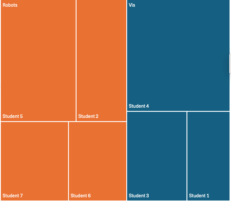
A treemap of the fake data
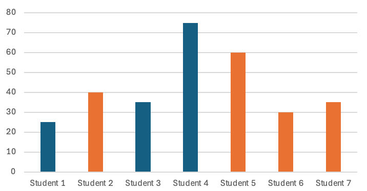
A chart of the fake data
I called the chart on the left a “TreeMap”. And I said it was good for some things (e.g., seeing that the vis students got slightly less than half the time), and bad at others (e.g. figuring out which student got the least amount of time).
This might suggest chart types as a strategy for learning Visualization: learn a long list of chart types, learn what they are good for, learn how to make each one well. This often involves a long list of rules. Visualization is often taught this way.
Notice that I did not name the other chart. I would have called it a “bar chart” or maybe even a “vertical bar chart”. But Excel uses the term “bar chart” for something else - it calls the thing above a “column chart.” Amazingly, it works the same no matter what you call it. We might not agree what to name it, but we probably can agree on what it is good for.
We can think of these charts not as their “types”, but rather in terms of the building blocks that make them up. An example of a useful kind of building block is encoding - how a data element is translated to visual elements. Whether you call it a “vertical bar chart” or a “column chart”, that chart encoded the values (in minutes) by the position of the top of the rectangle along the Y axis measured from X axis (a “common baseline”). For reasons we’ll learn about later, we prefer to say “position on common baseline” rather than “height of rectangle” or even “area of rectangle” - even though, in this case, all three of these are actually proportional to the data.
Some advantages to thinking in terms of encodings:
- We can understand how the encodings communicate, which helps us reason about whether using a particular encoding is likely to be effective for a particular task.
- We can use these understandings for many different possible charts.
- We can mix and match encodings. (notice that in both charts, I encode “topic” with color)
Once we learn that position along a common axis encodings are good for reading precise values and seeing the largest/smallest, we will know that many different visualizations based on this will be good for those tasks. Color is good for showing a small set of categories and can be added to many kinds of charts (combined with other encodings).
Here are 9 different visualizations of this same data with “position on common axis” encodings:
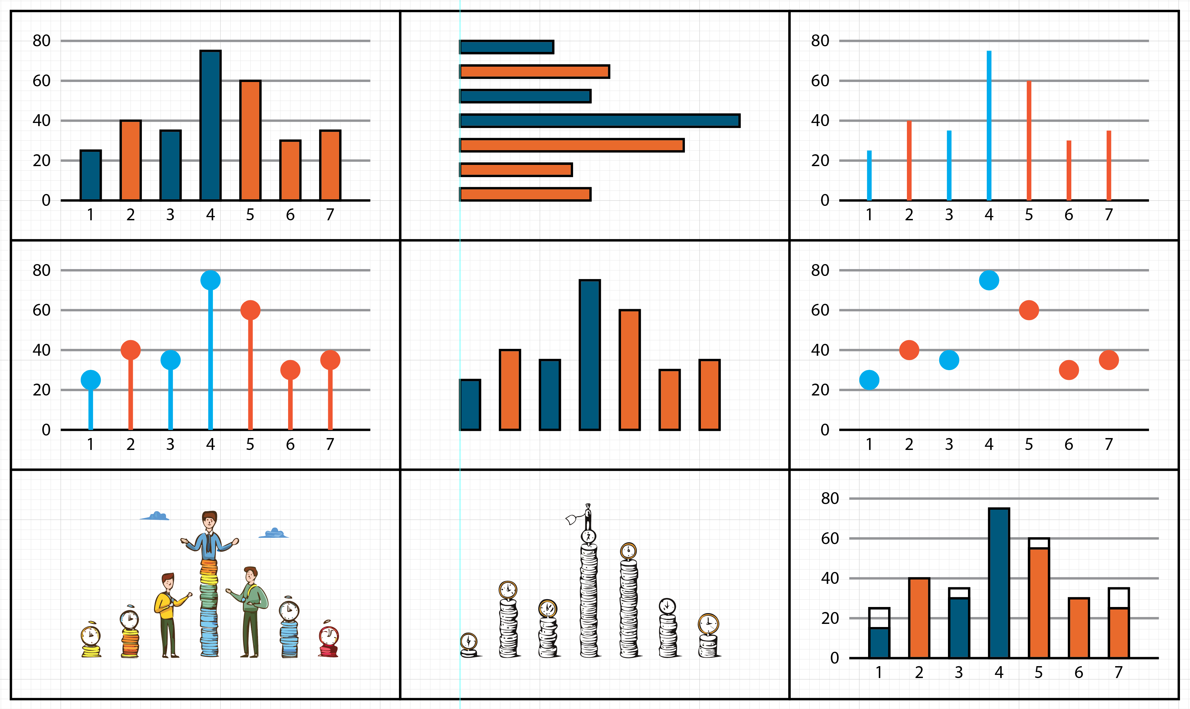
9 visualizations that use position-on-common-axis encodings to encode the same Fake Data. The left two on the bottom row were generated with AI fill in Adobe Illustrator and distorted the data. The amount of the distortion of the bottom center is shown by the bottom right visualization.
The key building block of the designs—position on common axis encodings—makes it possible for us to know what tasks they are all well suited for. For example, they are all good for quickly finding the biggest, or comparing two individuals. The differences in the visualizations do matter (e.g., the ones that don’t correctly encode the data are problematic; the big circles create some ambiguity in values, etc.). Details are important, but only if you get the basics right. And those details can also be driven by principles (like, be careful about distorting the data).
And, to add one more point about naming: here is another visualization of that same fake data:
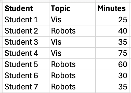
A Chart made from (the same) Fake Data
Yes, in my mind a table is a visualization. They are very good for some tasks. See Tutorial 2: A Simple Example: 4 Design Moves on a Table for an example of how the ideas discussed below can be applied to a table.
But, the point… my “method” is to think in terms of building blocks and principles, not chart types. It doesn’t matter what we call things; it matters that we make choices that serve the viewer’s tasks.
Abstractions - Two Key Building Blocks
The problems we need to solve are often very specific. In the examples above, my tasks and data were specifically about how much time I spent with students.
Abstraction is what allows us to take specific problems and understand them in general ways. In the example, we don’t need designs for student time allocation: we could describe the data in an abstract way (e.g., values for each element in a discrete set where the values make sense to add up to a whole) and tasks in an abstract way (e.g., find the smallest value).
Data and task abstraction are core concepts for visualization. The trick is to abstract in ways that are general enough so that they can match with other similar problems and solutions, but specific enough that we get useful matches. We will learn standard ways of doing this.
An analogy: You go to the doctor’s office because you feel sick. You think you have some unique situation. The last thing you want to hear is “That’s a novel and interesting problem! We need to devise a novel treatment. Let’s write a grant proposal and hire some research assistants…” No, you want to hear “I’ve seen that before. No problem. Take two aspirin and call me in the morning.”
As visualization practitioners, our goal is to be able to look at a problem and make those kinds of prescriptions. Task identification and abstraction are key here. It’s how we can say “I’ve seen that before” and get to “take two scatterplots and call me in the morning.”
Many problems we encounter are similar to other common problems, and the answers have been well-tested over the years. We usually don’t need a fancy new design: an existing, standard chart type probably will do the trick. Using a standard design has a lot of advantages: we don’t need to invent it, we don’t have to test it, we can use existing implementations, we don’t need to train the viewers to interpret them, …
The abstractions work well at the building block level as well.
Data abstraction is fairly standard - it’s part of computer science or math. We’ll review pieces useful for visualization. Tasks are trickier.
Aside: Even the term “task” is problematic. We will look at what it can mean, and how more precise terminology can be helpful.
How do we think about tasks?
The better that you understand what the visualization is trying to achieve (what will it help the viewer do), the more likely you will come up with a good solution. The goal is to have designs that serve the tasks.
Note the plural: you may have a set of tasks. Often, there isn’t just one at a time. There is a set of things that a set of someones may want to do for a set of reasons. And maybe your solution will address many of these.
Task is often an informal, fuzzy notion. It doesn’t always get explicitly written down or defined. But the clearer we are about it, the better off everything else will be. A visualization cannot be effective unless it has something to be effective at.
While task is a central thing, it is also hard to talk about. Historically, we’ve lacked good ways to talk about task. We’ll look at work that provides different ways to discuss task.
The building blocks of designs
A design is the plan for how you are going to turn the data into a “picture” that helps with the task. This is why it’s so important to understand task and data before trying to make a design.
Once you know your task and your data, you can try to design a solution. I say “design” to explicitly separate the act of coming up with the idea and actually building it (implementation). Design is the act of making conscious choices to solve a problem.
In terms of the class, a big part of what we’ll do is focus on design. What are the choices you can make, and how can you make good choices?
There are four main categories of things that we consider in designing a visualization. You can think of these as the kinds of choices you can make, or the kinds of building blocks you can build a visualization out of.
- Data Transformations - we compute some derived thing about the data that will be useful in one of the other steps.
- Layout - we decide where things go. Technically, this is a position encoding (see encodings below), but position is such an important thing, it gets its own special category.
- Encodings - an encoding is how we choose to map a data variable to some “visual variable” (an attribute of what we see - like color). Position is a visual variable, but it’s special enough that it becomes its own category (see layout).
- Interaction - taking user input is another thing you can do in a visualization. Often, input can be thought of as mapping input actions to changes in the visualization.
Another way to think about this is as “re-design” rather than design. We start with some visualization (a design), pick one of its choices (one of the 4 kinds of building blocks), and change it. I like to think of these like moves in a turn-based game; at each step I pick one of these things to either add (or change, if I am doing redesign).
For a simple example of applying these four design elements in a redesign see Tutorial 2: A Simple Example: 4 Design Moves on a Table.
Much of designing a visualization turns out to be making one of those 4 kinds of choices. Almost every visualization can be thought of in terms of these 4 building blocks.
I find this list to be a useful way to organize the larger list of more specific things you might do. Most things fit into one category or another. I won’t waste time arguing this is the best categorization – but it’s good enough to give you a sense of the kinds of things that you can think about.
We’ll learn how to choose these different components, and use them together. We will look at visualizations and try to understand them in terms of these four components. We’ll think about redesigning visualizations by changing the choices. We’ll try to develop a sense of how to map tasks and user goals onto these kinds of choices.
How do we make good choices for design?
Creating a visualization is about making those choices for a design so that the result is effective for the task… but how can you choose wisely?
Part of it is trial and error. Sorry. We learn by examples. Reflecting on examples that we make (prototyping), and examining examples of others carefully (critique).
But there are things we can use that can hopefully help us make better choices. Some examples (which we will study in class) include:
- Principles of Visualization - Over time, people in the field have gotten some ideas about what works and what doesn’t. Sometimes, this folklore is made up and may not be true. Other times, it comes from experience or has been proven by experiments.
- Principles of Perception - Understanding how people see (as in how the visual system works and how the brain interprets images) provides a lot of useful clues as to what designs will (and won’t) work.
- Principles of Visual Design - General ideas on how to make things that are “nice” visually and communicate effectively. These principles are the same if you’re designing a visualization, a web page, your resume, … - so they are good principles to learn!
- Examples - Looking at existing examples - both good and bad - can help us. Sometimes, we can gain intuitions so we can make new designs. Other times, standard solutions provide us with answers, or at least a starting point.
How to Design and Make Visualizations (Process)
The description above leads to a pretty simple recipe. Basically, there are three things to think about (that come from the definition):
- Why are you making this visualization? Who are you trying to help? What are you trying to help them do? I refer to the latter as the “task” - and it’s usually more important than the who part.
- What data are you trying to use to achieve this task?
- How are you going to use the data to help achieve the task?
I split question 3 into two parts. There’s a planning part, and a part where you make the plan more concrete by filling in the details. Which leads to the four-step recipe.
- Task
- Data / Resources
- Design
- Details
In the ideal world, you start at the top, and work your way down through the list. The steps are iterative: at the end of each step (ideally) you do some evaluation (e.g., critique) and maybe go back to a previous step.
Sometimes the steps don’t happen in order. For example, you really want to use a particular tool, try out a new algorithm, or make things a particular color, so you go looking for something to make with these details. Sometimes it seems like the data comes first: I got some data, I’d like to look at it. but even then, I argue that you have a task: figure out what the right questions to ask are, get a sense of what is there, etc. Often there is an iterative cycle - as the designer understands the data more, they can refine the task.
This is also not to say that you need to fully understand the task at the beginning. Sometimes, your understanding of the task is hazy, or changes as you learn more (from later stages).
In a little more detail…
- Task - understand the purpose of the visualization. Who is it meant to help? What is it meant to help them do?
- Data - what resources are available to help achieve the task? The main thing is (usually) the data.
- Design - what is the strategy for mapping the data into something visual?
- Details - how will you make this strategy into a specific picture / system that produces pictures? What are the specific choices (e.g., colors, implementation, …)
Later in class, we’ll see that this parallels Tamara Munzner’s nested model for validation. (We’ll read about it in her book, but it was a great paper first). I think in terms of visualization design, not just validation (but evaluation is so important to design that it might not matter), so I adjusted the layers a bit.
Critique: Example-Driven Learning
Critique is the practice of examining something carefully to understand it and learn, often in a “discussion” format. Critique is a key tool in learning about Vis, and in improving design (for Vis, and in general). It is also a generally useful skill that can be learned with practice. Tutorial 4: Critique provides a tutorial.
I mention it here because, like the building-blocks, it is central to my approach to teaching visualization, and I think it is central to the design process.