Assignment 4

Group members: Nate Vack and Adrian Mayorga

For the bad dataset we chose the eye data visualization that Nate posted about. The mappings are as follows:

Data:

  • List locations with associated times
  • Areas of interest
  • The image itself

Mapping:

  • Locations and times are aggregated into “fixations”
    • (x,y) position, time, duration
  • Areas of interest map to shapes
  • Image maps to itself

Visual Encoding:

  • Fixations are encoded by red circles.
    • center of circle is x,y position
    • size of circle is duration
    • sequential fixations are joined by a yellow line
  • Areas of interest are indicated by green shapes( ellipses , rectangles)

There are a few obvious flaws for these mapping and encodings. For one, mapping duration to size of circle is very misleading, it implies that when the fixation is longer, the area looked at is bigger. Additionally, it is not obvious that aggregating and thresholding the raw data into fixations is the  correct thing to do in all cases. The thinness and color of the lines also causes them to sometimes blend into the background image, making it hard for the investigator to see what’s going on.

We have come up with alternative encodings that we feel address these problems.

The first is to just draw the raw data as a continuous line over the image.

lines

This is essentially the same mapping, but skipping the aggregation step. Since each point now represents and equal amount of time, representing duration directly is not needed. Implicitly, the time spent in a region will be represented by having a higher density of lines.

The second is to “fog up” the entire image. Then “clear” the areas where the subject looked.

mask

This will make the areas where there was the most activity the clearest. However, the areas there there was little activity will suffer from a loss of detail.

The last is to instead of aggregating position and time into “fixations”, we can collapse this into a binary category of whether or not the subject was looking inside the region of interest. Using the other axis as time produces a line graph that clearly shows when the subject was looking inside the area of interest. However, all context of where exactly the subject was looking will be lost. This encoding would be more useful if the image had more than one area of interest.

bar

Group members: Nate Vack and Adrian Mayorga

For the good redesign we chose the Depth-Dependent Halos that I posted.

The mappings are:

Data

  • A set of 3 dimensional poly-lines

Mapping

  • Poly-lines are bundled together
  • A camera view is chosen and a 2-d projection is performed. Depth information is also calculated

Encoding

  • The bundles are drawn directly from the projection
  • Discontinuities in depth are encoded by white lines (halos) that surround the  bundles. Larger discontinuities yield larger halos.

Besides the halos, all of their mappings are pretty much the obvious ones, just a simple 3d to 2d projection. The halos intuitively encode differences in depth, almost in a sense hacking the perceptual system to convey 3d structure in a 2d image. Also, because they do not perform needless abstraction of the data, the context of the lines is not lost.

We have come up with the following alternates:

If annotations that label particular regions of the data are available, we could represent the connectivity explicitly with a node graph. Alternatively, if annotations are not available, more aggressive bundling can be performed.

graph

The same data can also be shown in a symmetric matrix

mat

The bundles can also be drawn as ribbons or arrows. While this removes the visual context, connectivity is more explicitly conveyed

ribbons

We can also change the way that depth is being encoded. If we instead use intensity, then closer areas would appear brighter, while the far away things would fade into the dark background, or vice-versa. With this mapping we lose the sharp delineation between relative depth discontinuities but it gives more information about absolute depths.

gray

Critique-II: Good One

February 15, 2010

in Student Posts

Group Members:

Jee Young Moon and Chaman Singh Verma

Source : 2nd Visualization: Big Bang

http://graphics.cs.wisc.edu/Courses/Visualization10/archives/602-assignment-iv-visualization-critique

( Acknowledgment) Images are taken from Google site.

**********************************************************************

Introduction:

We like this visualization because its contents carry  lots of information in space efficient manner.  With an effective integration of colors, words, and geometry make this visualization to describe a story around it and it supports Tufte’s argument that visualization must augment rational thinking.

1. Problem Definition:

In cosmology, there are many great experimental and theoretical results to substantiate the facts that Universe is expanding with the Big Bang. The problem is to show pictorially the entire knowledge to explain this natural phenomenon.

Source of this Visualization:

**************************

Scientific American Magazine ( Issue # is not known, circa 2004)

Targeted Audience :

*******************

General public who is interested in science but with probably less formal education the field of  cosmology.

2. Abstraction

  1. Time:    Universe is continuously expanding with time.
  2. Location:    Galaxies are running away from each other in higher dimension but for human understanding we can assume it to be in three dimensions.
  3. Geometrical  Shape :    Assuming the universe is expanding as balloon shape with time.
  4. Empty Space:      Dark energy is pervading in the universe,

3. Mapping and Encoding:

  1. Time is shown in the Z-Axis in increasing order.
  2. At any given instance of time, XY plane show the locations of  galaxies and starts.
  3. Dark energy is shown with the black color and different galaxies are  shown with different colors depending on their age.
  4. Expansion is shown in the shape of a balloon by bounding curves.
  5. Ever expanding nature is shown by the arrows in the picture.
  6. Text as additional information. It also shows composition of the universe in a separate pie chart and experimental measurements to support universe expansion.
  7. Translucent color in balloon shape is used to show the past universe.  An vivid 5 billion ago universe in the visualization exemplify this effectively.

4.  Other choices:

  1. This visualization doesn’t show or reveal the information that galaxies are running away from each other or stars are born and die. There is no mapping  between the two instances of galaxies positions.
  2. Instead of showing expansion of universe as in the open-ended cone shaped balloon, this visualization were more effective if we had chosen closed shaped balloon or sphere.

5. Comparison with our mapping


We believe that mapping a 3-dimensional phenomenon into 2-dimensional paper/screen is difficult, therefore the present visualization is probably better than ours. Since they dissect it by time, they effectively show 3-dimension.

Critique-II: Bad One

February 15, 2010

in Student Posts

Group members :  Jee Young Moon and Chaman Singh Verma

Selection :  California, Couch Patoto Generation

URL:  http://graphics.cs.wisc.edu/Courses/Visualization10/archives/564-good-and-bad-visualizations/comment-page-1#comment-132

Introduction:

This visualization shows a social phenomenon published in Time magazine. The shape, color and words have been ineffectively used to make this visualization fail in its purpose to convey the meaning and therefore, in our opinion,  this is a good example of “Bad Visualization”.

1. Problem:

The presenters want to show a trend among media consuming kids over a period of time.

2. Abstraction:

  1. Time and Activity : How kids spend their time in a day in media consumption ?

3. Encoding and Mapping

  1. Each activity is shown by three methods (1) Text (2) Glyphs and (3) boxes.
  2. Spend time for each activity is proportional to the number of  boxes.  The actual time is shown in the text.
  3. Clustering:   Boxes of each activities are clustered.
  4. Each box represent a duration of 10 minutes.

4. Some shortcomings in this visualization.

  1. No comparision : The problem contents says that kids are consuming more media than ever before, but nothing in this visualization compare the data with some earlier known data.
  2. Unordered boxes: Boxes are unsorted that makes visualization tough to understand.
  3. No Overlapping: Kids overlap many activities ( Watching TV and listening music ) but nothing in the presentation shows that overlapping.
  4. Non-Demarcated Boxes: For a beginner, the placement of box is quite puzzling.  for example, it is not clear where does the activity of watching TV starts and stops.  This ambiguity is contrary to the first principle of “visualization”.

5.  Proposed new encoding:

Advantages of this presentation over the original one.

  1. Comparison with the past is shown for each activity.
  2. Alonng the X-Axis data is sorted so we can immediately know where maximum or minimum time is spend.
  3. It is more intuitive and well known technique. As per Tufte argument, it is more acceptable because this pattern of presentation is well known.

The Good
Our good visualization can be found here:

http://www.mint.com/blog/wp-content/uploads/2009/11/MINT-TAXES-R4.png

Data/Mapping/Encoding

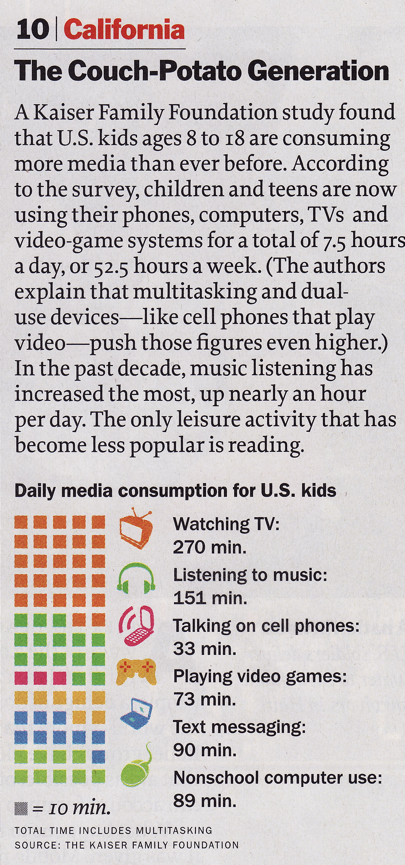
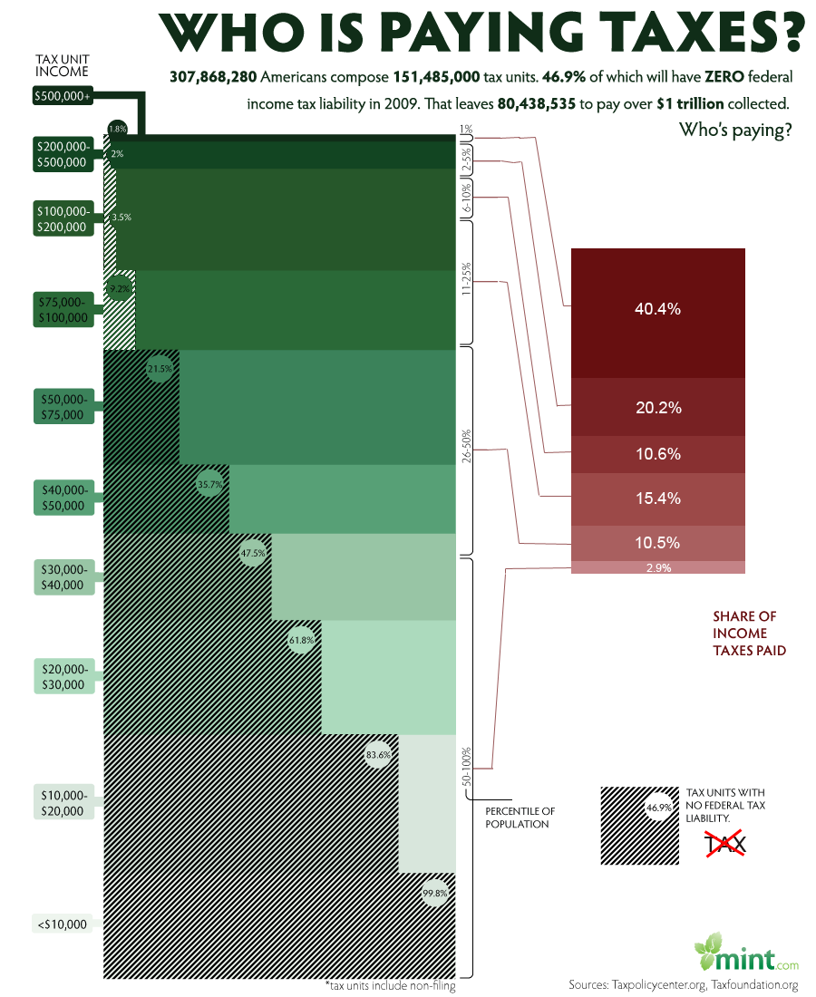
There are a large amount of data in this chart including percent taxable income, relative tax bracket size, and amount of total income tax paid.  The chart also links each tax bracket with the total income tax paid.  Each tax bracket is quantified as a percentage of the total population and encoded using the position in the chart, the height of the tax bracket block, and a shade of green.  Higher tax brackets are higher on the chart and thinner because they represent less of the population and are shaded darker.  Percent taxable income is shown by the percentage of the tax bracket that is shaded with hash marks.  These are always black and show the actual value.  The percent of total income tax paid by each bracket is shown in a pie chart using area/angle to split the total area.  Each percentage is shaded a darker shade of red as the tax bracket increases.  Connections between the tax bracket and total income tax paid are made using non-intersecting lines from the table to the pie chart.

For the most part, these are all good choices based on perception principles.  The tax brackets are ordered data encoded with position from the bottom in the left chart.  The relative size of each bracket is encoded using the height (length) of the block in the table.   The hash shading used to show percent taxable income is encoded as length along the horizontal which gives the viewer a good idea of the relative amounts that each bracket is taxed.  The pie chart is similar to the chart except that it uses area/angle, which are still good for quantitative data.

Here is the updated visualization:

Redone tax visualization

New Mapping

It was difficult to develop a better visualization however there were a few things that we wanted to fix.  First, we felt that the pie chart added just a little to much clutter to the image.  We determined that encoding the percent income tax paid using length instead of angle would be more consistent with the chart to the left.  This also removes clutter due to the connections made from the left table to the right table.

The second fix was to the color of the hash marks used in the upper tax brackets.  We observed that as the green became darker, the hash marks were less visible.  Our solution was to make the has marks white at the top of the chart.  This makes it much easier to compare upper values with lower values.

The final fix was to place a glyph next to the hash mark key.  While there is a note that explains what the has marks mean, on a quick viewing, the viewer might mistake the shaded region as taxable income instead of non-taxable income.  This was a mistake that I made on my first review.  Our glyph is the word tax with a red cross through it.  This should make clear to any viewer that the shaded regions are not taxable.

Did we make things better?

This was a good visualization to begin with.  We do believe that we where able to improve on it in minor ways.  We believe that switching from angle to length for the pie chart was very important to helping the viewer connect the two charts.  We also believe that changing the shading to a lighter color at the top of the left table was the only way to make the upper brackets readable.

The Bad

Our bad visualization can be found here:

http://emerge.softwarestudies.com/projects/ArtDiaspora.viz/kwangju-1degree-2.png

Data/Mapping/Encoding

The data in this visualization consists of seven categories and associations between each.  The categories are, Artist, Work, Form, Place of Creation, Date of Work, Place of Birth, and Date of Birth.  The associations are Artist to Work, Artist to Place of Birth and Date of Birth, and Work to form, Place of Creation, and Date of work.  Each category is mapped to a list and encoded using color and angle around a circle.  Each item in each category is also encoded using position in a list under the category and the categories color.  Each item also has a small image but that helps very little.  Associations are mapped to connections which are encoded as colored lines connecting two items on the perimiter of the circle.

This visualization was made as a show piece and may have been much more readable at a larger scale, however, on a computer screen it is simply impossible to trace any of the connections due to the large number of intersections.  As an aside, the creator made the mistake of connecting the title category to every item under that category,  this single attribute causes a majority of the clutter.

The main issue is that the visualization does not show the diaspora process of artists creating their work in different countries.

Here is our first attempt at a new visualization:

Updated Diaspora Vis

New Mapping

The first problem is to demonstrate the process of diaspora which is the process of artists moving from their native country and working in a different country.  Our sub goal is also to show all of the different association between the artists and their work.

For the first attempt, we mapped the percentage of artists working in other countries to a number (y axis) and encoded it as a percentage of a bar at a given time.  We mapped time to a number (x axis) and we show the percentages ate each time using the length of a bar and color to differentiate artists performing work in their home country from other countries.  Two charts are created to show both the date of creation of the painting and the date of birth of the artist.  This will help to identify generational trends.

In order to keep as many of the associations as possible, we include other data as comments in each bar.  Each comment pertains to the year that it occurs on and helps to show the data that was presented in the original chart.

This was created using a smaller, fabricated data set and was produced using Illustrator.

Did we make things better?

We believe that we did make things better.  The process of diaspora can clearly be seen by the rising percentages over time signifying that artists are leaving their country.  Associations are slightly harder to trace, however they were impossible to trace in the original so this is an improvement.

Here is our second attempt:
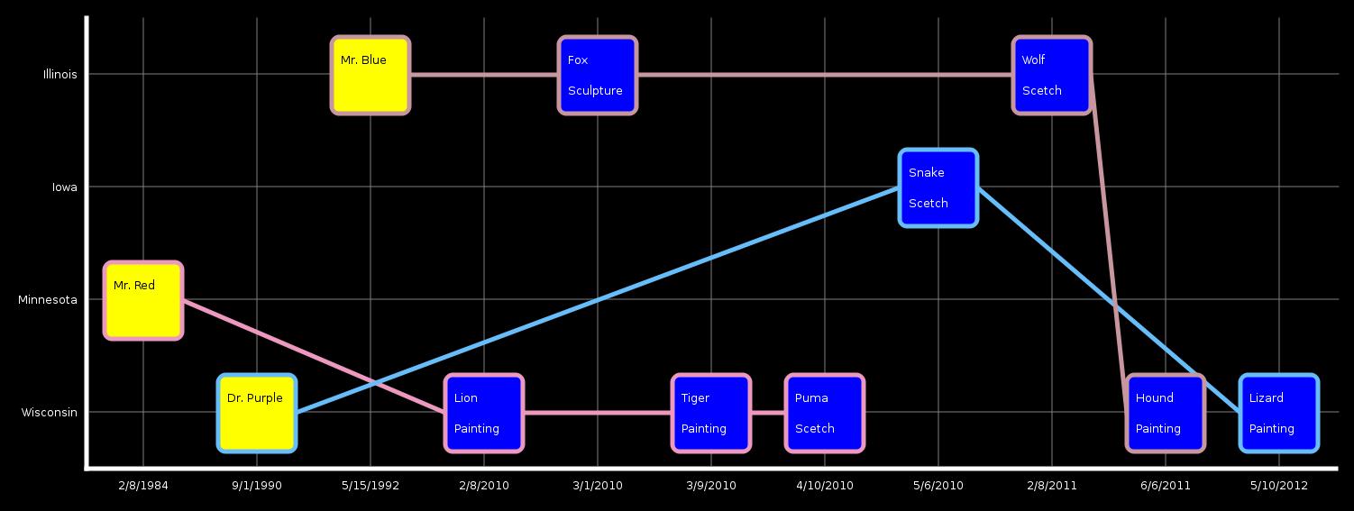
Diaspora second attempt

New Mapping

Again, the problem is to show the diaspora process while maintaining as many associations as possible.

We abstracted the Date of Birth and Date of Creation into just a date concept which is encoded as position along the x axis.  The Place of Creation and Place of Birth are combined into one concept that is encoded as position along the y axis.  These were chosen because diaspora’s main concept is changing regions over time.  The painter is encoded using his birth date and country to place him on the chart.  Painters are encoded using the color yellow.  Paintings are encoded using the date of creation and country of creation to place each on the chart.  Each painting also displays its form to help with association.  Painters are associate to their paintings using a personal timeline that is color coded for each painter.

This was implemented in C++ using the QT libraries to create the graphics.  Again, a fabricated data set was created to show example output at a reasonable scale.

Did we make things better?

We believe that this is also an improvement over the original.  Visualizing the process of dispora is accomplished by the deviation of each painting form the line that the original painter falls on.  Association can easily be made between work and painter and all other information by simply reading the country and date from the chart.
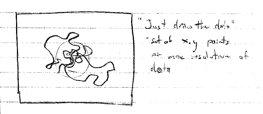
thist is a

The chart above was found at the website cited above and a large version can be found by going there.  This visualization falls on the InfoVis/Present side of the two perspectives covered in class and attempts to show the relation ship between income and income tax payed by different brackets of the population.  The chart would be of interest to any member of the united states curious about who pays what percent of income tax. The chart contains both quantitative and ordered data.  The quantitative data includes income size and percentage of taxable income.  The ordered data includes income levels and percent income tax paid.  I consider percent income tax paid to be ordered data because while the percentages could be considered quantitative, they are displayed in the context of a pie chart in which the size is used to create an ordering.

Tasks enabled include

  1. Determining what percentage of the population falls into a certain tax bracket.
  2. Determining what percentage of income in each tax bracket is considered taxable.
  3. Determining relative sizes of different tax brackets
  4. Determining how much total income tax is payed by each tax bracket.

Income size is encoded with plain text for each tax bracket.  Percentage of taxable income is also encoded with text but also with a horizontal bar that is shaded with hash marks over the required percentage.  Income levels are encoded using different shades of the color green with lighter being the lowest and higher being the darkest.  The size of the tax brackets is encoded in the height of the green blocks as well as percentages to the size of the blocks.  The percent income paid is encoded in a pie chart to the right of the income block along with text in each piece giving an exact value and shading that reflects the green counterpart.  Connections are made between each income block and its percent of total income tax with lines that do not intersect.

Ordering of the tax brackets is done using both position and lightness.  The highest earners are at the top and the lowest are at the bottom with the bottom being the lightest and the top being the darkest.  According to Munzner, position is the best encoding for all data types, for ordered data, lightness is the second best encoding.  The second best encoding for quantitative data is length which is used for percent of taxable income, and to some extent percent of income tax paid.  Area is used extensively in both the table and the pie chart.  While this is not one of the best encodings for any of the data types, it does allow the viewer to relate the sizes of two datum.

This visualization makes if very easy to answer the question “what percent of total tax income comes from what tax bracket.”  It is clear that even though only 1.8% of the income of the highest tax bracket is taxable, that bracket still pays the majority of income tax collected.  This is very important because saying that only 1.8% of income is taxable for those making more than $500,000 per year could be very misleading.

This is also a good example of removing chart junk.  There are no tidbits of information cluttering the valuable information.  There is a proper title and narrative at the top and a signature at the bottom.  The rest is information relevant to the visualization.

Good Visualizations:

Source: Cover of Independent, U.K., Jul 21, 2006

http://www.smashingmagazine.com/2008/01/14/monday-inspiration-data-visualization-and-infographics/

Explanation and background:

The visualization is simply the cover of the U.K. magazine Independent on July 21, 2006. On the day before, U.K. and the U.S.A. has rejected a UN call for immediate ceasefire in the Israel-Lebanon conflict, while most of the world backs up the UN call. Though the fact is simple and can be described by a few words, the editors chose a more active way to distribute the NEWS, while implying their attitude towards the fact that the U.S. and U.K. are insisting their own way.

Deconstruction:

The title (also acts as the capture) is a question asked for the audience. What’s new happened in Middle-East? Who backs immediate cease fire? The visualization lists the nations with the answer “Yes” and the nations with the answer “No”. Using national flag to represent a country is really a prevailing but effective method. In this specific circumstance, the number and area of nation flags creates an inevitable comparison which implies the decisions of the U.K. and U.S. government are against the whole world.  Now, even people without sufficient knowledge of politics and current events will know that few countries but U.K. and U.S. didn’t back the ceasefire call, which would be very possible to attract the eyes of the audience.

Critique:

This is one of the best cover pages of magazine I’ve ever seen. There is two major reason why I like this visualization.

First, you might argue that the visualization didn’t give out much information. However, in spite of the simple information, the sharp contrast between the left and right side makes very strong impression, while also influent most of the audiences emotionally. Though the visualization is simply indicating some facts, I believe most of people will extract following message from it: A. Most of the world would back the ceasefire call in the middle-east; B. the U.K. and the U.S. government are against the ceasefire call. Questions will soon arise in some of the audiences: why are the U.K. and U.S. against the world? Is it another “national benefit” issue, or is it another event in which they want to display their power?

Second, it’s really simple. By simple, I mean the implementation of the visualization is really easy. It’s really amazing an easily made visualization can take such good effect.

I haven’t found any bad thing for this visualization. As the cover, it properly achieved its function: to attract audience, and to present the most important content in the magazine.

Bad visualizations:

Source: http://www.willisms.com/archives/2005/03/the_american_em.html

Explanation:

This is a picture from the WILLisms NEWS website. It served as a figure for the comment article “ The America Empire”. The author is willing to use this figure to show the audience the military expenditures of the 16 nations who has the highest military cost. (Of course, the author’s major point is to point out America has the largest military expenditure, whose absolute value is almost the total summary of the other 15 top nations.

Deconstruct:

The figure is created based on a pie diagram which using different color to stand for different nations in this military expenditure competition, except for the U.S. For the U.S. partition, the author uses the national flag in a mesh background to emphasize. On the left, there is a color chart to correspond the nations and the colors in the pie diagram.

Critique:

The good thing is that the figure has a proper title and indicates its source.

However, the visualization is so bad that it against several basic principles for information visualization. Though the information it represents is straightforward, it cannot hardly be understand by the audience. It’s bad in following aspects:

  1. The colors for each nation are too many that they cannot be identified clearly. The figure attempts to challenge a person’s cognitive limit by the use of the 16 different colors.
  2. The use of the national flag with meshed background to emphasize the U.S. is confusing, and this abrupt style transforming makes the national flag hard to recognize by the audience.
  3. The details of the lines and color blocks of the pie diagram are not processed carefully. (See the jagged edge of the pie partition!) An ugly picture, comparing to a beautiful one, would be much harder for the audiences to accept.

In summary, the visualization Examining it with the principles for visualization design in Tufte paper, we can find that the paper does have sufficient data content, an integration of all the data and comparisons, however, the comparisons are too much so the major comparison is buried by redundant information. Based on the 4 level model of Munzner, we can confirm that the problem occurs at the abstraction level and visual encoding level, since the description for the problem and the algorithm is unlikely to be wrong.

A Good example:

The periodic table.

http://www.aip.org/history/curie/periodic.htm

Mendeleev's periodic table

Why do I think it’s a good visualization?

– It has been one of the most successful visualizations of all time. When it was first conceived, it exposed underlying trends which allowed scientists to design experiments and procedures to isolate most of the missing elements fairly rapidly, and it gave deep insights into the structure of atoms, allowing some startling predictions about undiscovered elements. The power of the periodic table is that it makes fundamental concepts so easy to grasp that it is used in middle schools to teach concepts that at one time were inaccessible to many of the most brilliant scientists in the world.

– It supports all kinds of queries very efficiently – as long as you know something about the properties of the element, you can go right to its entry, and get its atomic mass, electronegativity, symbol, name and other properties.

To use Munzner’s language, it works on several levels:

– It solves the right problem – the outer electron shell properties of each element are made explicit by their location, while the overall shape of the table shows patterns that govern all types of atoms. The proof is that many scientists were able to use the insights in the table to discover new elements.

– It uses the right abstraction – it is the same abstraction of electron shells that scientists came up with to describe electrons – that the number of valence electrons and filled shells can determine an element’s chemical properties.

– It uses the right visual encoding – position is first and foremost, and informative empty spaces are left in. Color can be used to encode other things, like the metal-nonmetal boundary, radioactivity, melting point, or other groupings.

– There isn’t really an algorithm to speak of…

Tufte’s principles:

– Comparisons – With the table you can compare elements, rows, columns, metals and non-metals, and the larger blocks corresponding to which subshells are outermost.

– Causality / mechanism – It’s got it in spades. Not to belabor the point, but the electron shell structure dominates most of the chemical and physical properties of elements, and it’s right there in the table.

– Multivariate analysis + Integration – Outer and inner shell electrons are encoded in position, and other properties are either shown in color, or listed directly in the table.

– Documentation – It all started with Mendeleev, but since then it’s been reworked by countless researchers, and is one of the most trusted and authoritative of all visualizations of data.

– Content – I think this principle is outside of the scope of visualization, but in any case, the content is a sound scientific theory, backed up by partial evidence in the beginning, and much more evidence since then.

A bad example

http://worldprocessor.com/catalog/world/images/011.jpg

Statistical Challenges

Why do I think it’s a bad visualization?

– It’s a globe – you can only see one side at a time

– It looks like all nonsense – with other globes on the same site, http://worldprocessor.com/catalog/world/, it at least makes sense to use a globe because they are showing data that has some geographic locality and “global” (not a pun) scope. Why would you draw these things on a globe? Where do they get these connections? What is the underlying story? What patterns are there in this?

– To be fair, this is probably not meant as a serious visualization, but as a kind of artwork. A lot of modern art seems to be trying to convey the feeling of helplessness in the face of the overwhelming complexity of modern life, but as a clear visualization of the author’s ideas, I think this one fails pretty badly.

Munzner’s principles:

– It’s not clear what problem they are solving, or if there is even an attempt to solve a problem here.

– The abstraction is a network between nebulous concepts involving various aspects of society and life in general. It’s only the least bit clear what the arrows mean – for instance, “standard of living” and “happiness” are only linked through the confounding influence of “energy production”.

– Encoding – position is not meaningful, color is not used, orientation varies without any apparent meaning, making it harder to read the text snippets, darkness (saturation) of the text varies in no discernibly meaningful way, and, being a globe, you can only see one side of it, and not without some distortion.

Tufte’s principles:

– Let’s just say Tufte would leave the room, and leave it at that.

Stinks
The National Spatial Data Infrastructure (NSDI) is a… well, what is it? Let’s find out.
Step 1. Google for NSDI. The very first result is
National Spatial Data Infrastructure — Federal Geographic Data …
Executive Order 12906 calls for the establishment of the National Spatial Data Infrastructure defined as the technologies, policies, and people necessary to …
Step 2. Go to www.fgdc.gov/nsdi/nsdi.html where we see
“Executive Order 12906 calls for the establishment of the National Spatial Data Infrastructure defined as the technologies, policies, and people necessary to promote sharing of geospatial data…”
So, NSDI is a collective noun for tech, policies and people.
Step 3. Not knowing where to go further, I click on “Home” to land at http://www.fgdc.gov/ where I see
“This nationwide data publishing effort is known as the National Spatial Data Infrastructure (NSDI).”
Hmmm… NSDI is a publishing effort. Moving on…
“The NSDI is a physical, organizational, and virtual network…”
So, now the NSDI is a magical, shape-shifting, material as well as intangible network!
Step 4. Further down, there is a link to the “Components of the NSDI” so I click on http://www.fgdc.gov/components where I see a block diagram of NSDI which shows that NSDI has 6 components.
NSDI components
For some reason, 4 components are stacked on top of each other, one wraps around two sides of the 4, and the sixth component is in the background, forming a backdrop for all other five. Why it is like so, I have no idea. Is there a significance to “Standards” wrapping around the two sides of the stack of “Clearinghouse/Portal, Metadata, Framework and GEOdata”? And, why is “GEOdata” have GEO in caps? Is that an acronym for something? Why is “Partnerships” italicized? What does that signify.
Oh, there is much more that is wrong with this picture, but I will stop here. As an attempt to convey what the premier national initiative would be to build a national capacity for geospatial data and technologies for one of the largest and certainly the richest and most advanced country in the world, the one that invented most of this field and technologies, this whole presentation simply stinks.
Now, for some fresh air
I love walking. I firmly believe that my quality of life is very closely tied to whether or not I can walk to where I want to go. I detest and fear a life where I would be dependent on cars. So, when walkscore.com came by, I was in heaven.

Walkscore of my neighborhood

In a very simple way, in a very simple interface, with just one box and no fiddling, it clearly and easily helps me discover the walkability of a neighborhood. It has everything that would make Tufte smile… multivariate analysis, the complex made simple, content that is king, ability to compare and contrast neighborhoods, a moving picture, and a clear explanation of “how it was done.”
Of course, it also has the best use of today’s technology. Just imagine how Minard’s march of Napoleon would have looked like if he had Google Maps, jQuery and Processing!

I think it is a common misconception that visualization needs to be complicated to convey a number of variables, and the two examples that I have chosen address this issue.  The first example is a UV index map from the EPA that is updated regularly on their website.

The bad:
There are a few features with the EPA’s UV index forecast that are worth pointing out.  First, the color scheme is very misleading.  We customarily associate red with danger and ‘cooler’ colors with safety.  This map has the red hues squarely in the middle of the scale with blue tones encapsulating both ends of the spectrum.  In fact, the two colors assigned to the lower and upper end of the scale are very similar and could almost be used interchangeably.   There is no logical progression to the colors, and the map author would have been better off using saturation (with one hue) in order to show increased UV levels.  (The full sized version can be seen here.)

The good:
This visualization shows the additional Crayon colors that have been created since 1903.  Color is used to represent actual color, which could have been accomplished less dynamically a number of different ways.  The timeline emphasizes the number of additions within the last 20 years, while showing the smaller proportion of changes before 1958.  A table showing the same information would not show the diversity as effectively. (The full sized version can be seen here.)

And now for one that I do like:

This one comes from a presentation by Bilge Mutlu, an assistant professor in our own CS department.

Yes, OK, this figure appears to do the same trick of indicting longer gaze fixations with bigger dots. I’m not a big fan of that. However! That’s a sideshow to the larger story: the role of gaze position in conversation.

The large timeline at the bottom shows both where the main speaker is looking over time, as well as when each person is speaking.

In general, this graphic isn’t anything flashy or using super sweet edge clustering; however, it does an excellent job of showing many simultaneous, related events. My main quibbles are with the patterned area in the speech (what does that mean?), and that even with the time scale at the top, it’s hard to get an intuitive sense of how much language fits into this figure. If space permitted, it might be interesting to actually transcribe the spoken text into the speech bars.