And now for one that I do like: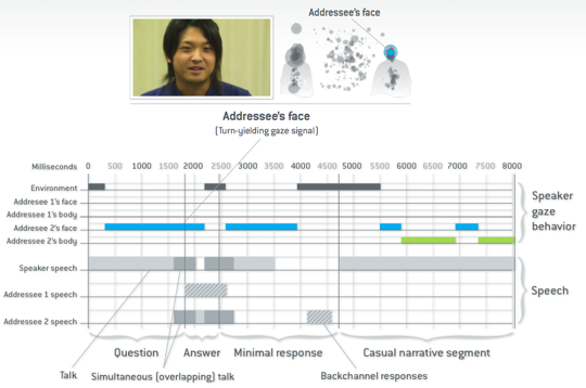
This one comes from a presentation by Bilge Mutlu, an assistant professor in our own CS department.
Yes, OK, this figure appears to do the same trick of indicting longer gaze fixations with bigger dots. I’m not a big fan of that. However! That’s a sideshow to the larger story: the role of gaze position in conversation.
The large timeline at the bottom shows both where the main speaker is looking over time, as well as when each person is speaking.
In general, this graphic isn’t anything flashy or using super sweet edge clustering; however, it does an excellent job of showing many simultaneous, related events. My main quibbles are with the patterned area in the speech (what does that mean?), and that even with the time scale at the top, it’s hard to get an intuitive sense of how much language fits into this figure. If space permitted, it might be interesting to actually transcribe the spoken text into the speech bars.