Group members : Jee Young Moon and Chaman Singh Verma
Selection : California, Couch Patoto Generation
URL: http://graphics.cs.wisc.edu/Courses/Visualization10/archives/564-good-and-bad-visualizations/comment-page-1#comment-132
Introduction:
This visualization shows a social phenomenon published in Time magazine. The shape, color and words have been ineffectively used to make this visualization fail in its purpose to convey the meaning and therefore, in our opinion, this is a good example of “Bad Visualization”.
1. Problem:
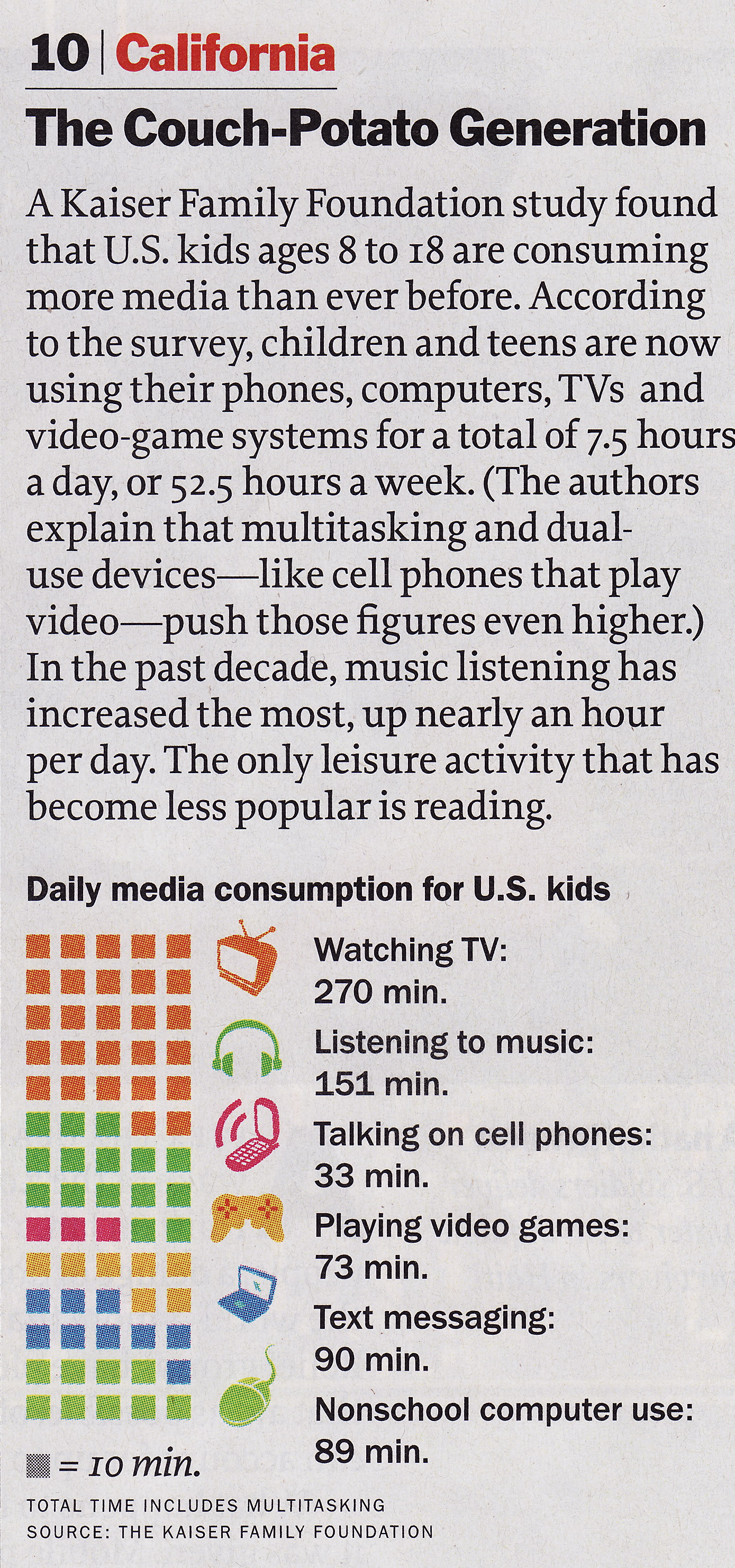
The presenters want to show a trend among media consuming kids over a period of time.
2. Abstraction:
- Time and Activity : How kids spend their time in a day in media consumption ?
3. Encoding and Mapping
- Each activity is shown by three methods (1) Text (2) Glyphs and (3) boxes.
- Spend time for each activity is proportional to the number of boxes. The actual time is shown in the text.
- Clustering: Boxes of each activities are clustered.
- Each box represent a duration of 10 minutes.
4. Some shortcomings in this visualization.
- No comparision : The problem contents says that kids are consuming more media than ever before, but nothing in this visualization compare the data with some earlier known data.
- Unordered boxes: Boxes are unsorted that makes visualization tough to understand.
- No Overlapping: Kids overlap many activities ( Watching TV and listening music ) but nothing in the presentation shows that overlapping.
- Non-Demarcated Boxes: For a beginner, the placement of box is quite puzzling. for example, it is not clear where does the activity of watching TV starts and stops. This ambiguity is contrary to the first principle of “visualization”.
5. Proposed new encoding:
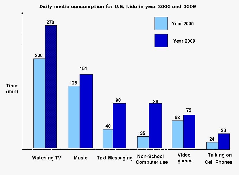
Advantages of this presentation over the original one.
- Comparison with the past is shown for each activity.
- Alonng the X-Axis data is sorted so we can immediately know where maximum or minimum time is spend.
- It is more intuitive and well known technique. As per Tufte argument, it is more acceptable because this pattern of presentation is well known.