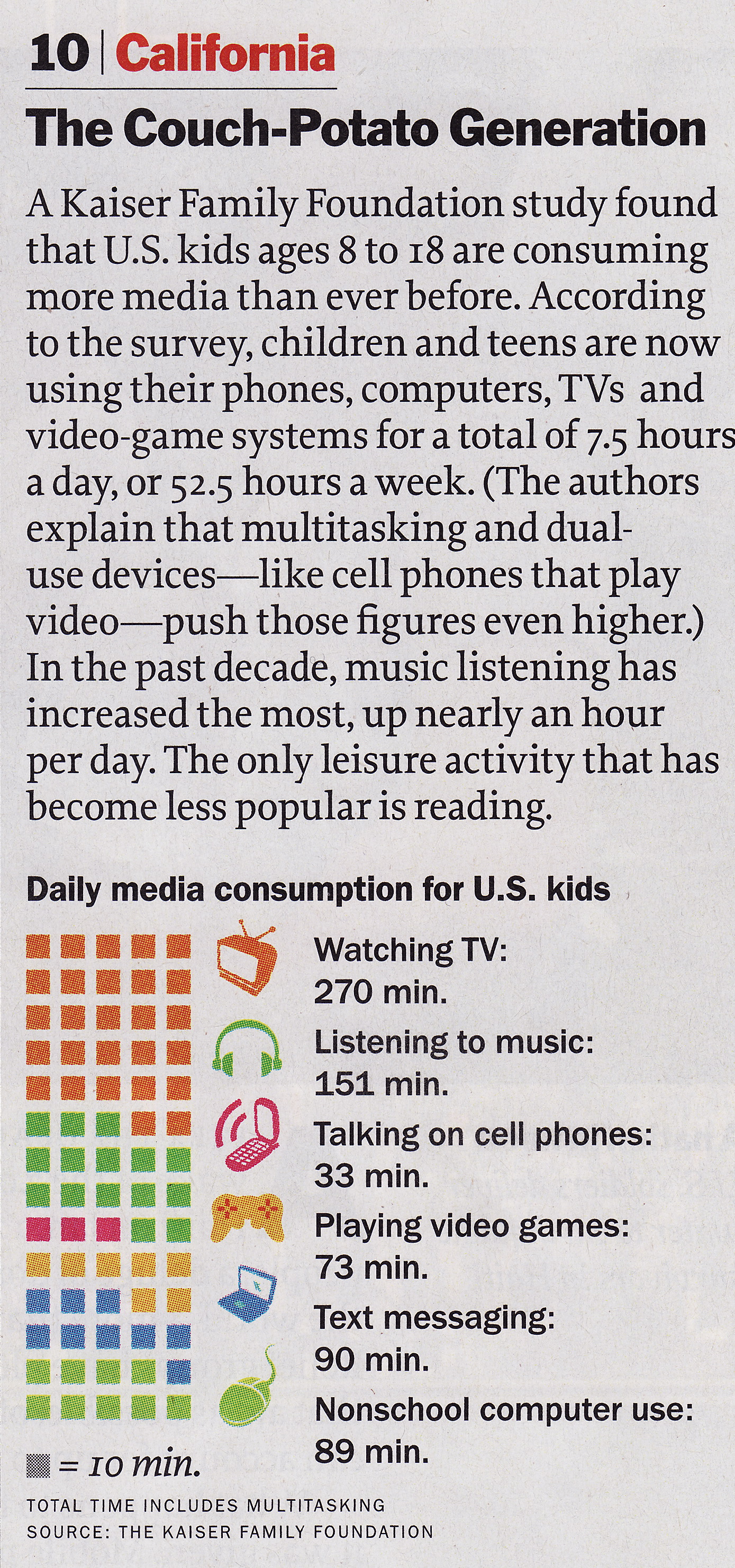
Student Posts

Bad example:

Spatial Images of Microarray Data

It takes a microarray data structure and creates a pseudocolor image of the data arranged in the same order as the spots on the array. Therefore, this plot shows the spatial distribution of the microarray.

In my opinion, this plot has drawbacks in three aspects.

First, it fails to emphasize the hot region and spots. The function of the spatial image should not be only present the microarray chip, but also point out the regions that different from its neighbors, by listing the location or intensity.

Second, it does not give the coordinate information. From the image, we can just guess the position of points of interest.

Third, it might be better that enlarge the spatial plot and make the scale bar thinner, as well as take use of the space between them.

Good example:

Heat map of Microarray Data (by NimbleGen)

Biology heat maps are typically used in molecular biology to represent the level of expression of many genes across a number of comparable samples as they are obtained from DNA microarrays

This example compares four groups. Here are some good parts in my viewpoint:

  1. Figure A clearly shows the relationship of the four groups, which is control, two treatments and their combination.
  2. Figure A gives suggestion of how to group the DNA segments (rows), which takes advantage of the good feature of heat map.
  3. Figure B compares the levels of different groups. It shows the trend and intensity, although the latter is hard to see.
  4. Figure C shows the expression levels of them. I believe if something is important but hard to be shown in the original plot, it is worthy to add another plot.

My examples are both (at least partly) concerned with where people look. First, my bad example:

In this image, taken from a brain imaging paper, illustrates where one subject looked over time, while being shown several emotionally arousing images. The green shapes indicate “areas of interest” used in statistical analyses, the red circles show where the subject’s gaze lingered (larger circles mean a longer fixation), and the yellow line connects the red circles, roughly indicating the gaze path. The solid red circle is for calibration purposes; it is the size of a one-second gaze fixation.

Here’s a larger version of one frame:

A couple of things in this figure irk me. First, two very different types of information (is this shape an area of interest or a gaze fixation?) are distinguished solely by color. In addition, while gaze position being encoded by position is completely reasonable, gaze duration is encoded by size — I suspect it’s radius, but it’s impossible to tell.

The problem with using size to encode duration is that it implies size or inclusion. All of the gaze fixation points are fundamentally the same size. A better option might be to draw each fixation the same size, and indicate duration with color intensity.

I don’t mind the yellow line particularly; however, one can’t tell either the direction of time along that line, nor relatively how far along in time any one fixation is.

Good

from Time magazine February, 1, 2010 Vol 175 No 4.

I like it used real product images in the plot. It attracts more attention than using a bar with the company name below it. It also lets us to know which company makes which product. But, this visualization can be improved to show that the merge of Cadbury and Kraft will have more market sharing than Mars has. Yes, this is a big problem because that point is what the writer wants to tell. But, somehow I liked the use of real product image a lot. Maybe, as a consumer, I interpret the article with the help of plot as a company selling milka buys a company selling dairy milk and will be bigger than a company selling Mars, instead Kraft buys Cadbury and it will be bigger than Mars Inc. But, for the investors, the company names would matter more than the product names. If I make an improvement to the plot, I would do it by putting Kraft image in a dotted rectangular above Cadbury image and putting an arrow between Kraft image on the fifth column and Kraft image in the dotted rectangular. This would make the height of Cadbury + Kraft will be higher than Mars.

Bad

from Time magazine February, 1, 2010 Vol 175 No 4.

Bad aspects of this visualization are like these.

  1. It will be better if the proxies are ordered in decreasing minutes.
  2. Proxy for text messaging is awkward.
  3. The above paragraph compares the present media consumption to the past media consumption. So, it should have the past media consumption visualization parallel to the current.
  4. Where is reading activity? Maybe reading is not included in media activities but in leisure.

But, there are some good aspects to this visualization, too.

  1. Showing the time as blocks gives us the idea the proportion of each activity in the overall media consumption easily.
  2. Even though the proxy of messaging is awkward, other proxies with the same color encoding in blocks are good and the use of proxies gives us instant concepts.
  3. Putting the actual minutes is good even though it is a little redundant with block counts. The reason is that the user does not have to count the number of blocks when the user want to compare his/her media consumption with the average, which I did.

I chose this visualization as bad because the third bad aspect is about what the writer wants to tell, I guess, and the first bad aspect can be fixed easily and bothers me a lot.

GOOD example:

Newsmap

Newsmap is a treemap visualization tool that depicts which news topics are most intensely being covered at a given moment. The goal of Newsmap is to help news readers finding out underlying patterns in news issue selection. The data is derived from Google news, which has location, section and time metadata and moreover already clusters similar articles into chunks with their own semantic algorhithms. It is intended for use by regular web users rather than trained specialists.

The quantity of a given issue topic is encoded into the size of the box and the font of the title inside it. The section in which the article cluster can be found is encoded into color hue, while the age of the issue is encoded into color lightness. The tool provides browsing by enabling users to select specific sections and countries. It also provides a search window that filters out article clusters with a specific keyword.

I like this visualization because it clicks with the intended audience by keeping its presentation as intuitive as possible. The topics of interests are right there in your face, by visually guiding the focus on the more prominent features. Moreover, it does not overload you with too much metadata because you can’t read the topics in the smaller boxes and fonts, unless you intentionally hover your mouse on them. With a remarkable simplicity, it shows the current landscape of topics in terms of specific issue, theme section and age of news on a single page.

======================

BAD Example:

ArtDiaspora.viz

ArtDiaspora.viz is a art-meets-cultural studies tool to visualize the concept of diaspora, by depicting various relationships between Korean-born artists, current residency and their works. It was presented at the 2002 Kwangju Bienniale, and uses the data from the artworks exhibited there.

This visualization ambitiously tries to include a vat array of data in a circular network diagram. The different classes (title of artwork, artist, country of residence, place of birth, year of birth, year of artwork, form of artwork) are encoded into different colors. Then the nodes are connected with colored edges.

Taking into account that this is presented at an art exhibition, the target audience may have been impressed by its beautiful design and the very idea of visualizing this kind of data. However, I don’t think this achieves its core goal of conceptualizing diaspora, because it is hard to read patterns with too many data categories cramped into one diagram. Artist’s name, country of residency, year of work would have been enough to show a meaningful pattern of talented artists moving out of Korea. Even for that, I don’t really see the need to use a circular network diagram rather than simple histograms and time-series worldmaps. On a shorter note, I don’t see why the category title (e.g. “Date of birth”) connects a edge to every single entity within the category. It makes the overloaded picture even messier.

Bad example

The two graphs show the natural rate of population increase for both developed countries and developing countries. The natural rate of population increase is the difference between the birth rate and the death rate. The purpose of this visualization is to reveal the difference in population growth rate (natural rate of population increase) between developed countries and developing countries.

However, this picture is an example of bad visualization because it doesn’t encode the important information in an effective way:

1) To getat a particular point in time, the viewer needs to calculate the vertical difference between the birth rate and death rate for that particular time, which is not intuitive.

2) The author wished to compare the population growth rates and conclude from these graphs that the population growth rate of developed countries is low and stable, while that rate of developing countries is high. However, by drawing the two graphs separately, it’s not easy to compare the difference.

Good example

http://well-formed.eigenfactor.org/radial.html#/?id=4324

This visualization gives an overview of the whole citation network. The colors represent the four main groups of journals, which are further subdivided into fields in the outer ring. The segments of the inner ring represent the individual journals. In the initial view, the top 1000 citation links are plotted. Selecting a single journal (inner ring) or whole field (outer ring) displays all citation flow coming in or out of the selection.

Benefit:

(1) The visualization is dynamic. If viewer click one journal, the other journals and their citation ship will fade away, and the clicked one will be highlighted.

(2) The ring design gives same emphasis to all journals. Imaging line or other shape, the information at the corner might be ignored.

(3) lines (citationship) between different journals run very smoothly. It gives the viewers a clear observation of which two journals are related.


Visualizing 3-Dimensional line data is an extremely tricky problem. Examples of such data are neuron connectivity information and fluid flow simulations. Below is a visualization of DTI fiber tracts in a human brain.

DTI fiber tracksThis visualization is able to correctly convey the connectivity information and at the same time adds depth cues in order to keep the three dimensional context. The paths are also bundled to give emphasis to general trends. I also like the fact that they use implicit perceptual cues ( the width of the halos around each line) and allow our visual system to perform the hard work of deciding what is in front of what. Previous approaches have tried to use realistic rendering, but because we rarely see such structures in real life, we have a hard time extracting the structure.

Here’s a link to the project page:

http://www.cs.rug.nl/~isenberg/VideosAndDemos/Everts2009DDH

The paper :

http://www.cs.rug.nl/~isenberg/personal/papers/Everts_2009_DDH.pdf

And additional high res images:

http://www.cs.rug.nl/~isenberg/uploads/VideosAndDemos/Everts_2009_DDH_supplemental_normal.pdf

There’s also a couple of link to videos in the project page. I encourage all to take a look at them.

I think that one of the most common problems when trying to visualize data is overcrowding. This can happen whenever one tries to display too many data categories, too many data points, or both. Below is a map from the National Weather Service that displays the current national weather warnings and advisories.

Small map of weahter warnings

The main problem with this map is that it tries to cram way too many types of warnings and advisories into a single view. There are a total of 30 categories, and all are coded by color. Eventually it becomes almost impossible to distinguish between them. For example,  does the coast of Hawaii have a Coastal Flood Warning, High Surf Warning, or both? Further investigation revels that it was a High Surf Waring.  There are even more problems when one considers the interaction that a user might have with the map. For one, clicking on a state and using the drop down menu to select one produce completely different results.

The current map and others can be found here

http://www.weather.gov/

One of the better visualizations that I’ve come across is in the Hierarchical Edge Bundles system built by Danny Holten at the University of Eindhoven. In this system, the visualizations are derived from a set of hierarchical data. The data is then drawn into clusters using either a radial or balloon layout. Finally, the relationships between the different data points is drawn by the use of edges linking the different points. These edges form a color gradient from the parent(green) to the child(red) and are further clustered with like edges through a series of bundling operations defined by a bundling parameter beta.

This visualization allows for a cleaner view of the relationships amongst hierarchical data. By encoding the edge direction via color and creating edge bundles of varying strengths, the user can easily detect patterns across the hierarchy of data and begin to form a more clustered hierarchy. By presenting this data in a radial or balloon layout, more information can also be derived in a single viewpoint than can be done with a simple top-down tree layout. In general, this represents a very clean design and uses encodings that are clear and easy to read. Data does not seem to become foggy as a result of the techiques and relationships within the data are very clearly emphasized.

In general, I really like this visualization because it is very clean and applicable to any sort of hierarchically defined data. Aesthetically, it makes for a very nice visual and also clearly conveys its intended information. More pictures and the paper explaining the system can be found here.

Good

American income tax statistics

“Who is Paying Taxes” mint.

http://www.mint.com/blog/wp-content/uploads/2009/11/MINT-TAXES-R4.png

Found at: http://www.visualizingeconomics.com/

Critique

The chart above was found at the website cited above and a large version can be found by going there.  This visualization falls on the InfoVis/Present side of the two perspectives covered in class and attempts to show the relation ship between income and income tax payed by different brackets of the population.  The chart would be of interest to any member of the united states curious about who pays what percent of income tax. The chart contains both quantitative and ordered data.  The quantitative data includes income size and percentage of taxable income.  The ordered data includes income levels and percent income tax paid.  I consider percent income tax paid to be ordered data because while the percentages could be considered quantitative, they are displayed in the context of a pie chart in which the size is used to create an ordering.

Tasks enabled include

  1. Determining what percentage of the population falls into a certain tax bracket.
  2. Determining what percentage of income in each tax bracket is considered taxable.
  3. Determining relative sizes of different tax brackets
  4. Determining how much total income tax is payed by each tax bracket.

Income size is encoded with plain text for each tax bracket.  Percentage of taxable income is also encoded with text but also with a horizontal bar that is shaded with hash marks over the required percentage.  Income levels are encoded using different shades of the color green with lighter being the lowest and higher being the darkest.  The size of the tax brackets is encoded in the height of the green blocks as well as percentages to the size of the blocks.  The percent income paid is encoded in a pie chart to the right of the income block along with text in each piece giving an exact value and shading that reflects the green counterpart.  Connections are made between each income block and its percent of total income tax with lines that do not intersect.

Ordering of the tax brackets is done using both position and lightness.  The highest earners are at the top and the lowest are at the bottom with the bottom being the lightest and the top being the darkest.  According to Munzner, position is the best encoding for all data types, for ordered data, lightness is the second best encoding.  The second best encoding for quantitative data is length which is used for percent of taxable income, and to some extent percent of income tax paid.  Area is used extensively in both the table and the pie chart.  While this is not one of the best encodings for any of the data types, it does allow the viewer to relate the sizes of two datum.

This visualization makes if very easy to answer the question “what percent of total tax income comes from what tax bracket.”  It is clear that even though only 1.8% of the income of the highest tax bracket is taxable, that bracket still pays the majority of income tax collected.  This is very important because saying that only 1.8% of income is taxable for those making more than $500,000 per year could be very misleading.

This is also a good example of removing chart junk.  There are no tidbits of information cluttering the valuable information.  There is a proper title and narrative at the top and a signature at the bottom.  The rest is information relevant to the visualization.
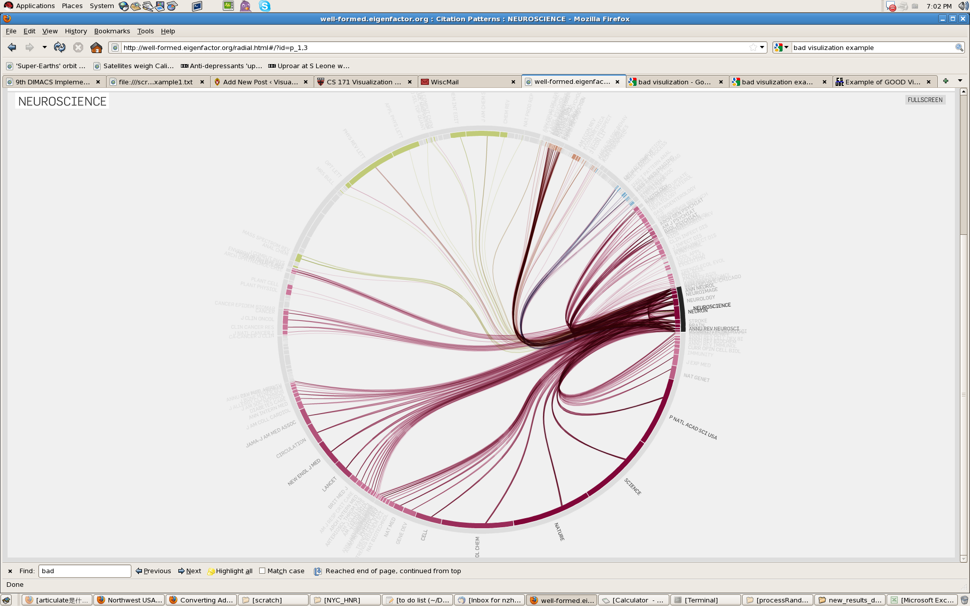
Bad

Bad visualization of 3D space

Edward J. Haug. Computer Aided Kinematics and Dynamics of Mechanical Systems. Allyn and Bacon 1989

Critique

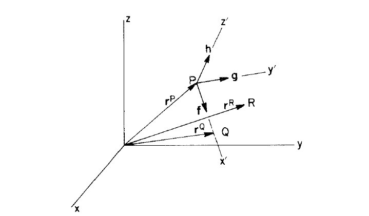
Visualizations of three dimensional spaces occur in almost every graphics and vector-math text book.  The image above is only an example of how this visualization is attempted.  The example image is attempting to show a local reference frame inside of a global reference frame and depict points in each.  This visualization method fails because often it doesn’t provide any method for determining “true” orientations.  Often these visualizations are given as an afterthought to a larger more thorough narrative, however, even with a good explanation, the visual can be misleading.  The main issues is that one entire dimension worth of data is thrown away in order to present the data in a two dimensional form.

There are a number of ambiguities including what direction is the x axis of the global reference frame pointing?  Are z’ and x’ pointing towards or away from the viewer?  Where is R?  With a little information including knowledge of left or right handed conventions, these questions are a little easier to answer however there are a number of queues that could be added to help pull useful information from the image


Bank Graph

February 10, 2010

in Critiques,Student Posts

This is a graph that compares the market values of various banks at two different times. Once in 2007, the other after the crash to show value in early January, 2009.

This graph is very misleading, shape is probably not the best method to display the data, especially when there are only two pieces of data that are being compared within one bank. If the plan is to also compare between different banks, then there should be a better ordering, possibly by original market value (represented by the blue circles) or changed market value (represented by the green circles), depending on what you wish to show or compare.

One major problem with this image is that I quantify and compare areas much more readily than I do diameter, which is how the circle sizes are determined. Especially as there is no actual diameter lines written in to compare the two. For example, Goldman Sachs, which has dropped from 100 to 35, does not immediately appear to be worth about a third of it’s original value. Looking at the graph, my first impressions is that it’s worth a much smaller fraction of the value. This is a very misleading image.