Bad example:
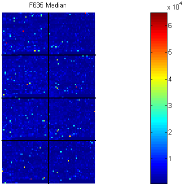
Spatial Images of Microarray Data
It takes a microarray data structure and creates a pseudocolor image of the data arranged in the same order as the spots on the array. Therefore, this plot shows the spatial distribution of the microarray.
In my opinion, this plot has drawbacks in three aspects.
First, it fails to emphasize the hot region and spots. The function of the spatial image should not be only present the microarray chip, but also point out the regions that different from its neighbors, by listing the location or intensity.
Second, it does not give the coordinate information. From the image, we can just guess the position of points of interest.
Third, it might be better that enlarge the spatial plot and make the scale bar thinner, as well as take use of the space between them.
Good example:

Heat map of Microarray Data (by NimbleGen)
Biology heat maps are typically used in molecular biology to represent the level of expression of many genes across a number of comparable samples as they are obtained from DNA microarrays
This example compares four groups. Here are some good parts in my viewpoint:
- Figure A clearly shows the relationship of the four groups, which is control, two treatments and their combination.
- Figure A gives suggestion of how to group the DNA segments (rows), which takes advantage of the good feature of heat map.
- Figure B compares the levels of different groups. It shows the trend and intensity, although the latter is hard to see.
- Figure C shows the expression levels of them. I believe if something is important but hard to be shown in the original plot, it is worthy to add another plot.