My examples are both (at least partly) concerned with where people look. First, my bad example: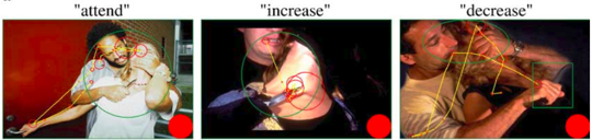
In this image, taken from a brain imaging paper, illustrates where one subject looked over time, while being shown several emotionally arousing images. The green shapes indicate “areas of interest” used in statistical analyses, the red circles show where the subject’s gaze lingered (larger circles mean a longer fixation), and the yellow line connects the red circles, roughly indicating the gaze path. The solid red circle is for calibration purposes; it is the size of a one-second gaze fixation.
Here’s a larger version of one frame: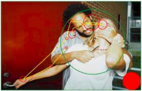
A couple of things in this figure irk me. First, two very different types of information (is this shape an area of interest or a gaze fixation?) are distinguished solely by color. In addition, while gaze position being encoded by position is completely reasonable, gaze duration is encoded by size — I suspect it’s radius, but it’s impossible to tell.
The problem with using size to encode duration is that it implies size or inclusion. All of the gaze fixation points are fundamentally the same size. A better option might be to draw each fixation the same size, and indicate duration with color intensity.
I don’t mind the yellow line particularly; however, one can’t tell either the direction of time along that line, nor relatively how far along in time any one fixation is.