With Data

These are lessons (mainly critiques and redesigns) where I provide the data so you can try to re-design things yourself.

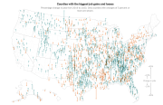
Unemployment Changes Across The Country

Unemployment Changes Across The Country

in Critiques

Core lesson: think about what a visualization makes easy to see. Different representations make some things easier, and harder. And some issues with dealing with geographic data in the US.

This comes from a New York Times story from August, 2024 The Geography of Unequal Recovery. Curiously, this page doesn’t show up well in my web browser, the images are from the mobile app (on an iPad).

Here is the “headline” (what appeared in the app “front page” that intrigued me):

Read more…