
Tutorial 1: What Is Vis
This tutorial gives you a sense of my thoughts on Visualization. I define visualization broadly and use this definition to explore the basic concepts. By defining visualization in a clear and operational manner, we can better organize our thinking about what it means to do visualization well (which is our goal), how we should go about doing it, and what we need to learn to do it.
This is the way that I like to think about visualization, and use to organize how I like to teach visualization. This is a 2026 re-write; you can see the older (pre-2026) version at Tutorial 1: What Is Visualization and How do We Do It?.
What is Visualization?
I like to start with defining Visualization. Not because it’s important to be able to identify what is and isn’t visualization, but because I think it’s good food for thought and helps organize our approach.
My definition is:
Visualization: a picture(1) that helps someone(2) do something(3).
All three of these parts (1) picture, (2) person, and (3) task are important and deserve some discussion.
Pictures and Implementations
First, there’s the picture part. Basically, a visualization is something that you look at (it is “visual”). You might argue that we should relax the “look at” and bring other senses to bear (e.g., auralization to communicate data via sounds). However, while there are similarities between vision and other senses, there are enough differences that I think it’s best to focus on visual things (things we see) for this discussion (and the class).
I am using the word picture (since that’s usually what it is) as placeholder, but it might be a moving picture (like an animation), or it might not be a picture in a traditional sense. For example:
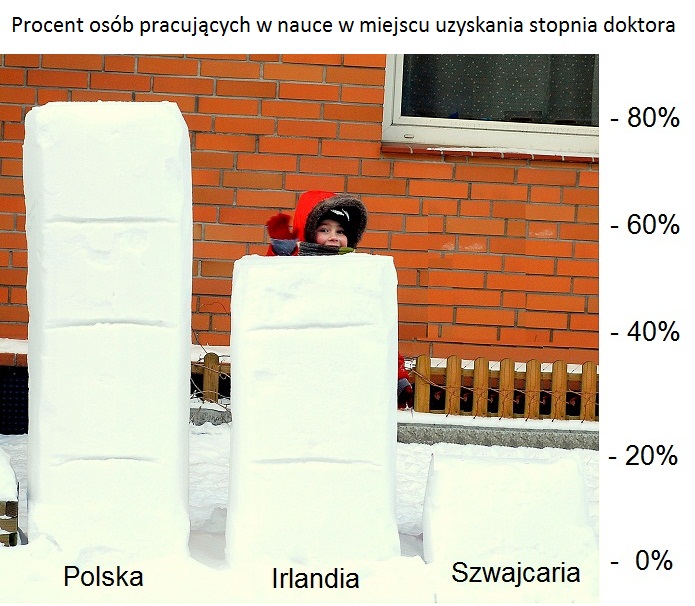
One way to implement a bar chart. from dataphys.org
A physical object that you look at can be a visualization (like the blocks of snow or the lego model in a picture below). Or a visualization could be an animation, or a sketch on the back of a napkin, or some interactive thing on a screen.
Implementations can take many forms. I’m not going to suggest you make snow sculptures (like the pictures above), but maybe prototyping with Legos (picture below) is a way to try things out. Your choice of implementation strategy is almost always dictated by practical issues (where you need to show your visualization, what tools are available, …). The appropriate tools change quickly. The principles of choosing what to make with them do not.
A side effect: I do not view implementation as central. It is not emphasized in my class, or these tutorials.
Purposes
The important part of the definition is that it helps someone do something. What makes a picture a visualization is a sense of purpose: it is intended to be used for something.
Aside: For now, I am using the concepts of “purpose” (what the visualization is meant to “do”) and “task” (a thing the viewer might want to achieve) loosely and somewhat interchangeably.
There is a very broad range of purposes. It could be anything from comparing values to catching the viewer’s attention or conveying an emotion.
Central to my definition of visualization is that it focuses on this sense of purpose - the picture is meant to do something, so we should think about what it is trying to do to make sure it really can help someone do the thing it’s meant to do.
Effectiveness: Good Visualizations
The definition doesn’t necessarily say that the visualization succeeds at helping someone do something. We can certainly have bad visualizations that don’t help. Effective visualizations (good visualizations) are pictures that really do help their intended audience achieve the purpose.
Key point: Effectiveness is relative to the purpose.
Making visualizations isn’t hard. Making good visualizations is hard.
Defining “good” visualizations is a topic unto itself. Evaluation considers how we decide if a visualization is good or not. At a high level, the definition of visualization provides an answer:
A good visualization is one that effectively serves its intended purpose (helping the audience do the thing the visualization was meant to help them do).
My goal (in this page/site/class) is to teach you how to design/create good visualizations. With the emphasis on the “good” part - making bad visualizations doesn’t have to be hard, and is probably not worth the effort.
Aside: In Munzner’s book, she defines visualization as being “designed to be effective.” In my mind, she is defining good visualizations - bad visualizations might not be effective, or might not be designed.
Here is one way to think about good visualizations:
A good visualization is a picture that makes it easy for the viewer to see the thing they need to see (in order to do the thing the visualization was meant to help them do).
This simple definition is something we will keep coming back to. The reason that we like visualizations is that pictures can make some things easy to see. The human visual system (it’s more than just saying “our eyes”) is remarkably good at looking at something and extracting some things from a picture, very quickly, and without much effort. A well-chosen picture (i.e., a well-designed visualization) can make useful things easy to see.
Thinking about “what is easy to see” is a simple operational strategy for designing and analyzing visualization. We will explore it in Tutorial 3: What is Easy to See?. Spoiler: it’s a remarkably useful and powerful tool, despite being easy.
Aside: The “what is easy to see?” works best with communicative goals. If we had another intent we might prefer visualizations with different qualities, for example if our goal was to show off our programming skill, we might prefer fancier visualizations even if they communicate poorly. Arguably, even in this case the ideas apply: a fancy visualization might let the viewer see that the developer is a good programmer, even if it doesn’t help the viewer learn anything about the data.
Our goal is effectiveness. Fanciness, clever implementation, novelty, and beauty are not the goal — but they can be in service of it. A visualization that no one engages with doesn’t help anyone, so “looks nice” isn’t decoration layered on top of effectiveness; it’s often part of it. The snow sculptures are doing real work: their novelty is what gets someone to stop and look.
Tasks as the Key
Let’s try the lesson with an example…
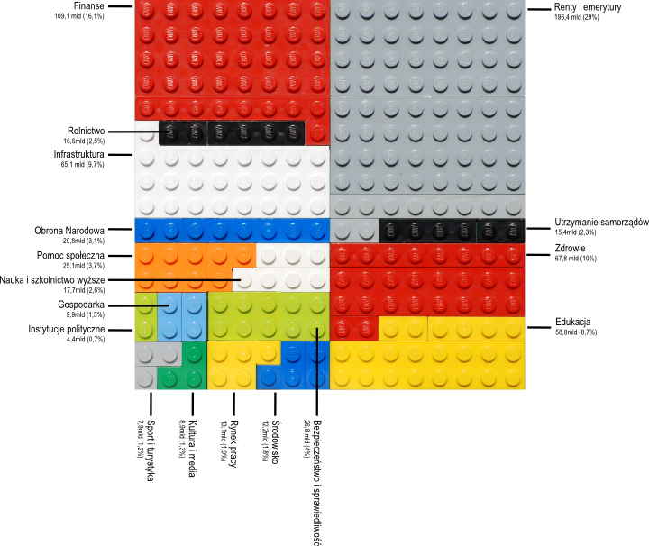
A Tree Map made of Lego from dataphys.org
I like this example because it shows that you can be creative with implementations. The visualization is a TreeMap - it is a fairly common design. The fact that it was made with Legos (rather than, say, Excel or JavaScript) is less important to how it communicates than the fact that it is a TreeMap, which enables the viewer to do certain things. For example, you can pretty quickly tell that large gray area in the upper right is a bit more than a quarter of the whole. There are other things this design is less good for. The fact that it is Legos is less important (although, it is cute).
Let me make a simpler example in English with some small fake data. I met with 7 students, some students work on robots, and some work on Vis. I put the times into Excel and made a treemap:
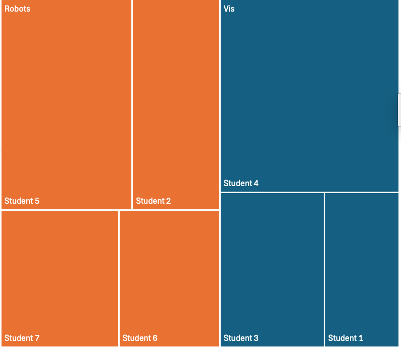
A Tree Map made from Fake Data
Again, notice there are things you can tell pretty quickly. I spend about half my time on each topic, although I spend a bit more on robots (orange) than Vis (blue). You can tell I spent about a quarter of the time with Student 4 (upper right). Some things are less easy to see quickly, such as “which student did I spend the least amount of time with”. The fact that these “tasks” are easier or harder is the nature of the design: TreeMaps are generally good for showing part/whole relationships, and less good for individual comparisons.
This point might be clearer with another chart of the same data:
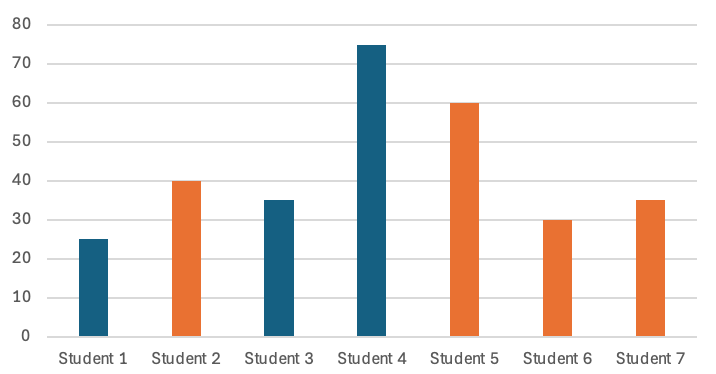
A Chart made from Fake Data
This is a very familiar chart type. You can tell very quickly that Student 1 had the least amount of time, or that Student 6 got 30 minutes. In order to see “did I spend more time with orange or blue students” or “was blue about 50%”, you would need to do some mental arithmetic.
Hopefully, I’ve convinced you that these two charts are good for different things. This is because of their design: one is designed for part/whole, the other for showing individual details. The design matters more than the implementation. Even if I made them in Legos, they would still serve the same tasks. The designs make some things easy to see (and other things less easy to see).
It is hard to say that one of these charts is better than the other. One is good for some things, the other is good for other things. If the purpose is to allow the viewer to quickly assess how much of the whole a group represents, then a TreeMap is great. If the purpose is to allow for getting specific values, then the TreeMap is not as good (for a variety of reasons we’ll learn in class). The lesson here is that task matters.
This example shows that different charts are good for different things. Often, design is a tradeoff: we need to make choices to support one task at the expense of others.
I’ll repeat this a lot: task matters. Don’t solve the wrong problem well.
Bad Visualizations
Another way to think about wanting to make good visualizations is that we want to avoid bad ones. There are a few different types of “bad” visualizations - these are things we want to avoid.
The definition of bad visualization is tricky, because there are many ways for a visualization to be bad. A few to consider…
- A bad visualization might fail to make things easy to see.
- A bad visualization might make the wrong things easy to see.
- A bad visualization might make it easy to see something that isn’t there.
Notice how this connects to task. There is something that the viewer should see (in order to achieve their task). Maybe the visualization does not make it easy to see this. Worse, it might distract you: it makes something else easy to see. And, there is the really bad case where the visualization is actively misleading: the thing that is easy to see is actually wrong.
In some cases, a visualization can actively mislead someone. More often visualizations just fail to make things easy to see.
It is tempting to list a bunch of rules that will help you avoid making a bad visualization. In most cases, you can figure out that the rule is trying to help you avoid making the wrong thing easy to see, or the right thing harder to see. But, rather than trying to learn a lot of specific rules of things to avoid (or to do), I think it’s better to try to understand the general principles of what makes things easy (or hard) to see. This is why the class will focus on principles.
How to make Visualizations: Design
Design (as a verb) is another term that is difficult to define, but worth discussing. Defining design is a whole philosophical debate – but the definition I am about to give is one I like, and will work with for the moment. The dictionary definition says something about planning how to make something. For the purposes of class / our discussion, I will define design:
Design (v): the act of making purposeful choices in the creation of something.
The idea is that what makes something design is that you actually think about the choices. You don’t just do any old thing - you actively choose. This is why I can distinguish between “bad design” (choices were made, but not well), and “not designed” (the choices weren’t thought about).
For this class or this website, the concept is that if you think about the choices you are making when creating a visualization, you will create better visualizations. But this holds true for almost anything you create. For example, if you are doing “Graphic Design” (for example, trying to make a nice looking and functional website or business card), the important thing is to consider the different choices that you are making.
Summary: Implications of the Definitions
My philosophy of how to do visualization and how to teach it is based on the broad definition: A visualization is a picture with a purpose. An effective visualization is one that is designed to achieve its goals. The goals/purpose/tasks are central. We can often use the lens of “what does the picture make easy to see?”
Tutorial 2: How to Think about Visualization: Building Blocks introduces my preferred way to think about how we design and analyze visualization: by thinking in terms of a set of building blocks. These include ways to abstract the tasks and data so we can define problems and connect them to solutions, and elements of visualizations that we can put together in principled ways to create designs. I believe that building blocks and principles are a better way to learn and practice visualization than trying to learn collections of chart types or design rules.
Tutorial 3: What is Easy to See? explores how the simple “intuition-based” notion of visualization through the question “what is easy to see?” provides a powerful tool, and a good place to get started with visualization design.