Critiques are examinations of specific visualizations. The idea of a critique is to examine something closely to learn from it (not just to criticize). The pages tagged here aren’t typical critiques - they are more “lessons built around an example.”
In many cases, I also use redesign where I try to explore alternatives as a way to learn.
Critique is a kind of snack rather than a separate part of the site: a page can be a critique and also be about encodings, or about a paper, so it’s a tag and not a section. Everything tagged here also lives in Snacks.
Learning to critique - that is, learning to learn by examining examples - is a useful skill unto itself (one we emphasize in class). There is a Tutorial on Critique that gives some basic strategies for learning to learn from examples. It suggests a stylized way to do critique (that I recommend in class). The critiques here do not follow the formula - but they all are attempts to learn lessons by looking at examples.
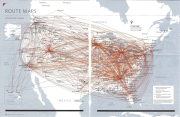
Let’s look at the “Airline Route Maps” (the ones that are in the back of an airline magazine) as a way to explore the importance of task and how understanding task and data can lead to novel designs. It will show us a different way to think about node link diagrams more generally.
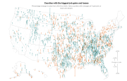
Core lesson: think about what a visualization makes easy to see. Different representations make some things easier, and harder. And be careful when dealing with geographic data in the US: populations and counties are spread unevenly.
Don’t make the wrong thing easy to see. Here’s a real example from my own work where a seemingly innocent line graph was misleading and needed some serious redesign.