I think this is an elegant way of displaying connections between a huge dataset.  To explain, this is a haplotype map that has SNPs (single nucleotide polymorphism) at the top (where it is feathered). They then study the genes of a population to determine the probability that SNPs occur together (called linkage disequilibrium. If you take two white squares at the top, and then draw lines parallel to the triangle to get an intersection, you get a square that represents that probability. A higher probability (closer to 1) is colored red. A probability that approaches random (.5) is white, with blue being slightly better than random and light red being between red and blue.

This means that triangles of mostly red, which are marked off in these plots, are those SNPs which are more likely to be passed on together during chromosome crossover. In the Caucasian sample, there are many more of these than in the Yoruba sample, which implies that any mutation that added something new to the gene pool happened more recently for Caucasians than Yoruba, as more crossovers (more generations) means less linkage disequilibrium.

These graphs are specifically of chromosome 8p23.1 and is for a 100kb region.

HapMap

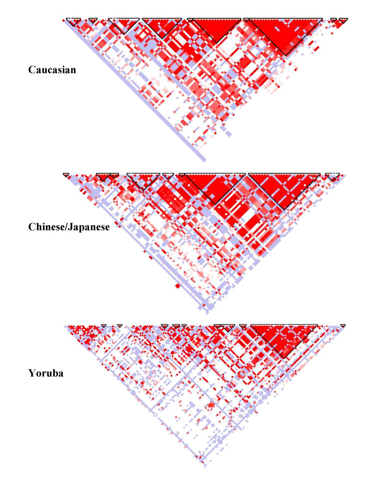
The intended audience are those with an understanding of biology and the human genome. It allows you to see, at a glance, genes or SNPs which are connected. This encodes probability to color, and uses position as a way of filling in the matrix connecting two values. The positions along the top of the triangle is mapped to position in the chromosome itself. I think it is good because you can clearly see the connections between different SNPs and regions with are likely to stick together during the recombination required to create gametes. It also is simple to glance between different HapMaps of the same chromosome in different populations and see which has had the most recent mutation (and therefore less time to be more random in the population).

The Good

February 10, 2010

in Critiques,Student Posts

The Cost of Care

http://blogs.ngm.com/blog_central/2009/12/the-cost-of-care.html

This visualization compares cost of healthcare per person to average life expectancy for various developed countries. This text is included on article linking to the actual image:

“The United States spends more on medical care per person than any country, yet life expectancy is shorter than in most other developed nations and many developing ones. Lack of health insurance is a factor in life span and contributes to an estimated 45,000 deaths a year. Why the high cost? The U.S. has a fee-for-service system—paying medical providers piecemeal for appointments, surgery, and the like. That can lead to unneeded treatment that doesn’t reliably improve a patient’s health. Says Gerard Anderson, a professor at Johns Hopkins Bloomberg School of Public Health who studies health insurance worldwide, “More care does not necessarily mean better care.”  —Michelle Andrews

This visualization encodes four dimensions of data in the following ways:

–       Cost of healthcare per person- y position

–       Average life expectancy- y position

–       Average number of doctor’s visits per person- line thickness

–       Type of coverage (universal or otherwise)- hue

What Munzner might say:

Cost and life expectancy clearly fall into the quantitative data category, and are encoded using position, the strongest visual channel for their data type. Type of coverage is categorical, and is encoded using hue, the second strongest visual channel for its data type (after position, which has already been used).  All the visual channels are seperable, and code these four dimensions without confusion. Also, cost and life expectancy are connected by lines, so their relationship is encoded using line slope. Clearly and explicitly relating this data makes the US pop out as the country with the steepest downward slope.

What Tufte might say:

First, this graphic is well documented. The creator, his position, the data source, the year the data was collected, the fact that some countries aren’t shown, and the scales for all the numeric data are all clearly written on the image. The lines connecting cost and life expectancy facilitate clear comparisons of all the data.

Edit: Here’s an interesting article where the creator justifies his design choice over a scatterplot: http://blogs.ngm.com/blog_central/2010/01/the-other-health-care-debate-lines-vs-scatterplot.html

The Bad

February 10, 2010

in Critiques,Student Posts

Trends and Technology Timeline 2010+: A roadmap for the exploration of current and future trends

http://nowandnext.com/PDF/trends_and_technology_timeline_2010.pdf

This visualization denotes current trends as well as predictions for future trends, and displays them in a way that is analogous to a subway map. This text is included on the map:

“This map is a broad representation of some of the trends and technologies currently visible. Improvement works are carried out at weekends and travellers should check to see whether lines are still operable before commencing any journeys. Helpful suggestions concerning new routes and excursions are always welcome.”

This visualization encodes five dimensions of data in the following ways:

–       “time zones”– radial distance from the center of the map, hue

–       phenomena – text labels, position on category lines, connection?

–       category of phenomena – hue

–       type of phenomena – shape, glyphs

–       global risks – bulleted list, containment?

What Munzner might say:

First of all, this “roadmap” doesn’t even use the strongest visual channel(s): absolute x and y position. Then, it uses hue to distinguish different time zones (even though this is ordered data, and saturation would be more appropriate), AND to distinguish different categories. And there are 16 different colors corresponding to different categories, even though the max amount of colors used should be eight.

What Tufte might say:

What is meant by “time zones”? The common definition of this word is very different from the definition as relates to this visualization. Also, trends appear on category lines in a particular order. Is there any logic behind this order? Does it imply causality? Finally, the extremely dense text doesn’t make very judicious use of ink.

The problem of displaying a data set that is multi-variate, time-varying, and comparative in nature is inherently very difficult. Jonathan Woodring and Han-Wei Shen at Ohio State have developed a very aesthetically pleasing method of displaying such information using three dimensional color mapping. However, their solution leaves a lot to be desired in terms of the composition of a successful visualization. While the colors do make for very visually pleasing images, the visualizations themselves are very difficult to interpret. The value of any given data point is encoded in its color and its position is representative of its relation to other data collections as defined by a set vocabulary of logical operations that the tool can visualize (over, in, out, atop, and xor). In addition to the limitation on the amount of data that is provided, the visualization provides the user with neither manner of inferring what the values encoded by the color actually represent nor a physical representation of the meaning of the positioning coordinates. Essentially, the user has no manner of extracting any data out of the visualization other than two points being different over one dimension or another. A user simply looking at the output of this visualization cannot really gain much from the end result other than a pretty picture generated from a complex data set. This visualization technique seems to have potential, but in it’s current state, it is simply not a very useful mechanism for data comparison.

Above is an image of a visualization generated by this tool representing a logical combination of data points from the Supernova Initiative Data Set. The paper and additional images can be found here.

I know most of our examples are from the digital world, but this is very cool indeed: a paper map, zoomable by virtue of clever folding:

http://www.thezoomablemap.com/

Hans Rosling’s TED presentation on international economic development issues. Pure genius of information visualisation, transforming time-series changes into a kind of sportscasting.

http://www.ted.com/talks/hans_rosling_shows_the_best_stats_you_ve_ever_seen.html

The week in 838 (Feb 9-11)

February 5, 2010

in News

For the second week in February, we’ll have a discussion of how to evaluate visualization, and do a little bit of evaluation ourselves. We’ll also start to look ahead for projects.

* Tuesday, Feb 9th – A discussion of Evaluation. There’s another hefty reading assignment: Reading 4: Evaluation, that requires you to post comments.

* Thursday, Feb 11th – We’ll discuss the critique assignment. No assigned reading, but the first phase of Assignment 4: Critiques. Be sure to do it ahead of time since we’re going to talk about it in class.

Cartograms

February 4, 2010

in Cool Stuff

Some of you might be wondering what’s going on when we bring up “Cartograms” – here is a nice example of a continuous cartogram, courtesy of Brian Yandell:

See 2008 election by state geographically or warped by population size
http://www-personal.umich.edu/~mejn/election/2008/

Mike’s notes for Tuesday, Feb 4th: 2010-02-02-whyvisnotes

Nakho’s notes for 2/4: cs_vis_03_1

Mike’s notes for Thursday, Feb 6th: 2010-02-04-ThinkDifferent

Nakho’s notes for 2/6: cs_vis_03_2

(Part 1 due by 7am, Thursday, Feb 11th – we’ll discuss the work in class)

(Part 2 due by 7am, Tuesday, Feb 16th – we’ll discuss the work in class)

In this assignment, your task is to look at a few visualizations and critique them, based on the things we’ve learned so far in class.

You will do this assignment with a partner (assigned in class, on Feb 4). If you were not assigned a partner on Feb 4, contact the instructor.

What to do:

Each person should find a visualization they think is good, and a visualization they think is bad. (each person does this, so each pair has 4 visualizations to look at – yes, you are supposed to find something good and something bad). Pick visualizations that are easily available (either on the web, or if it’s a picture, scan it).For the purposes of this exercise, static visualizations (images) are best.

Part 1 (the solo part): Each person should post their two visualizations, and their brief critique. Each person should also provide a brief critique of their partner’s selections as a comment. (so every person makes 2 postings for this part, and comments on 2 postings – with a catch described below). Try to consider as many of the issues that we have raised in class as possible – in particular, things like “does this visualization achieve its goal” (which requires you to articulate what its goal is) or “is it clear” or “does it make the task its designed to support easy” (again, which means you need to articulate its task).

If you want some ideas on how to do a critique, check out the homework assignment at Harvard. I don’t expect something as complete as the example at Berkeley, nor do I need you to explicitly consider the questions that Prof. Pfister lists in the Harvard assignment (but those are good things to consider).

Part 2 (the team part): Each pair (do this working together!): pick one of the good and one of the bad visualizations. For each one:

  • try to define the data, the mappings, and the encodings that the visualization uses. Think over where these choices came from – are they good choices (informed by perception or …) or just doing the obvious, or following a convention, or …
  • think up a few different mappings and encodings of the data (each will lead to a visualization). create rough sketches of what they might look like (either on the computer, or pencil and paper). if you do things on paper, try to scan it – or at least bring it to class. The goal here is really to consider the space of mappings and encodings to get an intuition for the range of what’s possible.
  • compare your mappings to the original – you might make things worse, but try to explain why.

Write up each analysis / redesign as a seperate posting. (note: this is seperate from the critique in part 1).

This assignment will undoubtedly stress the WordPress infrastructure we’re using for the class.

For this assignment:

  • Your visualizations and initial critiques must be created as postings to the “Student Posts” category (and maybe a subcategory, but we haven’t worked out that detail yet). Be sure to make that posting before 7am on the 11th. Please put a link to the visualization (or better: a small picture and a link) in the posting.
  • Your second critique cannot be done until your partner does #1 (and we “approve it” so it appears) – since you will add it as a comment to the other’s post. So, it should be done as soon as possible, but certainly no later than Tuesday, 2/16.
  • Your analyses should be created as postings (again, preferably with links to the original visualization) in the “Student Posts” category, before 7am, on Tuesday 2/16.

The goal here is to gain some practice with thinking critically about visualizations, and to think about what can be possible in creating mappings and encodings. After we learn more about perception, we’ll (hopefully) be able to have more “scientific” ways to choose among possible encodings.