Good
 from Time magazine February, 1, 2010 Vol 175 No 4.
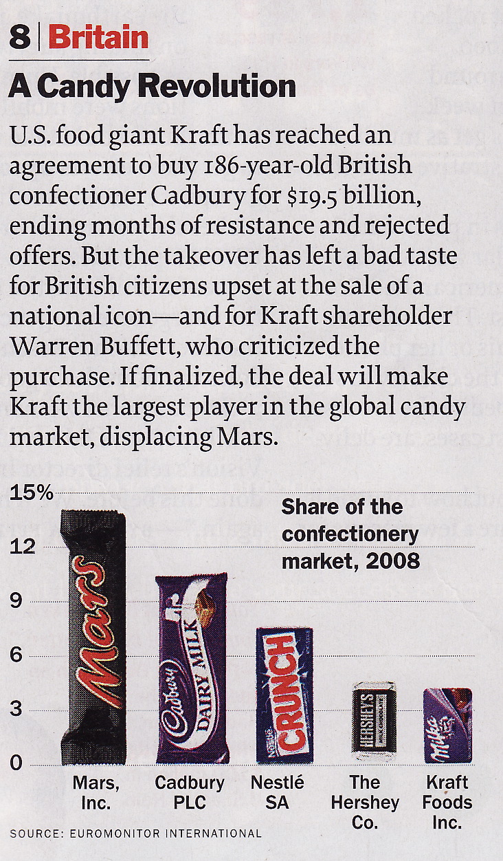
I like it used real product images in the plot. It attracts more attention than using a bar with the company name below it. It also lets us to know which company makes which product. But, this visualization can be improved to show that the merge of Cadbury and Kraft will have more market sharing than Mars has. Yes, this is a big problem because that point is what the writer wants to tell. But, somehow I liked the use of real product image a lot. Maybe, as a consumer, I interpret the article with the help of plot as a company selling milka buys a company selling dairy milk and will be bigger than a company selling Mars, instead Kraft buys Cadbury and it will be bigger than Mars Inc. But, for the investors, the company names would matter more than the product names. If I make an improvement to the plot, I would do it by putting Kraft image in a dotted rectangular above Cadbury image and putting an arrow between Kraft image on the fifth column and Kraft image in the dotted rectangular. This would make the height of Cadbury + Kraft will be higher than Mars.
Bad
 from Time magazine February, 1, 2010 Vol 175 No 4.
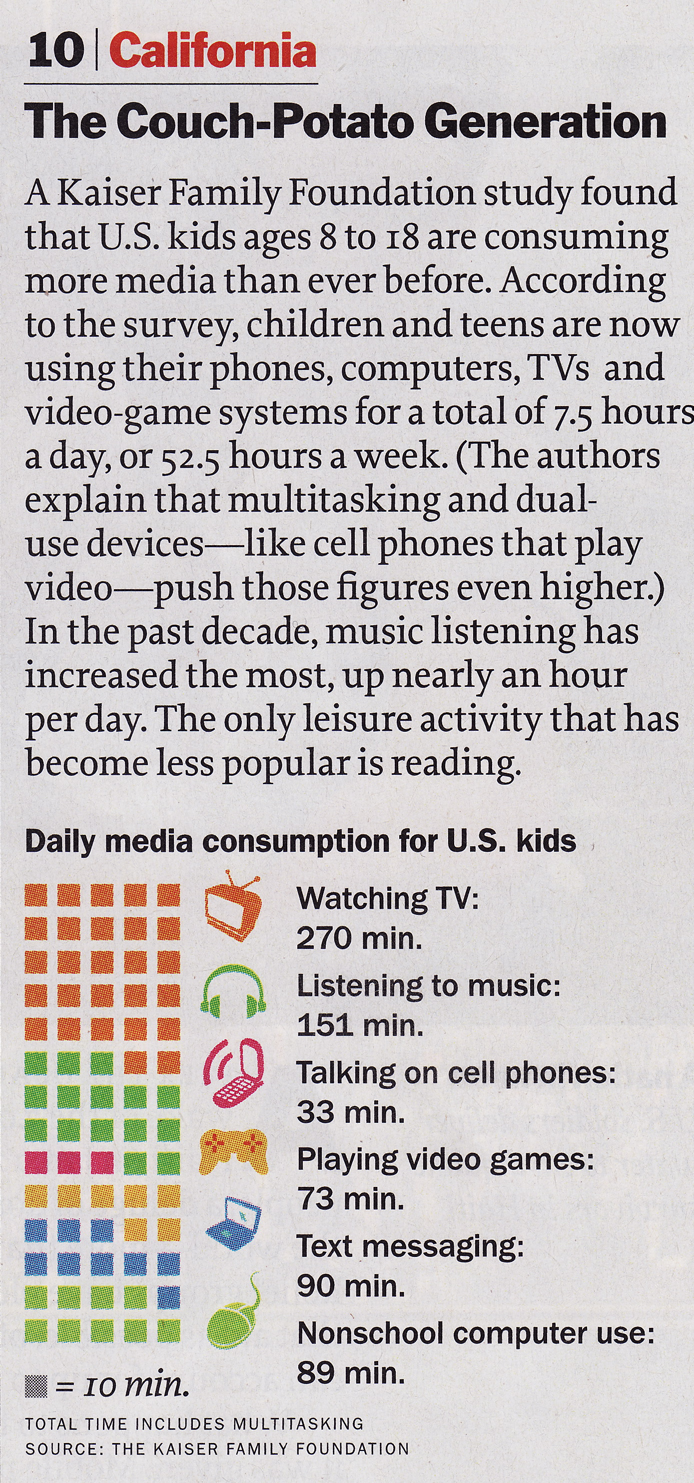
Bad aspects of this visualization are like these.
- It will be better if the proxies are ordered in decreasing minutes.
- Proxy for text messaging is awkward.
- The above paragraph compares the present media consumption to the past media consumption. So, it should have the past media consumption visualization parallel to the current.
- Where is reading activity? Maybe reading is not included in media activities but in leisure.
But, there are some good aspects to this visualization, too.
- Showing the time as blocks gives us the idea the proportion of each activity in the overall media consumption easily.
- Even though the proxy of messaging is awkward, other proxies with the same color encoding in blocks are good and the use of proxies gives us instant concepts.
- Putting the actual minutes is good even though it is a little redundant with block counts. The reason is that the user does not have to count the number of blocks when the user want to compare his/her media consumption with the average, which I did.
I chose this visualization as bad because the third bad aspect is about what the writer wants to tell, I guess, and the first bad aspect can be fixed easily and bothers me a lot.