We’re getting to the end of the design challenge, and will look forward to other things!
- For Tuesday (3/16) – we’ll talk more about Color. Remember to do the reading/commenting!
- For Thursday (3/18) – the final design challenge handins are due. We’ll talk about visual comparisons some more, and about projects.
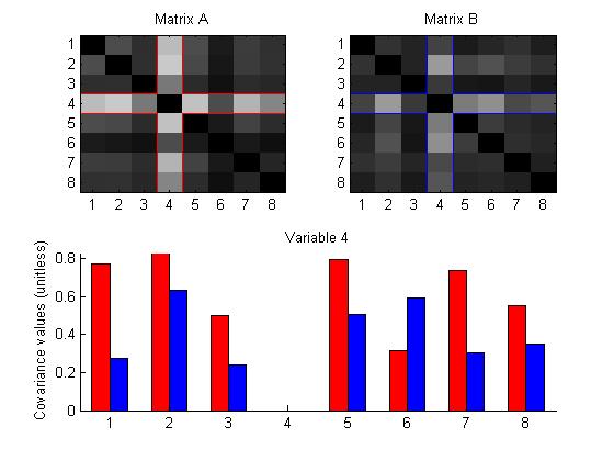
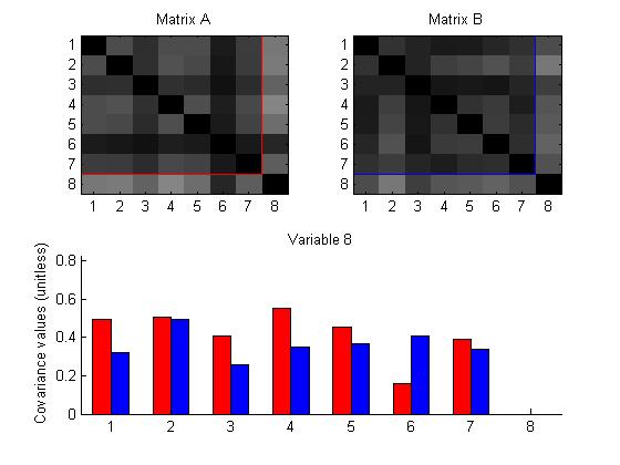
Comparing two matrices
Group: Leslie, Adrian, Jeremy
This design displays two matrices and offers a side-by-side comparison, mapping the value of the entries to color intensity.
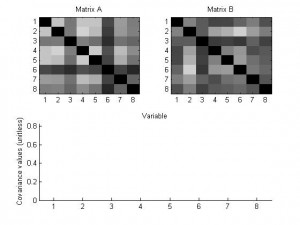
Furthermore, choosing a diagonal entry will highlight the row and column containing that entry in each matrix, and display a bar graph comparing the values of the entries.


(readings for class Tuesday, 3/23)
Everyone must read:
- Colin Ware, “Quantitative Texton Sequences for Legible Bivariate Maps,” IEEE Transactions on Visualization and Computer Graphics, vol. 15, no. 6, pp. 1523-1530, Nov./Dec. 2009, doi:10.1109/TVCG.2009.175 (ieee page)
Each person will be assigned to read one of the following (you may read more than one). Your initials will be at the end of the citation.
- Rheingans, P. Task-based Color Scale Design In Proceedings Applied Image and Pattern Recognition (SPIE), 1999 (citeseer – has PDF) (DH,SH,PK)
- Bruce E. Trumbo. A Theory for Coloring Bivariate Statistical Maps. The American Statistician, Vol. 35, No. 4 (Nov., 1981), pp. 220-226 (web version) (JH,FK,LW)
- James R. Miller, “Attribute Blocks: Visualizing Multiple Continuously Defined Attributes,” IEEE Computer Graphics and Applications, vol. 27, no. 3, pp. 57-69, May/June 2007, doi:10.1109/MCG.2007.54 (ieee page) (CH,NK,JYM)
- Daniel A. Keim, “Designing Pixel-Oriented Visualization Techniques: Theory and Applications,” IEEE Transactions on Visualization and Computer Graphics, vol. 6, no. 1, pp. 59-78, Jan.-Mar. 2000, doi:10.1109/2945.841121 (ieee page) (author’s page) (ET,CSV,JW,YL)
- Haleh Hagh-Shenas, Sunghee Kim, Victoria Interrante, Christopher Healey, “Weaving Versus Blending: a quantitative assessment of the information carrying capacities of two alternative methods for conveying multivariate data with color.,” IEEE Transactions on Visualization and Computer Graphics, pp. 1270-1277, November/December, 2007. (ieee page) (healy’s version) (DA,AM,NV)
Please post a comment on what you read, and what you learn from putting the two together.
This week in 838 we’ll wrap up the Design Challenge (remember the final writeups) as we start talking about color.
- Tuesday (3/9) – Color – be sure to do the reading (and post a comment). A lot of this might be a review of the stuff you might have learned about color in an intro graphics class like CS559.
- Thursday (3/11) – Comparative Visualization – we’ll discuss how we use visualizations to make comparisons amongst complex things. I might use this as a chance to present some of my ideas on the “science of comparison” (although they are somewhat unformed), we might use the time to talk about the design challenge (since everyone should have commented on everyone else’s design). Or we might use it as a chance to plan for the rest of the semester.
The Design Challenge “Preview Presentations” worked out well. It was nice to see the range of solutions that people came up with. But, its not over yet.
First: not all the designs demonstrated appear on the web. Be sure to get your design on the web as a posting in the “DC Results” Category ASAP. This is important for the next phases.
While the original deadline for the “final handin” was 3/11, we’ll extend that a little since I haven’t told you what you were supposed to do. But there will be something due before class on the 11th, and you’ll probably want to get started on the final writeup. (because there will be reading assignments for the following week)
For Thursday, March 11th (due before 8am so I can look things over before class): Each person should comment on everyone else’s design. The TA will count up how many comments on designs each person makes (yes, we do keep score!). This is important since people will need the feedback.
For Thursday, March 18th (due before 8am): Each group needs to turn in their final “product.” This should include any runnable demos and/or videos (arrange with the TA if you can’t upload things to the course web), as well as a document as described below. (it’s probably best if you prepare the document as a PDF, and make a posting to the Wiki with an attachment. if you can’t post PDF attachments, send it via email to the TA).
Your document should:
- Describe the visualizations that your group created (in sufficient detail that someone can understand them). Include the technical/implementation details, as well as the ideas of the design.
- Discuss the feedback that you received, and how you used it (or would use it) to improve the quality of the visualizations.
- Discuss the problems that your visualization addresses (what kinds of things can you see with it).
- Discuss the strengths and weaknesses of your methods.
- Discuss how the design principles (that we have discussed in class) influence your methods.
- Describe the process that you used to develop your solutions. How did your group work together? How did you generate ideas? How did you test them?
Also, for class on 3/18: we would like you to do a little evaluation about the class. Please print it on a piece of paper without your name (so we can keep it anonymous). In class, give it to the TA who will note that you’ve turned it in (we want to make sure everyone turns in something, but we want it to be anonymous). Please answer the following questions:
- What was your overall opinion of the design challenge project?
- What could we have done to make it better?
- What should we not change if we do something like this again in the future?
- What do you think about the class in general?
- What could we do to make the second half of the semester better than the first?
- What should we not change?
- Which topic (so far) did you find most interesting?
- Which topic (so far) did you find least interesting?
- Any other comments about the class are most welcomed.
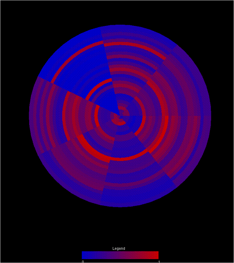
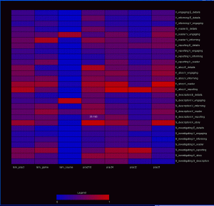
Group: Nate, Chris, Danielle
Two other visualizations that we’ve composed to address this problem use a color encoding to demonstrate the changes in data across different frameworks. Both visualizations utilize a red-blue color ramp encoding the normalized value of the data point. All data elements are pulled from the upper triangle of the matrix, so no redundant information is encoded in the view.
The first is a wheel with each wedge representing an individual matrix in the graph. Each of the rings then represents a single category pairing in the matrix. As a result, comparing the colors around a ring reveals trends in that pairing between the matricies. Comparing colors between rings reveals the relationship between the variable sets. Finally, comparing wedges reveals the similarity between matricies. Eventually, mouse overs should be integrated to give more information about any particular circle segment.

A second visualization, drawing from heat map principles, maps each matrix to a position along the x-axis. A particular pairing is then mapped to the y-axis. Mouseing over a box reveals the raw value represented by that individual data point. In this view, skimming across a row reveals relationships between variables across the matricies. Comparing boxes in the columns demonstrates the patterns within a matrix. Comparing rows represents comparisons between variable pairings. Comparing columns allows the user to compare different matricies.
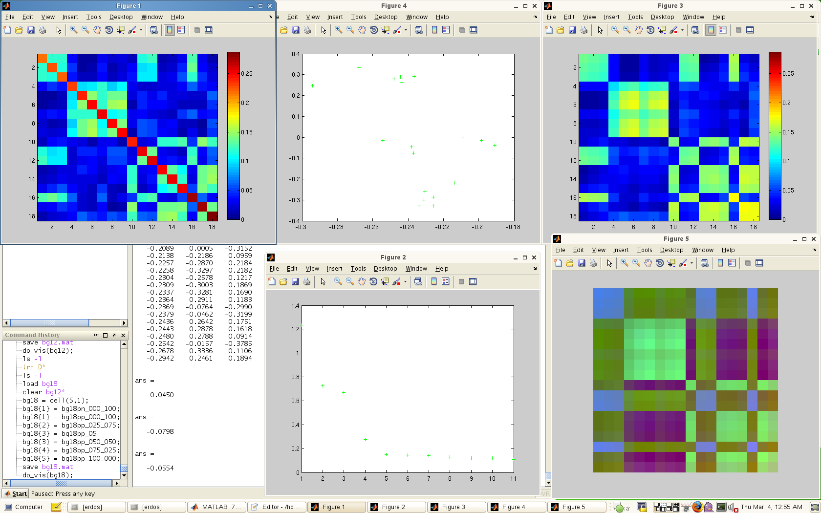
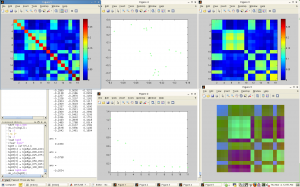
The third visualization is a kind of console for viewing the eigen-spectrum / PCA properties of the data. This console consists of 5 windows:
– The original data matrix
– The spectrum of eigenvalues
-The original matrix recomposed from the top 3 eigenvectors
-The PCA view of the matrix in 2D
-The first 3 eigenvectors mapped independently to the RGB channels.
A screen capture is shown below.
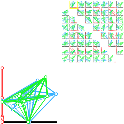
Team of Jeremy, Adrian and Leslie
A scatter plot matrix of pairwise projections.
This demo is online, and can be viewed here.
This prototype explores the idea of showing every possible axis aligned 2D projection. The weight between the nodes indicates the strength of the paring. In a given scatter plot, the position of the nodes is calculated by using the current two axis as to perform a lower dimensional projection. This allows us to see a difference in shape between each of the frameworks from several different “meaningful” views.
The Group: Danielle, Chris, and Nate.
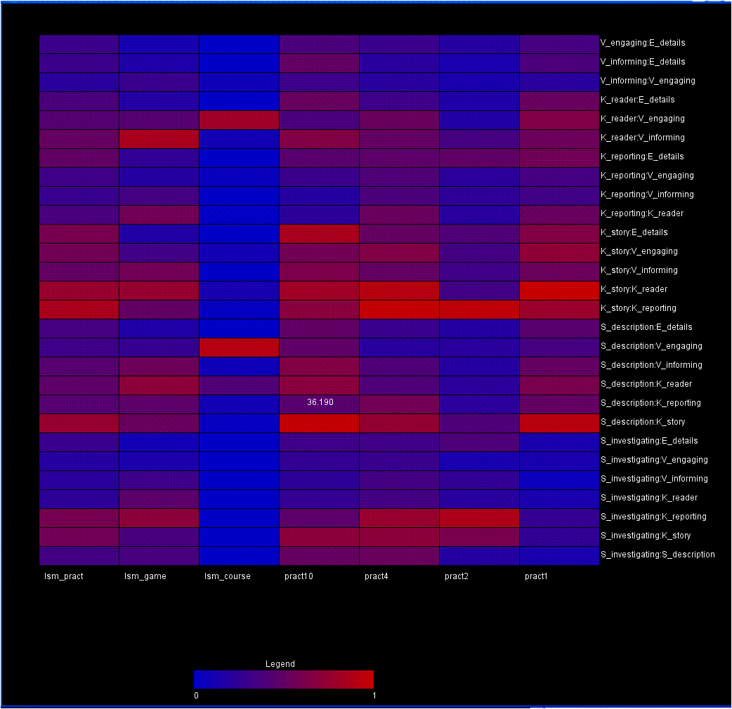
Here’s one of our sample designs — this shows a difference between two of the practicum datasets:
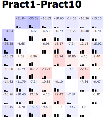
The pattern of this design is generally to show the data in a matrix layout. At the top of every cell, there’s the value of some comparison metric. At the bottom of the cell, the raw data (or something roughly equivalent) is shown — albeit in a low-res format. In this example, color redundantly encodes the main metric in a heatmap; with more complex comparison metrics, that need not be the case. Additionally, when the comparison metric has some sense of whether this comparison passed some statistical threshold, it can only color those cells that do.
Mouseover (or some other cell selection mechanism) can display additional information about the comparison in question — data values, diagnostic information on the residuals, and such.