Group members: Nate Vack and Adrian Mayorga

For the good redesign we chose the Depth-Dependent Halos that I posted.

The mappings are:

Data

  • A set of 3 dimensional poly-lines

Mapping

  • Poly-lines are bundled together
  • A camera view is chosen and a 2-d projection is performed. Depth information is also calculated

Encoding

  • The bundles are drawn directly from the projection
  • Discontinuities in depth are encoded by white lines (halos) that surround the  bundles. Larger discontinuities yield larger halos.

Besides the halos, all of their mappings are pretty much the obvious ones, just a simple 3d to 2d projection. The halos intuitively encode differences in depth, almost in a sense hacking the perceptual system to convey 3d structure in a 2d image. Also, because they do not perform needless abstraction of the data, the context of the lines is not lost.

We have come up with the following alternates:

If annotations that label particular regions of the data are available, we could represent the connectivity explicitly with a node graph. Alternatively, if annotations are not available, more aggressive bundling can be performed.

graph

The same data can also be shown in a symmetric matrix

mat

The bundles can also be drawn as ribbons or arrows. While this removes the visual context, connectivity is more explicitly conveyed

ribbons

We can also change the way that depth is being encoded. If we instead use intensity, then closer areas would appear brighter, while the far away things would fade into the dark background, or vice-versa. With this mapping we lose the sharp delineation between relative depth discontinuities but it gives more information about absolute depths.

gray

The Design Challenge

February 15, 2010

in Assignments

due dates: (see the rules)

  • initial solutions and class presentations – March 4th
  • final solutions and writeups – March 11th

The Design Challenge

The topic of this challenge is to create visualizations to help our colleagues in Educational Psychology interpret their Epistemic Frame Network data. Specifically, you need to address the problem of comparing two Frame Networks.

A detailed explanation of the data (and the problems the domain experts hope to solve) will be given in class on Thursday, February 18th.

This is a challenging problem for which we really don’t have a good solution yet. Our hope is that by having the class generate new ideas, we can find a bunch of new designs that may help them in both interpreting and presenting their data. Even though they have limited data right now, they are in the process of developing new tools that will generate a lot more data, so having good tools will be increasingly important. For your testing, we will also provide synthetic data.

The data is different than other data types seen in visualization. At first, it seems like lots of other network data. But these networks are small, dense, and weighted. Its not clear that standard network visualization methods apply. (and we haven’t discussed them in class yet)

The Data

(more details will be given in class on Thursday, February 18th)

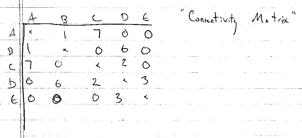
An Epistemic Frame Network consists of a set of concepts. The size of the network (the number of concepts) we’ll denote as n. For small networks, n might be a handfull (5 or 6), large networks are unlikely to be bigger than a few dozen (20-30). Most networks we’ll look at are in the 6-20 range. Each concept has a name which has meaning to the domain scientist. (see the information from the domain scientist to really understand what the data means)

The data for the network is a set of association strengths. Between each pair of concepts, there is a strength that corresponds to how often the two concepts occur together. If the association strength is zero, the two concepts never occur together. If the number is bigger, the concepts appear together more often. The actual magnitude of the numbers has little meaning, but the proportions do. So if I say the association between A and B is .5, you don’t know if that’s a lot or a little. But if the association between A and B is .5 and between A and C is .25, you know that A is twice as strongly associated with B than C. The associations are symmetric, but they don’t satisfy the triangle inequality (knowing AB and AC tells you nothing about BC).

The numbers for a network are often written in matrix form. The matrix is symmetric. The diagonal elements (the association between a concept and itself) is not well defined – some of the data just puts zeros along the diagonal. So the matrix:

0 .5 .25
.5 0 .75
.25 .75 0

Is a 3 concept network, where the association between node A and B is .5, between A and C is .25, and between B and C is .75.

A more detailed explanation of what the data means may be provided by the domain experts. But you can think of association strength as “how closely related are the two concepts” (stronger is more closely related).

As an analogous problem, you can think of the network as a social network. The concepts are people, and the associations are how well they know each other, or how much time they talk to each other. A description of this problem (as well as this visualization problem) is provided on the SCCP page (single conversation cocktail party). (in the terminology of SCCP, what we get is the “interaction matrix”, not the “measurement matrix”).

As a practical issue, the data will be provided as “csv” (comma seperated value) files containing symmetric matrices. The matrices are small enough that the redundancy isn’t a big deal. The will usually be an associated text file with the names of the concepts. If the names aren’t provided, you can just refer to the concepts by letter (A,B,C, …). In fact, you might want to refer to them that way no matter what.

The Problem

The domain experts will explain what they want to do in interpreting the data. But the real problems are generally comparative: given 2 or 3 (or maybe more) networks, how do we understand the similarities and differences.

When comparing networks, you can assume they have the same concepts in the same order. In the event that one matrix is bigger than the other, you can simply pad the smaller ones with extra rows and columns of zeros.

Keep in mind that the data is noisy, has uncertainty, and some ambiguity (since the magnitudes don’t have meaning). What matters are the proportions between different observations. In fact, different matrices might be scaled differently. This matrix here:

0 2 1
2 0 3
1 3 0

is equivalent to the one above in the previous section.

It might be easier for you to think about the problem in terms of the cocktail party. In fact, we’ll provide you with a pile of example data from our cocktail party simulator. (we have limited real example data).

The Solution

First, I don’t think there is “THE” solution. There are probably lots of good ways to look at this data. Some good for some types of understanding, others good for other types.

How often have I said to you that when you have eliminated the impossible, whatever remains, however improbable, must be the truth? (Sherlock Holmes)

I told David (the domain expert) that the way I was going to find one good visualization was to generate 50 bad ones first. You can see a number of my attempts on the SCCP page. We will provide you with the sample code for all of these (except for the graph visualization solutions, which use a program I downloaded called “graphvis”). Our domain experts have also generated a few visualization ideas that they will show to you on February 18th.

Well, hopefully, we won’t need to generate 50 ideas. We’ll learn from the initial attempts and get to good answers quickly.

Your team will be expected to generate at least 1 (preferably several) possible solutions. Ideally, you will implement them as a tool that can read in matrices of various sizes so that we can try it out. However, if you prefer to prototype your visualization by drawing it by hand, that’s OK – please use one of the “real” example data sets though.

There is a need for a variety of solution types:

  • static pictures (for putting into print publications) as well as interactive things
  • tools for exploring data sets (to understand the differences between a set of networks), as well as tools for communicating these findings to others (where the user understands the differences)

It is difficult to evaluate a solution without really understanding the domain. That’s part of the challenge. You will have access to the domain experts to ask them questions. You can also think about things in terms of the SCCP domain (for which you are as expert as anyone).

The Challenge

The class will be divided into teams of 3 (approximately, since we have 16 people). We will try to assign teams to provide a diverse set of talents to each team. Hopefully, each team will have at least one person with good implementation skills for building interactive prototypes.

You will be able to ask questions of the domain experts in class on February 18th. If you want to ask them questions after that, send email to me (Mike Gleicher). I will pass the question along, and give the response back to the entire class (watch the comments on this posting). 

Please do not contact the domain experts directly.This is partially to limit their burden, but also for fairness (some groups may have more access to them).

On March 4th, we’ll use the class period for each group to present their solutions to the domain experts and to discuss our progress. Groups will then get another week to write up their solutions. We’ll provide more details as time gets closer.

What to Create

Each time should create at least one (preferably more) visualization techniques for the ENF data.

You can devise tools for understanding a single network, but you must address the problem of comparing 2 networks. Its even better if you can come up with solutions for handing 3 or more networks. (but showing that you have a solution for the 2-way comparison is a minimum requirement)

Your approach should scale to networks with 20+ nodes in it.

It is best if you implement your proposed techniques so that they can load in data files. However, if you want to “prototype” manually (either drawing it by hand, or manually creating specific visualizations from some of the example data sets), that’s OK. You might want to do a simple prototype first, and then polish and generalize an implementation after.

For the demos (March 4th) you will be able to choose the data sets to show off your methods. For the final handins, we would prefer to be able to try out your techniques on “live” data. Ideally, we will give the tools you build to the domain experts and let them use them.

Designing tools that are interactive is great. For the demo, only you need to be able to use your tool (you will give the demo), but for the final handin, you will be expected to document what you’ve created.

I am aware that we haven’t discussed interaction (or network visualization) in class yet – this might be a good thing since I don’t want to cloud your judgment and have you just apply old ideas. Be creative!

Resources

Be sure to watch this page (and the comments on it) for updates and changes and more details.

Critique-II: Good One

February 15, 2010

in Student Posts

Group Members:

Jee Young Moon and Chaman Singh Verma

Source : 2nd Visualization: Big Bang

http://graphics.cs.wisc.edu/Courses/Visualization10/archives/602-assignment-iv-visualization-critique

( Acknowledgment) Images are taken from Google site.

**********************************************************************

Introduction:

We like this visualization because its contents carry  lots of information in space efficient manner.  With an effective integration of colors, words, and geometry make this visualization to describe a story around it and it supports Tufte’s argument that visualization must augment rational thinking.

1. Problem Definition:

In cosmology, there are many great experimental and theoretical results to substantiate the facts that Universe is expanding with the Big Bang. The problem is to show pictorially the entire knowledge to explain this natural phenomenon.

Source of this Visualization:

**************************

Scientific American Magazine ( Issue # is not known, circa 2004)

Targeted Audience :

*******************

General public who is interested in science but with probably less formal education the field of  cosmology.

2. Abstraction

  1. Time:    Universe is continuously expanding with time.
  2. Location:    Galaxies are running away from each other in higher dimension but for human understanding we can assume it to be in three dimensions.
  3. Geometrical  Shape :    Assuming the universe is expanding as balloon shape with time.
  4. Empty Space:      Dark energy is pervading in the universe,

3. Mapping and Encoding:

  1. Time is shown in the Z-Axis in increasing order.
  2. At any given instance of time, XY plane show the locations of  galaxies and starts.
  3. Dark energy is shown with the black color and different galaxies are  shown with different colors depending on their age.
  4. Expansion is shown in the shape of a balloon by bounding curves.
  5. Ever expanding nature is shown by the arrows in the picture.
  6. Text as additional information. It also shows composition of the universe in a separate pie chart and experimental measurements to support universe expansion.
  7. Translucent color in balloon shape is used to show the past universe.  An vivid 5 billion ago universe in the visualization exemplify this effectively.

4.  Other choices:

  1. This visualization doesn’t show or reveal the information that galaxies are running away from each other or stars are born and die. There is no mapping  between the two instances of galaxies positions.
  2. Instead of showing expansion of universe as in the open-ended cone shaped balloon, this visualization were more effective if we had chosen closed shaped balloon or sphere.

5. Comparison with our mapping


We believe that mapping a 3-dimensional phenomenon into 2-dimensional paper/screen is difficult, therefore the present visualization is probably better than ours. Since they dissect it by time, they effectively show 3-dimension.

Critique-II: Bad One

February 15, 2010

in Student Posts

Group members :  Jee Young Moon and Chaman Singh Verma

Selection :  California, Couch Patoto Generation

URL:  http://graphics.cs.wisc.edu/Courses/Visualization10/archives/564-good-and-bad-visualizations/comment-page-1#comment-132

Introduction:

This visualization shows a social phenomenon published in Time magazine. The shape, color and words have been ineffectively used to make this visualization fail in its purpose to convey the meaning and therefore, in our opinion,  this is a good example of “Bad Visualization”.

1. Problem:

The presenters want to show a trend among media consuming kids over a period of time.

2. Abstraction:

  1. Time and Activity : How kids spend their time in a day in media consumption ?

3. Encoding and Mapping

  1. Each activity is shown by three methods (1) Text (2) Glyphs and (3) boxes.
  2. Spend time for each activity is proportional to the number of  boxes.  The actual time is shown in the text.
  3. Clustering:   Boxes of each activities are clustered.
  4. Each box represent a duration of 10 minutes.

4. Some shortcomings in this visualization.

  1. No comparision : The problem contents says that kids are consuming more media than ever before, but nothing in this visualization compare the data with some earlier known data.
  2. Unordered boxes: Boxes are unsorted that makes visualization tough to understand.
  3. No Overlapping: Kids overlap many activities ( Watching TV and listening music ) but nothing in the presentation shows that overlapping.
  4. Non-Demarcated Boxes: For a beginner, the placement of box is quite puzzling.  for example, it is not clear where does the activity of watching TV starts and stops.  This ambiguity is contrary to the first principle of “visualization”.

5.  Proposed new encoding:

Advantages of this presentation over the original one.

  1. Comparison with the past is shown for each activity.
  2. Alonng the X-Axis data is sorted so we can immediately know where maximum or minimum time is spend.
  3. It is more intuitive and well known technique. As per Tufte argument, it is more acceptable because this pattern of presentation is well known.

The Good
Our good visualization can be found here:

http://www.mint.com/blog/wp-content/uploads/2009/11/MINT-TAXES-R4.png

Data/Mapping/Encoding

There are a large amount of data in this chart including percent taxable income, relative tax bracket size, and amount of total income tax paid.  The chart also links each tax bracket with the total income tax paid.  Each tax bracket is quantified as a percentage of the total population and encoded using the position in the chart, the height of the tax bracket block, and a shade of green.  Higher tax brackets are higher on the chart and thinner because they represent less of the population and are shaded darker.  Percent taxable income is shown by the percentage of the tax bracket that is shaded with hash marks.  These are always black and show the actual value.  The percent of total income tax paid by each bracket is shown in a pie chart using area/angle to split the total area.  Each percentage is shaded a darker shade of red as the tax bracket increases.  Connections between the tax bracket and total income tax paid are made using non-intersecting lines from the table to the pie chart.

For the most part, these are all good choices based on perception principles.  The tax brackets are ordered data encoded with position from the bottom in the left chart.  The relative size of each bracket is encoded using the height (length) of the block in the table.   The hash shading used to show percent taxable income is encoded as length along the horizontal which gives the viewer a good idea of the relative amounts that each bracket is taxed.  The pie chart is similar to the chart except that it uses area/angle, which are still good for quantitative data.

Here is the updated visualization:

Redone tax visualization

New Mapping

It was difficult to develop a better visualization however there were a few things that we wanted to fix.  First, we felt that the pie chart added just a little to much clutter to the image.  We determined that encoding the percent income tax paid using length instead of angle would be more consistent with the chart to the left.  This also removes clutter due to the connections made from the left table to the right table.

The second fix was to the color of the hash marks used in the upper tax brackets.  We observed that as the green became darker, the hash marks were less visible.  Our solution was to make the has marks white at the top of the chart.  This makes it much easier to compare upper values with lower values.

The final fix was to place a glyph next to the hash mark key.  While there is a note that explains what the has marks mean, on a quick viewing, the viewer might mistake the shaded region as taxable income instead of non-taxable income.  This was a mistake that I made on my first review.  Our glyph is the word tax with a red cross through it.  This should make clear to any viewer that the shaded regions are not taxable.

Did we make things better?

This was a good visualization to begin with.  We do believe that we where able to improve on it in minor ways.  We believe that switching from angle to length for the pie chart was very important to helping the viewer connect the two charts.  We also believe that changing the shading to a lighter color at the top of the left table was the only way to make the upper brackets readable.

The Bad

Our bad visualization can be found here:

http://emerge.softwarestudies.com/projects/ArtDiaspora.viz/kwangju-1degree-2.png

Data/Mapping/Encoding

The data in this visualization consists of seven categories and associations between each.  The categories are, Artist, Work, Form, Place of Creation, Date of Work, Place of Birth, and Date of Birth.  The associations are Artist to Work, Artist to Place of Birth and Date of Birth, and Work to form, Place of Creation, and Date of work.  Each category is mapped to a list and encoded using color and angle around a circle.  Each item in each category is also encoded using position in a list under the category and the categories color.  Each item also has a small image but that helps very little.  Associations are mapped to connections which are encoded as colored lines connecting two items on the perimiter of the circle.

This visualization was made as a show piece and may have been much more readable at a larger scale, however, on a computer screen it is simply impossible to trace any of the connections due to the large number of intersections.  As an aside, the creator made the mistake of connecting the title category to every item under that category,  this single attribute causes a majority of the clutter.

The main issue is that the visualization does not show the diaspora process of artists creating their work in different countries.

Here is our first attempt at a new visualization:

Updated Diaspora Vis

New Mapping

The first problem is to demonstrate the process of diaspora which is the process of artists moving from their native country and working in a different country.  Our sub goal is also to show all of the different association between the artists and their work.

For the first attempt, we mapped the percentage of artists working in other countries to a number (y axis) and encoded it as a percentage of a bar at a given time.  We mapped time to a number (x axis) and we show the percentages ate each time using the length of a bar and color to differentiate artists performing work in their home country from other countries.  Two charts are created to show both the date of creation of the painting and the date of birth of the artist.  This will help to identify generational trends.

In order to keep as many of the associations as possible, we include other data as comments in each bar.  Each comment pertains to the year that it occurs on and helps to show the data that was presented in the original chart.

This was created using a smaller, fabricated data set and was produced using Illustrator.

Did we make things better?

We believe that we did make things better.  The process of diaspora can clearly be seen by the rising percentages over time signifying that artists are leaving their country.  Associations are slightly harder to trace, however they were impossible to trace in the original so this is an improvement.

Here is our second attempt:

Diaspora second attempt

New Mapping

Again, the problem is to show the diaspora process while maintaining as many associations as possible.

We abstracted the Date of Birth and Date of Creation into just a date concept which is encoded as position along the x axis.  The Place of Creation and Place of Birth are combined into one concept that is encoded as position along the y axis.  These were chosen because diaspora’s main concept is changing regions over time.  The painter is encoded using his birth date and country to place him on the chart.  Painters are encoded using the color yellow.  Paintings are encoded using the date of creation and country of creation to place each on the chart.  Each painting also displays its form to help with association.  Painters are associate to their paintings using a personal timeline that is color coded for each painter.

This was implemented in C++ using the QT libraries to create the graphics.  Again, a fabricated data set was created to show example output at a reasonable scale.

Did we make things better?

We believe that this is also an improvement over the original.  Visualizing the process of dispora is accomplished by the deviation of each painting form the line that the original painter falls on.  Association can easily be made between work and painter and all other information by simply reading the country and date from the chart.

thist is a

The chart above was found at the website cited above and a large version can be found by going there.  This visualization falls on the InfoVis/Present side of the two perspectives covered in class and attempts to show the relation ship between income and income tax payed by different brackets of the population.  The chart would be of interest to any member of the united states curious about who pays what percent of income tax. The chart contains both quantitative and ordered data.  The quantitative data includes income size and percentage of taxable income.  The ordered data includes income levels and percent income tax paid.  I consider percent income tax paid to be ordered data because while the percentages could be considered quantitative, they are displayed in the context of a pie chart in which the size is used to create an ordering.

Tasks enabled include

  1. Determining what percentage of the population falls into a certain tax bracket.
  2. Determining what percentage of income in each tax bracket is considered taxable.
  3. Determining relative sizes of different tax brackets
  4. Determining how much total income tax is payed by each tax bracket.

Income size is encoded with plain text for each tax bracket.  Percentage of taxable income is also encoded with text but also with a horizontal bar that is shaded with hash marks over the required percentage.  Income levels are encoded using different shades of the color green with lighter being the lowest and higher being the darkest.  The size of the tax brackets is encoded in the height of the green blocks as well as percentages to the size of the blocks.  The percent income paid is encoded in a pie chart to the right of the income block along with text in each piece giving an exact value and shading that reflects the green counterpart.  Connections are made between each income block and its percent of total income tax with lines that do not intersect.

Ordering of the tax brackets is done using both position and lightness.  The highest earners are at the top and the lowest are at the bottom with the bottom being the lightest and the top being the darkest.  According to Munzner, position is the best encoding for all data types, for ordered data, lightness is the second best encoding.  The second best encoding for quantitative data is length which is used for percent of taxable income, and to some extent percent of income tax paid.  Area is used extensively in both the table and the pie chart.  While this is not one of the best encodings for any of the data types, it does allow the viewer to relate the sizes of two datum.

This visualization makes if very easy to answer the question “what percent of total tax income comes from what tax bracket.”  It is clear that even though only 1.8% of the income of the highest tax bracket is taxable, that bracket still pays the majority of income tax collected.  This is very important because saying that only 1.8% of income is taxable for those making more than $500,000 per year could be very misleading.

This is also a good example of removing chart junk.  There are no tidbits of information cluttering the valuable information.  There is a proper title and narrative at the top and a signature at the bottom.  The rest is information relevant to the visualization.

Our next “activity” in class will be a design challenge: where we give you a visualization problem, and ask you to propose solutions to it. Its an actual hard problem that someone on campus really cares about, and that I’ve thought about a bit. (I’m not telling you ahead of time).

What will happen:

  • Feb 18th (Thursday) – During class we will officially begin the challenge. We will introduce the problem in class. The domain experts will come to class to discuss the problem, and answer questions. We will show off a few of our own prototype solutions (that we will make available to you). We will tell you about the sample data. We will assign everyone to a team.
  • March 4th (Thursday) – Before class, you will create a posting describing your solution. You don’t have to turn everything in, but if you have a prototype, it would be good to link to it (so others can experiment with it). Include pictures in your post of what things look like on the example data.
  • March 4th (Thursday) – During class, each time will give a brief presentation of their solution(s). Our domain experts will attend to discuss.
  • March 4th-5th – After class, everyone will comment on everyone else’s design (each person must make a comment on every other team’s posting). This feedback will hopefully help improve the designs.
  • March 11th (Thursday) – Final handin due before class. Details to be provided.

We will provide you with:

  • Example data. (note: for the final handin, we might provide other data sets for you to test on as well)
  • A description of the domain, the data, and the kinds of tasks the visualization should support.
  • A few example visualizations (implemented in different ways, including Processing sketches and Excel spreadsheets)
  • A team to work with.

What you need to create:

A design (or designs) that address the problem. While you might just create example visualizations of the example data sets manually (say using a drawing program), we would prefer that your team produces a tool (or tools) that can take different data sets as input.

Some documentation (requirements to be determined later)

About the software you create:

  • There are no requirements as to what tools you need to use. Use whatever programming language, user interface toolkit, etc. that you like. The only restriction is that you must be able to give a demo in class (so it must either run on your laptop or my laptop).
  • We would prefer solutions that we (the rest of the class and our domain experts) can experiment with. Things that are easily deployed on the web are great. Or programs that are easily portable.
  • Personally, I would probably use Processing or Matplotlib (a python graphics library that interfaces with numerical tools) or maybe just write a C++ program using OpenGL.

We hope that each team will work together to design solutions to the problem. With an entire class trying, we’ll probably come up with lots of solutions – some of which might really help the domain experts.

Tuesday’s discussion on evaluation pretty much ran itself. Thursday’s discussion was based on the critique assignment as much as it was on any notes.

10-02-07-Evaluation – my notes

Reading 5: Perception 101

February 12, 2010

in Assignments

(readings due Tuesday, Feb 23rd)

In this reading, we’ll start our exploration of human perception with an eye towards visualization. Perception is a big topic – there are several courses on it at the university, so we can (at best) hope to scratch the surface.

The primary (required) reading is:

  • Chapters 1 and 2 in Visual Thinking For Design. Colin Ware’s take on it is interesting.

Another great survey is a web-based thing by Chris Healey. This one is nice because it includes some applets and demos that show off some of the suprising pre-attentive processing facts. The survey covers more than the first two chapters of Ware (like it covers Color), but seeing some of these topics before we discuss it in class is a good thing (color is a big topic!).

A recommended (but optional) reading is the Chapter from the 559 textbook. If you don’t have a copy, enough of us do that you can borrow one. This is much more of a “basic facts about perception” thing, and it covers many of the more advanced perception topics (like depth) that we won’t get to in Ware’s book for a few weeks.

  • Visual Perception by WIlliam Thompson. Chapter 22 of Fundamentals of Computer Graphics (by Shirley, et al). (it’s Chapter 21 of the 2nd edition).

As usual, please post at least one comment on what you’ve learned. One question you might want to address: what was the thing that most surprised you about how we see?

Power

February 12, 2010

in Cool Stuff,Student Posts

http://blog.duarte.com/2010/01/your-data-wants-a-makeover/

This amazing visualization uses animation and great story telling, but, wait, there is more… it also explains how it went from a spreadsheet full of numbers to the little movie. What a journey. Munzner would be proud.

The week in 838 (Feb 15-19)

February 12, 2010

in News

This week, we’ll continue to think about how to use visual encodings and start our first Design Challenge.

  • On Tuesday (Feb 16), we’ll look at the encoding redesign/analysis assignments that people did as a way to think through these issues of encoding (primarily, but abstraction and problem selection as well). I’ll also give out some preview of the design challenge.
  • On Thursday (Feb 18), we’ll begin the design challenge. Our domain experts will be visiting the class to introduce the “domain science” and I’ll show off some initial experiments. (often, the search for a good design requires going through a bunch of bad ones). We’ll also assign the teams for the challenge on this day.

Note: I am intentionally not giving you any details about the design challenge until it begins. Except that you will work in assigned teams of 2-3 and you will have 2 weeks.

Also, there will be no readings due this week. I’ll announce the readings for the following week soon (so you can get a head start).