GOOD example:

Newsmap is a treemap visualization tool that depicts which news topics are most intensely being covered at a given moment. The goal of Newsmap is to help news readers finding out underlying patterns in news issue selection. The data is derived from Google news, which has location, section and time metadata and moreover already clusters similar articles into chunks with their own semantic algorhithms. It is intended for use by regular web users rather than trained specialists.
The quantity of a given issue topic is encoded into the size of the box and the font of the title inside it. The section in which the article cluster can be found is encoded into color hue, while the age of the issue is encoded into color lightness. The tool provides browsing by enabling users to select specific sections and countries. It also provides a search window that filters out article clusters with a specific keyword.
I like this visualization because it clicks with the intended audience by keeping its presentation as intuitive as possible. The topics of interests are right there in your face, by visually guiding the focus on the more prominent features. Moreover, it does not overload you with too much metadata because you can’t read the topics in the smaller boxes and fonts, unless you intentionally hover your mouse on them. With a remarkable simplicity, it shows the current landscape of topics in terms of specific issue, theme section and age of news on a single page.
======================
BAD Example:

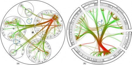
ArtDiaspora.viz is a art-meets-cultural studies tool to visualize the concept of diaspora, by depicting various relationships between Korean-born artists, current residency and their works. It was presented at the 2002 Kwangju Bienniale, and uses the data from the artworks exhibited there.
This visualization ambitiously tries to include a vat array of data in a circular network diagram. The different classes (title of artwork, artist, country of residence, place of birth, year of birth, year of artwork, form of artwork) are encoded into different colors. Then the nodes are connected with colored edges.
Taking into account that this is presented at an art exhibition, the target audience may have been impressed by its beautiful design and the very idea of visualizing this kind of data. However, I don’t think this achieves its core goal of conceptualizing diaspora, because it is hard to read patterns with too many data categories cramped into one diagram. Artist’s name, country of residency, year of work would have been enough to show a meaningful pattern of talented artists moving out of Korea. Even for that, I don’t really see the need to use a circular network diagram rather than simple histograms and time-series worldmaps. On a shorter note, I don’t see why the category title (e.g. “Date of birth”) connects a edge to every single entity within the category. It makes the overloaded picture even messier.