The Group: Danielle, Chris, and Nate.
Here’s one of our sample designs — this shows a difference between two of the practicum datasets: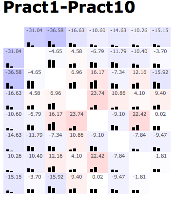
The pattern of this design is generally to show the data in a matrix layout. At the top of every cell, there’s the value of some comparison metric. At the bottom of the cell, the raw data (or something roughly equivalent) is shown — albeit in a low-res format. In this example, color redundantly encodes the main metric in a heatmap; with more complex comparison metrics, that need not be the case. Additionally, when the comparison metric has some sense of whether this comparison passed some statistical threshold, it can only color those cells that do.
Mouseover (or some other cell selection mechanism) can display additional information about the comparison in question — data values, diagnostic information on the residuals, and such.
{ 12 comments }
Providing various options (one of matrix, statistical threshold) for coloring each cell seems to be useful for user to explore.
My only issue with this visualization is that it keeps the redundant symmetry in the matrix dataset. Throwing one triangle of data away would open that space for comparison with at least one other triangle of data from another matrix.
This is nice representation, but I think, it is good only for small dataset. As the dimensions grow, it will be timing consuming efforts to understand the pattern in
the dataset. The use of text in each box has added some more information. Use of
colors on the bars, could simplify understanding dataset.
I do like the idea of putting both the bar graphs and the statistical data all in one cell, It would be nice if the color differences were stronger, so we could make out visual color patterns more readily, rather than relying on the bar graphs or the numbers.
This is a nice visualization, kinda like a combination of a heat map and histogram matrix. However, as has been pointed out, as the number of dimensions grows, the space the redundant information in the upper triangular becomes more and more significant.
I think using both bar charts and numbers in each cell gives a lot of information and saves space. I like the matrix structure but it might be more economic to keep only half of it due to symmetry.
I like that many visual variables were used together so well. The redundant thumbnails should be removed so that the user isn’t left with the impression of a pattern or cluster that really doesn’t exist. I think it’s OK if a visualization is not symmetrical, especially if it reduces the overall amount graphical content.
I agree with Shuang, and this used to be our next step: To combine the second and third methods of ours. Danielle, Chris, and Nate is very successful in choosing the color coding and the bar color. However, a scale bar might be easy to help the audience understanding the meaning of each color. This design, as we discussed before, has an intrinsic disadvantage that it does not show the difference of two matrix in a macro view, that might be a problem needed to be solved.
This is a good idea and we did something similar. Overlaying the color was a nice touch that we didn’t think of. The major issue with this as we’ll as our is scalability. I’m of the opinion that this method scales fairly well even at 20 frames. It may require a zoomed in view but it’s probably the best way we’ve seen of comparing more than two frames directly.
This provides a lot of information about a small portion of the dataset, which seems like an important view at some part of the exploration process. If you decide to take Jeremy’s advice and remove the redundant bar graph data, you might be able to take that a step further by showing the bar graphs on one triangle and the numeric data on the other. It might make your design look a little cleaner (or it might make it harder to make connections between related information).
Among other matrix based visualization used in this design, I think this one is a pretty one. It nicely combines different idea on a matrix. I would suggest dropping the symmetry part of matrix to reduce redundancy + clutter.
This visualization allows several visual queries to be performed efficiently.
– Spotting large differences is easy because the color encoding allows selective color attention.
– Comparing values of a particular concept among frames is facilitated by selecting its row and observing the heights of black rectangles. This works because both triangles of the symmetric matrix is drawn.
– Matrix value lookup is easy because of spacial arrangement. Additional values are given through mouse over.