The Week in 838 (Feb 22-26)

February 19, 2010

in News

This week, you’ll be working on the Design Challenge and will have done the first readings on Perception.

Class will be a little odd because of some timing constraints and to give teams time to meet.

  • February 23 (tuesday) – We’ll start our conversation on Perception discussing the readings. We’ll stop as if it were a “normal” (50 minute) class to give teams time to meet. Also, I will be giving a talk in the physics department (if you’re curious to see what I have to say).

Chaos and Complex Systems Seminar:

On Tuesday, February 23, 2010, 12:30-1:30 p.m. in 4274 Chamberlin Hall, Michael Gleicher, UW Department of Computer Sciences, will speak on “Pictures from piles of data.”

ABSTRACT: Most of my work is focused around a single (broad) question: How can we use our understanding of human perception and artistic traditions to improve our tools for communicating and data understanding? In problems ranging from molecular biology to video editing, we are faced with a deluge of data. In this talk, I’ll survey some of the ways we’ve tried to turn this problem into solutions. I’ll discuss our efforts in scientific visualization and multimedia, showing how we can use ideas from art and perception to create novel tools for a range of problems. Time permitting, I might also discuss some of my efforts to create a cross-disciplinary course on Visualization.

Refreshments will be served.

  • February 26 (thursday) – we’ll continue the discussion of perception and visual cognition. We’ll also take some time to talk about the design challenge – possibly to discuss some of the topics that you wish you knew more about (but won’t get to see until later in the semester).

Movie Narrative Charts (by Randall Munroe)
http://xkcd.com/657/

This infographic shows the interaction between various characters in movies. Though mainly intended for geek humor, some valuable insights can be drawn from such approaches nonetheless. It is effective at visualizing which events involve more complex interaction between key characters, while at the same time making it possible to see the narrative trail each character followed before that (surprisingly, the visual encoding is also perceptually clear enough). This approach could prove valuable in studying historical material with focus on interaction between key figures.

Design Challenge Teams

February 18, 2010

in Uncategorized

With 16 people, there is a team of 4 and 4 teams of 3.

While having a diverse set of people in class makes things interesting, it can also complicate teamwork since people are distributed all over campus. I do appreciate the efforts that people make in working togeher – hopefully the experience of collaborating with people from outside your field will make up for the inconvenience of having to deal with distance.

  • Albers, Danielle    Vack, Nate    Hinrichs, Christopher
  • He, David    Kishor, Puneet    Faisal, Khan    Moon, Jee Young
  • Hill, James    Liu, Ye    Huang, Shuang
  • Mayorga, Adrian    White, Jeremy    Watkins, Leslie
  • Turetsky, Emma    Kim, Nakho    Verma, Chaman Singh

We will provide time in class for teams to talk and coordinate.

My hope is that teams will work together to develop solutions to the challenge, but I understand that collaboration can be challenging. Having subsets of the the team develop solutions (leading to multiple solutions) that are then just combined into a coordinated presentation is OK if you really can’t find ways to work together.

In order to keep the “assignments” category clean, I am putting posts about example data for the design challenge under a tag: DC Example Data. If you go to that link, you’ll see all the posts about example data. There’s not much there yet, but keep watching…

This is a simple example of synthetic data, generated using the cocktail party simulator.

All of these data files come from the same network: a 12 person party with 1 host. All guests know the host and 2 other people (so D knows A (the host) and C and E (its two neighbors).

In the simulation, we add two factors:

sampling (how many observations do we take to build the matrix). in many cases, we are undersampling (not getting enough samples to really capture the phenomenon, which will lead to noisy measurements)

measurement noise (random chance added to the numbers). basically, this says that when we make an observation, there’s a chance it might be a random event (two people that do not know each other still may talk to each other, or two people are talking to each other, but we missed it)

This example should allow you to see how well your techniques deal with these two factors. The underlying phenomenon is the same (so we would hope to have very similar representations), but the errors might make that harder to discover.

The datafiles have the names formed as:

P 12 x 100 – 0 – 1

which means:

  • 12 person party (all these are the same)
  • x means that its the single host party (we’ll see other networks in future data)
  • 100 means 100 samples
  • 0 means no noise (6 means the +/- 3 noise added to each conversation selection)
  • 1 is the trial (there are two trials of each condition given)

Here is a ZIP of a bunch of these: p12x.zip (16 to be exact)

(right now, I can’t upload individual CSV files – but we’re working on fixing that)

We’ve posted a bunch of pages about the design challenge:

By now you should be familiar with the design task. We’ve compiled some simple “experimental” visualizations to provide both a starting place and to give you an idea of what works and what doesn’t when comparing adjacency matrices in this context.

All of the following examples (and the .cvs files with the raw Epistemic Net data) can be found here.

Here are some examples of the visualization tools that we’ve come up with to help with the problem. If you want to examine these experiments more closely, download the linked file, download and install Processing, and open the associated files. If you are just interested in the raw data, look at the .csvs in the data folder of the above file. The matrices are stored in blocks of nxn (where n is the number of nodes) cells with 0’s in the diagonal (representing that the strength of association from a node to itself is unknown/undefined). Each of the .csv represents a different venue. The .xlsx file presents all of the venues together so you can gauge relative scales.

Experiment one: The Asterisk

Similar to a radar plot, the asterisk measures the association strength along a different spoke for each member. The “fan” approach widens these bars to make them easier to see.

Experiment two: The CompareMat

Overlays the adjacency matrices, represent strength by the radius of a circle. Smaller circles are always drawn on top of the larger ones so there is no missing information.

Experiment three: The Golfball

Creates a graph of all the nodes in the matrix, represents the connection between them by the width of the edges. Of course, fully connected graphs of any significant size can be hard to parse…

Experiment four: The Spokes Graph

Represents each node separately as a line in a table, with the ability to highlight sections of the graph to see specific vertices.

As you can tell, none of these designs is perfect, and all of them could use some work even if they are in fact somehow the right way of looking at these data. For more discussion consult this page and the assignment page.

(note – read the general intro first – this is probably more detailed / domain specific than what you want to start with)

(note 2 – I (Mike) have added the headings and formatting. For comments I’ve added, i’ve italicized things)

The paper referenced in the text below is available from IJLM0102_Shaffer.

The Context: What is the domain?

Epistemic games are based on a specific theory of learning: the epistemic frame hypothesis. The epistemic frame hypothesis suggests that any community of practice has a culture and that culture has a grammar, a structure composed of:

  1. Skills: the things that people within the community do
  2. Knowledge: the understandings that people in the community share
  3. Identity: the way that members of the community see themselves
  4. Values: the beliefs that members of the community hold
  5. Epistemology: the warrants that justify actions or claims as legitimate within the community

This collection of skills, knowledge, identity, values, and epistemology forms the epistemic frame of the community. The epistemic frame hypothesis claims that: (a) an epistemic frame binds together the skills, knowledge, values, identity, and epistemology that one takes on as a member of a community of practice; (b) such a frame is internalized through the training and induction processes by which an individual becomes a member of a community; and (c) once internalized, the epistemic frame of a community is used when an individual approaches a situation from the point of view (or in the role) of a member of a community.

Put in more concrete terms, engineers act like engineers, identify themselves as engineers, are interested in engineering, and know about physics, biomechanics, chemistry, and other technical fields. These skills, affiliations, habits, and understandings are made possible by looking at the world in a particular way: by thinking like an engineer. The same is true for biologists but for different ways of thinking—and for mathematicians, computer scientists, science journalists, and so on, each with a different epistemic frame.

Epistemic games are thus based on a theory of learning that looks not at isolated skills and knowledge, but at the way skills and knowledge are systematically linked to one another—and to the values, identity, and ways of making decisions and justifying actions of some community of practice.

The domain problem: assessment of Epistemic Games / Epistemic Frames

To assess epistemic games, then, we begin with the concept of an epistemic frame. The kinds of professional understanding that such games develop is not merely a collection of skills and knowledge—or even of skills, knowledge, identities, values, and epistemologies. The power of an epistemic frame is in the connections among its constituent parts. It is a network of relationships: conceptual, practical, moral, personal, and epistemological.

Epistemic games are designed based on ethnographic analysis of professional learning environments, the capstone courses and practica in which professionals-in-training take on versions of the kinds of tasks they’ll do as professionals. Interspersed in these activities are important opportunities for feedback from more experienced mentors. In earlier work, I explored a few ways of providing technical scaffolds to help young people meaningfully engage in the professional work of science journalists. I also conducted an ethnography of journalism training practices, studying a reporting practicum course on campus. This has led to my current effort: seeking to better understand how we might measure and articulate the similarities and differences between the writing feedback in different venues – in this case, copyediting feedback given in the journalism practicum, copyediting feedback given in a journalism epistemic game, and copyediting feedback given in a graduate level psychology course (i.e., a non-journalism contrast venue).

I’m particularly interested in differentiating the kinds of writing feedback that are more characteristic of journalism from more general writing feedback. In order to investigate these patterns quantitatively, the feedback from each venue has been segmented (each comment from each writing assignment for each participant in each venue was treated as a separate data segment) and coded for the presence/absence of a number of categories (for a graphic example of this using a different data set, see the attached paper, p.6). Using epistemic network analysis, the resulting data set can then be used to investigate such ideas as the relative centrality of particular frame elements, i.e., the extent to which particular aspects of journalistic expertise (categories of skills / knowledge / values / identity / epistemology) are linked together in the feedback provided.

The challenge: Comparing Epsitemic Frame Networks

The design challenge arises when we try to compare this multidimensional data set across venues. It is unwieldy to say the least to try to compare multiple sets of 17 items. We can overcome that by first calculating the root mean square of the 17 relative centrality values, then scale the resulting values to achieve a single similarity index for the set, and finally compare those values. However, this involves collapsing a number of dimensions that a) might not properly be collapsed, and b) might be useful for providing an overall profile for comparison.

As a way of retaining potentially important dimensional information, we’re also trying a multidimensional scaling technique, principle coordinates analysis (similar to principle component analysis), to identify a subset of coordinates we might then use to map the different venue’s data and produce 2 or 3-dimensional, i.e., graph-able representations of the data for comparison. The challenge of how to represent these multi-dimensional data sets remains.

There is another challenge inherent in our relative centrality metric: it calculates the centrality of a given element by summing the co-occurrences of a particular element with any other element, meaning it collapses the specific linkages taking place to provide a more general indication of the importance of the element. Comparing data from different venues though reveals that two elements from different venues with the same relative centrality values can actually be linked to quite different specific elements. In the terms of this data set, this would be something like data from both the practicum venue and the psychology venue showing Knowledge of Story as highly central, while a closer inspection of the links occurring reveals they are linked quite differently in each case.

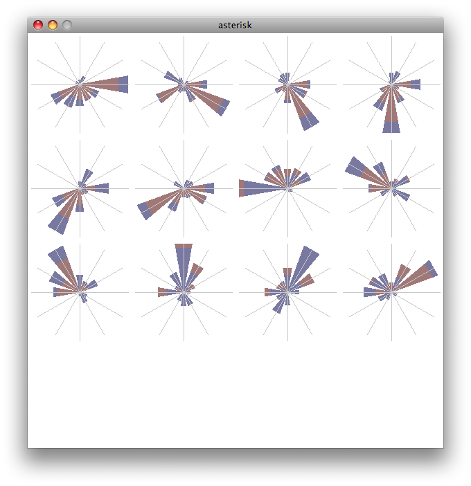
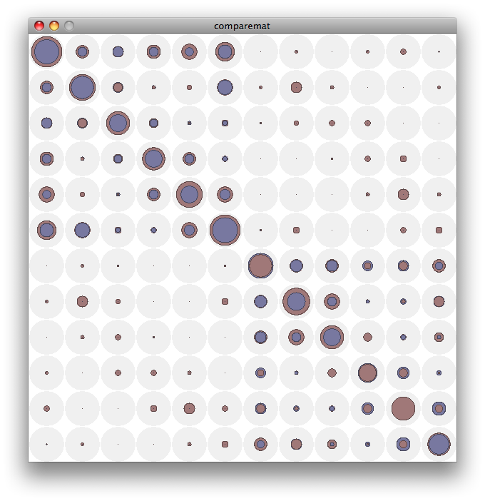
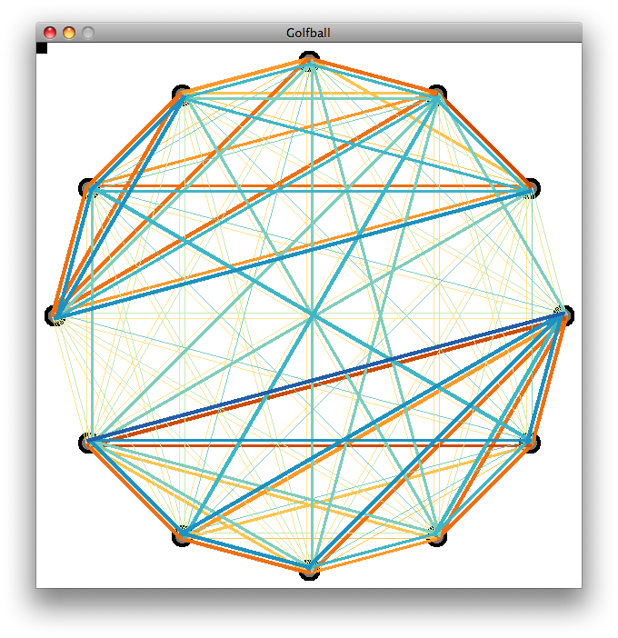
So, I’ve produced a new metric, relative link strength (RLS), which, like the relative centrality metric, is based on the co-occurrence of epistemic frame elements in the data segments. However, instead of collapsing these co-occurrence frequencies into a single value, RLS retains the specificity, producing a matrix of link frequencies between every pair of the codes (frame elements). This is particularly useful for drilling into the apparently similar relative centrality values between different contexts, but takes an unwieldy representational set of 17 elements and makes it even more complex as a matrix of 17 by 17 elements. Even focusing on a particularly interesting subset of 8 elements means figuring out the best way to show an 8×8 matrix. Working solutions to this so far include generating radar plots for each of the elements (the rows of the matrix, if you will) with each venue represented in semi-transparent solid fills to get a sense of the similarity / difference between the venues on each dimension. This approach is better than some, but has drawbacks.

Looking forward to thinking through this and the overall similarity representation with the group.

I realize that I never formally said some things that might wonder about:

  • We do keep score. Participation is a large part of how I know that you’re learning things in the class. We keep track of whether people show up, if they do show up do they participate, etc.
  • If you don’t like to participate in the conversation, there are other ways for people to show me that they are learning (for example, one student sends me notes summarizing what he learned from the class). But participation means more than just taking in from lectures: it means giving back to the class.
  • If you are assigned to work in a pair/team, I assume the work comes from the whole team unless the team all tells me otherwise. I will not try to assign different credit within a team (unless the entire team says so).

I will be better about providing feedback (it’s something I realize that I am bad at).

You have all given me a great deal of slack as I try to figure out how to make a class like this work. I promise to be equally understanding when I need to evaluate people.

In case you’re wondering, the elements of the class (as far as grading) will be (I am finally far enough into it that we can predict it):

  • Participation and readings
  • Assignments (besides readings) and challenges (like the critique assignment and the design challenge)
  • Project(s) – my plan is to have people do projects after break. The idea is to break things in two (2 projects) with the idea that if the first one goes well, the second one can be an extension of it. But if you make a bad choice in your first project, you can try something different for the second half.

Redesign of WalkScore

February 16, 2010

in Student Posts

Puneet & Danielle

Problem -> abstraction -> encoding -> implementation

Munzner describes the above process as ‘domain problem characterization, data/operation abstraction design, encoding/interaction technique design, algorithm design’

Deconstructing Walkscore
————————
Problem: Assess livability of a neighborhood by how far one has to walk for different services. The idea is that places you would usually walk to — parks, neighborhood grocery stores, restaurants and coffee shops — make up the social fabric of a neighborhood.

Abstraction: Livability is abstracted to availability of different services within walking distance.

Encoding: Map position to position, distance to color

Implementation: Show the results on a map.

Suggested improvement: Walkscore is a wonderful way to visualize and assess livability of a neighborhood. The improvements I can think of are: a heat map that creates a color gradient from green to red, where greener is closer and redder is farther from the origin. Ironically, Walkscore does implement a heat map, but only as a pre-created map for certain neighborhoods. As far as I can see, it does not have a facility for the users to create one for their own neighborhood.

An additional interface element to implement would be to weight the various walking destinations — for some, having a grocery store within walking distance may be more important, while for others, existence of neighborhood coffee shops or parks where neighbors gather may be more important. Being able to move sliders for various destination categories and watching the heat map change in real-time would be one one meaningful improvement that I can think of.

With this change, the user does not necessarily get a better or worse view of the information, but simply is presented with a different interpretation. If someone were looking to explore a particular area, the original encodings would be ideal to use. However, if someone was looking to make a decision about a location based on factors important to them, the heat map would provide a very straightforward basis for such a decision.