The Cost of Care
http://blogs.ngm.com/blog_central/2009/12/the-cost-of-care.html
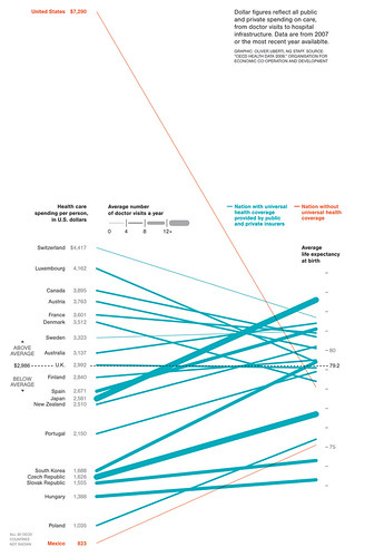
This visualization compares cost of healthcare per person to average life expectancy for various developed countries. This text is included on article linking to the actual image:
“The United States spends more on medical care per person than any country, yet life expectancy is shorter than in most other developed nations and many developing ones. Lack of health insurance is a factor in life span and contributes to an estimated 45,000 deaths a year. Why the high cost? The U.S. has a fee-for-service system—paying medical providers piecemeal for appointments, surgery, and the like. That can lead to unneeded treatment that doesn’t reliably improve a patient’s health. Says Gerard Anderson, a professor at Johns Hopkins Bloomberg School of Public Health who studies health insurance worldwide, “More care does not necessarily mean better care.” —Michelle Andrews “
This visualization encodes four dimensions of data in the following ways:
– Cost of healthcare per person- y position
– Average life expectancy- y position
– Average number of doctor’s visits per person- line thickness
– Type of coverage (universal or otherwise)- hue
What Munzner might say:
Cost and life expectancy clearly fall into the quantitative data category, and are encoded using position, the strongest visual channel for their data type. Type of coverage is categorical, and is encoded using hue, the second strongest visual channel for its data type (after position, which has already been used). All the visual channels are seperable, and code these four dimensions without confusion. Also, cost and life expectancy are connected by lines, so their relationship is encoded using line slope. Clearly and explicitly relating this data makes the US pop out as the country with the steepest downward slope.
What Tufte might say:
First, this graphic is well documented. The creator, his position, the data source, the year the data was collected, the fact that some countries aren’t shown, and the scales for all the numeric data are all clearly written on the image. The lines connecting cost and life expectancy facilitate clear comparisons of all the data.
Edit: Here’s an interesting article where the creator justifies his design choice over a scatterplot: http://blogs.ngm.com/blog_central/2010/01/the-other-health-care-debate-lines-vs-scatterplot.html
{ 1 comment }
This graphic is a simple and elegant in the way it shows the raw data, but the way it really excels is in the way it highlights the outliers. First, there is the fact that the US is so far ahead of all of the other countries in terms of spending. This point is emphasized by the fact that the US has to be put so far above the legend – all of the other countries fit inside of a neat boundary, which the legend delineates and reinforces, while the US is so far out that the legend has to be adapted so that the line for the US can pass through it. It is a bit hard to read the data from the other lines since they overlap so much, but the real message is in the space separating the US from the rest.
Secondly, there is the emphasis on how only 2 countries have private healthcare, and that in both cases people make the fewest doctor visits. The use of a red hue to signify this draws the viewer’s eye immediately to these 2 cases.