Group: Nate, Chris, Danielle
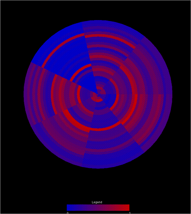
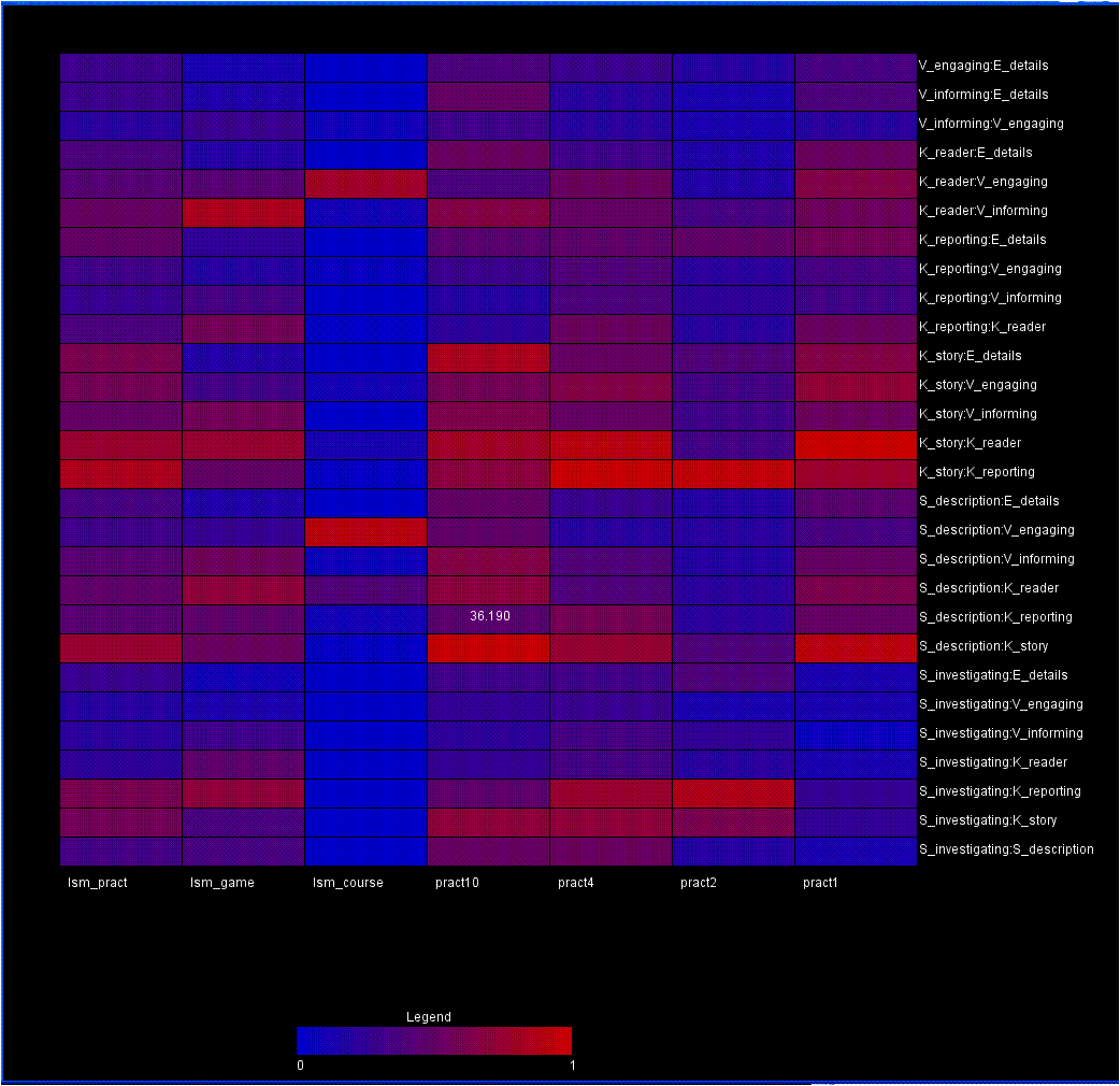
Two other visualizations that we’ve composed to address this problem use a color encoding to demonstrate the changes in data across different frameworks. Both visualizations utilize a red-blue color ramp encoding the normalized value of the data point. All data elements are pulled from the upper triangle of the matrix, so no redundant information is encoded in the view.
The first is a wheel with each wedge representing an individual matrix in the graph. Each of the rings then represents a single category pairing in the matrix. As a result, comparing the colors around a ring reveals trends in that pairing between the matricies. Comparing colors between rings reveals the relationship between the variable sets. Finally, comparing wedges reveals the similarity between matricies. Eventually, mouse overs should be integrated to give more information about any particular circle segment.
A second visualization, drawing from heat map principles, maps each matrix to a position along the x-axis. A particular pairing is then mapped to the y-axis. Mouseing over a box reveals the raw value represented by that individual data point. In this view, skimming across a row reveals relationships between variables across the matricies. Comparing boxes in the columns demonstrates the patterns within a matrix. Comparing rows represents comparisons between variable pairings. Comparing columns allows the user to compare different matricies.
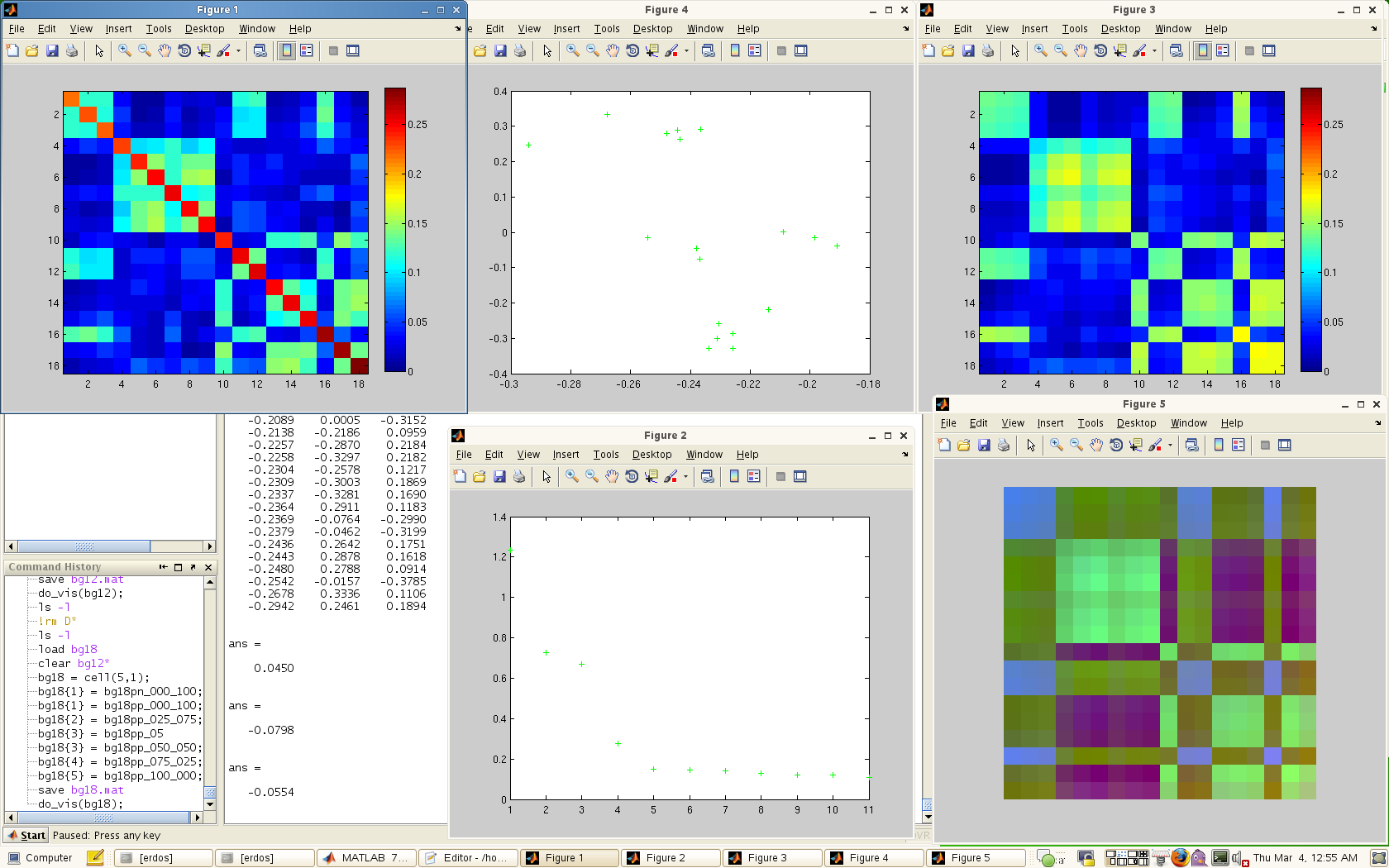
The third visualization is a kind of console for viewing the eigen-spectrum / PCA properties of the data. This console consists of 5 windows:
– The original data matrix
– The spectrum of eigenvalues
-The original matrix recomposed from the top 3 eigenvectors
-The PCA view of the matrix in 2D
-The first 3 eigenvectors mapped independently to the RGB channels.
A screen capture is shown below.
{ 12 comments }
I like the first and the third examples; the first for its attempt at visualizing multiple datasets by transforming a triangle of a matrix to a wedge in a circle, and the third for its attempt at creating a dashboard with multiple views of the same data, perhaps a first step toward a multiscale, multiview browser (a la the Synteny Browser).
I like the immediate easiness of spotting differences among datasets in the circular view, but it accidentally implies that the variables closer to the center are indeed more central.
Nice efforts in all the three visual representations, but in my opinion, one thing that all of them is missing is “Simplicity”, specially the first and third one. For both first and third, a nice paragraph is required to interpret the colors.
The second one could be improved further by use of light contrasting colors.
Overall, good efforts for this complex problem.
In the first visualization, I feel that the inherent issue of the outer circles having more area in the arches could give rise to an idea that there possible more in the arch. It’s just the nature of using wedges. I like how you can easily compare between matrices.
I like the second visualization as a heat map of the matrices and pairings, rather than the data of the matrices themselves. I think this one could be very useful.
The multiple views in the third dataset are nice. I like the idea of finding a property of the matrix itself and observing that, rather than the raw data.
First a comment on the color ramps. Blue-red is really hard to tell apart, so maybe another color spectrum would be better? Also, instead of using a continuous one, I think binning the ramp would be easier to tell apart. Sine you can see the exact values when you mouse over, you really don’t loose that much information.
I like the fact that in the first two, many different matrices can be compared. However, if each individual matrix has many dimensions, things start to get a bit hard.
The eigenvalue based visualizations give a nice statistical snapshot of an individual matrix, but it is unclear to me how you would compare different matrices with these techniques.
The heatmap is quite neat and it directly shows the relationship among factors. Like other posts, I would suggest another color spectrum.
For the last visualization, I wonder why the original data (Figure 1) has a diagonal with different colors. Figure 2 shows the magnitude eigenvalues. I think vertical lines can be a better choice since the length can represent the magnitude of the value. A quick question: do we need assumption to ensure all the eigenvalues are real instead of imaginary?
I think that is because the diagonal value of the original data does not means anything, so they are coding it as “no meaning”.
Using two or more hues to represent values ranging from 0 to 1 may not be necessary and may also add unwanted visual complexity. Showing all of the values at once is certainly a good way to give an overall impression and look for areas of interest, but showing a scale down version initially, while allowing the user to scale and explore, might help reduce the size.
The ability to rotate the entire visualization (for the rectangular versions) might be a nice feature so that the potential patterns/clusters can be evaluated horizontally and vertically.
I like the style of all the three design. However, there might be slight problems within design 1 and 2. Design 1 might be good at revealing relationships between adjacent sectors, but the ability decreases when the two sectors are not together. Design 2 might have the same problem. For example, I can tell by my eyes that Ism_pract and Pract4 might have very high correlation rates, but the distance between them prohibits me identifying it quickly.
I agree that the outer circles in the first visualization skew the meaning a little. It’s definitely difficult to see what’s going on at the middle. Perhaps starting the data at halfway along the radius and leaving the center blank would help.
The second visualization makes sense to me. I like the idea of converting the matrix into a vector, that seems intuitive and provides a different way of looking at the data.
I have to admit that I’m a little rusty on my linear algebra so the third visualization is a little over my head and I’m not sure how to interpret it.
I think the second design is the easiest to interpret. Like some people in the comments above me, I think the biggest drawback of the first visualization is that it’s hard to compare 1) matrices that are across the wheel from each other and 2) variables that are close to the center of the wheel. If there was some way to clearly distinguish the related portions of the circle, it would be a great way to show lots of information in a quick snapshot view.
I think the significance of the third design isn’t the design itself, but the idea that the dataset itself can be simplified pretty dramatically before we even start to think of visualization designs. If we can automatically reduce the data to 2 or 3 dimensions without losing anything important, that makes the design problem easier for everyone!
The use of circle rings and wedges to compare multiple information is a neat idea. It not only gives an overall picture by comparing networks but also provides fine grained information about nodes across two different dimensions(within network and across network). Our group had a similar idea to use rings to show node relative strength. In this case wedges represent a node and ring a network.
The matrix view in the last visualization actually look pretty nice than the other two groups’ matrix view. But I do remember from their presentation that this is not on the actual epistemic frame data?