Assignments

By now you should be familiar with the design task. We’ve compiled some simple “experimental” visualizations to provide both a starting place and to give you an idea of what works and what doesn’t when comparing adjacency matrices in this context.

All of the following examples (and the .cvs files with the raw Epistemic Net data) can be found here.

Here are some examples of the visualization tools that we’ve come up with to help with the problem. If you want to examine these experiments more closely, download the linked file, download and install Processing, and open the associated files. If you are just interested in the raw data, look at the .csvs in the data folder of the above file. The matrices are stored in blocks of nxn (where n is the number of nodes) cells with 0’s in the diagonal (representing that the strength of association from a node to itself is unknown/undefined). Each of the .csv represents a different venue. The .xlsx file presents all of the venues together so you can gauge relative scales.

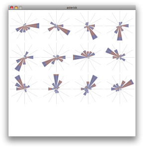
Experiment one: The Asterisk

Similar to a radar plot, the asterisk measures the association strength along a different spoke for each member. The “fan” approach widens these bars to make them easier to see.

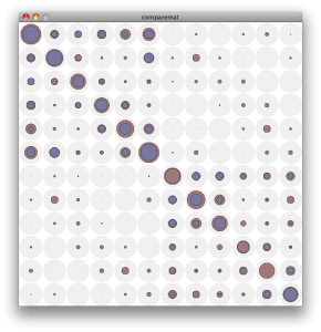
Experiment two: The CompareMat

Overlays the adjacency matrices, represent strength by the radius of a circle. Smaller circles are always drawn on top of the larger ones so there is no missing information.

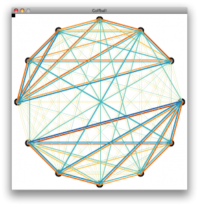
Experiment three: The Golfball

Creates a graph of all the nodes in the matrix, represents the connection between them by the width of the edges. Of course, fully connected graphs of any significant size can be hard to parse…

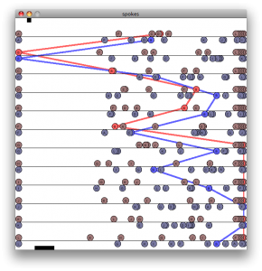
Experiment four: The Spokes Graph

Represents each node separately as a line in a table, with the ability to highlight sections of the graph to see specific vertices.

As you can tell, none of these designs is perfect, and all of them could use some work even if they are in fact somehow the right way of looking at these data. For more discussion consult this page and the assignment page.

(note – read the general intro first – this is probably more detailed / domain specific than what you want to start with)

(note 2 – I (Mike) have added the headings and formatting. For comments I’ve added, i’ve italicized things)

The paper referenced in the text below is available from IJLM0102_Shaffer.

The Context: What is the domain?

Epistemic games are based on a specific theory of learning: the epistemic frame hypothesis. The epistemic frame hypothesis suggests that any community of practice has a culture and that culture has a grammar, a structure composed of:

  1. Skills: the things that people within the community do
  2. Knowledge: the understandings that people in the community share
  3. Identity: the way that members of the community see themselves
  4. Values: the beliefs that members of the community hold
  5. Epistemology: the warrants that justify actions or claims as legitimate within the community

This collection of skills, knowledge, identity, values, and epistemology forms the epistemic frame of the community. The epistemic frame hypothesis claims that: (a) an epistemic frame binds together the skills, knowledge, values, identity, and epistemology that one takes on as a member of a community of practice; (b) such a frame is internalized through the training and induction processes by which an individual becomes a member of a community; and (c) once internalized, the epistemic frame of a community is used when an individual approaches a situation from the point of view (or in the role) of a member of a community.

Put in more concrete terms, engineers act like engineers, identify themselves as engineers, are interested in engineering, and know about physics, biomechanics, chemistry, and other technical fields. These skills, affiliations, habits, and understandings are made possible by looking at the world in a particular way: by thinking like an engineer. The same is true for biologists but for different ways of thinking—and for mathematicians, computer scientists, science journalists, and so on, each with a different epistemic frame.

Epistemic games are thus based on a theory of learning that looks not at isolated skills and knowledge, but at the way skills and knowledge are systematically linked to one another—and to the values, identity, and ways of making decisions and justifying actions of some community of practice.

The domain problem: assessment of Epistemic Games / Epistemic Frames

To assess epistemic games, then, we begin with the concept of an epistemic frame. The kinds of professional understanding that such games develop is not merely a collection of skills and knowledge—or even of skills, knowledge, identities, values, and epistemologies. The power of an epistemic frame is in the connections among its constituent parts. It is a network of relationships: conceptual, practical, moral, personal, and epistemological.

Epistemic games are designed based on ethnographic analysis of professional learning environments, the capstone courses and practica in which professionals-in-training take on versions of the kinds of tasks they’ll do as professionals. Interspersed in these activities are important opportunities for feedback from more experienced mentors. In earlier work, I explored a few ways of providing technical scaffolds to help young people meaningfully engage in the professional work of science journalists. I also conducted an ethnography of journalism training practices, studying a reporting practicum course on campus. This has led to my current effort: seeking to better understand how we might measure and articulate the similarities and differences between the writing feedback in different venues – in this case, copyediting feedback given in the journalism practicum, copyediting feedback given in a journalism epistemic game, and copyediting feedback given in a graduate level psychology course (i.e., a non-journalism contrast venue).

I’m particularly interested in differentiating the kinds of writing feedback that are more characteristic of journalism from more general writing feedback. In order to investigate these patterns quantitatively, the feedback from each venue has been segmented (each comment from each writing assignment for each participant in each venue was treated as a separate data segment) and coded for the presence/absence of a number of categories (for a graphic example of this using a different data set, see the attached paper, p.6). Using epistemic network analysis, the resulting data set can then be used to investigate such ideas as the relative centrality of particular frame elements, i.e., the extent to which particular aspects of journalistic expertise (categories of skills / knowledge / values / identity / epistemology) are linked together in the feedback provided.

The challenge: Comparing Epsitemic Frame Networks

The design challenge arises when we try to compare this multidimensional data set across venues. It is unwieldy to say the least to try to compare multiple sets of 17 items. We can overcome that by first calculating the root mean square of the 17 relative centrality values, then scale the resulting values to achieve a single similarity index for the set, and finally compare those values. However, this involves collapsing a number of dimensions that a) might not properly be collapsed, and b) might be useful for providing an overall profile for comparison.

As a way of retaining potentially important dimensional information, we’re also trying a multidimensional scaling technique, principle coordinates analysis (similar to principle component analysis), to identify a subset of coordinates we might then use to map the different venue’s data and produce 2 or 3-dimensional, i.e., graph-able representations of the data for comparison. The challenge of how to represent these multi-dimensional data sets remains.

There is another challenge inherent in our relative centrality metric: it calculates the centrality of a given element by summing the co-occurrences of a particular element with any other element, meaning it collapses the specific linkages taking place to provide a more general indication of the importance of the element. Comparing data from different venues though reveals that two elements from different venues with the same relative centrality values can actually be linked to quite different specific elements. In the terms of this data set, this would be something like data from both the practicum venue and the psychology venue showing Knowledge of Story as highly central, while a closer inspection of the links occurring reveals they are linked quite differently in each case.

So, I’ve produced a new metric, relative link strength (RLS), which, like the relative centrality metric, is based on the co-occurrence of epistemic frame elements in the data segments. However, instead of collapsing these co-occurrence frequencies into a single value, RLS retains the specificity, producing a matrix of link frequencies between every pair of the codes (frame elements). This is particularly useful for drilling into the apparently similar relative centrality values between different contexts, but takes an unwieldy representational set of 17 elements and makes it even more complex as a matrix of 17 by 17 elements. Even focusing on a particularly interesting subset of 8 elements means figuring out the best way to show an 8×8 matrix. Working solutions to this so far include generating radar plots for each of the elements (the rows of the matrix, if you will) with each venue represented in semi-transparent solid fills to get a sense of the similarity / difference between the venues on each dimension. This approach is better than some, but has drawbacks.

Looking forward to thinking through this and the overall similarity representation with the group.

The Design Challenge

February 15, 2010

in Assignments

due dates: (see the rules)

  • initial solutions and class presentations – March 4th
  • final solutions and writeups – March 11th

The Design Challenge

The topic of this challenge is to create visualizations to help our colleagues in Educational Psychology interpret their Epistemic Frame Network data. Specifically, you need to address the problem of comparing two Frame Networks.

A detailed explanation of the data (and the problems the domain experts hope to solve) will be given in class on Thursday, February 18th.

This is a challenging problem for which we really don’t have a good solution yet. Our hope is that by having the class generate new ideas, we can find a bunch of new designs that may help them in both interpreting and presenting their data. Even though they have limited data right now, they are in the process of developing new tools that will generate a lot more data, so having good tools will be increasingly important. For your testing, we will also provide synthetic data.

The data is different than other data types seen in visualization. At first, it seems like lots of other network data. But these networks are small, dense, and weighted. Its not clear that standard network visualization methods apply. (and we haven’t discussed them in class yet)

The Data

(more details will be given in class on Thursday, February 18th)

An Epistemic Frame Network consists of a set of concepts. The size of the network (the number of concepts) we’ll denote as n. For small networks, n might be a handfull (5 or 6), large networks are unlikely to be bigger than a few dozen (20-30). Most networks we’ll look at are in the 6-20 range. Each concept has a name which has meaning to the domain scientist. (see the information from the domain scientist to really understand what the data means)

The data for the network is a set of association strengths. Between each pair of concepts, there is a strength that corresponds to how often the two concepts occur together. If the association strength is zero, the two concepts never occur together. If the number is bigger, the concepts appear together more often. The actual magnitude of the numbers has little meaning, but the proportions do. So if I say the association between A and B is .5, you don’t know if that’s a lot or a little. But if the association between A and B is .5 and between A and C is .25, you know that A is twice as strongly associated with B than C. The associations are symmetric, but they don’t satisfy the triangle inequality (knowing AB and AC tells you nothing about BC).

The numbers for a network are often written in matrix form. The matrix is symmetric. The diagonal elements (the association between a concept and itself) is not well defined – some of the data just puts zeros along the diagonal. So the matrix:

0 .5 .25
.5 0 .75
.25 .75 0

Is a 3 concept network, where the association between node A and B is .5, between A and C is .25, and between B and C is .75.

A more detailed explanation of what the data means may be provided by the domain experts. But you can think of association strength as “how closely related are the two concepts” (stronger is more closely related).

As an analogous problem, you can think of the network as a social network. The concepts are people, and the associations are how well they know each other, or how much time they talk to each other. A description of this problem (as well as this visualization problem) is provided on the SCCP page (single conversation cocktail party). (in the terminology of SCCP, what we get is the “interaction matrix”, not the “measurement matrix”).

As a practical issue, the data will be provided as “csv” (comma seperated value) files containing symmetric matrices. The matrices are small enough that the redundancy isn’t a big deal. The will usually be an associated text file with the names of the concepts. If the names aren’t provided, you can just refer to the concepts by letter (A,B,C, …). In fact, you might want to refer to them that way no matter what.

The Problem

The domain experts will explain what they want to do in interpreting the data. But the real problems are generally comparative: given 2 or 3 (or maybe more) networks, how do we understand the similarities and differences.

When comparing networks, you can assume they have the same concepts in the same order. In the event that one matrix is bigger than the other, you can simply pad the smaller ones with extra rows and columns of zeros.

Keep in mind that the data is noisy, has uncertainty, and some ambiguity (since the magnitudes don’t have meaning). What matters are the proportions between different observations. In fact, different matrices might be scaled differently. This matrix here:

0 2 1
2 0 3
1 3 0

is equivalent to the one above in the previous section.

It might be easier for you to think about the problem in terms of the cocktail party. In fact, we’ll provide you with a pile of example data from our cocktail party simulator. (we have limited real example data).

The Solution

First, I don’t think there is “THE” solution. There are probably lots of good ways to look at this data. Some good for some types of understanding, others good for other types.

How often have I said to you that when you have eliminated the impossible, whatever remains, however improbable, must be the truth? (Sherlock Holmes)

I told David (the domain expert) that the way I was going to find one good visualization was to generate 50 bad ones first. You can see a number of my attempts on the SCCP page. We will provide you with the sample code for all of these (except for the graph visualization solutions, which use a program I downloaded called “graphvis”). Our domain experts have also generated a few visualization ideas that they will show to you on February 18th.

Well, hopefully, we won’t need to generate 50 ideas. We’ll learn from the initial attempts and get to good answers quickly.

Your team will be expected to generate at least 1 (preferably several) possible solutions. Ideally, you will implement them as a tool that can read in matrices of various sizes so that we can try it out. However, if you prefer to prototype your visualization by drawing it by hand, that’s OK – please use one of the “real” example data sets though.

There is a need for a variety of solution types:

  • static pictures (for putting into print publications) as well as interactive things
  • tools for exploring data sets (to understand the differences between a set of networks), as well as tools for communicating these findings to others (where the user understands the differences)

It is difficult to evaluate a solution without really understanding the domain. That’s part of the challenge. You will have access to the domain experts to ask them questions. You can also think about things in terms of the SCCP domain (for which you are as expert as anyone).

The Challenge

The class will be divided into teams of 3 (approximately, since we have 16 people). We will try to assign teams to provide a diverse set of talents to each team. Hopefully, each team will have at least one person with good implementation skills for building interactive prototypes.

You will be able to ask questions of the domain experts in class on February 18th. If you want to ask them questions after that, send email to me (Mike Gleicher). I will pass the question along, and give the response back to the entire class (watch the comments on this posting). 

Please do not contact the domain experts directly.This is partially to limit their burden, but also for fairness (some groups may have more access to them).

On March 4th, we’ll use the class period for each group to present their solutions to the domain experts and to discuss our progress. Groups will then get another week to write up their solutions. We’ll provide more details as time gets closer.

What to Create

Each time should create at least one (preferably more) visualization techniques for the ENF data.

You can devise tools for understanding a single network, but you must address the problem of comparing 2 networks. Its even better if you can come up with solutions for handing 3 or more networks. (but showing that you have a solution for the 2-way comparison is a minimum requirement)

Your approach should scale to networks with 20+ nodes in it.

It is best if you implement your proposed techniques so that they can load in data files. However, if you want to “prototype” manually (either drawing it by hand, or manually creating specific visualizations from some of the example data sets), that’s OK. You might want to do a simple prototype first, and then polish and generalize an implementation after.

For the demos (March 4th) you will be able to choose the data sets to show off your methods. For the final handins, we would prefer to be able to try out your techniques on “live” data. Ideally, we will give the tools you build to the domain experts and let them use them.

Designing tools that are interactive is great. For the demo, only you need to be able to use your tool (you will give the demo), but for the final handin, you will be expected to document what you’ve created.

I am aware that we haven’t discussed interaction (or network visualization) in class yet – this might be a good thing since I don’t want to cloud your judgment and have you just apply old ideas. Be creative!

Resources

Be sure to watch this page (and the comments on it) for updates and changes and more details.
Our next “activity” in class will be a design challenge: where we give you a visualization problem, and ask you to propose solutions to it. Its an actual hard problem that someone on campus really cares about, and that I’ve thought about a bit. (I’m not telling you ahead of time).

What will happen:

  • Feb 18th (Thursday) – During class we will officially begin the challenge. We will introduce the problem in class. The domain experts will come to class to discuss the problem, and answer questions. We will show off a few of our own prototype solutions (that we will make available to you). We will tell you about the sample data. We will assign everyone to a team.
  • March 4th (Thursday) – Before class, you will create a posting describing your solution. You don’t have to turn everything in, but if you have a prototype, it would be good to link to it (so others can experiment with it). Include pictures in your post of what things look like on the example data.
  • March 4th (Thursday) – During class, each time will give a brief presentation of their solution(s). Our domain experts will attend to discuss.
  • March 4th-5th – After class, everyone will comment on everyone else’s design (each person must make a comment on every other team’s posting). This feedback will hopefully help improve the designs.
  • March 11th (Thursday) – Final handin due before class. Details to be provided.

We will provide you with:

  • Example data. (note: for the final handin, we might provide other data sets for you to test on as well)
  • A description of the domain, the data, and the kinds of tasks the visualization should support.
  • A few example visualizations (implemented in different ways, including Processing sketches and Excel spreadsheets)
  • A team to work with.

What you need to create:

A design (or designs) that address the problem. While you might just create example visualizations of the example data sets manually (say using a drawing program), we would prefer that your team produces a tool (or tools) that can take different data sets as input.

Some documentation (requirements to be determined later)

About the software you create:

  • There are no requirements as to what tools you need to use. Use whatever programming language, user interface toolkit, etc. that you like. The only restriction is that you must be able to give a demo in class (so it must either run on your laptop or my laptop).
  • We would prefer solutions that we (the rest of the class and our domain experts) can experiment with. Things that are easily deployed on the web are great. Or programs that are easily portable.
  • Personally, I would probably use Processing or Matplotlib (a python graphics library that interfaces with numerical tools) or maybe just write a C++ program using OpenGL.

We hope that each team will work together to design solutions to the problem. With an entire class trying, we’ll probably come up with lots of solutions – some of which might really help the domain experts.

Reading 5: Perception 101

February 12, 2010

in Assignments

(readings due Tuesday, Feb 23rd)

In this reading, we’ll start our exploration of human perception with an eye towards visualization. Perception is a big topic – there are several courses on it at the university, so we can (at best) hope to scratch the surface.

The primary (required) reading is:

  • Chapters 1 and 2 in Visual Thinking For Design. Colin Ware’s take on it is interesting.

Another great survey is a web-based thing by Chris Healey. This one is nice because it includes some applets and demos that show off some of the suprising pre-attentive processing facts. The survey covers more than the first two chapters of Ware (like it covers Color), but seeing some of these topics before we discuss it in class is a good thing (color is a big topic!).

A recommended (but optional) reading is the Chapter from the 559 textbook. If you don’t have a copy, enough of us do that you can borrow one. This is much more of a “basic facts about perception” thing, and it covers many of the more advanced perception topics (like depth) that we won’t get to in Ware’s book for a few weeks.

  • Visual Perception by WIlliam Thompson. Chapter 22 of Fundamentals of Computer Graphics (by Shirley, et al). (it’s Chapter 21 of the 2nd edition).

As usual, please post at least one comment on what you’ve learned. One question you might want to address: what was the thing that most surprised you about how we see?

(Part 1 due by 7am, Thursday, Feb 11th – we’ll discuss the work in class)

(Part 2 due by 7am, Tuesday, Feb 16th – we’ll discuss the work in class)

In this assignment, your task is to look at a few visualizations and critique them, based on the things we’ve learned so far in class.

You will do this assignment with a partner (assigned in class, on Feb 4). If you were not assigned a partner on Feb 4, contact the instructor.

What to do:

Each person should find a visualization they think is good, and a visualization they think is bad. (each person does this, so each pair has 4 visualizations to look at – yes, you are supposed to find something good and something bad). Pick visualizations that are easily available (either on the web, or if it’s a picture, scan it).For the purposes of this exercise, static visualizations (images) are best.

Part 1 (the solo part): Each person should post their two visualizations, and their brief critique. Each person should also provide a brief critique of their partner’s selections as a comment. (so every person makes 2 postings for this part, and comments on 2 postings – with a catch described below). Try to consider as many of the issues that we have raised in class as possible – in particular, things like “does this visualization achieve its goal” (which requires you to articulate what its goal is) or “is it clear” or “does it make the task its designed to support easy” (again, which means you need to articulate its task).

If you want some ideas on how to do a critique, check out the homework assignment at Harvard. I don’t expect something as complete as the example at Berkeley, nor do I need you to explicitly consider the questions that Prof. Pfister lists in the Harvard assignment (but those are good things to consider).

Part 2 (the team part): Each pair (do this working together!): pick one of the good and one of the bad visualizations. For each one:

  • try to define the data, the mappings, and the encodings that the visualization uses. Think over where these choices came from – are they good choices (informed by perception or …) or just doing the obvious, or following a convention, or …
  • think up a few different mappings and encodings of the data (each will lead to a visualization). create rough sketches of what they might look like (either on the computer, or pencil and paper). if you do things on paper, try to scan it – or at least bring it to class. The goal here is really to consider the space of mappings and encodings to get an intuition for the range of what’s possible.
  • compare your mappings to the original – you might make things worse, but try to explain why.

Write up each analysis / redesign as a seperate posting. (note: this is seperate from the critique in part 1).

This assignment will undoubtedly stress the WordPress infrastructure we’re using for the class.

For this assignment:

  • Your visualizations and initial critiques must be created as postings to the “Student Posts” category (and maybe a subcategory, but we haven’t worked out that detail yet). Be sure to make that posting before 7am on the 11th. Please put a link to the visualization (or better: a small picture and a link) in the posting.
  • Your second critique cannot be done until your partner does #1 (and we “approve it” so it appears) – since you will add it as a comment to the other’s post. So, it should be done as soon as possible, but certainly no later than Tuesday, 2/16.
  • Your analyses should be created as postings (again, preferably with links to the original visualization) in the “Student Posts” category, before 7am, on Tuesday 2/16.

The goal here is to gain some practice with thinking critically about visualizations, and to think about what can be possible in creating mappings and encodings. After we learn more about perception, we’ll (hopefully) be able to have more “scientific” ways to choose among possible encodings.

Reading 4: Evaluation

February 4, 2010

in Assignments

(reading due Tuesday, February 9th – please post comments before 7am)

One big question we’ll need to ask with anything we do with visualization is: is it any good?

There are many different ways to assess this. In fact, you can ask this question from the different perspectives on visualization (domain science, visualization/CS science, design). I’ve chosen 3 readings that come at evaluation from these different directions:

  • Tamara Munzner. A Nested Model for Visualization Design and Validation. Infovis 2009 (project page with pdf)

Of course, we can’t talk about “what is good” without consulting Tufte for his strong opinions. (not that he isn’t going to make his opinions clear). This “chapter” is kindof split into one on good and one on bad.

  • Edward Tufte. The Fundamental Principles of Analytical Design. in Beautiful Evidence. (protected pdf). In hindsight, this Tufte chapter is actually much better in the “how” to make a good visualization, and trying to distill the general principles, than many of the others we’ve read. But its Tufte, so its still full of his opinions on “what is good.”
  • Edward Tufte. Corruption in Evidence Presentations. in Beautiful Evidence. (protected pdf)

Finally, Chris North at Virginia Tech has been doing some very interesting work on trying to quantify how much “insight” visualizations generate. I recommend reading the actual journal article with the details of the experiments, but the short magazine article might be a good enough taste of the ideas. (Update: I actually recommend reading the shorter “Visualization Viewpoints” article, since it gives a better overview of the basic ideas. If you’re interested, you can go read the longer journal article that details a specific experiment.)

  • Purvi Saraiya, Chris North, Karen Duca, “An Insight-based Methodology for Evaluating Bioinformatics Visualizations”, IEEE Transactions on Visualization and Computer Graphics, 11(4): 443-456, (July 2005). [pdf]
  • Chris North, “Visualization Viewpoints: Toward Measuring Visualization Insight”, IEEE Computer Graphics & Applications, 26(3): 6-9, May/June 2006. [pdf]

Everyone should read all 3 of these. (well, at least 1 chapter of Tufte and at least one of the Chris North papers).

In the comments, share your thoughts on how these different ways to look at evaluation (well, Munzner actually gives several – but I am lumping them together) might relate and help you think about creating visualizations and/or visualization research yourself. What do you think is important for your perspective (e.g. your domain)?

If you have experience in another domain where there are ideas of how things are evaluated, how might these ideas relate to how visualization is evaluated?

Everyone in class must contribute at least one “top level” comment answering the questions above, and preferably add some replies to others to “start up” the class conversation on evaluation.

(due Thursday, Feburary 4th – for discussion in class. for reasons i do not understand, this posting didn’t work the first time, so I had to redo it)

This is a classic paper – but I want you to read it to inspire you to “think differently.” This paper is a great example of how you can take a problem with an “obvious” answer, and come up with something different.

When reading it, consider how their solution to showing a route breaks some of the “assumptions” we have about maps.

  • Manessh Agarwalla and Chris Stolte. Rendering Effective Route Maps: Improving Usability Through Generalization. SIGGRAPH 2001. (pdf) (project page) (acm dl)

Think about the domain that you work in – what kinds of assumptions do people make that might be re-assessed to come up with new visualization? What other examples can you think of where challenging typical assumptions can lead to something interesting?

Everyone should comment on what kinds of assumptions can be challenged in visualizations. In class we’ll discuss how to use this to design novel visualizations.

This paper will also come up again when we talk about abstraction and generalization.

If you’re interested, here’s another (optional) paper with an even more non-standard approach to a similar problem:

Before class, comment on the paper (or papers if you read both), as well as to comment on challenging assumptions.

(due Tuesday, Feb 2)

Again, I’d like you to read 3 things to give you 3 different perspectives on the matter.

  1. Chapter 9 of Visual Thinking (the textbook) by Colin Ware. Yes, we’re reading the last chapter first. You might want to skim through the book leading up to it (I basically read qucikly) it in one sitting. Reading the ending might motivate you to read the whole thing (which we will later). The perspective here is how the perceptual science might suggest why vis is interesting.
  2. Chapter 2 of Tufte’s Visual Explanations (pages 26-53). The perspective here is historical – what can happen when Visualizations work or fail. A scan of the capter is here, and hopefully you remember how to access the protected course reader.
  3. The paper: J.-D. Fekete, J.J. van Wijk, J.T. Stasko, C. North,  The Value of Information Visualization.
    In: A. Kerren, J.T. Stasko, J.-D. Fekete, C. North (eds.), Information Visualization – Human-Centered Issues and Perspectives. LNCS 4950, Springer, p. 1-18, 2008. Which is here.

Originally, I was going to assign a different 3rd paper (which I still rcommend, if you want to read an optional 4th paper):  “Views on Visualization” by Jack van Wijk.   There’s a copy here. This is an extended version of his best-paper-ward winning “Value of Visualization” paper (which is here).

Please read these things and post some comments about what you think of them. We’ll discuss them in class through the week.

assignment due Thursday, January 28th (please post your comments before 9am so we can read them before class)

The goal of this assignment is to give you an idea of what is going on in “Visualization Research” as a Computer Science Discipline. This is only one perspective on visualization, and this will give you a particular slice of it, but its better than nothing.

The premiere academic venue for Visualization (as a computer science sub-area) is IEEE “VisWeek.” Its a set of 3 conferences that are co-located. The proceedings are published as a special issue of IEEE Transactions on Visualization and Computer Graphics. The event is evolving. Its usually in October.

The past few years, there’s been 3 events “Vis,” “InfoVis,” and “Vast” (Visual Analytics Science and Technology). The most recent one (2009) was in Atlantic City this past October.

The goal of this assignment is to give you an idea of what kinds of things go on at this venue (as a way of sampling what “Visualization Research” is.

Your task is to look through the “proceedings” of the “conference” (really the 3 co-located events) and see what catches your eye. Of course, this being the modern era, you won’t actually look at the printed proceedings (they don’t even give it out at the conference – they give out a USB stick). One down side is that printed proceedings are great to flip through for this kind of purpose, and online proceedings are less skimmable. You don’t need to read the papers, but I want you to get a sense of what kinds of topics are there (and might be interesting to you). If you had the printed proceedings, you could flip through and see what pictures stood out.

What you should do (the resources for doing this are below):

  1. Look over all the titles, see what catches your eye.
  2. For some subset of those, look a little more closely. Read the abstract, look at the pictures, maybe the author has a website or something…
  3. Pick a few of your favorites. Between 3-5. At least one must come from InfoVis, at least one must come from Vis. Give your list as a comment to this message. Please either remember your list or bring it to class.

Without the printed proceedings, your resources for doing it:

  • The VGTC website. VGTC is the committee of IEEE that organizes the conferences. They have a great website. For example, at this page you can see a list of all the papers, links to the abstracts, and links to the slides from most of the talks from Vis09. (there’s a similar page for infovis).
  • The graphics papers on the web resource has links for Vis09 and InfoVis09. These are unofficial, but they usually have links to either the author’s web pages or the project web pages, where you can find more info (and even the PDF of the paper).
  • The official digital library page. Most useful to get the actual papers. We have a campus-wide subscription (so either access it with a campus IP address, or use the library’s proxy server).
  • If you’re off campus, you need to access the IEEE DL via a proxy. I think this works.

All you need to do is add a list of 3-5 papers as a comment to this posting, and come prepared to talk about what you’ve found. Again, I don’t expect you to actually read any complete papers (you are welcome to, but there will be plenty of time for that later in the semester) – but I do want you to get a sense of the range of topics that people are writing about.

Addendum: the digital library, while inconvenient, is the only real way to get the papers reliably and officially. Many authors put copies of the papers on their personal or group websites, but not everyone (and its unclear with the IEEE copyright agreement if this is a legal thing to do. it is OK with ACM).

Addendum 2: I understand that the papers people pick will be biased towards those that are convenient to find. There is no notion that this will be an unbiased sampling.