Stinks
The National Spatial Data Infrastructure (NSDI) is a… well, what is it? Let’s find out.
Step 1. Google for NSDI. The very first result is
National Spatial Data Infrastructure — Federal Geographic Data …
Executive Order 12906 calls for the establishment of the National Spatial Data Infrastructure defined as the technologies, policies, and people necessary to …
Step 2. Go to www.fgdc.gov/nsdi/nsdi.html where we see
“Executive Order 12906 calls for the establishment of the National Spatial Data Infrastructure defined as the technologies, policies, and people necessary to promote sharing of geospatial data…”
So, NSDI is a collective noun for tech, policies and people.
Step 3. Not knowing where to go further, I click on “Home” to land at http://www.fgdc.gov/ where I see
“This nationwide data publishing effort is known as the National Spatial Data Infrastructure (NSDI).”
Hmmm… NSDI is a publishing effort. Moving on…
“The NSDI is a physical, organizational, and virtual network…”
So, now the NSDI is a magical, shape-shifting, material as well as intangible network!
Step 4. Further down, there is a link to the “Components of the NSDI” so I click on http://www.fgdc.gov/components where I see a block diagram of NSDI which shows that NSDI has 6 components.
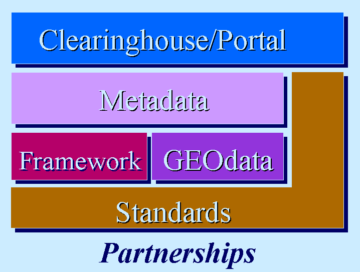
For some reason, 4 components are stacked on top of each other, one wraps around two sides of the 4, and the sixth component is in the background, forming a backdrop for all other five. Why it is like so, I have no idea. Is there a significance to “Standards” wrapping around the two sides of the stack of “Clearinghouse/Portal, Metadata, Framework and GEOdata”? And, why is “GEOdata” have GEO in caps? Is that an acronym for something? Why is “Partnerships” italicized? What does that signify.
Oh, there is much more that is wrong with this picture, but I will stop here. As an attempt to convey what the premier national initiative would be to build a national capacity for geospatial data and technologies for one of the largest and certainly the richest and most advanced country in the world, the one that invented most of this field and technologies, this whole presentation simply stinks.
Now, for some fresh air
I love walking. I firmly believe that my quality of life is very closely tied to whether or not I can walk to where I want to go. I detest and fear a life where I would be dependent on cars. So, when walkscore.com came by, I was in heaven.
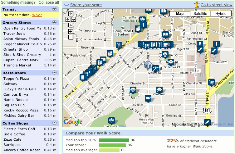
Walkscore of my neighborhood
In a very simple way, in a very simple interface, with just one box and no fiddling, it clearly and easily helps me discover the walkability of a neighborhood. It has everything that would make Tufte smile… multivariate analysis, the complex made simple, content that is king, ability to compare and contrast neighborhoods, a moving picture, and a clear explanation of “how it was done.”
Of course, it also has the best use of today’s technology. Just imagine how Minard’s march of Napoleon would have looked like if he had Google Maps, jQuery and Processing!
{ 2 comments }
This is one great example to show where visualization is a great way to solve or query some problems. In this visualization, the glyphs are intuitive, text fonts and their placement is nice to read, background color is esthetically pleasing and above all, it solves some of my day-today problems.
This visualization incorporates all the four fundamentals of “Good Visualization” that we covered in the class.
As far as the NSDI graphic, I completely agree with your analysis. The authors are essentially trying to summarize a paragraph with an interesting visual. They’ve missed the mark with this image, however. The ordering and stacking appear to have absolutely no significance. Additionally, the bland colors and inconsistent font choice make the graphic visually distasteful. The pale blue of the Partnerships box make that particular element very difficult to pick up on, despite the fact that it appears to be the intended “foundation” of their company’s purpose.
I must admit that this visualization intrigued me enough that I found myself checking out the website right after viewing the post. While it is not necessarily the prettiest visualization, a lot of data is contained in a single view. Essentially, this visualization appears to have three distinct components. The sorted list of destinations on the left allows the user to get a quantitative sense of the image. A brief look at the bars at the bottom give the viewer a sense of the “walkability” of the area, not only with respect to their own location but in comparison to similar locations in the area. Finally, while the overlap of the glyphs is mildly distracting, the map provides a very informative and clean view that combines the information in the previous panels with a sense of global location and orientation.