Bad example
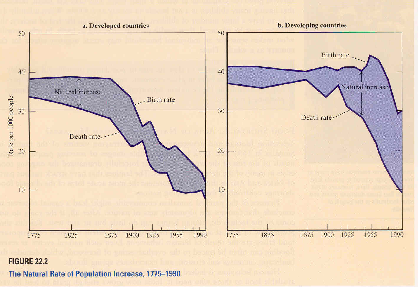
The two graphs show the natural rate of population increase for both developed countries and developing countries. The natural rate of population increase is the difference between the birth rate and the death rate. The purpose of this visualization is to reveal the difference in population growth rate (natural rate of population increase) between developed countries and developing countries.
However, this picture is an example of bad visualization because it doesn’t encode the important information in an effective way:
1) To getat a particular point in time, the viewer needs to calculate the vertical difference between the birth rate and death rate for that particular time, which is not intuitive.
2) The author wished to compare the population growth rates and conclude from these graphs that the population growth rate of developed countries is low and stable, while that rate of developing countries is high. However, by drawing the two graphs separately, it’s not easy to compare the difference.
Good example
http://well-formed.eigenfactor.org/radial.html#/?id=4324
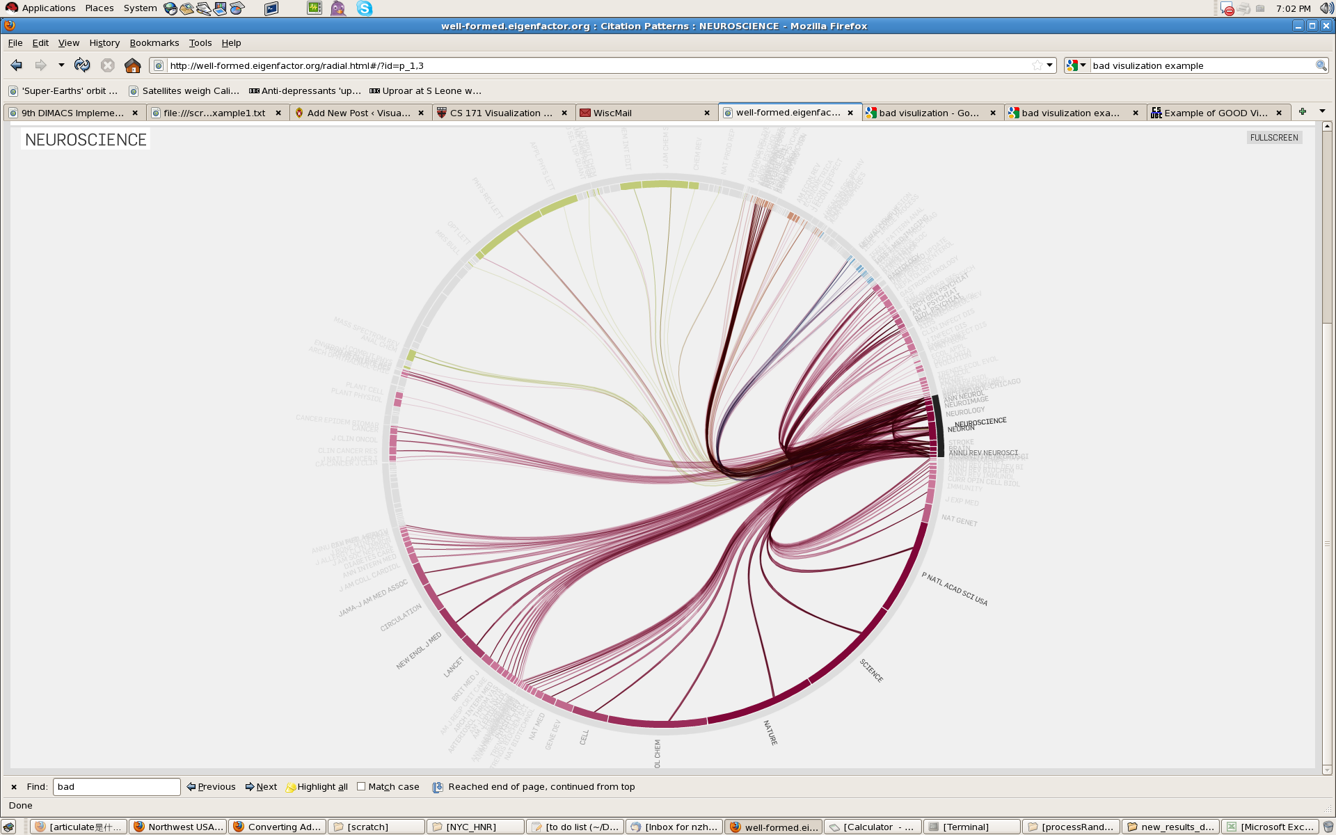
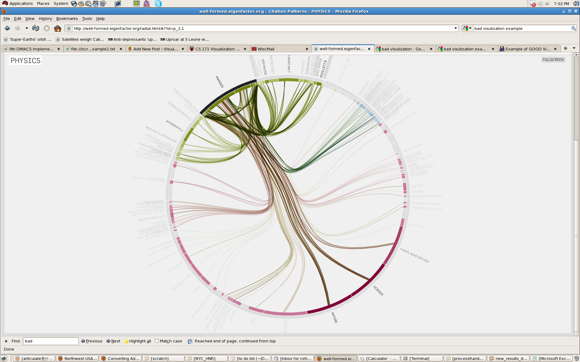
This visualization gives an overview of the whole citation network. The colors represent the four main groups of journals, which are further subdivided into fields in the outer ring. The segments of the inner ring represent the individual journals. In the initial view, the top 1000 citation links are plotted. Selecting a single journal (inner ring) or whole field (outer ring) displays all citation flow coming in or out of the selection.
Benefit:
(1) The visualization is dynamic. If viewer click one journal, the other journals and their citation ship will fade away, and the clicked one will be highlighted.
(2) The ring design gives same emphasis to all journals. Imaging line or other shape, the information at the corner might be ignored.
(3) lines (citationship) between different journals run very smoothly. It gives the viewers a clear observation of which two journals are related.
{ 2 comments }
The population plot makes it harder to know the exact rate of natural growth. But the intent was not to show exact value,rather, give an overall picture of natural growth in developing countries in comparison to developed ones. In this regard, I would say that the visualization did a good job. A side by side plot with common-axis seems to be a fairly good (and also clean) indicator for comparison. Sometimes drawing two plots on same axis can increase clutter.
One bad points for this visualization are is from Tufte’s guidelines of missing the source of their data.
The “bad” one shouldn’t be considered as a very bad one. As it’s from a scientific report, the main point might not only be the natural rate of population, but also be the birth rate and the death rate. Thus, only emphasize the natural rate of population might not be a good solution. I like the figure as it is, since it gives out a very complete data: the natural rate of population, the birth rate and the death rate, and their changing and shifting with time. The difference between the plot for the developing countries and for the developed countries is obvious, but the comparison is not explicit. This might be a major drawback of the design.