Tutorial 3: What is Easy to See?
A surprising amount of visualization design and analysis can be wrapped up in the single question “What does this visualization make easy to see?”
I am always looking for a shorcut that I can give to people to help them do Visualization better. Is there one easy thing that will help a lot? This is my current favorite: Ask “What does this visualization make easy to see?”
The biggest short cut - Always emember the “prime directive:” Task First! (hopefully you got that from Tutorial 1: What Is Visualization and How do We Do It?) - is harder to make direct use of. The “easy-to-see” shortcut is so simple, and can be used by everyone on day one (it is in Tutorial 1: What Is Visualization and How do We Do It? (Tutorial 1)), but less prominent.
You can ask the question in both directions:
- Critique: Ask “What does this visualization make easy to see?” (and, correspondingly, “what does it not make easy to see?”).
- Design: Ask “What do I want to make easy to see?”
If the answers don’t match, there is room for improvement…
You might wonder… “how do I know what is easy to see?”
Here’s my conjecture:
Your intuitions and impressions (your initial reactions to asking the question yourself) are probably a really good starting point. Yes, your ability to answer this question will get better after studying the “science” (and art) of visualization (perception, cognition, design, …).
Practice looking at visualizations and asking yourself “what does this make easy to see?” I think this is a learnable skill.
“What do I expect my viewer to see?” (rather than “what is it easy for me to see?”) is a harder (and better) question. It gets at the limit of the “self-experiment”. You are probably biased (you know what you want to see). Intuitions and impressions are just a starting point. Answering this harder questions is where science and rigorous process comes in. But you can get pretty far with the easy version.
One to practice on
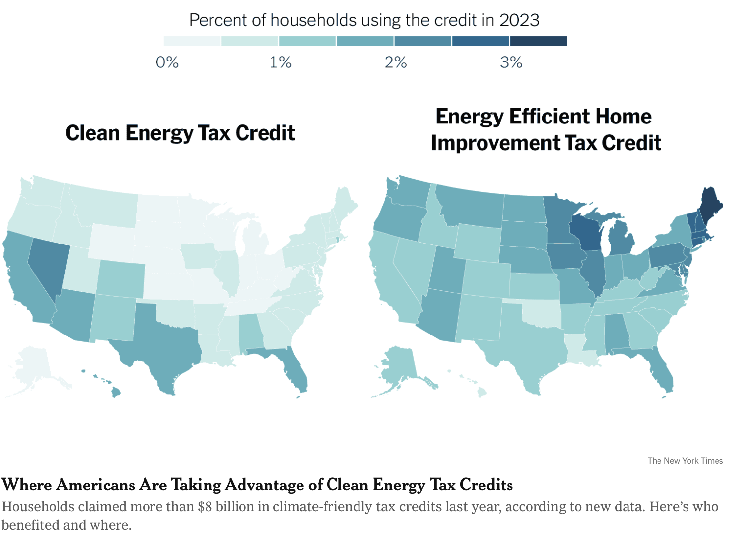
Here’s a visualization from the New York Times:

Maps of percentage of households taking advantage of two different tax credits, by state. from the NY Times
Before reading further, try this yourself. List a bunch of things that are easy for you to see. What questions can this visualization answer easily? What questions come to your mind? Are they easy or hard to see the answers to?
For me, it jumps out at me that my state (Wisconsin) is pretty high on the right (home improvement) and low on the left (clean energy). Actually, I am one of those people who got that credit that year. Other stuff jumps out at me as well… for example, on the left, states at the bottom seem to be higher, whereas the north central and north east are high on the right.
Some questions are hard to answer (not easy to see). Where does Wisconsin rank among the highest? What states are high in both metrics? The answers are there - they are just hard to see. If we wanted our viewer to be able to see the answers to those kinds of questions.
Comparing Visualizations
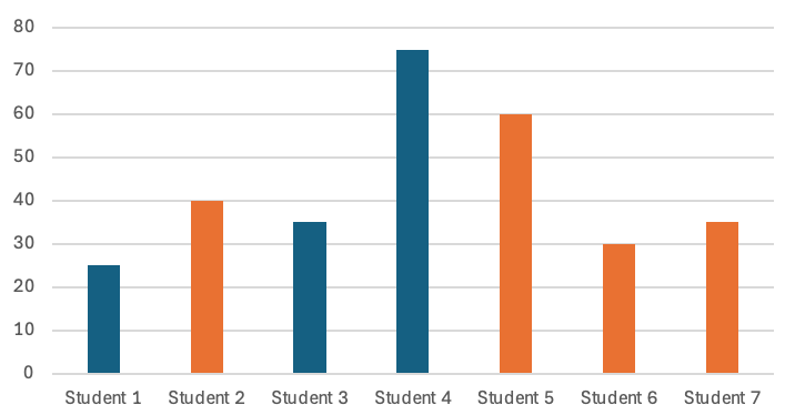
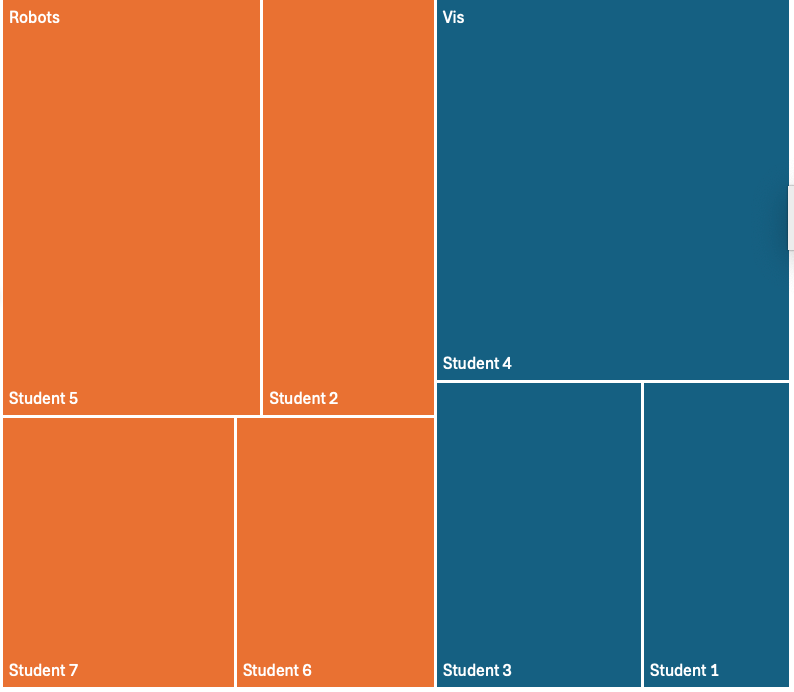
The “what does this make easy to see” becomes easier when you have two different visualizations of the same data. Using the simple example from Tutorial 1: What Is Visualization and How do We Do It?:
A bar chart of the fake data A treemap of the fake data 

Even though I can’t put them next to each other, they should be really easy to compare. Ask yourself: what can I see easily in the bar chart (but not the treemap)? What can I see easily in the treemap (but not the bar chart)?
I believe that practicing to develop this skill is a good step in learning visualization.
Connecthing this to design
I think we can use the question to shape a lot of what we do in terms of visualization practice:
What design choices should we make in order to make the things we want to see easy to see?
The power of a visual representation is that it can make certain “things” easy to “see.” The scare quotes are intentional because those are a bit handwavy - this is where the science should come in. The idea of “thing” gets at the notion of task (why are we making a visualization). See Tutorial 1: What Is Visualization and How do We Do It? to get at that core question of task. The “easy to see” is where visualization science comes in (how? does it work robustly for everyone? etc.). But for now, develop your intuitions.
What’s amazing about this question:
- It gets at the core of visualization design. We seek to make pictures that make make it easy to see the things that the viewer needs to see. (or, my prefered way to talk about visualization, achieve the task). We can consider design decisions in terms of how they will make certain things easier (or less easy to see).
- It provides a concrete way to critique and compare visualizations. We can ask the question literally - “what does this visualization make easy to see?” We can use it to motivate follow ons like “how does this visualization make it easy to see (the things it makes easy to see)”.
The double edge of this sword is important: if a visualization makes something easy to see, there is almost certainly something else that it is making less easy to see.
The core of visualization design is making a hard decision: what am I going to make easy to see (at the potential expense of everything else). This is why task is so important: it lets us know what needs to be easy to see so we can work to make it easy to see.
If we know the task, then we also know the “non-task” (the things we are not as concerned that the visualization does well). We can make choices (design) so that the visualization is good for the task, The more clarity and specificity we have about the task, the more able we are to know that “everything else” is the “non-task”
If you’re doing critique (even self-critique): ask “what does this visualization make easy to see” (and also “what doesn’t think visualization)