
Airline Route Maps: An interesting Solution to a Node-Link Problem
Let’s look at the “Airline Route Maps” (the ones that are in the back of an airline magazine) as a way to explore the importance of task and how understanding task and data can lead to novel designs. It will show us a different way to think about node link diagrams more generally.
In the back of airline magazines (these seemed to have gone away), there was always a map that showed where the airline flew. For a big airline, with lots of cities and flights, these maps were usually total hairballs - and I used them as an example for that in class. Almost all of them were very similar in design. (avoid peeking at the radically different design below).
Note: all these maps are circa 2013-2014, and most come from actual in-flight magazines (or the online versions). My circa 2013 cell phone camera wasn’t up to today’s standards.
Here is the one from Delta (circa 2013):
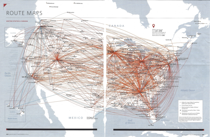
The Delta Airlines route map from the back of their magazine, approximately 2013. Ripped out of the Delta magazine and photographed by the author.
The one from United isn’t that different (the details and data are different):
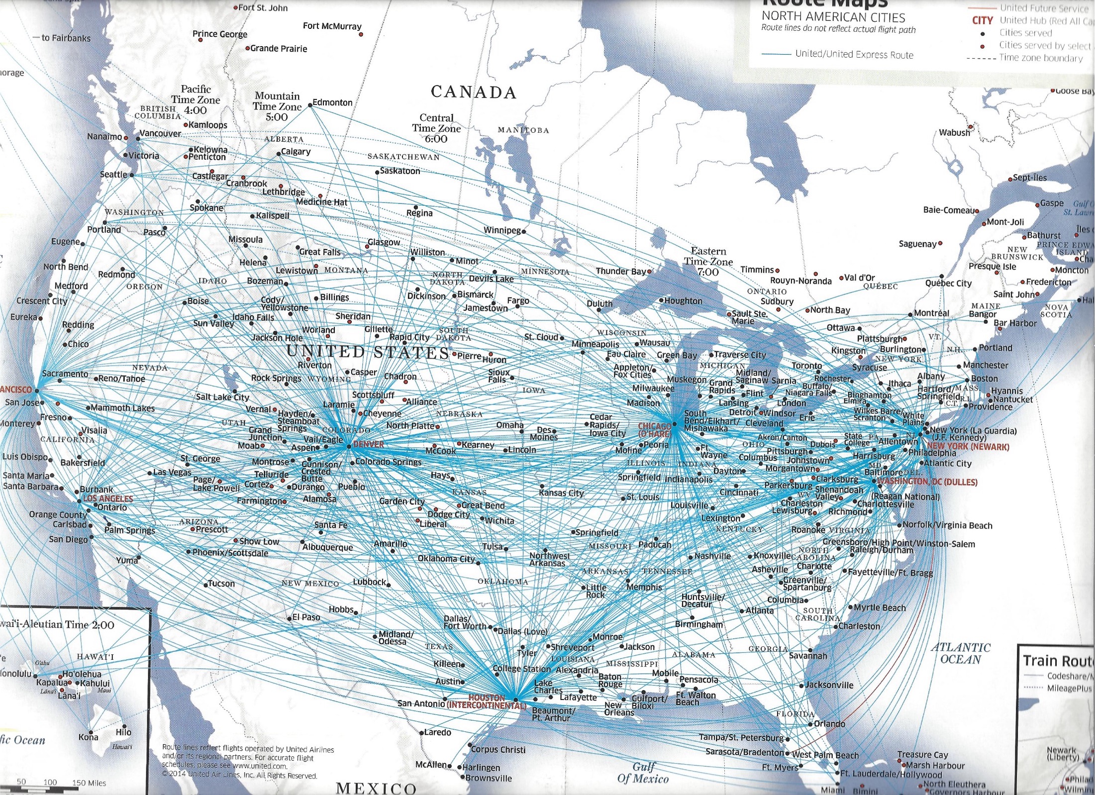
The United Airlines route map from the back of their magazine, approximately 2014. From the United Airlines magazine, photographed by the author.
Basic Critique
Let’s look at these “standard” examples to “critique” and get the basic ideas.
The data is node (city) and links (flight routes). The design is a node-link diagram where the positions of the nodes are fixed based on the position of the city on the map. The links are drawn as “direct” routes (generally arced - unclear if these are actual great circle routes, or some artistic license to make it nicer, and maybe a little less congested, than straight lines). Because the map was meant to be printed in an airline magazine, it is not possible to use interaction.
Let’s use the United one…
Before we start, try to critique a bit yourself. What do you notice? What do you think this visualization makes easy to see (or not)? What can you do with this map? What might you want to do with this map that would be difficult?
Let me try this in “stylized critique form” (see Tutorial 4: Critique )…
-
If the goal is to show that the airline has a lot of flights to a lot of places, the overwhelmingness of the hairball really emphasizes that.
-
If the goal is to show the hub and spoke topology on the airlines network, the high densities around the main hubs make that clear. The arced paths, which generally avoid flying over hubs, help by avoiding flying directly over hubs.
-
If the goal is to help the viewer identify specific routes, the large amount of overdraw makes it difficult to follow any individual path, so specific path tracing is likely to be difficult - especially for routes in congested areas.
-
If the goal is to remind the viewer of the airline’s identity, using the airline’s color scheme in the map helps.
Note how these critiques relate to task (obviously). There are things this map is good for, and not good for. Try to use this map to figure out “where can I fly to directly from Madison” or “what are good routes between Madison and Oklahoma City.” A critique practice: try to identify tasks this map is good or bad at, and think about why.
I’d like to think the designer was conscious of this: they were trying to make a map to emphasize the richness of the network by conveying overwhelm. They weren’t trying to make a practical route planning tool.
Task is one important factor… but the data is also an important factor. Part of the reason this design works (to the extent it does) are properties of the data. The airline does go to a lot of places. It does have a rich network with lots of flights. It has a hub-and-spoke organization that dominates the patterns.
An Alternative?
I lacked the creativity to come up with a solution that addressed the focus tasked. For years, I used the example in class - usually the answer was interaction (or something that didn’t meet the original design constraints). But then, one day, hiding in the back of an airline magazine, I saw a solution that opened my eyes.
This is a route map for a small airline that specialized in taking people from (Northern) European cities to (Southern) European tourist destinations. Take a minute to figure out how it works on its own. What tasks can you do or not do? What does it make easy to see/do?
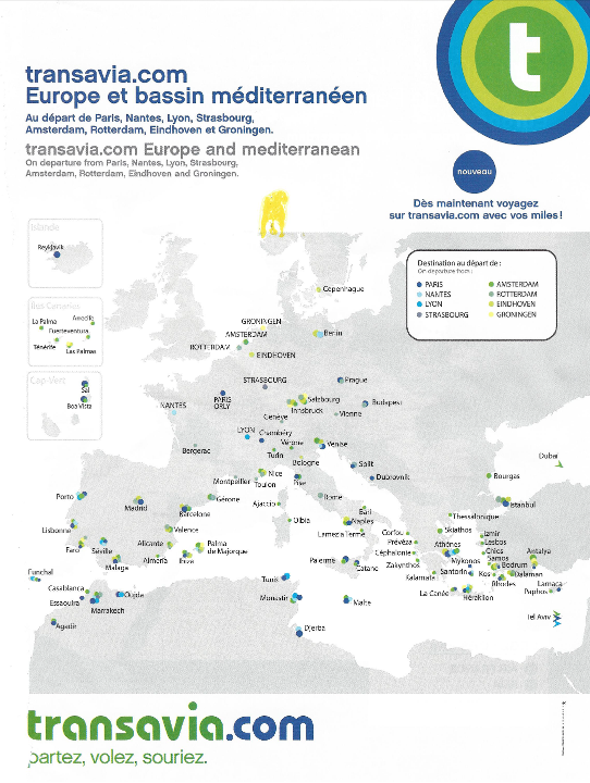
The route map of Transavia airlines, circa 2013. This was photographed from an inflight magazine (probably KLM, who is the partner airline of Transavia). The yellow splotch is probably from my lunch Photographed by the author from an in-flight magazine.
Here is a detail close up to make what is going on clearer. And a re-creation of the legend as SVG (see the AI statement below).
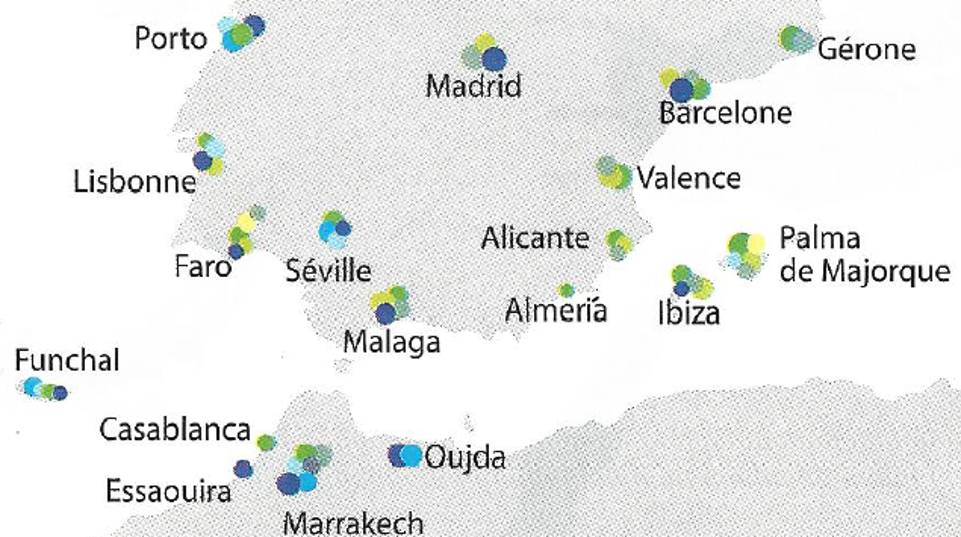
Detail of the Transavia route map. Photographed from an infight magazine.

Caption for the Transavia route map. The colors represent the different hubs tha airline flies to. Generated by Gemini based on the images shown here.
Again, I recommend you think about this map yourself before reading my “critique”.
This is a nice example of how to show node-link data with something other than a node-link diagram. The connections between nodes are implied by the colors. The colors are chosen to fit the color scheme of the airline (and are not shown well by my circa 2013 cell phone).
First, let’s think about some tasks…
-
I live in city X, where can I get to? Easy: I can find my city on the map and see what dots are there. There aren’t that many colors to remember (since there aren’t too many hubs).
-
Where can I get to from Hub X? Somewhat easy: just look for where there there are dots of that color. In theory, this is a “pre-attentive” task (focus on a specific color); in practice,the colors might not be distinct enough.
-
Can I get from X to Y in 1 stop? Easy: look at the colors of the dots for X; look at the colors for the dots for Y; if the same color appears in both, then I can connect through that hub. With a conventional design, it requires tracing edges.
-
I want to get a sense of where the airline goes? Easy: see what cities have dots - they aren’t obscured by the clutter of routes.
-
I want to get a sense of the network topology and how complex the network is (the “I want to impress the viewer that the airline has a big network” from above). OK: it isn’t as obvious as with the route maps above: there isn’t the sense of an overwhelming jumble, and its hard to see the “star” patterns of hub and spoke. But, this network isn’t as overwhelming as the major US airlines above, and with the hubs all close together, it’s not clear that they wouldn’t all blur together if I tried the standard design.
What impresses me about this design is that it provides a non-obvious and non-standard design (using color matching to encode connection) for a very standard network visualization problem - that actually does seem to address the important tasks.
But a lesson here: this design only really works because it matches both the tasks and the data. If the network didn’t have a hub and spoke topology, it wouldn’t work (there is no way to encode connections between non-hubs). It’s also not clear how it scales to a bigger network.
Some critique points…
-
If the goal is to make something that is instantly recognizable and usable, the novel design may not be a good idea because it takes a bit of effort to figure out for the first time. However, this novelty might create engagement, and the determined viewer will be able to address some complex tasks.
-
If the goal is to make something robustly color-safe (both for color vision deficient viewers, but also resillience to color reproduction issues), the maps reliance on having a relatively large set of distinct colors (one per hub) may be problematic.
-
If the goal is to scale to a larger number of hubs, the use of a distinct color per hub might put a constraint on how big the design can get. Also, the viewer has to remember the colors for each hub.
-
If the goal is to scale to a larger number of cities, the need to put a cluster of dots at each city might make the map dense.
The Takeaways…
For me, the two big lessons:
- Considering task and data can help us come up with novel designs.
- Node-link diagrams are not the only solution for node-link data. In fact, there are many tasks that they do not serve well.
GenAI Disclosure:
I used Gemini to convert my crappy cell-phone pictures of the Transavia map to SVG version. This worked amazingly well for the legend, so I got greedy and tried it for the whole map. It didn’t work so well. To see as far as I was able to get (using my limited prompting skills and patience) you can look at the best I was able to get.
I was slightly more successful at getting gemini to re-create the detail view. But it is clear that the washed out colors, overlapping dots, and indistinct patterns make it too hard for its vision model to identify the circles: /VisSnacks/critiques/250624-routemap/transavia-detail-gemini.svg. Even when the prompt said “Recreate this map as a resolution independent SVG image. Use circles for the colored circular marks next to each city. Match the colors and positions of the circles in the map as closely as possible. Each city many have more than one circle. Format the SVG file so that no line has more than 120 characters. ignore the gray background.”