
College Attendance Line Chart
This is a lesson on Axis Truncation for Line Graphs. It was inspired by a graph in the New York Times.
I like the example because (1) Axis Trucation was on my mind (from a previous critique ), (2) this seems to be a reasonable use of Axis Truncation, and (3) the data (and an alternate plot) were easily available, so we can do comparative critique and try some redesign variants ourselves.
First, here’s the line graph from the New York Times, this is a screenshot from my phone:
A line graph comparing college attendance rates for men and women over time.
from the New York Time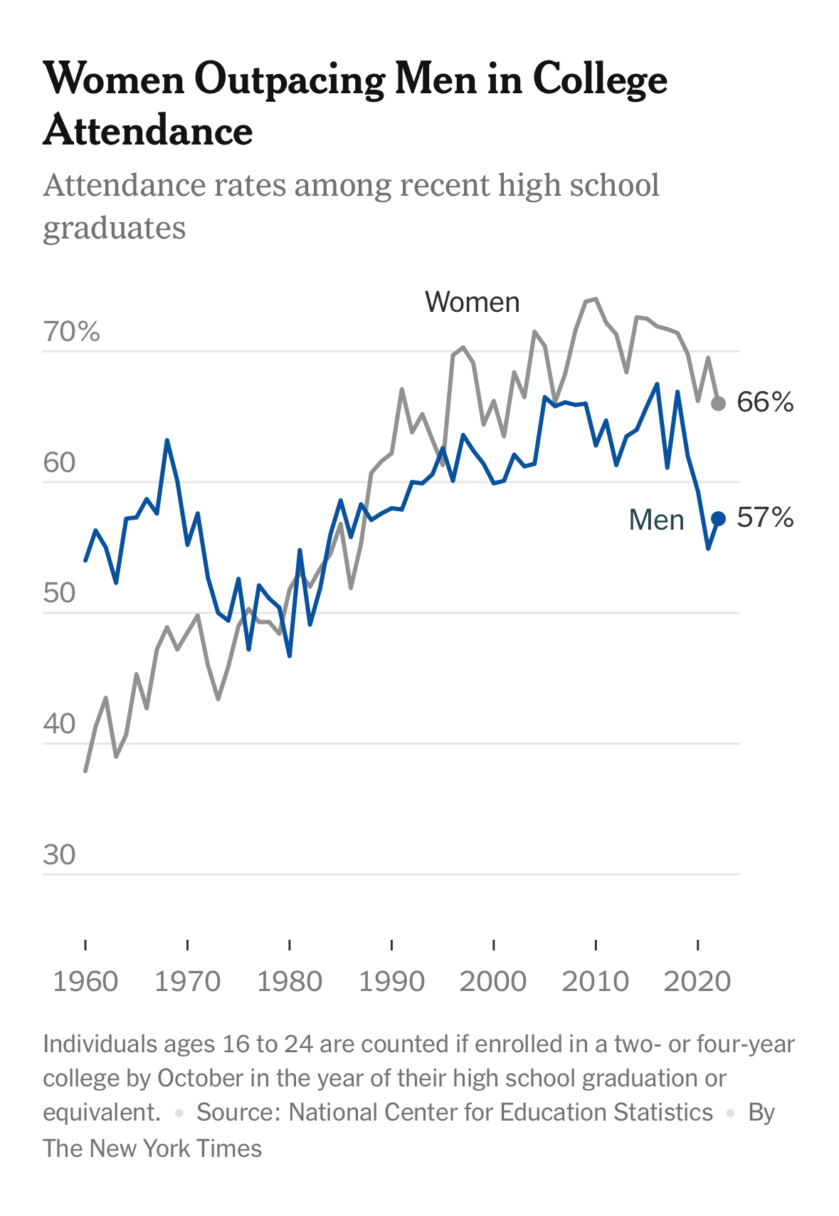
(generic critique advice) Take a minute to look at this chart - click on it to see it at full size. It might be harder to interpret out of context (but this was a “teaser” image on my front page). What does it make easy to see? What might we learn from it’s choices?
Note: I do not want to talk about the specific message conveyed in this chart (although, that might come up), or why this is the right or wrong statistic to show (it is the rate of college attendance of high school graduates - it doesn’t consider differences in the rates of high school graduation, or success rates once these students get to college). The choice of data is an important point, but requires too much context (which the article should give).
This is a simple chart - comparing two time series (women and men) over a series of years 1960-2020 for a continuous measure (rate of high school seniors attending college).
Here is a very similar chart - it’s effectively the same data (over a shorter range of time). It comes from the U.S. Bureau of Labor Statistics (BLS), and on their web page it (1) is interactive and (2) allows downloading the data (so we can experiment). The legend suggests ethnicity (which is in the data), but I’m not sure that’s actually shown.

A version of the line chart from the BLS. Bureau of Labor Statistics (BLS)
(generic critique advice) Take a moment to compare these similar charts. What are the (meaningful) differences? What can you learn from the different choices?
Side by Side for Easier Comparitive Critique
Looking at these, I see three “big” differences …
- The BLS version shows the overall average, while the NY Times only shows the two groups.
- The BLS version has different axis trucation (which is exagerated by the differences in aspect ratio).
- The groups are encoded differently: NY Times uses color, BLS uses line style.
I’ll discuss each of these in turn because they are interesting points…
Showing the average
The BLS chart has a third line: the “total” (for the entire population). Note: you can’t just average the two lines (since there are different numbers of men and women). So, this really does add information.
What are the pros and cons of the choice to include the total line?
The total line shows the overall trend. If the goal is to make the overall trend clear, showing it explicitly makes it easier for the viewer to see. In the BLS chart, they make that line the most salient (it is darker and solid - although, not by much). If the goal was to emphasize the overall trend, having more contrast would make it more obviously salient.
The downside is that it adds visual clutter. If the goal is to emphasize the differences between men and women, extra information might be distracting. Having the total doesn’t necessarily help make the comparison.
One of the things I find interesting: having the total line allows me to better see the relative trends. For example, some years, both groups go down, while in other one group dominates the differences. For example, in 2021, the individual groups both have spikes (in opposite directions), while the overall total stayed constant.
What this emphasizes for me… these designs are good for showing the trends in the individual groups (and comparing the trends), but are less good for seeing the patterns in the relationships.
Let’s try to do a re-design that better supports understanding the differences in the groups. If the goal is to understand the differences in the relationship of each group to the overall, then it show those relationships. I can do this by normalizing (dividing each group by the total). I divided the total by the total (which is always one) because it was an easy way to show that in Tableau. I recreated a version of the original in Tableau for easier comparison between examples.

Recreation of original

Ratios against totals
The new chart does not show the overall trend, but it does show that the relative trends for men and women are different - in fact they generally seem to be in opposition. When the rate for women goes up, it generally goes down for men. If the number of students is constant, then this makes sense - but we would need different data to tell that.
Is this redesign successful? It does more clearly show that the patterns in each group are not driven by the overall trend, but it completely hides the overall trend. And, it might be harder to interpret: logs of ratios are not as simple as values themselves. We’ll look at more redesign options later.
Part of the problem is that I am limited in what I can do: since I only have these percentages, I can’t compute some of the things I might want to try. For example, we might want to see things in terms of the total numbers.
Truncating the axis
Both of the charts chose to truncate the axes (not show 0). The decision to truncate comes up a lot - and there is a lot to be said about it (there will be a lesson on it). This is, arguably a place where the conventional wisdom says that axis truncation is a reasonable choice. Note that both the BLS and NY Times truncated their axis in a similar manner (loosely bounding the data) - the NY Times axis is a broader range because they have historical data that covers a wider range.
To make clearer what is going on with axis truncation, here are my recreations of the charts with different axes shown.

Showing the entire range of percentages
Trucating to maximally use space
Try the comparative question: what do the charts (differently) make easy to see?
To me, they tell very different stories. With the whole range, I see that the big trend is relatively constant - there are small wiggles, and some one off spikes, but overall, the numbers are pretty stable. With the truncated chart, I see there is a lot of variance. Is a five percent dip for a year a big deal? It is also much easier to see the differences between the groups.
The “conventional wisdom” says that it can be OK to truncate axes for a line chart, but some of the “science” says it is almost always a bad idea. Even astute viewers will sometimes miss the axes (there’s a paper on this). So we need to ask our usual question in two ways: (1) What does this chart make easy to see? and (2) What would this chart make easy to see if the axes is misread?
For this case, a misreading isn’t catastrophic. A viewer might over emphasize the variance (the variance is about the same as the trend), or pay too much attention to a spike (the negative blue downward dip in 2016 is huge!). But the overall message is still relatively similar - there isn’t too big a trend, green is consistently higher, there is variance. Contrast this to the A Robot Performance Graph Mistake example, where a misreading of the truncation gives a completely different message.
Axis truncation deserves its own lesson - coming at some point.
Choice of group encoding
Another difference in the original charts was the choice of how the groups are encoded. In the New York Times, they colored the lines, in the BLS chart they use line patterns (dots and dashes). In my recreations, I used color (mainly because it was easy in Tableau).
Is this a significant difference? I don’t know. If we were printing in black and white, the line styles would be an advantage. The line styles are definitely color-blind safe. In principle, there is more of a “color association” than a “line style association” (i.e., I don’t associate dashes with men, but I might associate blue with men).
I explicitly chose not to use “gender stereotype” colors, as this is considered a bad practice (see this article for a nice discussion). There is a whole art to picking the colors in a way that maximizes the association (so the viewer is more likely to associate each line with the correct group). In principle, the viewer should look at the key - but why make them do the extra work? This applies not only to first noticing the encoding, but also remembering it.
Other possibilities - Redesign
These “critiques” look at the details, but they don’t necessarily suggest what else we might do for this scenario, or a similar scenario we might encounter. It is difficult to make any prescriptions without more context - we are mainly trying to understand the rammifications of the designers’ choices.
To aid in exploring, I will pick objectives - note that this might not be what the original designer had in mind.
- I am stuck with the measure that we have (percentage of high school grads going to college) - without much control that this might not be the most informative measure.
- The viewer gain a sense of the overall trend.
- The viewer gain a sense of the gap and its trend.
- I need to be able to do this quickly, without a lot of custom tooling (i.e., using my limited abilities in Tableau).
Before reading about what I might try, you might want to think for a moment about what you might do. In fact, you can take the data and try yourself.
My first reaction is that achieving both goals 2 and 3 are tricky - there is a tension between them. This comes out in the trucated axis example (above): the non-truncated axis shows the trend well, the truncated zooms in on the difference. But even zoomed in on the difference, the trend in the differences is hard (for me) to see - because because what I am shown (the individual groups) vary with the overall trend.
Considering a different strategy: I want the viewer to see two things, maybe I should show each explicitly. I can compute the gap and show it - since its a percentage, it can go on the same axis as the overall trend.

Showing the trend in college enrollment (percent of high school grads enrolling) and the gap between women and men on a single chart.
We can see all sorts of good and bad in this. For example, it wastes a lot of space in the middle. I could try something different (using different scales)

Showing the trend in college enrollment (percent of high school grads enrolling) and the gap between women and men on a separate charts.
I’ll leave it to you to decide which one you prefer - or what else might be worth trying. This is critique practice - you can try to examine a specific decision, and/or generate other options.
One other thing to mention: notice that I chose a different “derived” quantity here than in the “ratios against totals” example above. Why did I do a simple difference this time, but the ratios in the earlier example? I have no good reason - the ratios were the first thing that came to mind. When I did these latter charts, I thought to try the simple difference. This choice of the derived quantity is a choice - and is worth thinking through.
Going Farther
There is a ton of data on this topic from the Institute of Education Sciences.
If you want to play with the data, I have a csv file, or you can even look at my Tableau workbook.