
A Robot Performance Graph Mistake
Don’t make the wrong thing easy to see. Here’s a real example from my own work where a seemingly innocent line graph was misleading, and needed some serious redesign.
A cautionary tale… This is from one of my own (rejected) papers. My student (Yeping) made this figure, but I take responsibility for not catching the problem. Two reviewers explicitly called out a problem (discussed in this critique), it both led them to the wrong conclusion about our work, and made them think we were intentionally trying to mislead them…
And the real problem was even deeper… It might seem that this is a simple case of (spoiler alert) axis truncation, but it really points out the importance of not making the wrong thing easy to see.
Key Lesson (principle): Make the right thing easy to see. Don’t make the wrong thing easy to see.
Lesson: Beware truncating Axes
Here’s a figure from a (rejected) paper submission that a student and I made to a robotics workshop:
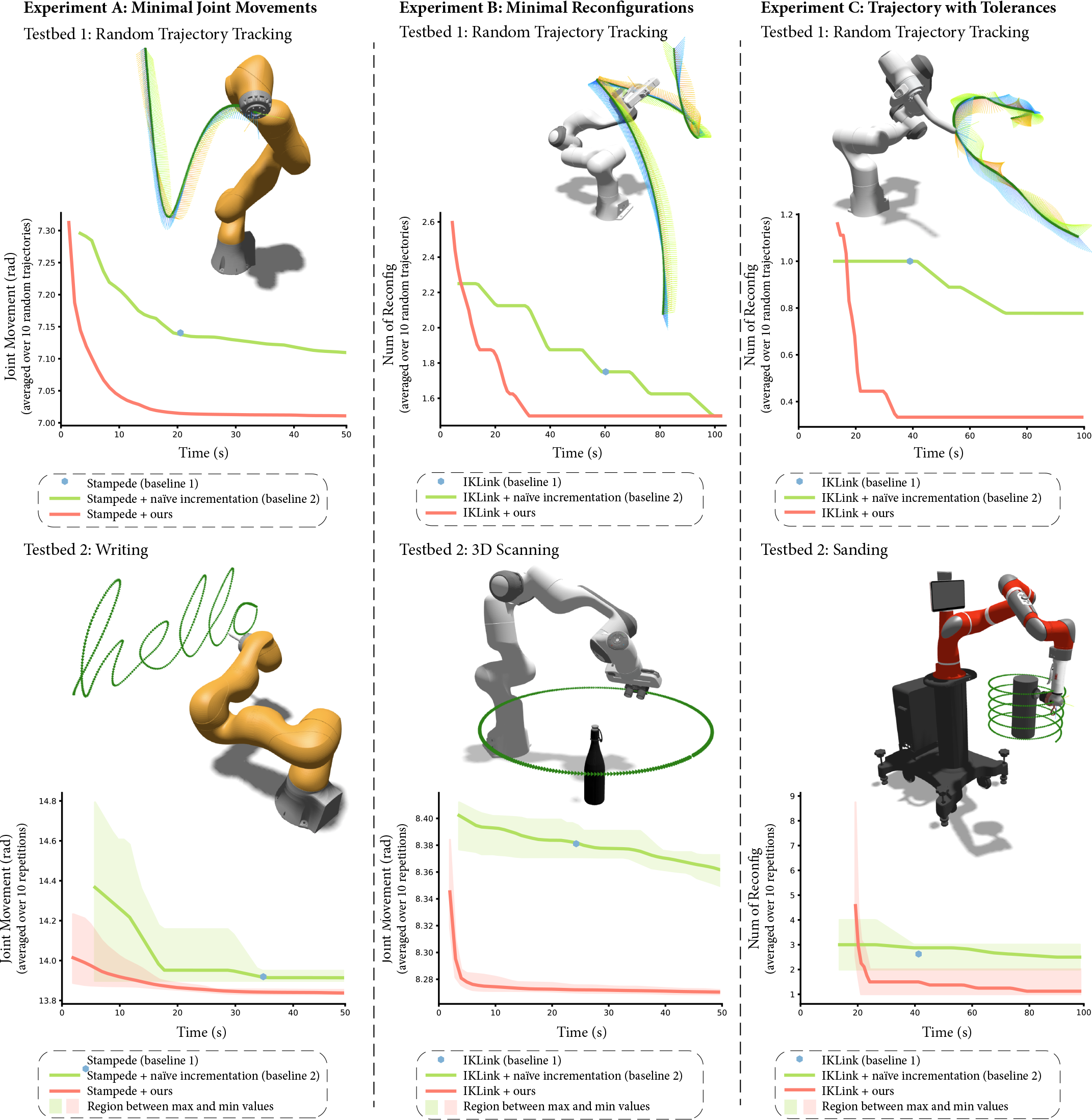
A figure from a robotics paper showing 3 experiments applied on 2 testbeds. The figure shows what the robot does, but also graphs comparing the performance of our algorithm and a baseline. Figure by Yeping Wang and Michael Gleicher
This is a cool figure with a bunch of robots doing stuff (there are 6 experiments, although it is labeled as 3 experiments across 2 testbeds).
There are robots doing stuff! What’s not to like?
The graphs show the performance of our new algorithm is way better than the baselines. But this isn’t about the robotics, let’s focus on one of the graphs…
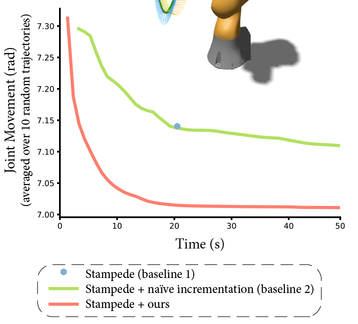
A graph of the performance of our new algorithm. Our algorithm is the orange line, the baseline is green (and the blue dot). The algorithm is meant to minimize joint movement (shown on the Y axis).
Without telling you anything about the robotics problem - except that the problem is to minimize joint movement (shown on the Y axis), and that it’s an incremental algorithm (the estimate gets better over time), what do you see in the graph? Our algorithm is shown in orange, and the baseline is shown in green.
What does this graph make easy to see? What jumps out at you as the main comparison?
Probably, the thing that you notice is that the orange line is consistently and significantly lower than the green one - at all points on the graph. This is what I saw when I looked at the graph at first. This is what the reviewers saw.
But then, look at the Y axis labels - the difference is between (approximately) 7.02 and 7.12. That’s less than 2% – not a big deal. If you’re a reviewer, you are thinking “this difference is less than 2%, that’s not a big improvement”. Worse, you are thinking “the authors made that 2% improvement really big - they must be trying to fake me out, I don’t trust them.” Yes, they told us that.
The easy thing is to blame the Y-axis truncation. Had we not truncated the Y axis, it would have been clear that this is a tiny difference - and not interesting. Y-axis truncation is bad here, but we’ll leave that for another lesson.
The problem is that the graph made the wrong thing easy to see! It was so easy to see the Y axis difference that you might not notice the important thing: the positions on the X axis. This graph didn’t make the right thing easy to see, and (possibly worse) it made the wrong thing easy to see!
An obvious fix is to not truncate the Y-axis - at least this would make the wrong thing harder to see.
Indeed, that is part of the solution. We also need to make sure that the right thing is easy to see. Here is that part of the figure from the final paper.
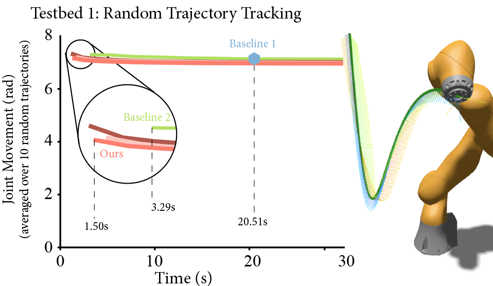
The improved graph. Our method gets a solution that is just as good (insignificantly better) than the baseline method in less than half the time. Both methods are way faster than the (non-incremental) state of the art.
Notice how we emphasize the differences on the X-axis. We had to zoom in on the left side, since that’s where the action is. Baseline 1 (the blue dot way off to the right) was the state of the art. And even our “simple” baseline was a lot better.
The Real Lesson…
The big lesson: make the right thing easy to see, and don’t make the wrong thing easy to see.
The important thing (the point of the paper) is that our algorithm gets a result faster than the baseline, and that result is not worse than the baselines. The X-axis (time) is the main point - we need to call attention to it. We still need the Y-axis (result quality), as we need to show that our result is not worse. Our results are marginally better - but the main thing is we get them much faster.
The differences in times are important - we need to make them easy to see. The differences in quality are less important - we don’t need to call attention to those differences.
Here is the final figure, if you’re curious…
The final figure showing the results from our paper. 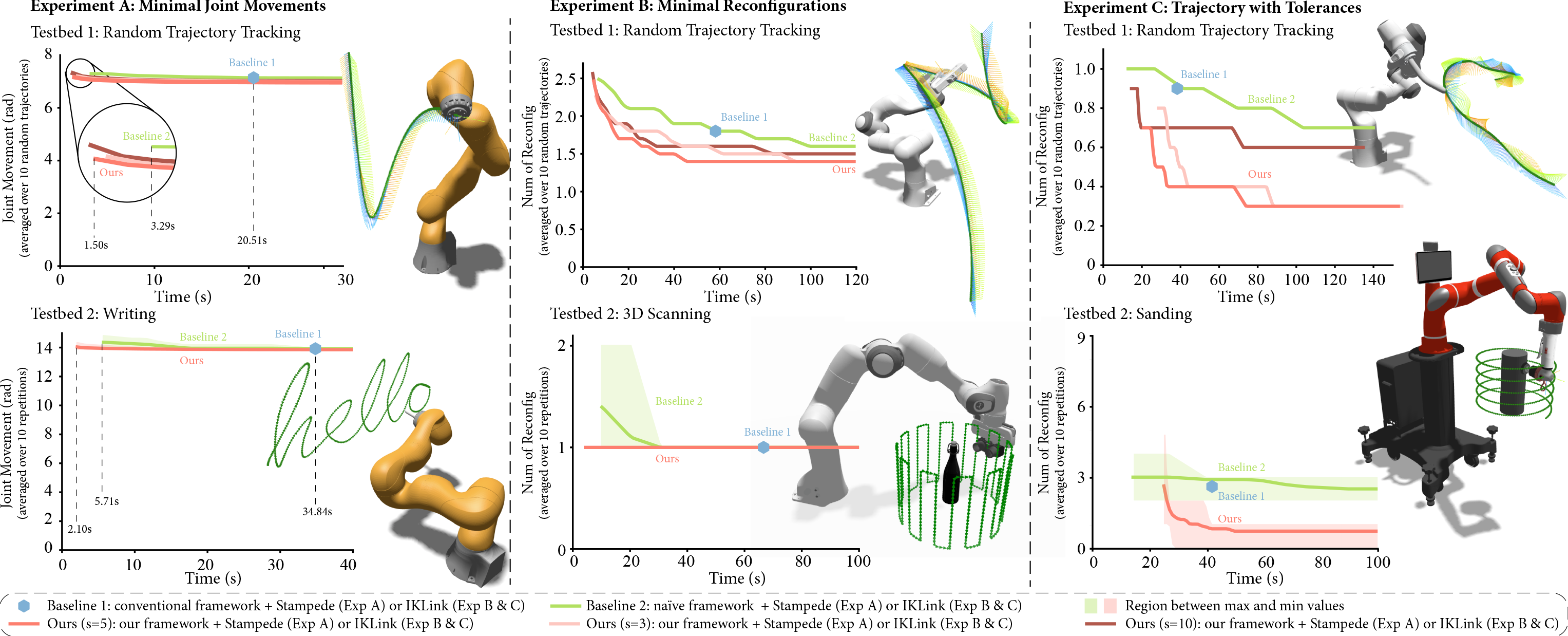
Takeaway…
Don’t make the wrong thing easy to see!
Be careful when truncating axes is a corallary to the more fundamental principle: make the right thing easy to see, don’t make the wrong thing easy to see.
With an improved figure (and some other writing fixes), the paper was accepted at a journal. You can see the figure in the paper: Yeping Wang and Michael Gleicher. Anytime Planning for End-Effector Trajectory Tracking. IEEE Robotics and Automation Letters, 10, 2025. (DOI).
But, the big lesson for Visualization: Don’t make the wrong thing easy to see!