
Unemployment Changes Across The Country
Core lesson: think about what a visualization makes easy to see. Different representations make some things easier, and harder. And some issues with dealing with geographic data in the US.
This comes from a New York Times story from August, 2024 The Geography of Unequal Recovery. Curiously, this page doesn’t show up well in my web browser, the images are from the mobile app (on an iPad).
Here is the “headline” (what appeared in the app “front page” that intrigued me):
A New York Times headline that appeared on my iPad from the NYTimes
Let’s start with the country-wide map (since it’s the top thing in the article), and makes the point even clearer:
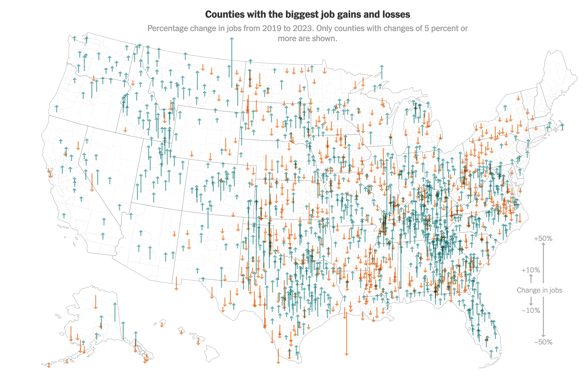
Changes in employment for each county in the US. from the NYTimes
What caught my eye (from a visualization perspective) was how the irregular nature of counties made it difficult for me to really see what was going on. That isn’t Tutorial 4: Critique (critique). Let’s see what I can learn from it.
What I want to see (this is an approximation of what the designer’s goals were - I don’t really know there intent) is where in the country jobs are growing/shrinking. From the title, I should expect to learn that different places fared differently - I want to know where, and how much.
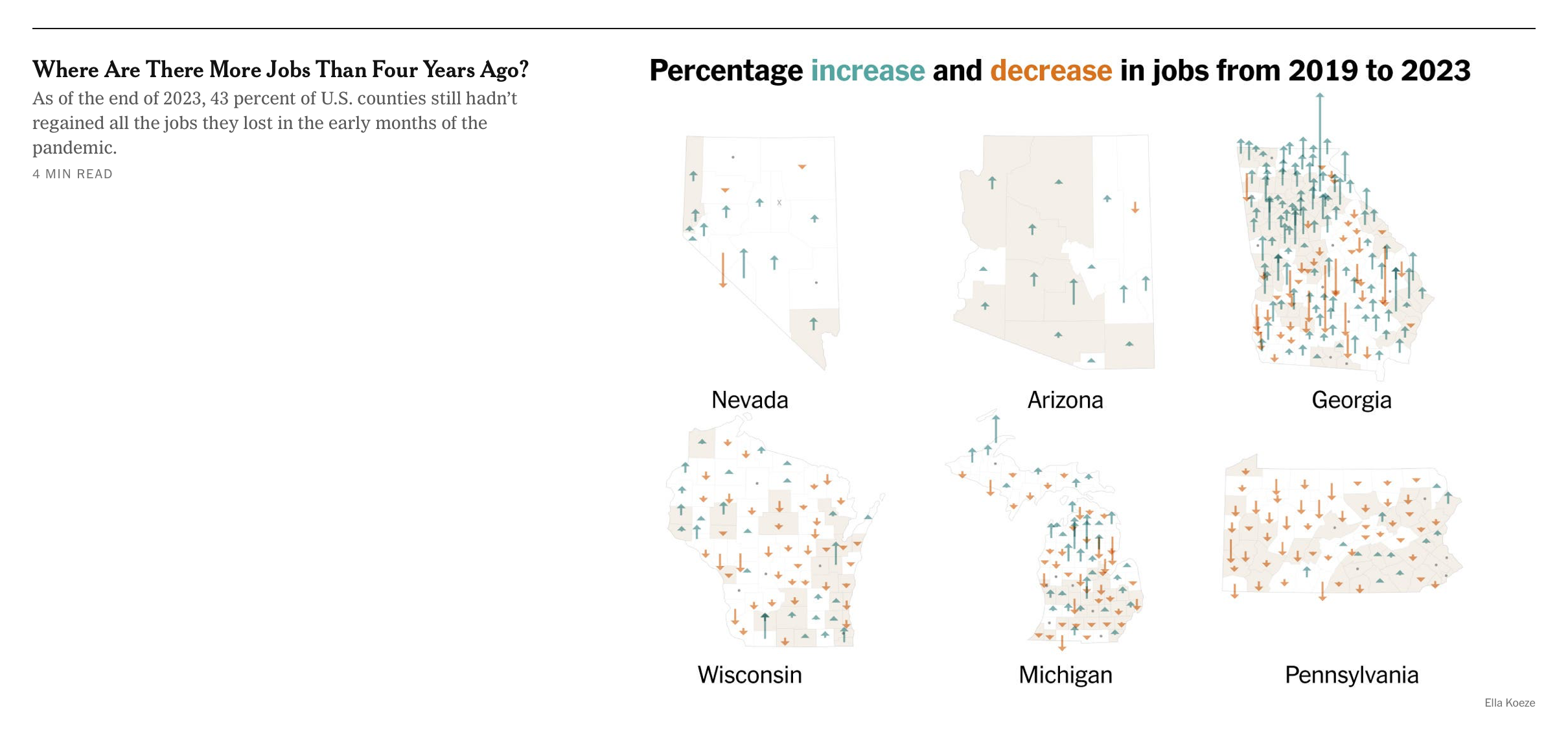
What does this visualization make easy to see? One thing that jums out at me: Georgia has a lot of small counties, whereas Arizona has a few big counties. This problem is even clearer in this figure (from later in the article) that compares states:
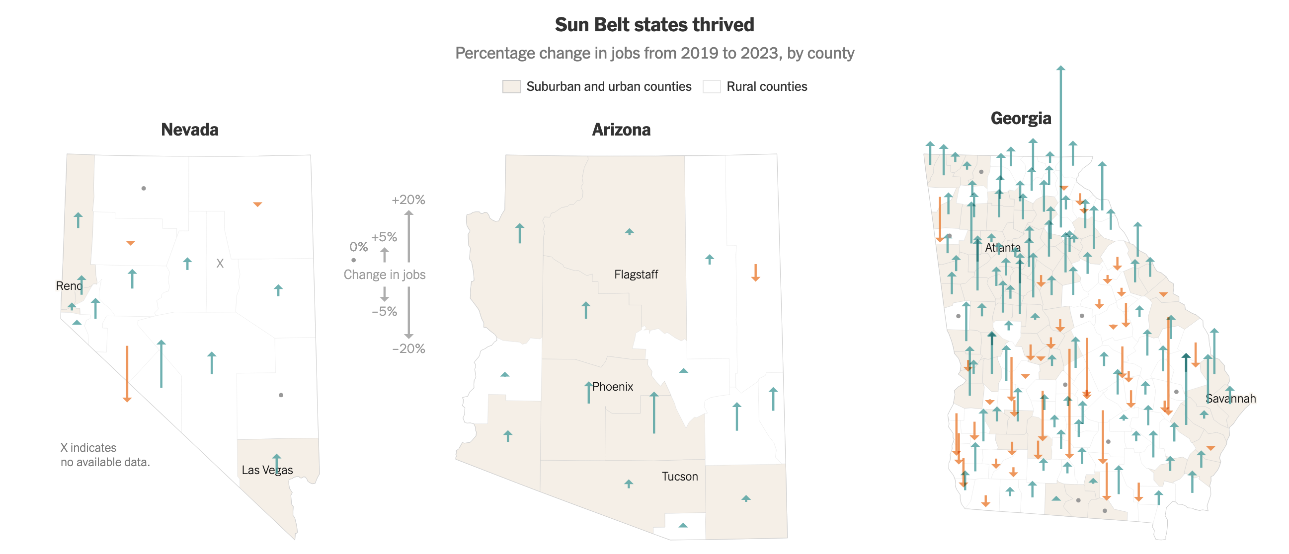
A portion of a figure from a NY Times article showing changes in the number of jobs. from the NYTimes
Different states divide themselves into counties differently. Georgia has lots of (geographically) small counties, whereas Arizona divides itself into a few big ones. This has to do more with history and politics and (usually) doesn’t represent population.
I don’t think the designer intended to teach me about how states were divided (they made the wrong thing easy to see!). This comes up often in student projects - it doesn’t matter what per-county data you look at, the differences in the number of counties always pops up. Texas and Georgia have lots of counties.
Beyond the Number of Counties
The arrows themselves encode the change in number of jobs (as a percentage), with color encoding whether it is positive or negative.
The dense array of arrows kindof looks like trees - it’s kindof cool. Is it effective? In dense locations, it’s hard to see individual arrows (look at northern Georgia), and it is hard to see if a dense region is made from lots of small arrows, or fewer big ones.
Color helps a lot - I can see regions where things are going one way or the other quickly, as well as the regions that are mixed.
Finding the big arrows (places where there are radical changes) is mixed. The big up arrow in Montana and big down arrow in Southern Louisiana pop out. But the huge arrows in west Texas? (that has so many blue pixels it swamps out all the smaller orange arrows).
Of course, those big arrows might not mean much - because they don’t consider the population (and absolute number of jobs). The state of Montana is full of big blue up arrows, but fewer people live there than in Philadelphia which has no arrow at all.
This kind of makes it had to tell how significant the changes are. And because these changes are percentage changes, a small county (where a few people can make a big difference).
This can be even more misleading because the counties may have different numbers of people - independent of their size. For example, in Nevada, about 3/4 of the population lives in one county (Clark county, where Las Vegas is). So, the small blue arrow in the lower right part of the Nevada map probably represents more jobs than the rest of the state.
Of course, this might have been the point: 10 new jobs might make a huge difference in a county where 20 people are employed, but won’t make a difference in a big city. But in the design of the visualization (which includes choosing the aggregation strategy), a designer should consider and be aware which message they want to make easy to see.
Re-Design Experiments
To understand the design, I’d like to compare it with some more standard alternatives. I can’t get the exact same, data, but I can try to get something close.
I pulled 2023 and 2020 (the website didn’t have 2019) from the US Bureau of Labor Statistics Employment and Wages Data Viewer. I pulled “All Counties, One Industry, All Ownerships, Total all industries” for 2023 Q4 and 2020 Q1. I had Co-Pilot write a script to aggregate the data (script) (csv).
A Data Mistake…
I initially tried this using the Q4 data from 2020, and got a very different result. In December of 2020, unemployment was high because of the pandemic. Most places experienced job growth from that low point.
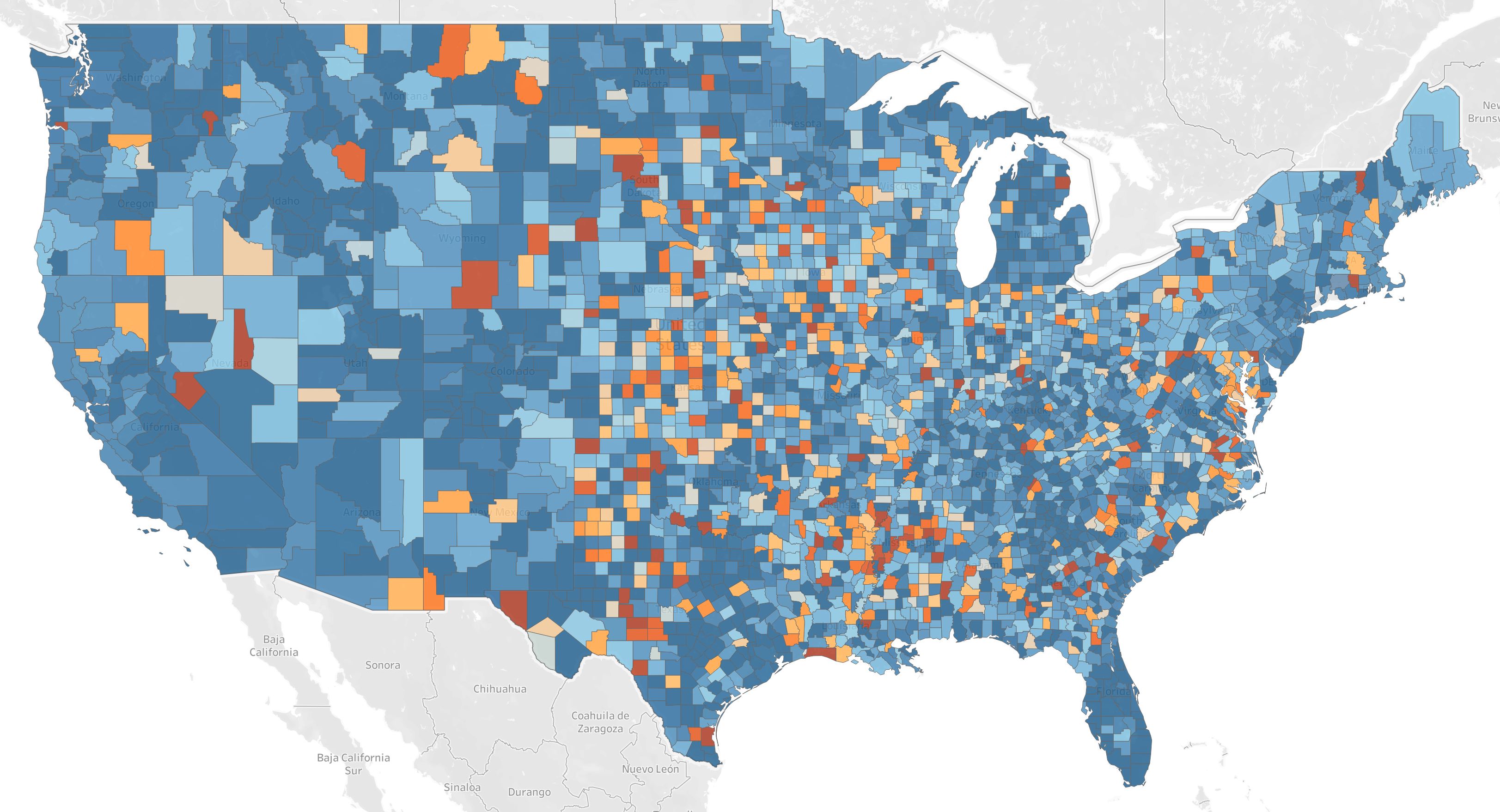
Change in Unemployment Dec 2020 to December 2023 (as a percentage). Orange is negative, blue is positive (the scale is not included - but was truncated at 10%). Most of the country improved after the pandemic.
I loaded the data into Tableau - since that’s the easiest way for me to make a map. One trick: I had to tell Tableau that the FIPS code was a string (so it preserves the leading zero) and a County (so it knows its a FIPS code). I also filtered out things outside the continental US.
My goal is to show where there was a big change in the number of people employed, in percentage terms (where the differences are felt most). Unlike the original, I want to convey the total number as well (to give a sense of the magnitude).
The obvious way to show a per-region (county) value is a chloropleth map (encode value with color). This is straightforward in Tableau. I chose to limit the range of percentages to -50 to 50 (this is what the NY Times did).

Percent change in number of people employed 2020 to 2023. Blue is increase, orange is decrease. Scale clipped at 50%. Click this (or any almost image) to zoom. Made by the author with Tableau.
In this view, the geographic size of the county matters - but this is not connected to employment (either in terms of population, or change). Using the same symbol for each county (like the NY Times original) is an option. I don’t know how to do this in Tableau, but I can make a circle per county - and use a color encoding on that.

Percent change in number of people employed 2020 to 2023. Blue is increase, orange is decrease. Scale clipped at 10%. Click to zoom. Made by the author with Tableau.
While this tells the same story, it makes the variable sampling rate of counties really obvious (which is good, if showing the different density of counties is a goal). But it still is based on percentages - so those small counties show big gains.
I could also use the absolute difference in the number of people employed. Here is that shown the same way.

Change in number of people employed 2020 to 2023. Blue is increase, orange is decrease. Scale clipped at 50,000 people. Click to zoom. Made by the author with Tableau.
This tells a very different story. Most places had a small changes in terms of number of people. Some of the ones that pop out are curious - and they suggest to me that changes in number of people employed is affected by changes in overall population. During COVID a lot of people left the cities for the mountains (San Francisco is a big decrease).
Of course, I can put these two together: use the color to encode the impact o n the county, and use size of the circle to encode the number of people employed in the county (how significant that impact is).

Change in percentage change in number of people employed 2020 to 2023. Blue is increase, orange is decrease. Size of circle shows the number of people employed in . Click to zoom. Made by the author with Tableau.
This kindof works. It’s a bit tricky: there are wide ranges in both the percentages and city sizes, but I don’t care about conveying the fine details. Similarly, there is a lot of overlap in the dense regions, but that kindof makes the point. I had to play with the color scale (I chose a binned palette) and the circle sizes to get it to look OK (and it only looks OK at full size on my big monitor). It bugs me that the light colors don’t show up well on the gray background, but those small tweaks are beyond my Tableau skills.
How well does this design work? It lets me see regions of gains and losses. I can look for very dark colors (positive or negative) to see places where there were major shifts, and the size of the dots let me know if this affected a lot of people. There is overlap in the dense regions, but I can still get a sense of what is going on. The white dots (to show places that didn’t change) get lost a bit on the gray (but the places of no change were left off of the NT Times version). If you need the geography lesson about the variance in county size, you can still get it.
Let’s try a comparitive critique…
My Design: Color indicates percent change, circle size represents total employment.
NY Times Design: Arrows length indicates percent change.
Actually, I’ll leave the comparitive critique as an excersize for the reader. It is easy to complain about the details in mine (I neither spent time tweaking, nor have the Tableau skills) - so try to focus on the general concepts of the design. What does the dots make easier to see? What does it make harder to see?
If you want to play with this yourself, I’ve provided the (csv file) and the Tableau workbook (twbx file).
GenAI Disclosure:
I used Claude to find the data and get instructions on how to get exactly what I wanted. The prompt was “provide an excel file that has the number of employed people in each county in the US for the years 2019 and 2023”.
I used CoPilot with the Gemini model to write the script to process the data.