Design Challenge 1 Updates…

by Mike Gleicher on March 15, 2017

Almost everyone has turned in the assignment.

For those of you who were just minutes late, it isn’t a big deal (although, you did have weeks).

However: in looking at the first few, I see there was something that was not clear in the instructions. We will give people a chance to correct it. (it’s small)

Here is the bad paragraph from the assignment (emphasis added by me):

For each visualization, there should be a good caption, explaining the data and enough of the story. Although, if your graph is really great, the reader might figure out the story without reading the caption. Please do not put your name inside the PDF (so that we can send them out for anonymous critique). The PDFs should be 1 page each. it should be clear from the visualization and/or caption what data set it is. Turn in a 6th document that explains how you made the pictures, and what you were trying to show with each one. These will be turned in as an assignment on Canvas.

We asked for your captions to explain what the story is that the viewer supposed to see. There is a hazy line between explaining what the graph was meant to be about (i.e., what question) and telling the answer directly.

Peer reviews will be asked to evaluate “Does the visualization address/answer the question effectively” – so they need to know what question the designer had in mind.

For many of you, this is in the documentation file – but since the documentation file is (almost always) not anonymous – so we can’t give it out for peer review.

So… we are giving you the option to address this issue. You may either:

  1. (not recommended option) Redo your pictures with better captions (and turn them in again) – we ask for your honesty in not changing your pictures.
  2. Add an extra file with the captions / questions for each picture that doesn’t have your name on it. For many of you, this is just making an anonymized version ofthe notes file you turned in (with less detail).
  3. Be proud that you were able to guess what I meant when I made the assignment.

If you want to update your assignment, you may do so – either on Canvas, or by sending the new “extra file” to the TA (copies to both of them by email). If you turned things in before this morning, we know it, and adding this extra information will not be held against you.

Note that this is not a big deal: when we grade, we have access to your extra file and can see your descriptions there. But you might want to do this for the benefit of your peer reviewers, or add the extra questions if you don’t feel your descriptions convey them well.

You must do this before we send the files out for peer review. This is a hard deadline. To be safe, do it before 10am, Thursday, March 16th (since we’re likely to start sometime around then). If you’re brave, you can try it after that, but if we start on time, you might lose out.

Last minutes of the Design Challenge 1 Design Phase

by Mike Gleicher on March 15, 2017

The designs for Design Challenge 1 are due in a few hours… A few last minute memos.

If you’ve turned things in already, thank you! You will find out the rewards of being on time.

For everyone: as I mentioned in class, we won’t be doing the in-class critiques tomorrow (we’ll be doing an in-class design exercise). So there’s no need to bring a paper print out of your design.

There was a Piazza question about “late policy” – if you didn’t hear (or actually, even if you did) let me clarify…

We need you to turn things in on time so that we can prepare them to send them out for peer review. So, if you don’t turn things in on time, there will be steep penalties…

  • If you turn things in on time, we will check them and (possibly) give you a chance to correct small procedural mistakes before they go out for grading and peer review.
  • If you turn things in slightly late (within 24 hours or so), we will send them out for peer review (and grading) as is. So you’ll get a penalty for being late, and potentially another penalty for getting things wrong.
  • If you turn things in more than slightly late (after the time we gather the assignments to send then out for peer review), they will not go out for peer review. We will give you a larger penalty. Also, while the peer reviews aren’t used for your grade (the ones you write are, but the ones you receive are just feedback), they can influence your grade (if we don’t like your designs, but the peer reviewers do, then we might reconsider). So you will really lose out by being late.

So, short version: if you’re going to be late, try hard not to be very late. And don’t worry about bringing a copy to class.

And also from Canvas… don’t worry if your “pages” are bigger than a page – as long as the designs are clearly separable.

Interaction Examples

by Mike Gleicher on March 13, 2017

Non-Interactive

Chiccago Homicide Rate (NOT interactive – uses a callout for story)

  • pick the view – so viewer doesn’t have to

Thanksgiving Flight Pattners

  • just animation (somewhat gratuitous / redundant)

Where shows are popular – Limited Interaction (menu to pick a map)

  • Why did they do it this way?
  • what other interactions might you want? (find this one)

Untangling Spaghetti

NGRAMs original spaghetti

  • needs to be sufficiently tall

Making Gammy History (spaghetti plot – exposes hidden stuff on hover)

  • detail on demand
  • readability cure

Detail on Demand

Impact of Obamacare

  • Juxtapose cloropleth map w/detail on hover

NBA Correllogram -> Scatterplot

  • details on demand w/click and hover


Switch Data / Detail on Demand

NY Times – stream graphs of state migration

  • detail (readability) on demand
  • switch data / view

Vornoi Tree map of state migration

  • switch data
  • detail (story readability) on demand

Interactive Experimentation

538 P-Hacking (interactive machinery)

  • encourage exploration and tinkering

Social Security

  • first page, various things with mousovers
  • 2nd page, interactive experiment

Basic Charts Brought to Life (Pan, Zoom, Detail, …)

VEP Demos

  • Non Interactive Scatterplots
  • Interactive Scatterplots
  • Detail on demand
  • Selection in the browser (sorting etc in browser)
  • pan/zoom

Pan, Zoom + Detail

Claudio’s Shadows Thing (need to turn off Ghostery)

  • pan/zoom
  • switch data
  • detail on hover

Life Expectancy (vs poverty & geography)

  • Chloropleth map with pan zoom
  • Hover for details on demand
  • Images really don’t tell story (good design challenge problem!)

Scrollable Narratives (Progressive Reveal)

Voting Habits

  • Animated story as scroll

How the recession shaped the economy

  • scrollable narrative, interactions at each step
  • really about story telling from spaghetti

Not Necessarily for Class

Explorable Explanations

  • examples aren’t as good as i would hope


The Week in Vis: Week 9, March 13-17

by Mike Gleicher on March 10, 2017

Last week we talked about Color. And we could keep talking about color, but we won’t. It will probably keep coming up.

And we started on the first Design Challenge, including doing a little bit of design critique. The main thing is due this week.

This week, we’ll move on to considering interaction. For now, we’ll talk about interaction to understand what and why. The how is much harder, and is something we’ll come back to.

Note that the design challenge deadline (Tuesday) is a pretty hard deadline. If you don’t get your designs in on time, we won’t be able to send it out for peer critique. We’ll send things out for peer review later in the week, the reviews aren’t due until after break, but since the next Design Challenge will start immediately, you might want to get them done sooner rather than later.

  • Monday, March 13 – Lecture on Interaction. It’s best if you do (at least some of) Reading 9 before class. As usual, the initial posting for the discussion assignment (Assignment 9) is due.
  • Tuesday, March 14 – Design Challenge designs due. This is the main turnin for the assignment. (although, you still need to do peer reviews). Because of the timing of peer reviews, this deadline is hard – late assignments will be penalized.
  • Wednesday, March 15 – In Class Design Exercise – We’ll do a design problem in groups. Bring colored pencils/markers and paper. We might also do some more discussion of interaction.
  • Friday, March 17 – No class. It’s the day before break! I’ll have office hours if you want to come by and talk.
    Seek and Find 9 is due. Also, if you haven’t done the Mid-Semester Eval form, please do.

The Week in Vis: Week 8, March 6-10

by Mike Gleicher on March 5, 2017

Wow – we’ve reached the middle of the semester! Which is why I’d like you to do the mid-semester course evaluation.

Last week, we talked about encodings. And we looked at Tableau, not just because it’s useful for the Design Challenge Assignment, but also because it embodies a lot of the concepts behind encodings.

If you’d like to see Alper’s notes on Excel for the design challenge, they are online. The Tableau notes are coming soon.

For this coming week, you’ll continue to work on the Design Challenge. Drafts are due in class on Wednesday – you should have some initial ideas at least and some sketches. Part of this is to make sure you’ve gotten started.

The main topic will be color. This is a big and complex topic. We’ll talk about it in class Monday. We’ll have a reading and discussion on it. We’ll barely scratch the surface of its complexity. But hopefully, it will give you the basic ideas…Design Challenge 1: One Data Set, 4 Stories

  • Monday, March 6 – Lecture on Color. Please do part 1 of Reading 8 before class. I’ll go through the main ideas in lecture, but it’s one of those things that’s best if you hear it multiple times. As usual, the initial discussion posting for Assignment 8 is due.
  • Tuesday, March 7th – Turn in 2 drafts for the design challenge. For the drafts, it’s OK to sketch (send a picture/scan of your sketch). At this point, we’re mainly checking to make sure that you’ve started. But the more you tell us about what you’re doing, the more likely it is that we can provide meaningful feedback.
  • Wednesday, March 8 – In-Class Exercise to do critiques on your sketches for Design Challenge 1. Remember to bring at least one of your designs on paper to show your classmates! We’ll also spend some time talking about color (since there is so much to say).
  • Friday, March 10 – No Class! It’s prospective student visit day for CS grad students. But don’t forget that there is a seek and find and you need to continue the discussion for assignment 8.

Next week is the week before break. We’ll talk about interaction. We’ll wrap up the design challenge. I’ll tell you about my plan for what happens in class after break.

Mid-Semester Survey

by Mike Gleicher on March 5, 2017

As I mentioned in class, I would like to do a “mid-semester evaluation” so you can give me some feedback as to how class is going and I can adjust things to make it better for the second half of the semester (or improve things for next semester).

You should receive and email from Qualtrics (the survey system the University licenses) with a link to the survey. I don’t want to put the link on the open web. If you don’t get the link by email, let me know and I’ll send it to you myself.

Once you’ve done the survey, I will return the favor and give you feedback on how you’re doing. Since the survey is anonymous, you’ll have to tell me you’ve done the survey by going to Canvas – there is an assignment there (https://canvas.wisc.edu/courses/38193/assignments/65043) and you can just say “I did the survey.”

Please do the survey before March 17th.

The Week in Vis: Week 7, Feb 27-Mar 3

by Mike Gleicher on February 25, 2017

Did we really have a week with no new postings to the website? (well, there was a posting about the Excel walk-thru, but it wasn’t on the news page. And there are some things going on in Piazza)

In class this week, we talked about encodings – the basic building blocks of visualizations. Even if I use different terminology than the book, they are the important connection between data and design. We also saw how to use Excel to do far more Data Analysis than I thought it could – which will be really handy for getting an initial grasp on your Data for the Design Challenge. We had more practice with doing critiques (both on Wednesday and Friday).

This coming week, the topic is perception. While this is normally the land of psychology classes, understanding human perception can be really helpful in designing visualizations. We’ll also continue to help you get started on the Design Challenge.

  • Monday, February 27th – “Lecture” on Perception, and the role of experiments in visualization. Please do the reading before class. We’ll also do a “mini” in-class exercise (and maybe finish the one we started on Wednesday). As always, the initial posting for the Discussion Assignment is due.
  • Wednesday, March 1st – We’ll get a brief tutorial on Tableau. If you want to follow along, get a Tableau license on your laptop before class. (see the posting, although you can install/use the trial even before you get a license). We’ll also do some more critique practice, and talk about the second part of the reading.
  • Friday, March 3rd – Optional Class – Design Challenge discussion. For those interested, we’ll gather in the class room to talk about the Design Challenge and try to help each other make visualizations from the data. And there’s a seek and find.

Of course, none of this should be a surprise if you look at the class schedule, which is complete until break, and decently sketched in after that.

So the things in flight this week:

  • The Design Challenge is really happening. The posting still says draft, but the only changes I expect are the links (and details) for turning things in. Even information on the evaluation rubric was posted.
  • Reading 7 – Perception 101 – the first part is due Monday (two chapters of Ware to read, and the Healy&Enns paper (at least look at the pictures). If you’re interested, the optional readings are interesting to get beyond the basics (but still at a survey level). The readings for Wednesday will bring the idea of emprical work for visualization to the front.
  • Assignment 7 – Perception Discussion – as usual, start a discussion about the topic on Monday, with additional postings through the week.
  • Seek and Find 7 – may seem more connected with last week’s topic (and the design challenge), but perception is part of everything.
  • The class survey will happen this week – watch the web page for details. Basically, if you give me feedback, I’ll return the favor and give you feedback.


Excel-Fu — Walkthrough

by Alper Sarikaya on February 22, 2017

This is a visual walk-through of the Excel-FU demonstration done in-class by Alper on Wednesday, 2/22.  This walk-through uses the data in the nba_players dataset Box folder.  We’re using Excel 2016 here, which is available for you to download through Microsoft using your wisc.edu login here: http://office365.com.

Importing and Excel Tables

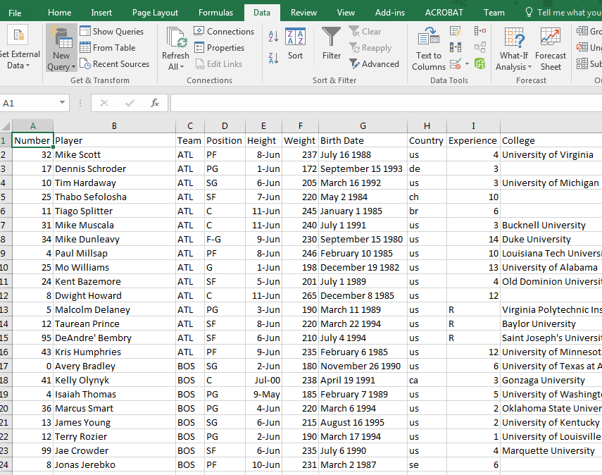
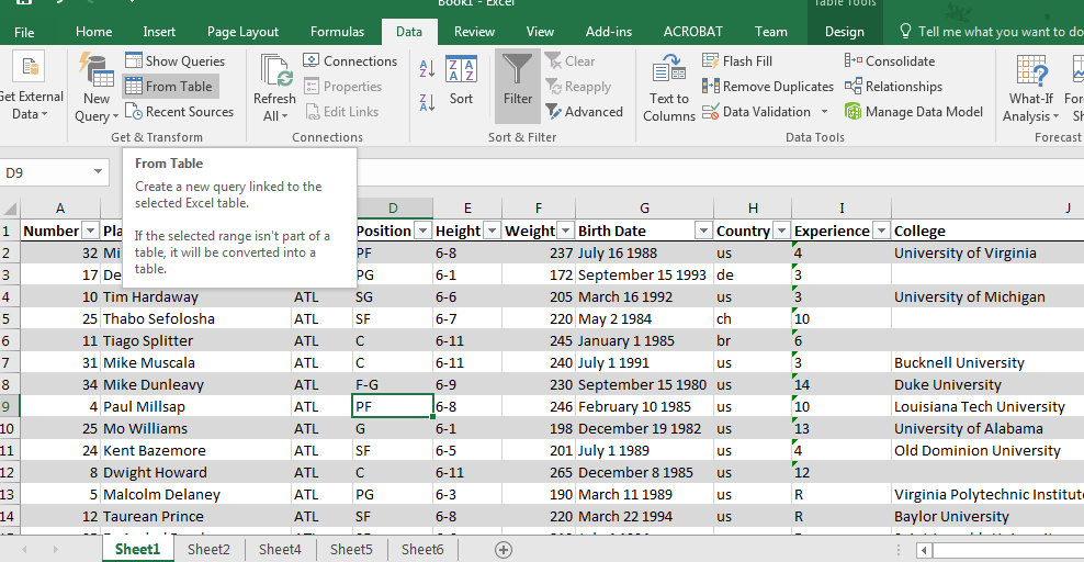
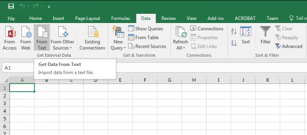
Importing data is always the first step.  Let’s import the data through Excel, by going to the Data tab in the Ribbon, then clicking “From Text.”

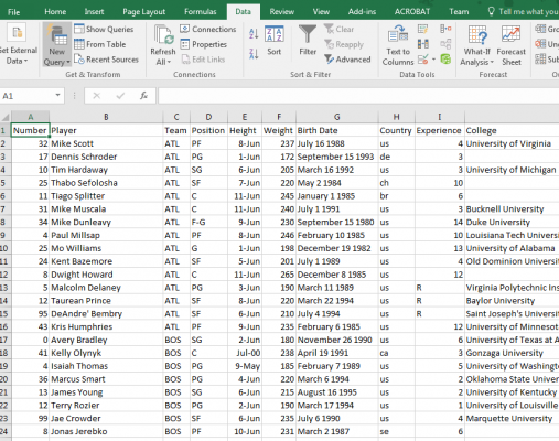
Select the nba-players.csv file, pass through the first step, select “Comma” as a delimiter, then hit enter to import the data.

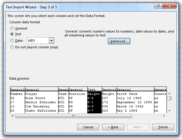
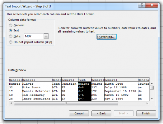
The height column seems to be all goofed up (it’s reporting height as a date), most likely because Excel thought that value was formatted as a date.  I can re-run the import process again, by right-clicking the data in the sheet, and selecting the “Edit Text Import…” option.  Clicking through the wizard again, pause on the last step.  Click on the problem column (Height) and change the column data format to “Text”.  This tells Excel not to guess what the column is.  Click okay, and see that the data looks okay.

Let’s change this data into an Excel table.  This will let us treat the dataset as a named field, and let us make calculations based on columns named by the column names.  Select the entire dataset by using Ctrl+Shift+[arrow key] (or Ctrl+A), then under the Home tab in the Ribbon, click the “Format as Table” option, then select a design.  This might kill the external CSV import; click OK to continue.  You can now use the drop-downs by each column title to filter the items, and make formulae that use the table data (e.g., in another cell, type =SUM(Table1[Number])).

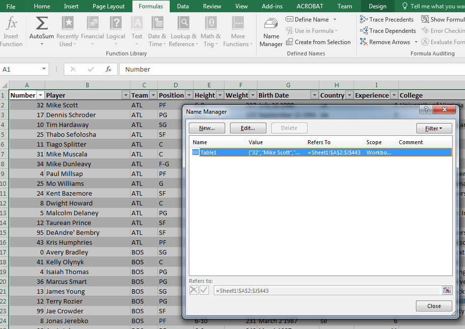
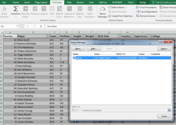
We can name this table so it’s easier to refer to it. Go to the Formula tab in the Ribbon and click “Name Manager” near the middle.  We can rename the table to “players”, so now this will be our reference throughout the table.

PivotTables (data aggregation)

We can see some trends over the dataset by using the dimensions and aggregating by the number of players by the values in the dimensions.

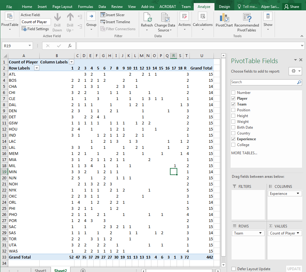
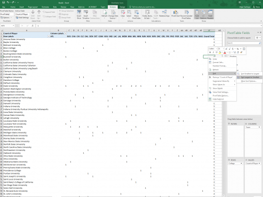
Make a new sheet, then create a PivotTable by clicking Insert on the Ribbon, then “PivotTable”.  In the data source box, type the name of the table (“players”), then click OK to place it into your new sheet.

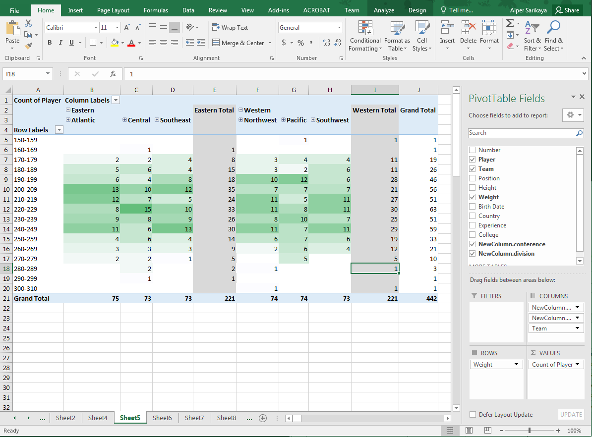
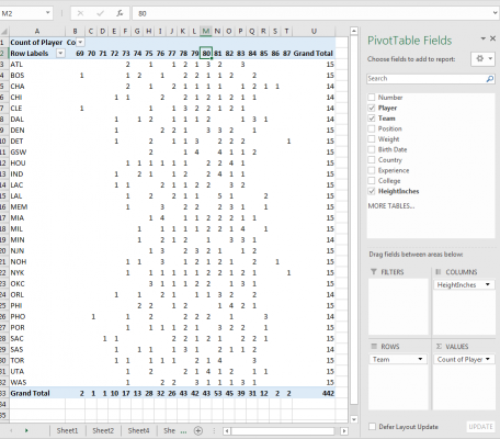
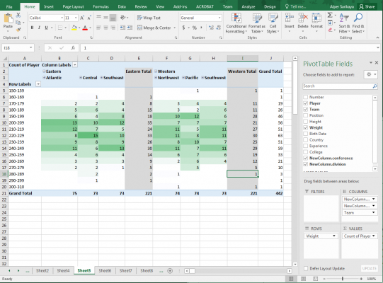
In the PivotTable sidebar, drag “Team” to rows, and “Player” to values.  This enumerates all unique teams on the rows, and counts the number of unique players per team.  Try out different combinations to see more interesting aggregations: show the experience by team.

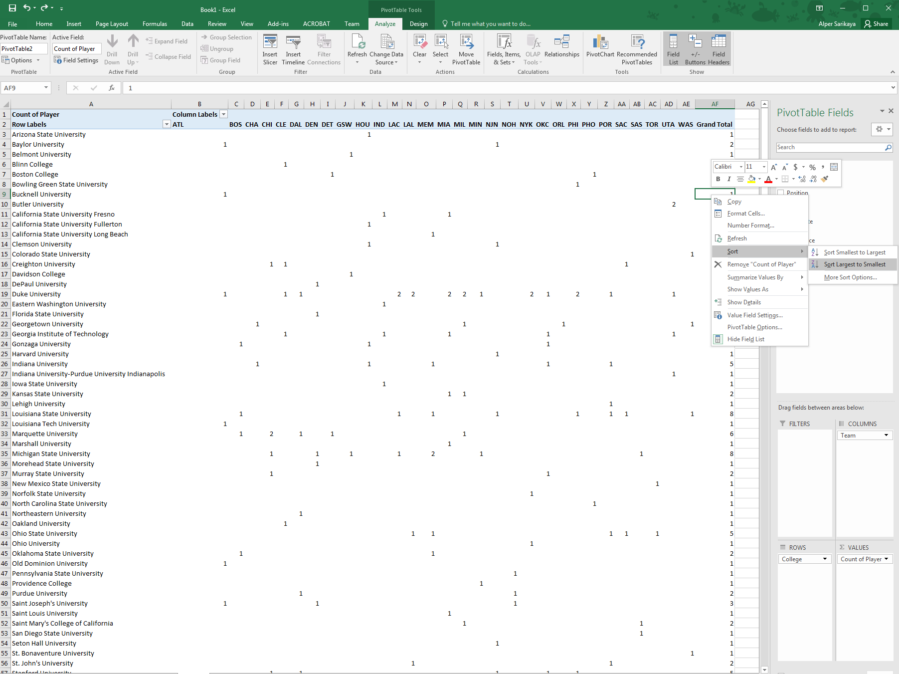
Maybe even the team by the colleges that represent them?  If the table gets too big, you can try sorting: right-click one of the totals fields per college, then sort largest to smallest.

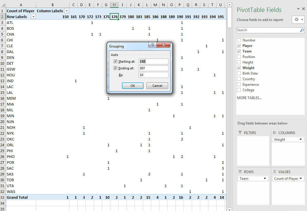
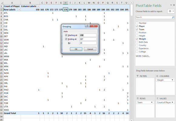
For continuous fields, you can also bin so that each individual value doesn’t get a cell.  Right-click on one of the column identifiers that you want to bin, then select “Grouping”.  Either accept the default options or insert your desired values.

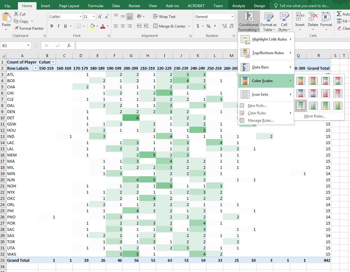
To highlight cells in a heatmap form, select your data range (without including the totals row; this’ll throw off the normalization), then under the Home tab in the Ribbon, select “Conditional Formatting”, then “Color Scales”, then green-to-white ramp.  You can modify this rule by clicking “Conditional Formatting” again, clicking “Manage Rules…” at the bottom, then double-clicking your rule to change the color ramp or fix maximum or minimum values.

Using Query Editor

Excel has a handy query editor that can let you do repeatable actions to data to let you clean it.  Most importantly, it has a “history” of all the actions that you take to clean, so you can rewind if an issue comes up.  The resulting query is able to re-run on the data, even if the source data changes.

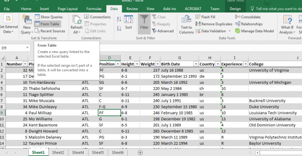
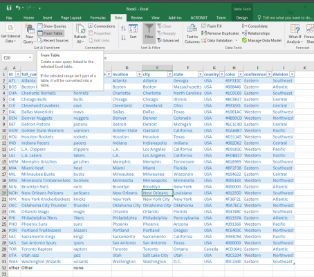
To load your first query, go back to the initial data import (Sheet1), select a cell in the table, then go to the Data tab in the Ribbon, then click “From Table” button within the “Get & Transform” group.  This will populate a new query with all data from the table.

The query editor gives a preview of the data.  The data is not accessible until you “Save & Load”, which will place the data into a new sheet.

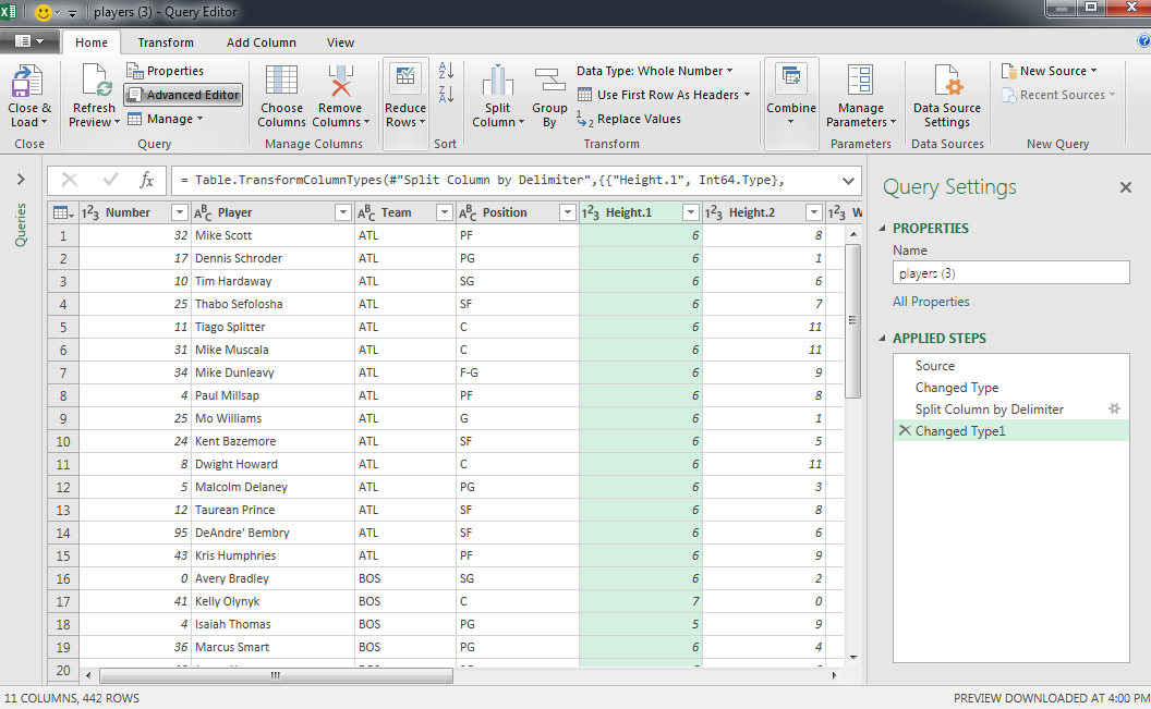
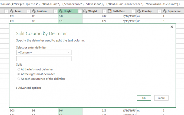
Let’s say that we want to change height into a continuous value: inches.  We’ll do this by splitting the column up into the feet and inch components, then making a new derived column. To split the column into its components, click the “Height” column header, then click “Split Column” in the ribbon, then “By Delimiter…”.  Select “–Custom–” from the drop-down options, then enter a dash into the text field.  Click okay.

Notice this replaced the original column with Height.1 and Height.2.  We’ve also added some steps into the Applied Steps pane, and can reorder or remove these steps if we so choose.  All actions we take are recorded in this pane, and we can rewind the data state by clicking on previous actions.  Be sure to click on the the last step when adding actions, otherwise you may be making actions out of order.

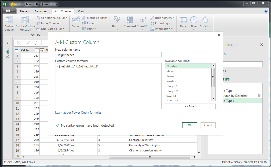
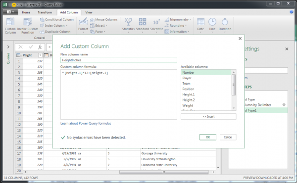
To add a new column, select the Add Column tab in the Ribbon, then click “Custom Column”.  We can enter an arbitrary equation here; let’s just put in [Height.1]*12+[Height.2] and rename the column to HeightInches.  Hit OK.

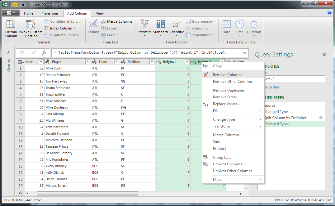
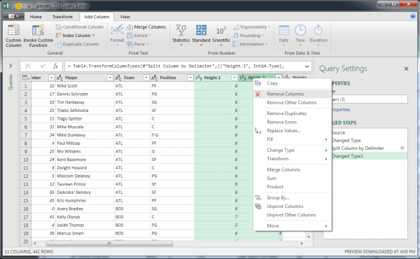
We can remove the two old height columns by selecting them by clicking on their headers, then right-clicking and selecting the “Remove Columns” option.  Since this query editor is stateful and has history, we will not have hanging references; HeightInches is still well-defined.

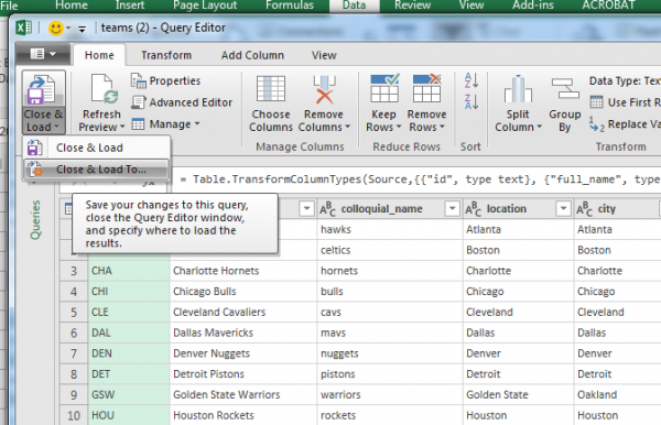
Save the Query by exiting the window and selecting the “Keep” option.  A new sheet is populated with your query results.  You can again name this table in the Name Manager (call it something like “players_clean”) and can now use the new height field.

Merging Datasets Together

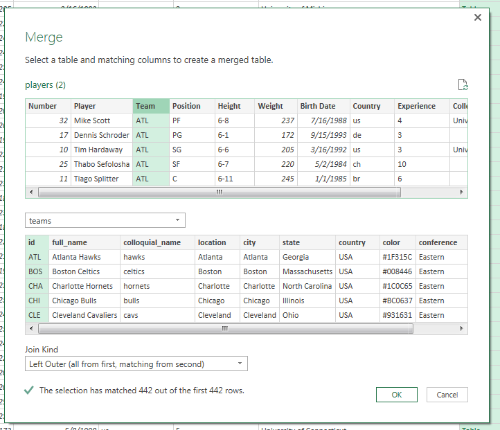
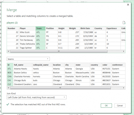
The query editor makes it easy to join multiple datasets together.  We will need a field in both datasets that let us join the data together on a common value.  In our dataset, the three-letter acronym of the team (e.g., “ATL”) will let us do that.  We want some metadata about the team (what conferences and division is each team in) so that we can look at differences of player attributes between conferences and divisions.

Load in your other dataset just like in the first step; we’ll use teams.csv from the Box folder above.  Format it as a Table, then open the query editor from table as before.

Immediately save and close this query as a connection so that our original query can have access to this data.  Do this by clicking “Close & Load” arrow (far-right on the Home tab in the Ribbon), then selecting the “Close & Load To…” option.

In the dialog box, select the “Only Create Connection” radio button, then hit enter.  Now, re-enter your original query by finding it in the Workbook Queries sidebar and double-clicking it (if the sidebar is hidden, go to the Data tab in the Ribbon, then click “Show Queries” in the Get & Transform group).

Select “Merge Queries” from the Combine group in the Ribbon.  Select the column in the first table to merge on (in our case, “Team”), then select the second table from the dropdown, and the corresponding column in that table.  Excel will give a message with a checkmark if the join is successful (the engine finds data for every row).  Accept the join by clicking OK.

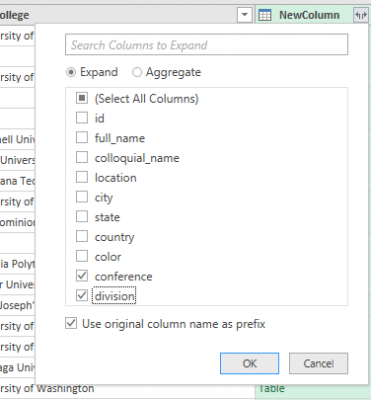
This adds a Table-valued column to the query.  To select the fields we want, click the Expand icon next to the column title, and select only “Conference” and “Division”.  Click OK.

Save and close the query.  The table will update, but you may need to refresh connections to see the new fields in the PivotTable.  Click “Refresh All” in the Data tab in the Ribbon.  Try creating a hierarchy of conference, then division.

Visualization

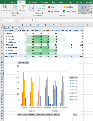
I’d anticipate that you wouldn’t want to use Excel to make a vis, but PivotCharts are actually responsive to your PivotTable!  Simply click “Suggested Charts” in the Insert tab in the Ribbon and accept the default “Clustered Column” type by clicking OK.  When you change the properties of your PivotTable or expand heirarchies, the graph will follow!

Let us know if you find any other cool tricks with Excel!  If you have any comments, please leave them on Piazza or feel free to send me mail.

The Week in Vis: Week 6, Feb 20-24

by Mike Gleicher on February 17, 2017

This past week we talked about abstraction, and you gave me some free consulting on my web page we tried to learn more about graphic design.

This week, we’ll connect the abstractions to visualizations – by discussing encodings (the mappings from data to “visual variables”). To start, we’ll just think about the mappings and how these lead to designs – and then we’ll move on to talking about the perceptual issues in choosing the encodings.

This week, we’ll also start with our first “Design Challenge” where you’ll be able to try out all the stuff you learned and make some visualizations. This will be the first of 3 design challenges. It will play out over the weeks before Spring Break (a little more slowly than future ones which will each be 3 weeks).

  • Monday, February 20th – Lecture on Encodings. Since it’s Monday, you know that there’s a reading due (Reading 6:Encodings) for class, and an initial posting to the discussion (Discussion 6: Encodings).
  • Wednesday, February 22nd – We’ll have a “hands-on” demo where we’ll show off how Excel (yes, Excel!) can be used for some of the kinds of data analysis/visualization you may want to do for the Design Challenge. We’ll also do some in-class exercises involving encodings and redesigning encodings.
  • Friday, February 24th – We’ll have an optional, in-class discussion about the Design Challenge. This will be time for you to bring your own data set (so we can decide as a group whether it’s a good one to use), but we can also talk about the ones we provided, and maybe talk about tools a little bit. We won’t have anything planned, but will be in class to discuss what people want to talk about.
    And Seek and Find 6 is due. And, if you want to be on time, all the additional postings for Discussion 6 are due (but hopefully, you’ve done them earlier so that others can discuss).

So for this week…

Piazza (again)…

by Mike Gleicher on February 17, 2017

While I said that Piazza is optional, I realize that having only a part of class sign up an imbalance – some people have access to more information, and find out about stuff sooner.

So while posting on Piazza will remain optional, I would like everyone to at least be registered on it, so that you can be aware of what’s going on there.

I think in the next few weeks, as everyone starts working on the first Design Challenge, people will want to discuss things like what tools to use, and to ask for help with tools. Since we (the course staff) aren’t necessarily experts at things like Tableau, having a “user community” may help us figure it out more easily.

As I like to say… There are 51 of you, and one of it. You should win – if you play as a team. Collaborating to learn about the tools is encouraged (but we want people to do assignments individually).

So, next time you log into Canvas, at least click the button and set up your Piazza account. As an inducement, over the next week, I will make some postings suggesting some resources that might be helpful for the first Design Challenge.